Why you can trust TechRadar
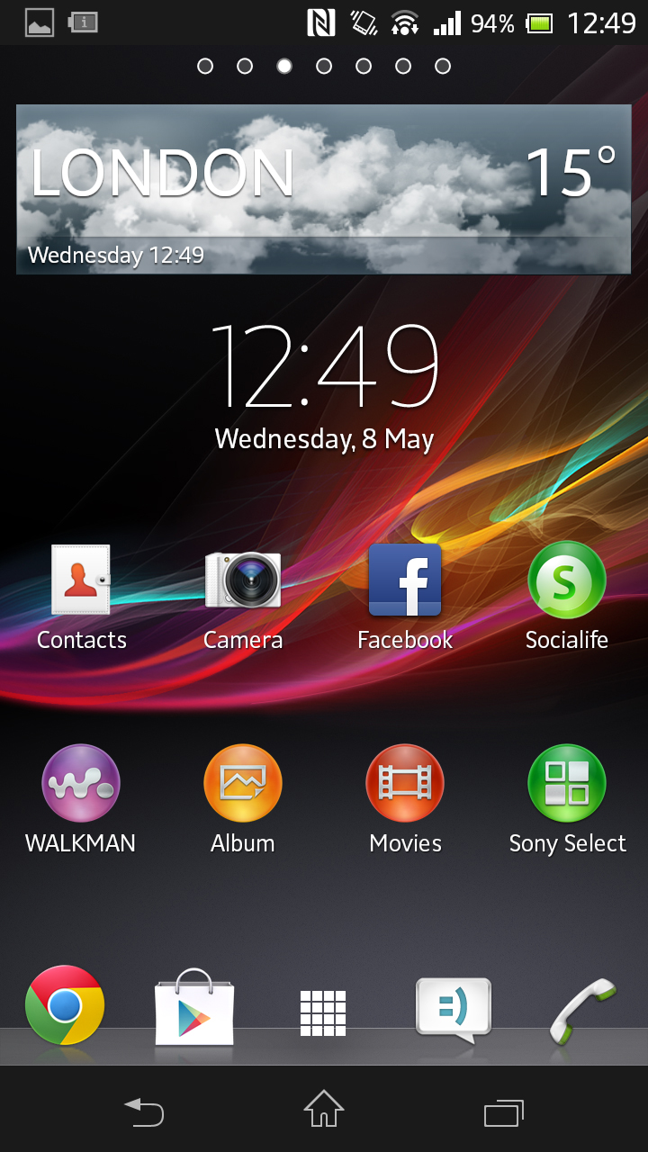
Like Samsung, Sony doesn't leave Android well enough alone. Using the Xperia SP will be easy for anyone familiar with Google's OS - but looking at it is completely different.
Everything from the font to the icons themselves has been changed thanks to Sony's own TimeScape skin.
Opinions differ on whether Sony's take on Android is a good thing, but we think it's a nice change. Although, a bit of clarification: the skin is actually called User Experience Platform (or UXP NXT) but has been shorthanded to TimeScape after a social networking tool that (until the arrival of the Sony Xperia Z and Socialife) came as part of the package.
The skinny white font is refined and the Sony own-brand widgets and icons have a mature look to them that will be refreshing after time spent with Samsung's colourful, Nintendo-like UI. You get plenty of opportunities to admire Sony's work as well, because there are a fair number of first-party media services that, if we're honest, you won't need. But more on that later.
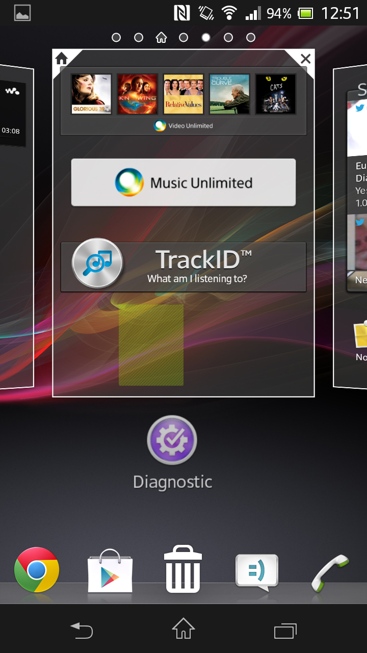
Although it looks different, the layout of the interface on the Sony Xperia SP is still classic Android. You've got seven home screens to populate with apps and widgets, with four main apps anchored to the bottom of the screen either side of a shortcut to the grid view.
At any point, you can call down the notifications bar by swiping down from the top of the screen, enabling you to tinker with important functions such as Wi-Fi, Bluetooth or battery settings.
You can sit 16 apps on the 4 x 4 grid of each home page or alternatively group them into folders of four.
Larger widgets, such as Socialife, will take up more space, but the benefit is they can be arranged and customised according to your liking.
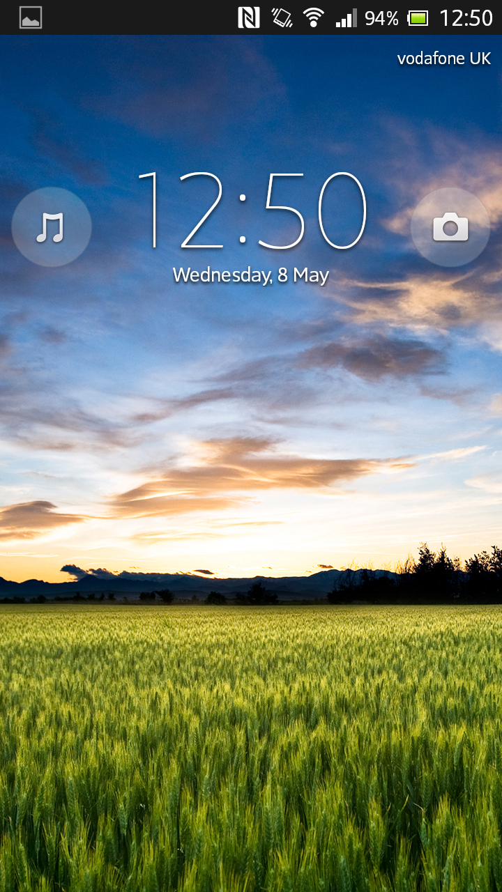
From the lock screen, you can access the Walkman and Camera shortcuts for playing music or taking a quick picture, and also swipe down to quickly check the notifications bar. Once you swipe upwards (or enter a pattern or passcode) you're into the interface proper.
We'll be honest: we expected the addition of Sony's skin to hamper the smoothness of navigating the Sony Xperia SP.
In actual fact, it was remarkably smooth - even on usual sticking points like exiting apps back to the home screen.
Much of the credit rests with Google's Android 4.1.2 Jelly Bean, which has been drastically improved when it comes to speed and smoothness.
It won't always be the case. After you've been using the Sony Xperia SP for a few months and you've loaded it with apps and software updates, you can certainly expect some lag. It happens with every phone in existence, so savour the buttery smoothness of those first few weeks before the 1GB RAM starts getting strained.
You can customise the home screens with a long-press on your desired space that will bring up the option to add in a widget or app shortcut and change the theme or wallpaper.
Either that, or pinch and draw your fingers together to zoom out. You'll then need to drag to your desired space and release. You can also change the wallpaper this way - either from the pre-selected Xperia choices or a third-party option from the Google Play store.
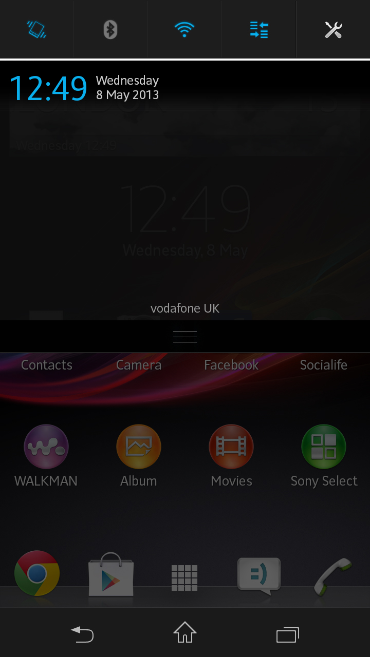
The three soft touch keys at the very bottom of the screen are your navigation tools. The Back, Home and Recent keys are a staple of Android and will stick with you through menus, apps, media and gaming.
At any point you can find your way back to the home screen or your last step with these keys, and you'll use them hundreds of times a day. Nice to see then that Sony has made them responsive and easy to hit in a hurry.
Because of the size of the Sony Xperia SP, you'll find you can mostly interact with the interface and the physical keys on the right side of the phone with just one hand.
If you swipe upwards from the base of the phone at any point in the OS, you'll be greeted with Google Now - one of Android Jelly Bean's big new additions. It enables you to enter a quick search, and to have relevant internet-based information such as weather or sports scores delivered to your handset.
We don't want to descend into the customary Android vs iOS debate here, but we'd be remiss if we didn't point out that Apple's UI is still easier to use if you're a complete newcomer to smartphone systems.
Your mum, gran or dog will find using the iPhone 5 easier than the Sony Xperia SP at first glance - but if you put some time in you'll see Android has matured into a rich, layered interface with minimal performance issues that offer excellent options for customisation.
