Why you can trust TechRadar

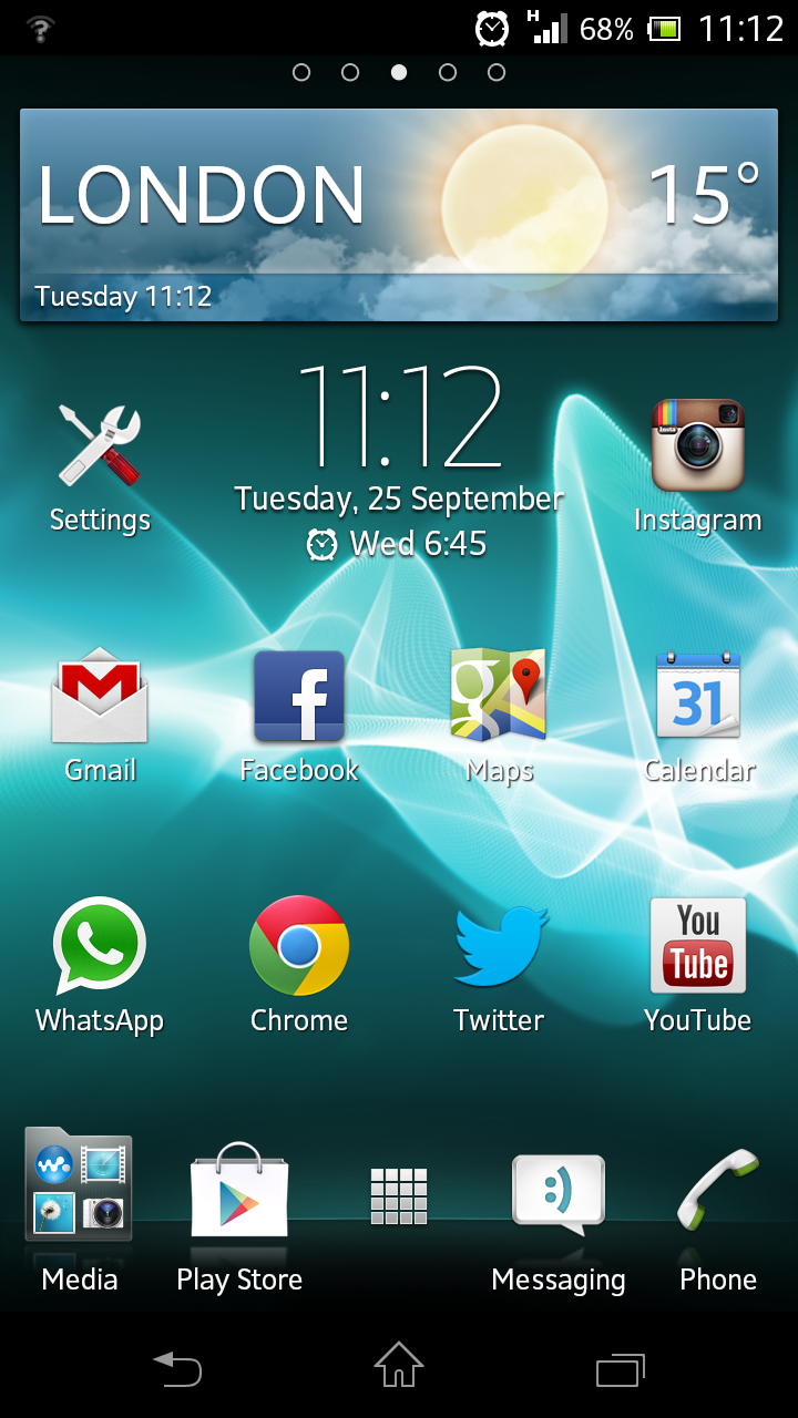
Although the Sony Xperia T is part of the Android family, the interface looks markedly different from Android on a Samsung, HTC or LG phone.
Sony has covered the OS with its own TimeScape skin, and added a few extra themes and widgets not available on other devices.
The Android 4.1 update operating system has improved the device over the last couple of years, and you can see the fruits of Google's labour on the Xperia T.
Swiping between home screens (there are five) is a fluid and smooth experience.
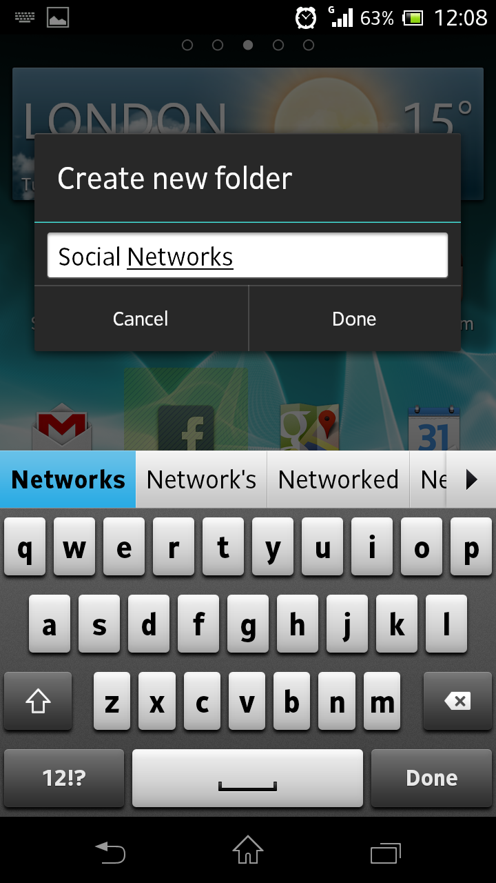
You can drag and drop apps together to create folders and organise your home screen with widgets from the Android stable.

From anywhere in the interface you can swipe down to bring down the notification menu, which tells you about app updates, messages or emails as well as enabling you to control things such as Wi-Fi or Bluetooth.
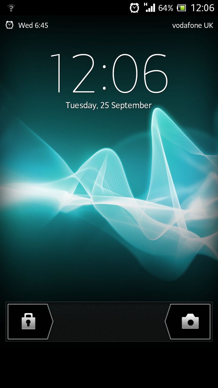
Before you get to the interface, you're confronted with the lock screen. From here you can swipe left to open the phone or swipe right to launch the camera.
You can also answer or ignore calls and, in what is a very useful feature, skip tracks if you're playing music on the phone.
This is useful when on the move as it means you don't need to unlock the phone and open the music player just to skip on a song or two.
TimeScape comes with its own eponymous widget that collects all your social network feeds into one place.
You can add in the likes of Twitter, Google+ and Facebook and choose how often it refreshes.

While this can easily be accomplished with third-party apps or the social networks themselves, Sony's offering is slick and fits into the look of the interface.
A long press on the home screen enables you to either change the wallpaper or add widgets, while a long press on an app enables you to reposition it somewhere else.
Even with the option for folders, you'll find the five home screens fill up quickly - especially if you use large widgets like Timescape Feed, Flipboard or Google Calendar.
Apps themselves load up quickly and there's barely noticeable lag as you make your way around the interface.

Multitasking is harder to do on a smartphone than it is on a tablet, and we still feel Android loses out slightly to iOS when it comes to this.
One other minor point is that the move to three soft-touch buttons (Back, Home and Recent Apps) means that accessing the settings menu is achieved through the pull-down notification menu.
It takes some time to get used to this, and we felt that having it constantly available at the bottom of the screen was preferable.
We found the Xperia T picked up our gestures well and using the keyboard was easy enough to get used to. The haptic feedback is quite apparent, although there is the option to deactivate it if you prefer.