Why you can trust TechRadar

Contacts
Managing contacts on the Sony Xperia T is a relatively easy affair thanks to the same smart options we see on all premium smartphones.
You can add selected contacts to your favourite list or organise them into groups.
For individuality you can also assign different ringtones to different people.
There's limited social network integration.
Although you can import from Facebook or Google+ to see additional information such as birthdays, this isn't really handled as well as other phones such as the Samsung Galaxy SIII.
It would have been nice for the Xperia T to display a profile picture on the contact card, for example.
Calling

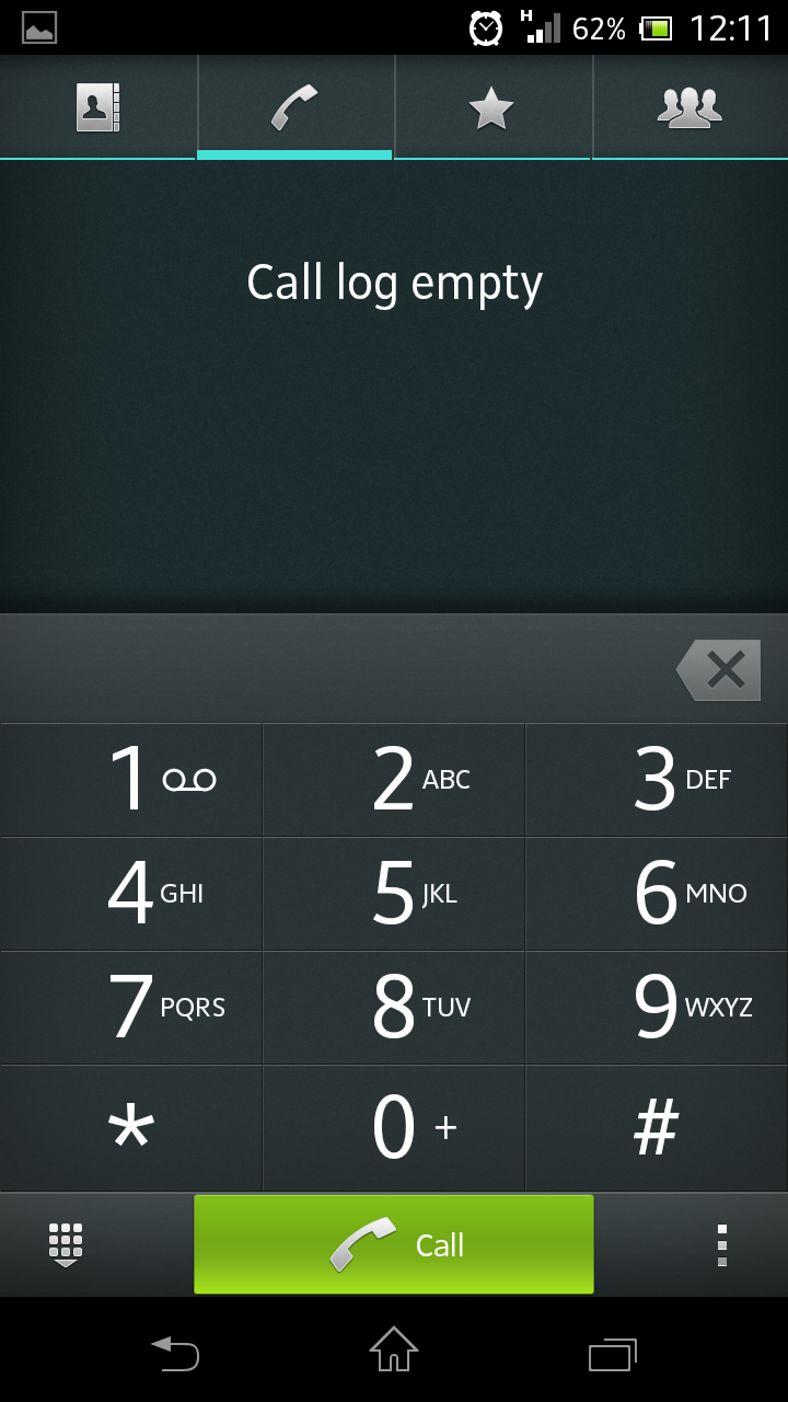
The dial pad icon is located on the bottom right corner of the home screen (although it can be placed anywhere) and the Sony Xperia T features smart dialling.
When you enter a number, you are given the option to also send that person a text message or email, offering a quick alternate route if you decide you don't want to speak to them after all.
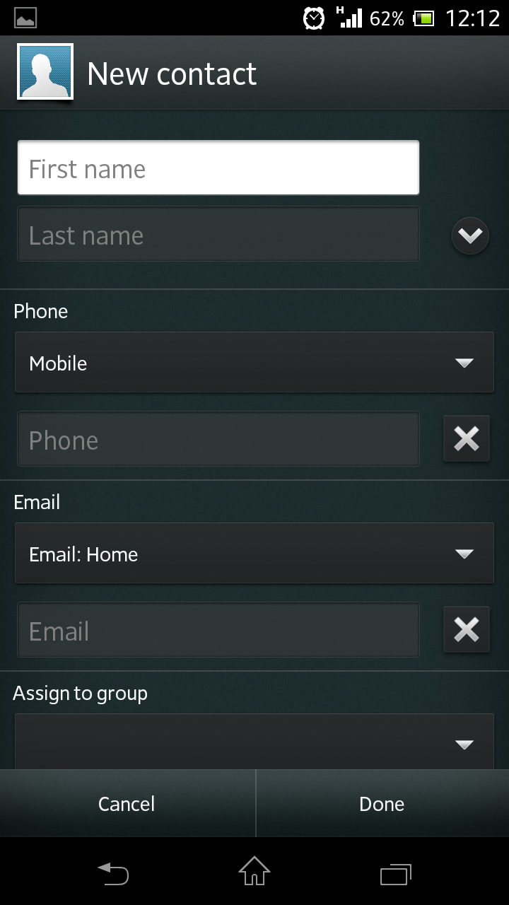
To add a contact, you tap a small icon at the bottom-centre of the screen. The Xperia T gives you plenty of options for information including the aforementioned ringtone as well as adding a nickname.
If you're particularly popular and have a large contact list, you can search by tapping the magnifying glass on the bottom left of the screen, or filter using a variety of options.
If you're a WhatsApp user, then the contact card will automatically display the option to send a WhatsApp message instead of a traditional SMS.
The Sony Xperia T handled calls well, as we would expect. Although the volume won't go amazingly high, we found call clarity to be good and didn't experience any dropped calls.
During a phone call, you can switch to speakerphone (which sounded good when we tried it) and drop the call screen away, leaving you free to navigate the phones interface. This isn't a revolutionary feature but is quite handy if you want to look something up without cutting off the call.