Why you can trust TechRadar

Messaging on the Sony Xperia T follows a pretty conventional path and anyone used to either Android or a smartphone in general will be able to get the hang of it pretty quickly.
Like the dial pad icon, the message icon starts off as one of the four shortcuts anchored to the screen.
It'll show up no matter which of the five home screens you're currently viewing – perfect for some fast messanging action.
Like any other app it can be long-pressed and placed anywhere you want.
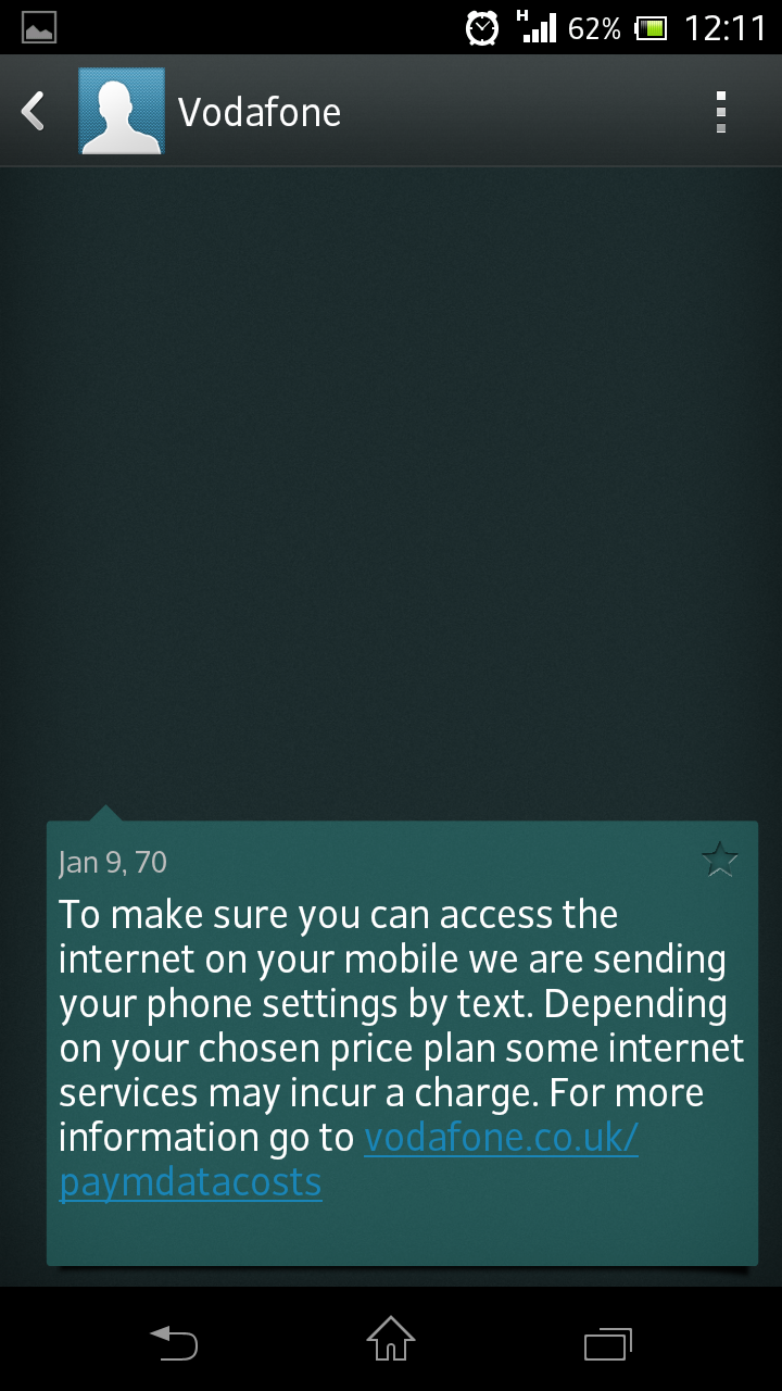
Once you're into the message hub it will display all your texts with the most recent appearing at the top of the list.
It works like a conversation, displaying both received and sent messages with the most recent action (sent or received) placing that conversation at the top.
If you long-press on a message you can delete that specific message while long pressing on the entire conversation in the message hub screen will enable you to delete the entire thread.
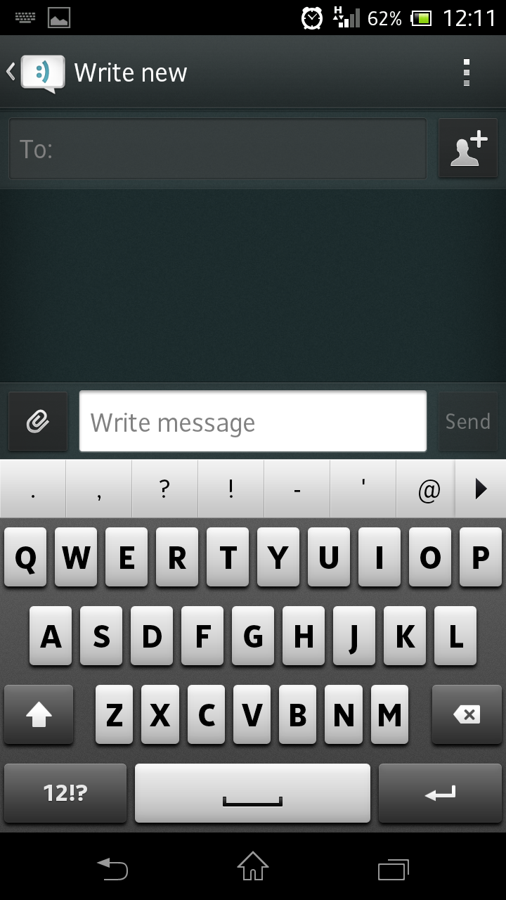
Composing a message is very easy and we found the Xperia T's on-screen keyboard to be up to the task.

If you prefer a different style of keyboard though, there are plenty available to download from the Google Play store.
Again, haptic feedback is pretty noticeable here so if you're not a fan be sure to turn it off before hammering out a message.
Although the screen on the Xperia T isn't as big as other phones (or phablets) we've seen the keyboard doesn't feel cramped.
If you turn the phone landscape the accelerometer picks up on it (although not as quickly as it could) and switches the keyboard accordingly. You're given much more space in landscape mode and this makes it easier to type at speed.
When tapping out a message, there's the option of adding a file as well as sharing a picture or a note. These are all represented underneath the message box by the relevant shortcut tiles.
If you receive a message (or Facebook update) a small blue light on the front of the screen will blink accordingly.
It will turn green if you receive an email and means you can see at a glance whether you have any new messages. This is a small but handy feature and should really be a standard fare on all smartphones.