Why you can trust TechRadar
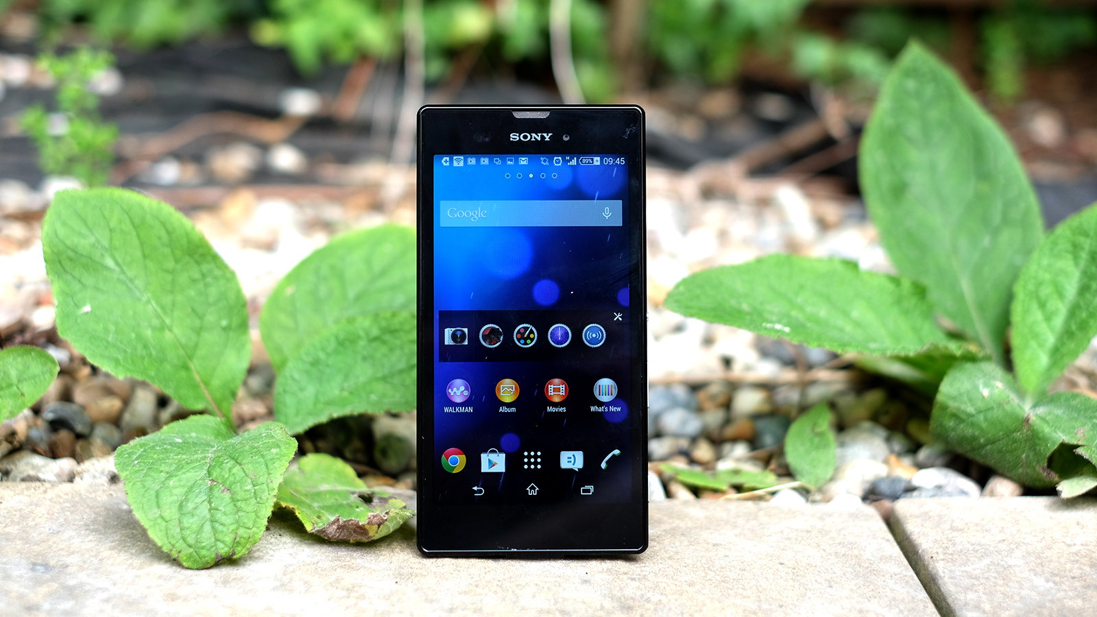
In many respects the Sony Xperia T3 is quite a simple, pared-back phone. However, it has the same up-to-date interface as the Sony Xperia Z2.
The same is not true of other recent Sony phones, including the Xperia E1 and Xperia M2. Here you get a few extra visual refresh elements that make the phone seem as clean and clear as something like the Nexus 5's Google Now/Experience interface.
From a quick glance of the interface it looks a lot like old versions of the Xperia UI, but look closer and you'll see it actually looks a lot fresher.
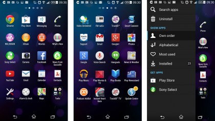
Sony has got rid of the extra lines and the widgets/apps divide in the apps menu, and altered the font. This results in a very attractive and clear interface that looks and feels a lot like a mildly tweaked version of standard Android. Among the many overbearing custom interfaces, that's a very good thing.

It does add a few features, though. The apps menu gets its own Sony interface screen, and there are a bunch of widgets that link into Sony's preinstalled apps.
Just about the only contentious part of the Sony Xperia T3's otherwise remarkably tasteful interface is the breadth of apps that come as part of it. There's nothing new – it's the same line-up you get with the Xperia Z2 or M2.
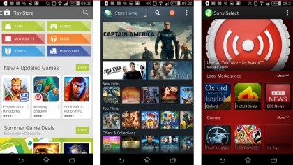
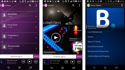
There are Sony's music, movie and photo apps, a Sony app store and a largely redundant social/news feed app called Socialife News. None of these are truly offensive and some, like Walkman, are pretty useful, but you have no option to uninstall them.
Sign up for breaking news, reviews, opinion, top tech deals, and more.

Sony includes a bunch more apps, like the Shazam-a-like TrackID, an office suite and a couple of image editing apps. But you can uninstall these.
Does Sony throw-in too many extras? Yes. But I'd rather have a nice-looking and feeling UI with a few extra apps than an all-round horrible interface with nothing but Google's apps there.
Despite the fact that the Sony Xperia T3 has just 1GB of RAM and the same class of Snapdragon 400 processor as the entry-level Moto G, performance is fairly good. As the interface is not a significant drain on performance and the phone 'only' has to render in 720p, there's no major lag.

That 1GB of RAM is going to limit how many apps you can install before you see a performance hit, though. Don't you find it a bit of a swizz that the Xperia T3 uses more-or-less the same processor as the £99 EE Kestrel?
It doesn't have any more power than those low-end Snapdragon 400 phones, either. In Geekbench 3 the phone scored around 1361 points, similar to those phones.
In general use the Snapdragon 400 chipset is more than capable of keeping Android 4.4.2 quick. But with things like 3D games you're not going to get quite as fancy-looking effects as you'd get with a Snapdragon 800 or 801 CPU.
With an LG G2, for example, Dead Trigger 2 is all shiny surfaces and lighting effects. With the Sony Xperia T3, the visuals look a bit flatter – still detailed and sharp despite the 720p resolution, but you lose out on some of the more processor-intensive effects.
Current page: Interface and performance
Prev Page Key features Next Page Battery life and the essentials
Andrew is a freelance journalist and has been writing and editing for some of the UK's top tech and lifestyle publications including TrustedReviews, Stuff, T3, TechRadar, Lifehacker and others.
