Why you can trust TechRadar
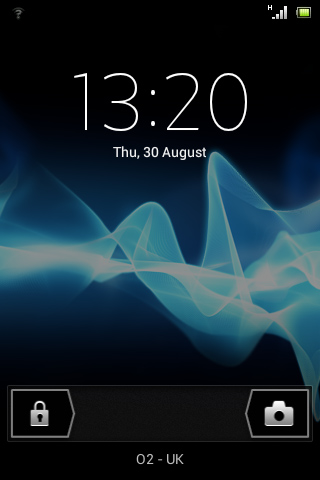
Running Android 4.0 Ice Cream Sandwich, the Sony Xperia Tipo should be a joy to use.
It enables you to drag and drop apps on top of each other to create folders, swipe sideways across an app to close it or a notification to clear it, view widgets before you place them, and more. It's a great interface that brings Android close to the slickness of iOS.
From the lock screen you can go to the home screen/currently opened app or launch the camera, you can pull down the notifications screen and act on any texts or missed calls.
That's a welcome addition, and quick access to the camera is always a nice feature, but it's a shame there's no direct access to things such as contacts or messages.
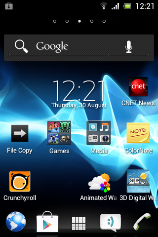
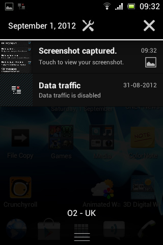
As is standard with Android, the Sony Xperia Tipo's notifications bar lives at the top of the screen, and a downwards swipe will pull it open. The settings screen and any un-cleared notifications are accessible from here, while it also tells you the date.
There are only five home screens, which even with folders will quickly fill up if you're using many widgets, but there is also a bar at the bottom that's visible from every home screen and can house up to four applications or folders (in addition to an unmovable icon that takes you to the application list).
Widgets also come in various shapes and sizes, so if you opt for small ones you can add quite a few to a single home screen. Pinching any home screen will bring up a floating display of all your widgets - it can look a bit messy, but it enables you to quickly access the one you want.
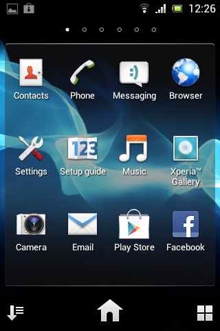
The Sony Xperia Tipo's applications list can quickly get quite long as more and more applications are installed, so thankfully it's easy to manage and can be sorted alphabetically, by most used, by how recently things have been installed or in your own custom order.
You can launch any application from here, while long-pressing one will enable you to place it on a home screen, or when applicable share it by email, MMS or various social networks and cloud storage spaces.
Long pressing an icon on a home screen enables you to move it around, add it to a folder or delete it.
Android 4.0 works reasonably well on the Sony Xperia Tipo, is well laid out and looks good. Anyone coming from another Android handset will be right at home, but even those new to the OS should be able to pick it up quickly.
Scrolling between home screens is smooth, and operating the phone in general is smooth and responsive.
Android 4.0 isn't quite the joy it is on some handsets, though. This is mostly down to the small screen size, leading home screens to feel cramped - particularly when widgets are added to the equation.
It also means the keyboard is awkwardly small and easy to make mistakes on, though in landscape mode it's not too bad.
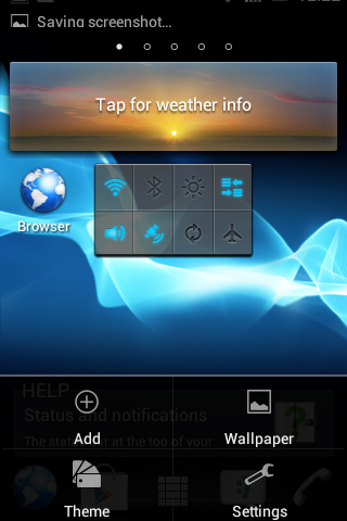
On top of that, elements of the UI sometimes overlap. For example, when first signing in to Google Play the password entry box overlapped with a back button, causing us to accidentally back out to the previous screen when attempting to enter our password.
There was also slight occasional slow down and jerkiness.
Despite launching with Android 4.0, the Sony Xperia Tipo also features hardware home and back keys, which is unnecessary when Android 4.0 is built around the concept of a buttonless UI.
These buttons both spoil the aesthetics of the phone and - more importantly - take up space that could perhaps otherwise have been used for a bigger screen.
James is a freelance phones, tablets and wearables writer and sub-editor at TechRadar. He has a love for everything ‘smart’, from watches to lights, and can often be found arguing with AI assistants or drowning in the latest apps. James also contributes to 3G.co.uk, 4G.co.uk and 5G.co.uk and has written for T3, Digital Camera World, Clarity Media and others, with work on the web, in print and on TV.
