Why you can trust TechRadar

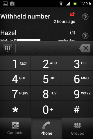
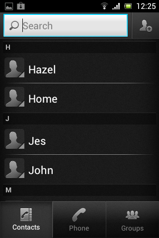
The Sony Xperia Tipo has separate icons for contacts and the dial pad. Though both of these screens can be accessed through either icon, they simply dictate which screen you start on. You can also access a call log, contact groups and favourites from here.
By default, the dial pad icon is the only one on a home screen, and this can be found at the far right of the bottom bar. Of course, this being Android, either icon can be moved and placed wherever you want.
The phone features smart dialling, and once you enter a number it also presents you with the option to send a text rather than call it. Similarly, selecting a contact from the phone book gives the option of calling, texting or emailing them, which is a great way of keeping all the communication functions together in one area.
If anything, it's a shame the Sony Xperia Tipo's main SMS inbox isn't available from the contacts and call screens.

There also isn't much in the way of social network integration. You can sync contacts with Facebook, and all the major networks are well served with apps from Google Play, but it would be nice if contacts could be messaged on these platforms from the main contacts screen.
This is one area where Google could definitely learn from Microsoft's Windows Phone 8.
Calling a contact takes more button presses than it should. Once on the contacts screen you have to tap once to select a contact, and then again to choose whether to call or text them. It's not a big deal, but could have been avoided by using swipes.
For example, swiping left across a contact could have called them, while swiping right would bring up the messaging screen, thus cutting down on button presses. Even once added to favourites it still takes the same number of button presses to call a contact.

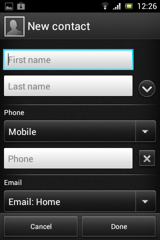
Adding a contact to the Sony Xperia Tipo is done by tapping an icon on the top-right of the contacts screen, and a decent amount of information can be added to each contact.
From multiple numbers and emails, to their address, related websites, notes, nicknames and more, there's just about everything you could ask for. Not to mention the ability to add them to a group and assign a custom ringtone.
Call clarity is good, and even the speaker phone works quite well. In our time with the phone we did experience one dropped call, but that was in a very poor signal area.
Options from the call screen are fairly standard - you can access the dial pad, toggle speaker phone on or off, mute the call and end the call. You can also hide the screen altogether and navigate the phone without cutting the call.
James is a freelance phones, tablets and wearables writer and sub-editor at TechRadar. He has a love for everything ‘smart’, from watches to lights, and can often be found arguing with AI assistants or drowning in the latest apps. James also contributes to 3G.co.uk, 4G.co.uk and 5G.co.uk and has written for T3, Digital Camera World, Clarity Media and others, with work on the web, in print and on TV.
