Why you can trust TechRadar
Screen
- Only 720p, so not Full HD
- Almost edge-to-edge giving it a brand new look
- 5-inch screen size makes this an easy to hold phone
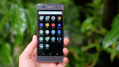
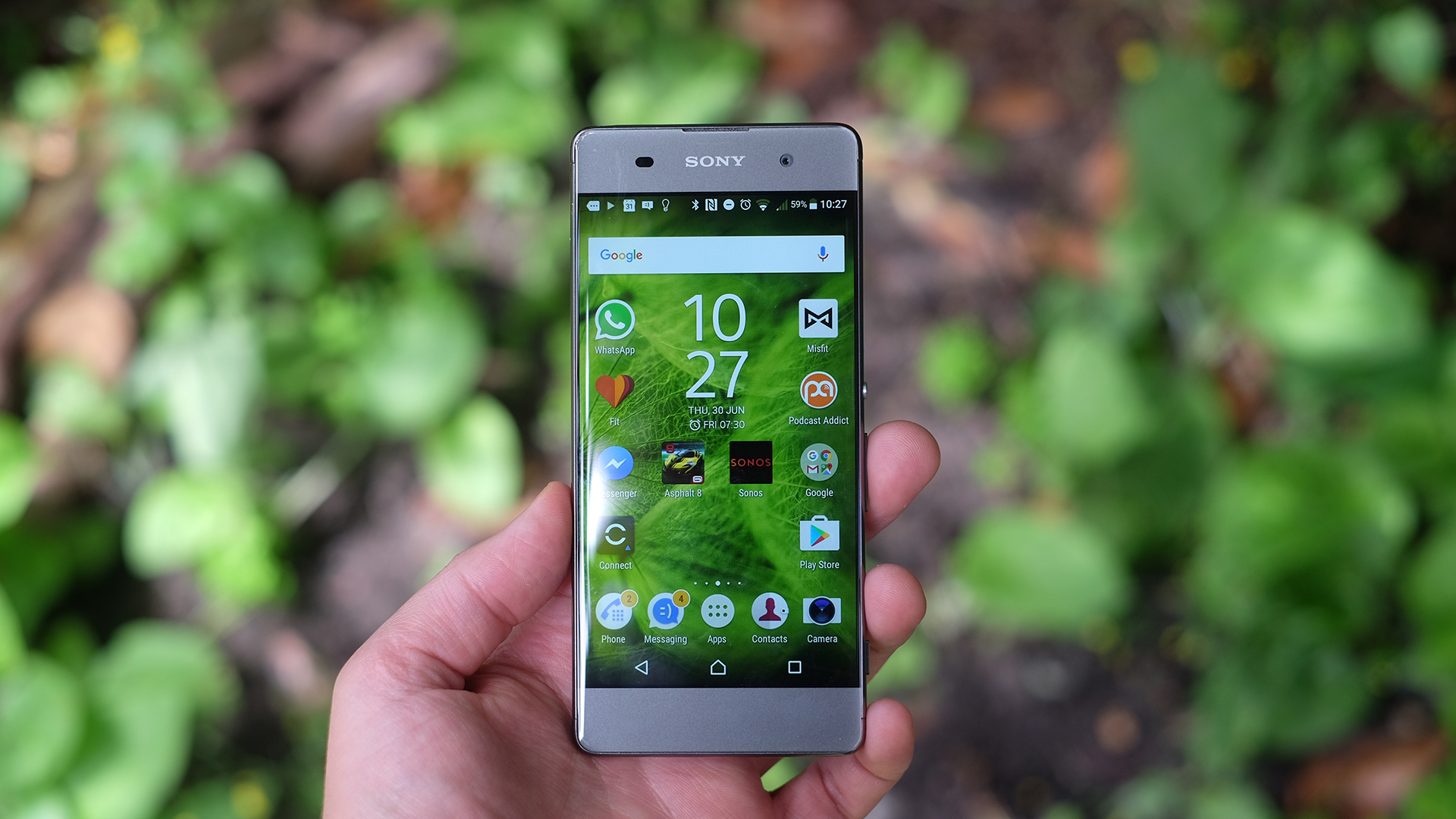
The Sony Xperia XA doesn't have a particularly impressive screen either. It's a 5-inch 720p IPS LCD display, at a time when several phones at the price are 1080p, most notably the Motorola Moto G4 (which also has a larger screen).
Screen quality is fine, but not at the level of the more expensive Xperias. There's clear brightness loss at an angle and contrast shift at a couple of extreme angles. Unless you fiddle with some sliders fairly deep in the Settings menu, a blue-leaning white balance also makes color tone seem odd, a little "not quite right", to start with.
Of course, the great thing about phone screen quality at this point is that in real-life terms all these criticisms don't necessarily have to register. I'd be perfectly happy living with a screen like this, and once your eyes have bedded into it a bit, you'll see it doesn't actually suffer from the (potentially) cloying oversaturation of the top-end Xperias.

Outdoors visibility is surprisingly good too. The Xperia XA kicks into a sort of 'turbo' mode when it senses it's in a bright environment, altering color and contrast to keep the screen as comprehensible as possible.
It's a perfectly fine screen, but you do need to live with the truth that you can get something more impressive for less money right now.
Software
- Runs latest Android 6 Marshmallow build
- Sony's Xperia UI overlay is looking better than ever before
- Android 7 Nougat will land on the Xperia XA, eventually
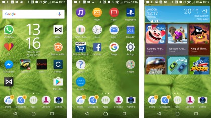
Sony hasn't put any new magic into the Xperia XA's software either. The phone runs Android 6.0 with a familiar Xperia custom UI.
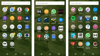
In the past we could say that the Sony Android UI was pretty light, feeling much like normal Android but with a Sony stylistic tweak. We can't say that anymore because where Android Marshmallow uses a vertical apps menu, the Sony Xperia XA and its brothers are stuck in the past with apps pages instead.

One style isn't empirically better than the other, but I do find that Google's (not that) new vertical style works very well with large app collections. After a while you gain a sort of muscle memory of the sort of gesture required to get where you want to be, where here there's going to be some flicking involved unless you want to keep your apps library perfectly arranged in folders.

With very little obvious change in the software since last year, the Xperia XA has a simple, almost spare interface. Where Sony gets more obviously involved is with apps.
There are Sony apps for SMS and calls, and for just about every kind of media you'll find on a phone: a videos app, a music app and the Sony PlayStation app, among others. It's not bloat-free but the Sony Xperia XA still gives off the impression of being 'clean' because of its software look.
Current page: Screen and software
Prev Page Introduction and design Next Page Performance and batteryAndrew is a freelance journalist and has been writing and editing for some of the UK's top tech and lifestyle publications including TrustedReviews, Stuff, T3, TechRadar, Lifehacker and others.

