Why you can trust TechRadar
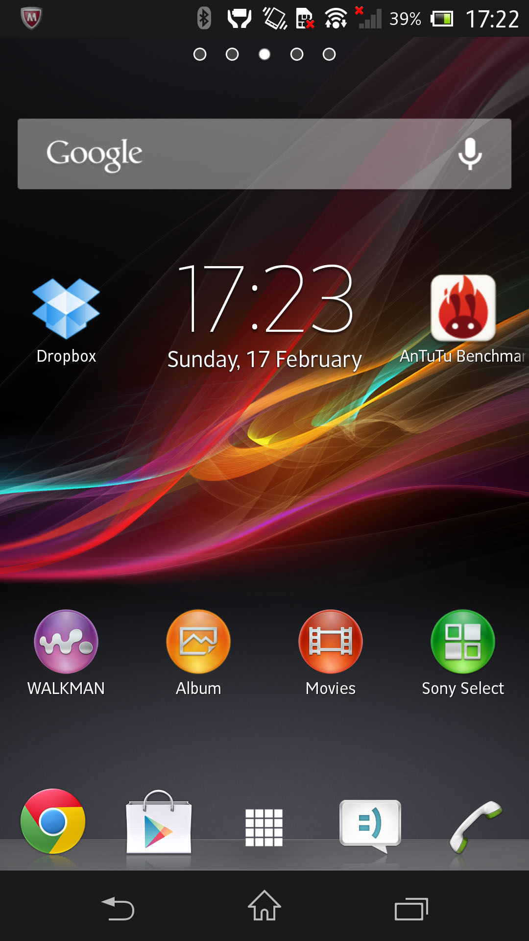
Sony may have broken free of Ericsson but it's clearly decided that the Sony Xperia brand is one worth keeping. And in line with that, some similarities remain other than the name.
It means that when you turn on the Sony Xperia Z, if you've used one before, you'll feel at home. Quite a clever move from Sony, which clearly doesn't want to alienate potential upgraders.
Thankfully, elements such as the shocking Timescape widget have been retired. Smaller, more obvious things like the clock widget stay.
The Sony Xperia Z ships with Android 4.1 Jelly Bean. Yes, it's not the most up-to-date handset as enthusiasts devour Android 4.2 on Nexus devices, but it's the next best thing, and Sony has promised an update shortly after launch.
For all the money and resources that Sony is pouring into getting this phone into the mainstream, the Sony Xperia Z won't be left sitting on the fringes here, allowing the likes of the Samsung Galaxy S4 superior bragging rights.
Sony's take on Android is customized - but not too much compared to some phones we've seen before.
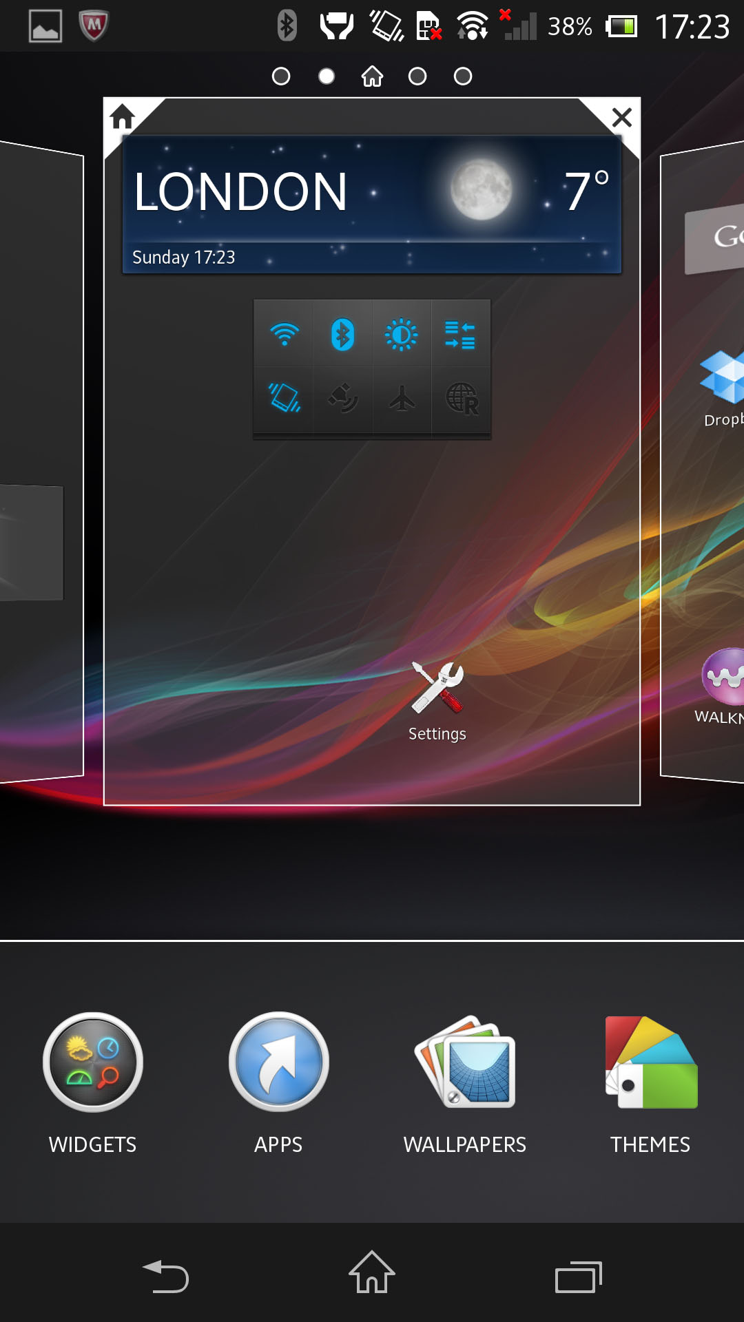
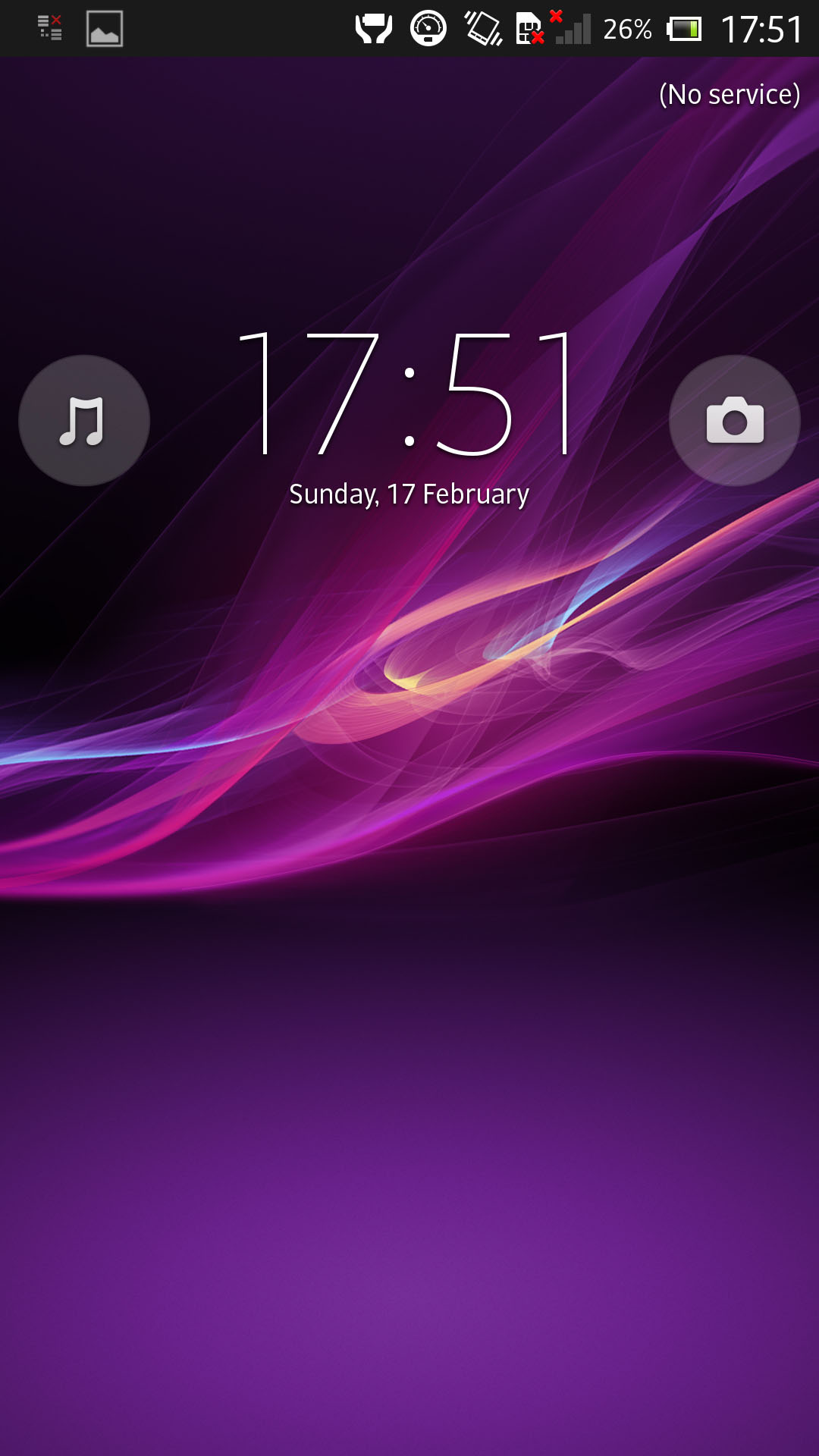
You get five home screens with no ability to add any more, though such is the Android way, you can always install your own launcher if you want and change that.
By default, you get shortcuts to apps Sony feels you'll treasure most - but again, you can move/delete/add to these as you see fit. One of Android's great strengths is its infinite customizability.
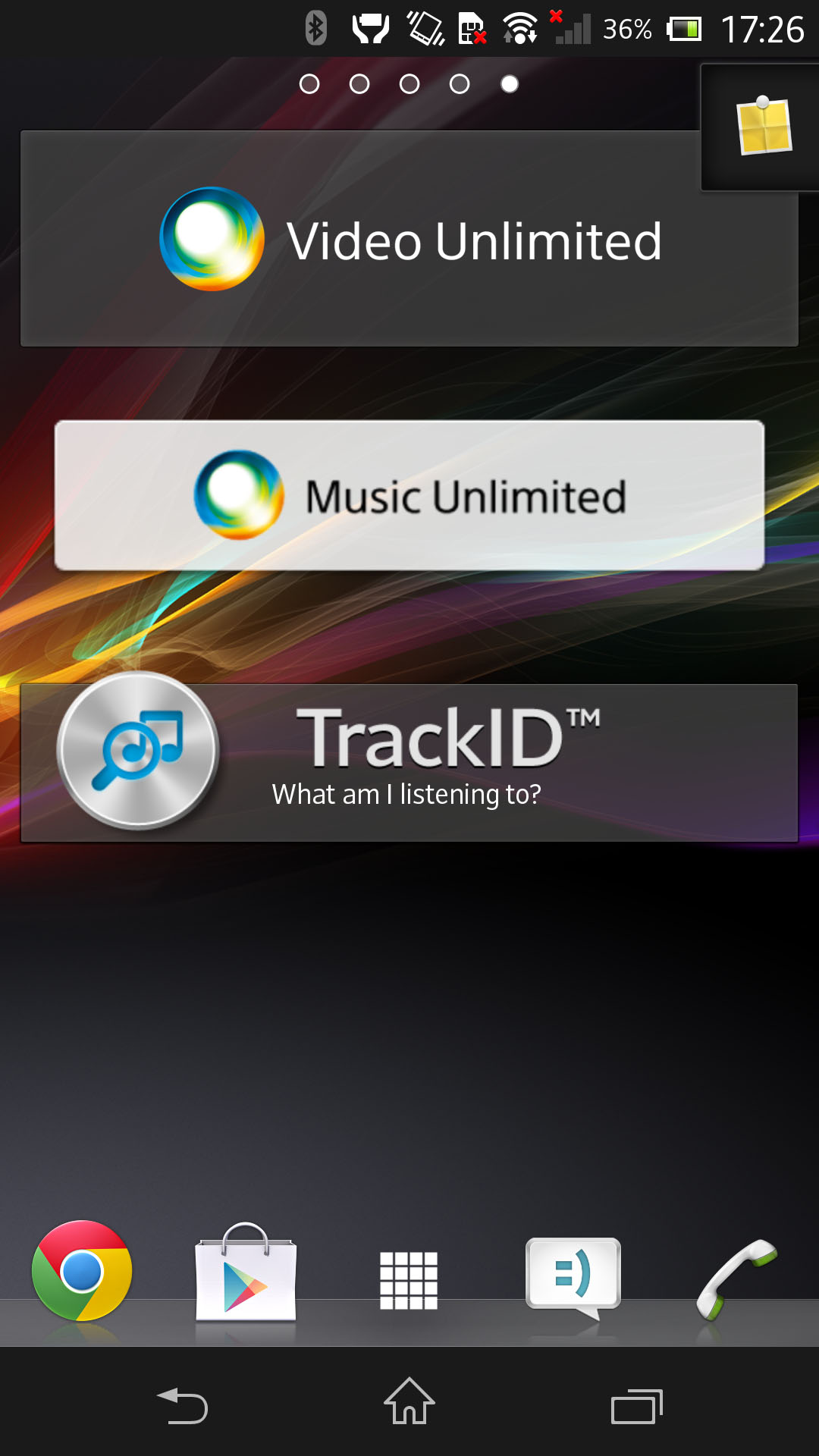
On top of that, Sony gives you its own widgets, such as Music Unlimited or links to its online stores. Most manufacturers do this - clearly, they want to draw you into their own ecosystems. But these can be moved or deleted too if they get in the way.
If you're wondering how you navigate, the answer is on-screen. Everything is done via the screen. Sony has bowed down to Google in this respect.
Where some OEMs will still include their own soft keys, the Sony Xperia Z eschews them for the standard Mountain View options of back, home and multitasking - on-screen buttons that appear and disappear as they are needed.
One thing you'll notice is that this is one speedy son-of-a-Sony. Naturally, with a quad-core 1.5GHz processor - and Android's Project Butter enhancement - we'd have expected it to be quick on all but the most extreme of tasks, so we found little here to induce complaint.
Zipping between home screens is a breeze, and we encountered absolutely no lag.
We're fans of Sony's "Small Apps" integration. It's a simple idea - tap the multi-app button at the bottom right of the screen and the Sony Xperia Z brings up not only your open apps but a selection of mini apps that you can launch on the screen in conjunction with what you're doing.
They're basically widgets that stay on-screen, rather than being tied to the home screen.
Sony gives you access to things such as a small note app or a countdown timer with a few options and the ability to download more from Google Play.
If developers buy into the idea, it could work out well, but we sadly don't think they will.
Due to the sheer number of Android variations, there's no financial incentive for developers to build things like this that will only work for one section of the market.
Android's excellent notification bar is here, enabling you to pull it down and view your latest messages and notifications.
Thanks to Jelly Bean, you can now pinch to expand notifications or swipe to clear individual ones. It's all very intuitive and nice to work with.
Sony's also furnished the Xperia Z with shortcuts to toggle settings such as those for Wi-Fi and Bluetooth - the kind of thing you take for granted when you have but rue when you lose.
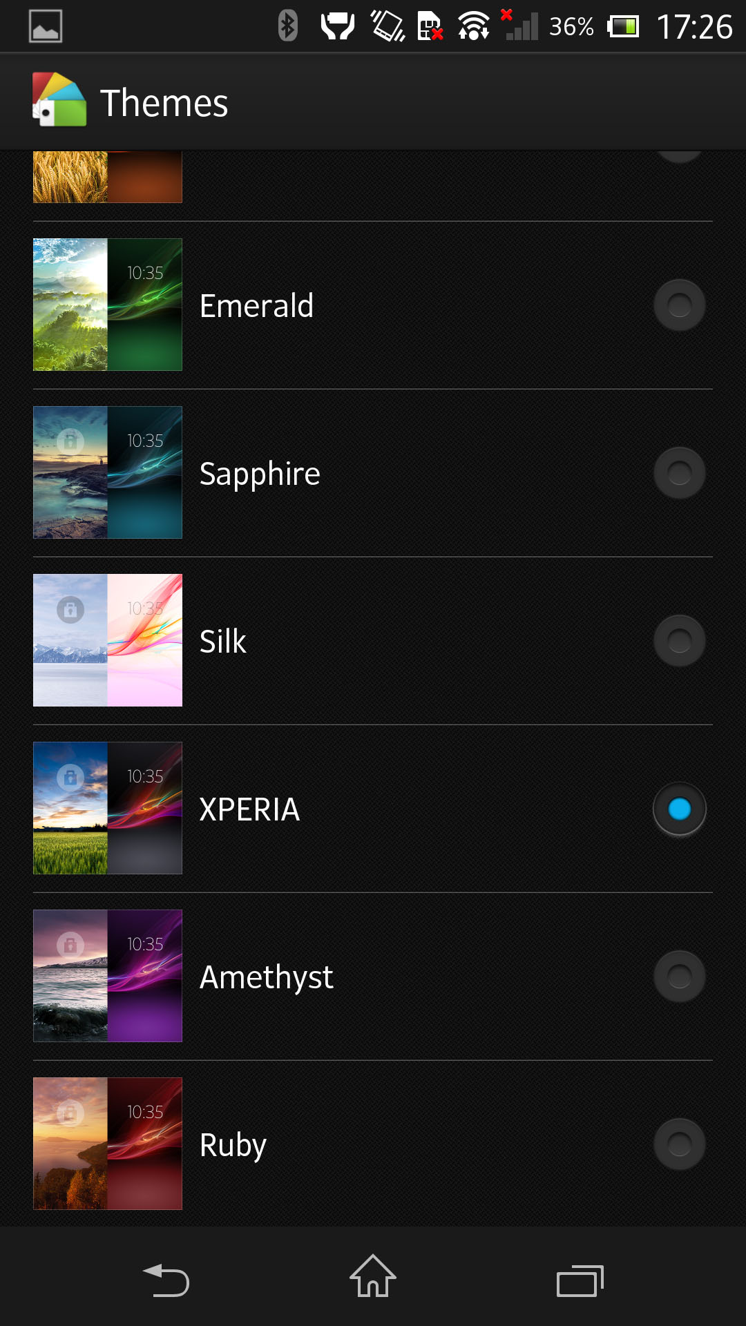
You can also change themes from within the settings, which is a nice touch. It adjusts more than just the wallpaper and alters menu colours too.
That's one of those things you wouldn't notice if you weren't looking for it, but it's nice to play with. HTC does something similar with Sense, and we think it's great.
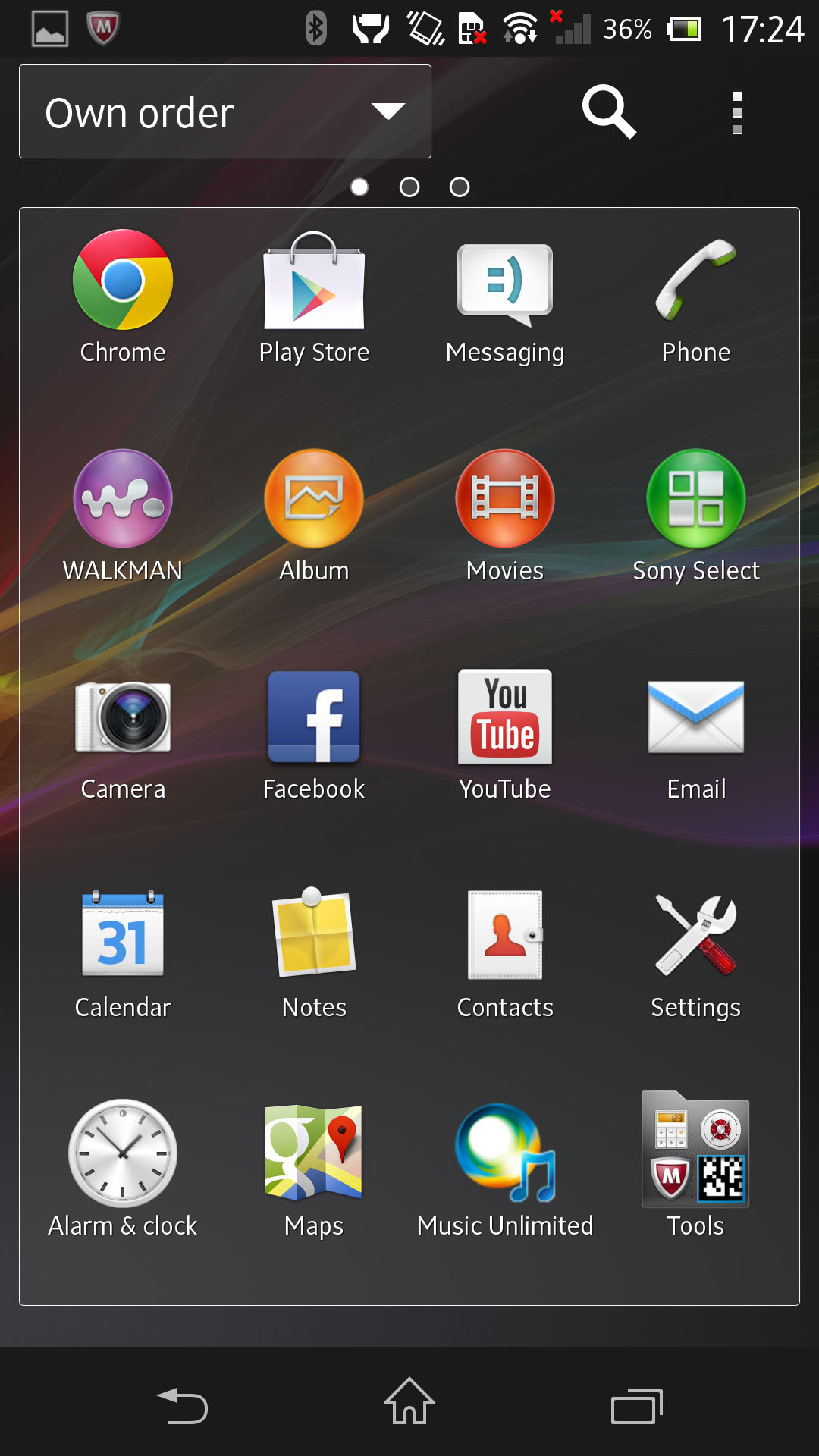
Apps are accessed via the app drawer, which you get into from the dock at the bottom of the home screen.
There's not much we can tell you about this if you've used an Android phone before - the apps sit there and can be reordered by alphabetical means or otherwise. Unfortunately, if you have OCD like us, this is the bit you may find yourself wincing at.
See, with the iPhone, you'll find your app icons presented uniformly. They're the same size and shape and it all looks very neat and tidy.
Yet with Android there are no restrictions, so you end up with app icons in all shapes, sizes and colors, and it can look like the inside of a child's toy chest. It's a shame because the Sony icons look beautiful, but as soon as you start adding your own shortcuts, your home screen may start to resemble a scrapbook instead.
If you're an Android fan, you'll pick it up easily. And if you're not, it's pretty intuitive, enabling you to delve in as much or as little as you like to change things or leave them as is.
We also have to give a quick heads up here to Google Now - first introduced in Jelly Bean 4.1 and all present.
It's supposed to help manage your life by telling you how long the journey home from work will take or what the weather's like. You can track parcels or view photos of local beauty spots.
It's a great idea in principle but it still all feels a little bit Beta.
Google Now is not a Siri-rip-off. Rather, it's Google's interpretation of a mobile assistant. We just can't help wondering how that interpretation was reached, at least until it starts to really offer you information that is tailored for your life, rather than sometimes accidentally waking you up to tell you that it's time to leave for a meeting on the other side of the world (a problem if you have a shared international calendar).
