Why you can trust TechRadar
Being an Android device, the Xperia Z Ultra supports all manner of messaging solutions, and it manages to do them all a good service.

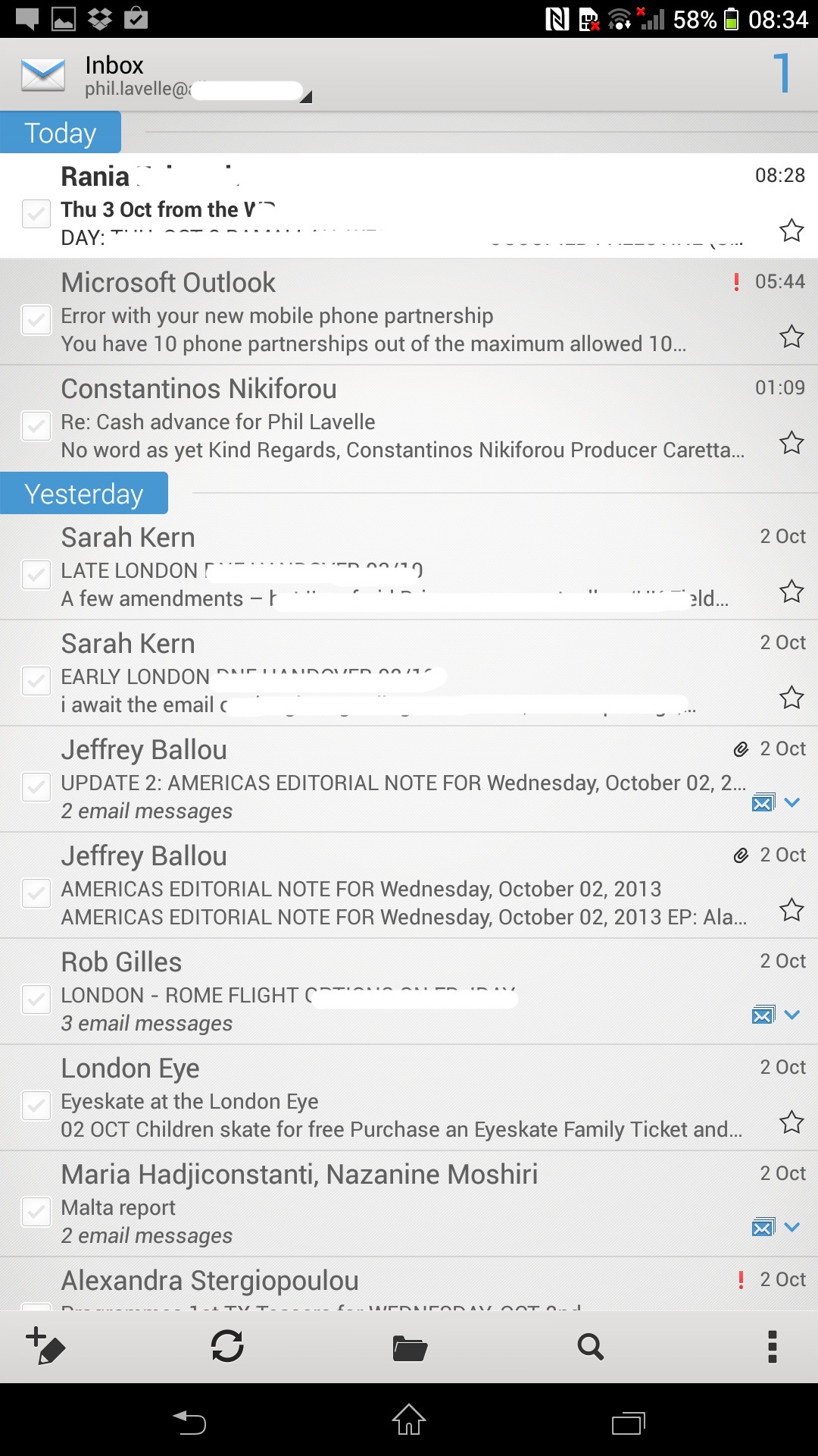
First of all, there are the email clients. Users are spoilt with two email options out of the box. There's the standard Android email app that you get on most other Google-esque devices. It supports POP3, IMAP and Exchange folders and is pretty run of the mill.
Gmail users are automatically signed in to Google's own email app which handles Gmail with style and seamlessly integrates with mailboxes, labels and so on. Even priority and social inboxes get the treatment.
As for SMS, again, it's the standard affair. It's nothing to write home about, nor is it so bad that you'll find yourself writing home about it to complain. SMS and MMS messages are handled through the same app.
You turn an SMS into an MMS by simply tapping the paperclip icon next to the text entry field and then choosing your attachment of choice.
Or you can go into the likes of the gallery app and pick what it is you want and then compose a message that way.
One of the really cool features of Android's messaging system is the preview option. This means that when you get a message, before the envelope appears in the notification area at the top, the actual text will scroll along.
So, you're sitting at your desk and your phone beeps – you glance across and you are then able to actually read the entire message in all its glory without even lifting a finger and picking it up.

Social media is integrated in as much as you can download the relevant apps like Facebook, Twitter and Instagram and have them then link into the OS, allowing you to share content via them and have them pop up with notifications in the notification bar up top.
The Xperia Ultra also invites you to sign into Facebook as you set it up from scratch so that it's able to then start popping users' profile pics into your address book. It's a functional integration without being too overbearing.
We are still scarred by the Timescape UI of old Xperia days that saw us plagued with constant notifications.
This, thankfully, strikes a happy medium. There is an app called SocialLife – a Sony take on those social media aggregators that put all of your Twitter and Facebook feeds in one place. It's a bit bland, but does the job if you like that sort of thing.
Of course, part of the whole messaging experience is being able to type your musings easily and this is where some will fall down. No matter how nimble you are, you may struggle to type on a device that has more in common with a paving slab.
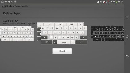
Luckily, Sony has thought this through. There is personalisation on the keyboard here on a mass scale. Firstly, you can choose the look of your keyboard through a skin (very important for the shallow among us) and decide if you prefer Sony's lighter shades or a grey and black MacBook Pro style.
There's also a one-handed mode that actually works rather well considering the way the Xperia Ultra balances in the hand thanks to that even weight distribution.
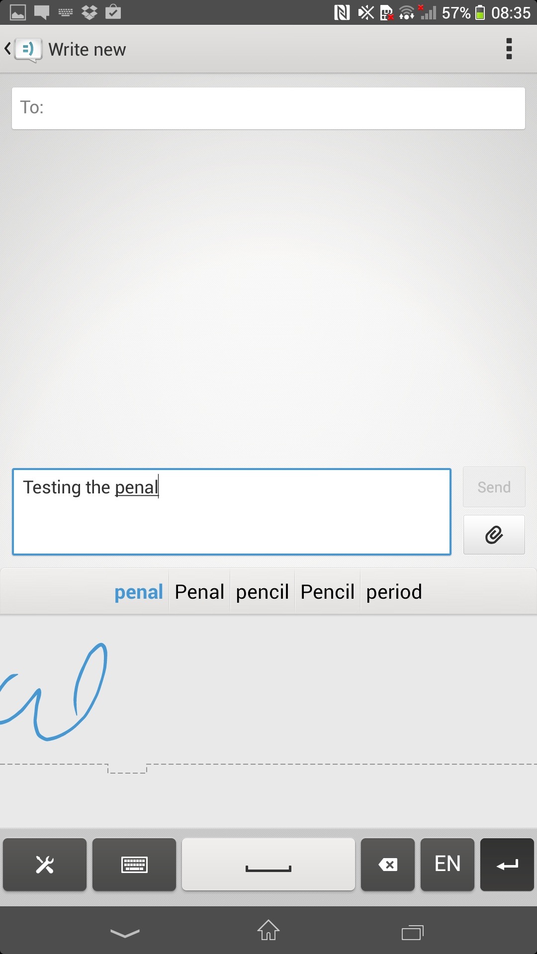
When holding it in both palms, it's fairly easy to type onto and there is also the Sony version of Swype (now adopted by Google, SwiftKey and a whole lot more) that lets you swipe between letters and works far too well for it to be considered a gimmick.
If you just want to, y'know, type the old fashioned way, they keyboard has haptic feedback built in. Not something we'd normally mention but it deserves it here if only for comedy reasons. It is really strong. Which makes it sound really loud with that motor.
When typing messages quickly, it sounded like we were trying to jump start a car. The neighbours actually came around to see if everything was OK.

And then we have something new – pencil integration. Think the S-Pen of the Samsung Note range, but imagine you could do the same kind of thing with a pencil. That's what the Ultra allows. In the demos, it looked fantastic. In practice, we found it not so great.
And it came down to one simple reason – we just never seemed to have a pencil around. In fact, we asked around, and everybody had pens – blue, red, green, black – you name it, they had the colours. But nobody seems to carry pencils any more apart from teachers and artists.
So to use this kind of functionality, you have to come prepared. Which then makes you wonder why Sony didn't just have a little pen in a dock like Samsung and be done with it. Either way, it works.
And though it seemed to lack the clarity of the S-Pen a bit as well as the fabulous Note apps that go with that. But for most people who just want a glorified stylus, it's enough.

Gareth has been part of the consumer technology world in a career spanning three decades. He started life as a staff writer on the fledgling TechRadar, and has grew with the site (primarily as phones, tablets and wearables editor) until becoming Global Editor in Chief in 2018. Gareth has written over 4,000 articles for TechRadar, has contributed expert insight to a number of other publications, chaired panels on zeitgeist technologies, presented at the Gadget Show Live as well as representing the brand on TV and radio for multiple channels including Sky, BBC, ITV and Al-Jazeera. Passionate about fitness, he can bore anyone rigid about stress management, sleep tracking, heart rate variance as well as bemoaning something about the latest iPhone, Galaxy or OLED TV.
