Why you can trust TechRadar
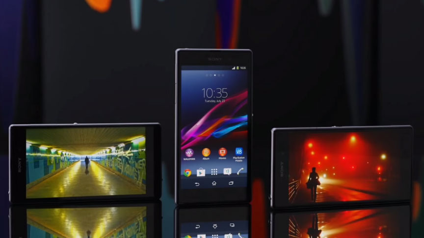
The Sony Xperia Z1 has recently been updated to Android 4.4.2 KitKat and the most obvious changes are visual, and greet you when you boot up.
Sony's UI sits atop Google's code and that's pretty much identical to what we saw on the Xperia Z1 and the Android 4.2.2 it first launched with in 2013.
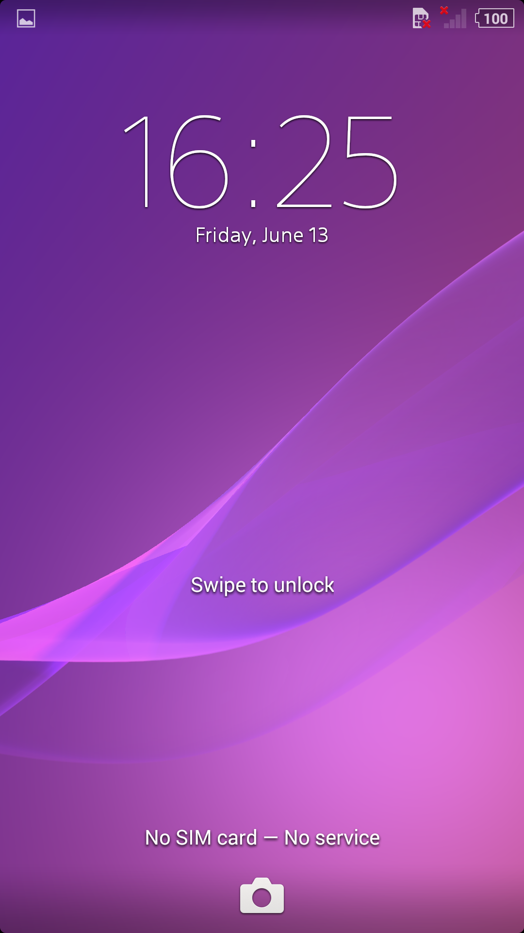
There's a new lock screen, which has a glittery, bubbly look to it, plus Sony's switched the lock screen's camera quick-launch shortcut to the pull-up slot that's usually accommodated by Google Now.
The animation is smoother when unlocking the phone too, with the Z1 now gently fading the Home screens into view when unlocking the phone. It's a nicer transition than just smashing the phone into life.
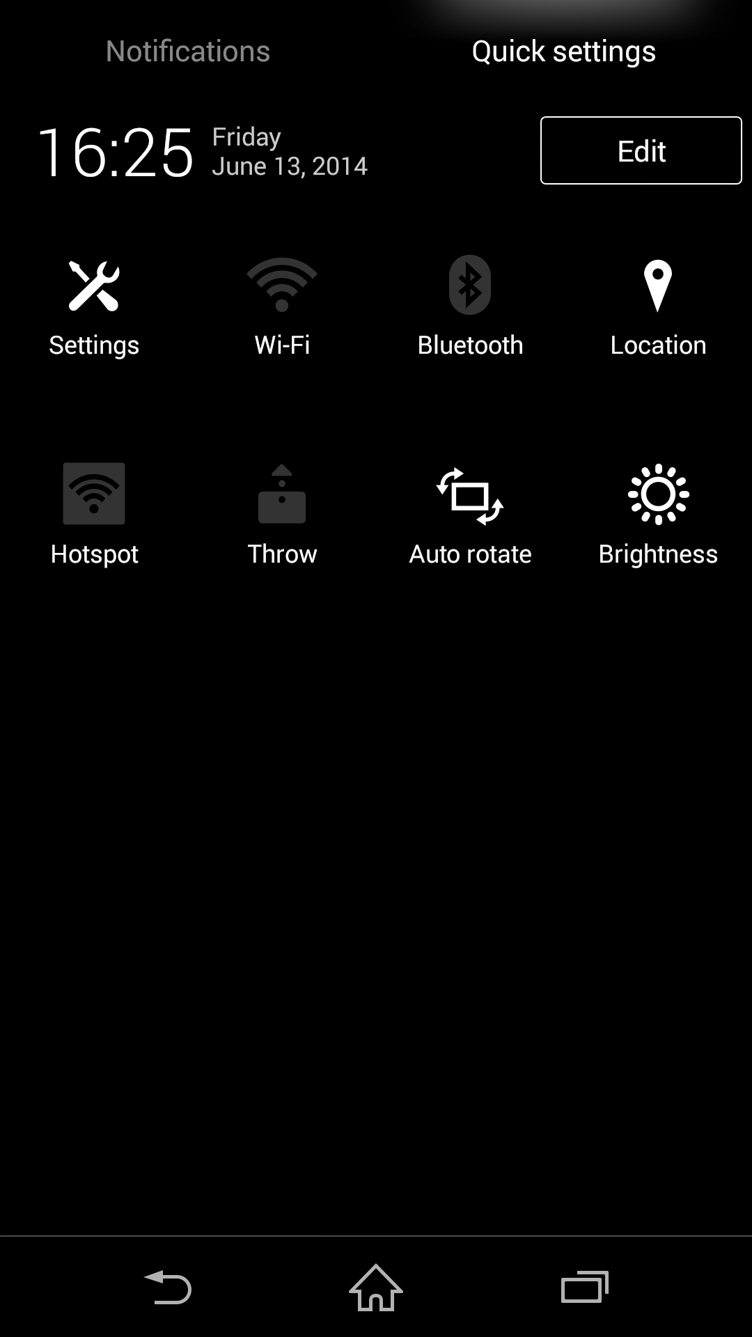
Sony's now split the Notifications pull-down into two tabs, one for the actual system messages and another for the phone's various settings.
A two-finger sweep down the screen takes you straight to the Settings tab here, which is useful, plus you can edit which toggles appear, with a maximum of 16 slots available for your favourite system shortcuts.
On the Home screen itself another of Google's new design decisions can be seen: the new transparent status bar. This means your background image now stretches to the top of the display beneath the bar, a nice little visual touch that improves the appearance of Android with the KitKat update.
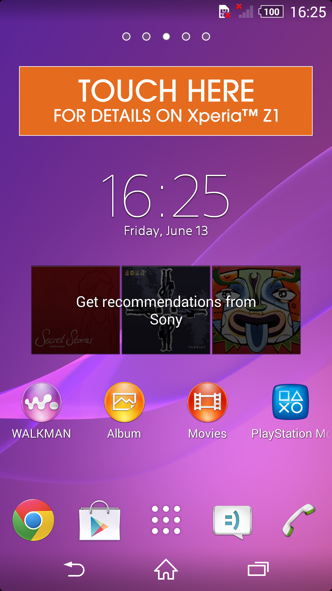
There is also a percentage indicator in the battery life icon of the Xperia Z1, empowering the user with access to electrical information previously only dreamt of.
The keyboard contains a useful new change in the 4.4.2 code: built-in support for the emoji emoticon system. And an onboard answering machine system has been added to the Xperia Z1's calling menu, with the option to set ringing time and a number of voice greetings and preset messages to play to callers.
Unlock the phone properly and you see a fairly simple initial Home screen, with your clock, Google search bar, a few Sony app shortcuts and the standard floating Android shortcut bar beneath.
It's not particularly thrilling, with Sony barely changing the look of this Home layout for the last few years.
A pinch-zoom or long-press on the display brings up Sony's own shortcut and widget installer, which also pops up the wallpaper and theme setting options.
The Z1 initially arrives with five Home screens, but you can boost this to seven from the same menu. You can also tap the little house icon that sits in the corner of each screen's display to make any particular layout the one the phone defaults to on boot and when quitting apps.
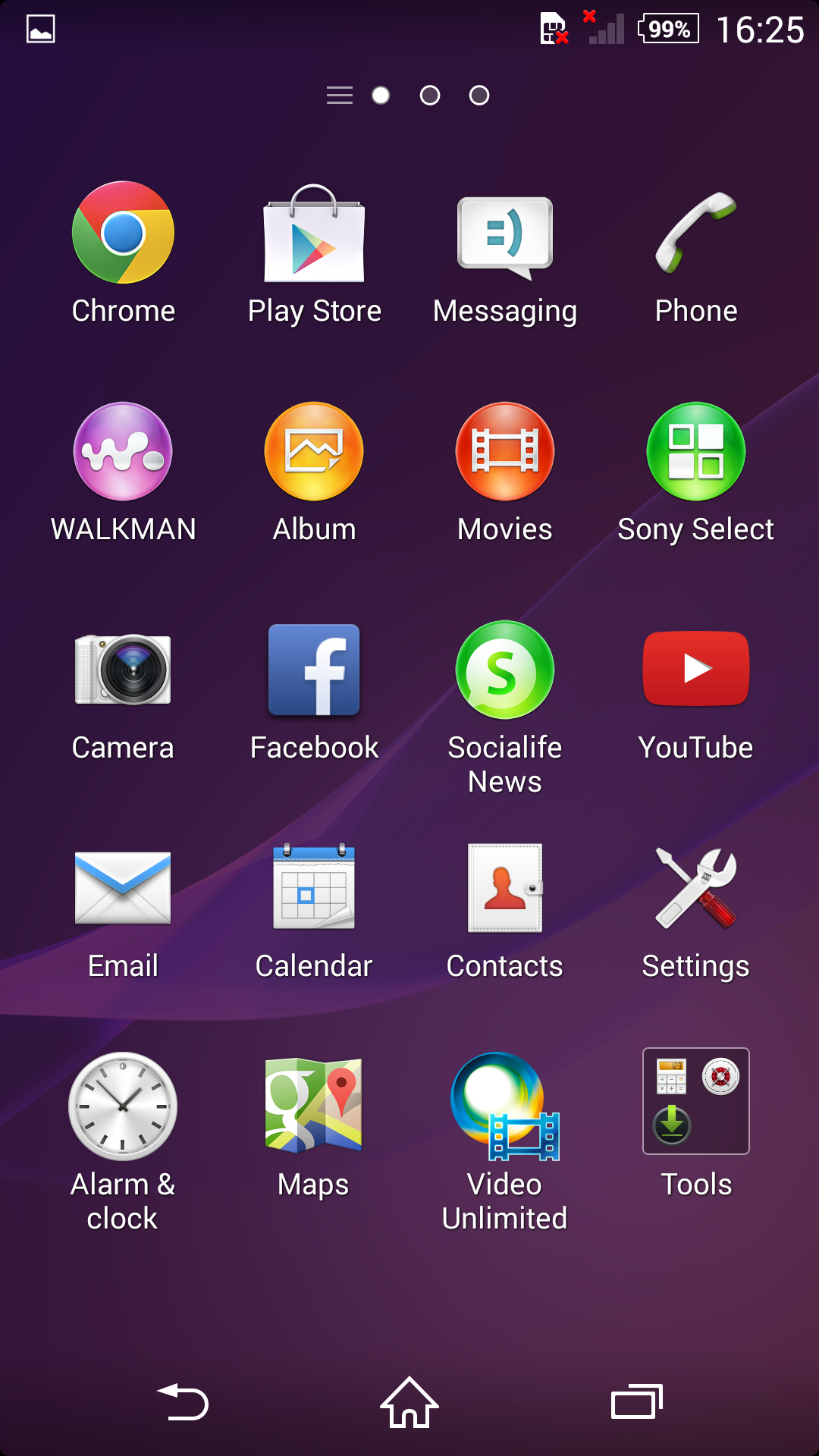
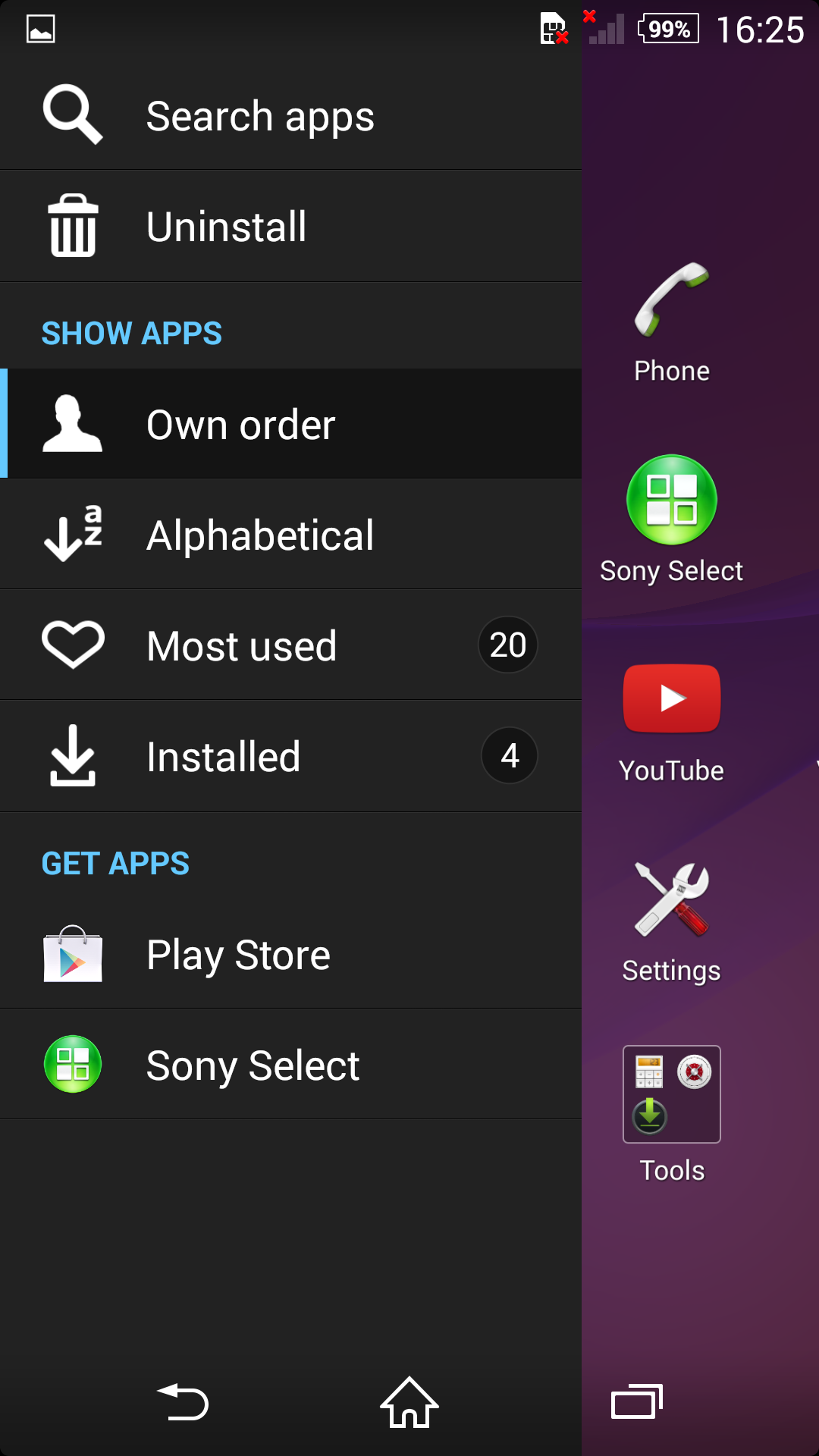
Sony's taken a new approach to the Android app drawer, too. This big list of everything, accessed by pressing the grid on the floating dock, now comes with its own slide-in menu.
From this, you can select apps to uninstall, edit the order they appear in, and, if you've really gone for broke in installing stuff, search for a particular app by name.
In terms of getting your apps, Google Play is the obvious choice, as that's the default app store that comes pre-loaded on every Android-powered phone. However, as all the hardware makers are keen to do, Sony's added its own Sony Select app recommendation engine here, which exists as both a standalone app and a massive, full-screen widget.
It's an odd addition, presenting a curated selection of apps and media, with shortcuts that link to Google Play and Sony's own online shops, plus there are film links that open up not in Google's movie store but in Sony's own Video Unlimited app.
Hence things start to become a little confusing, with the phone often pointing you off in various directions to get your content from competing services.
One of Sony's big wins when it comes to improving Google's standard Android options can be found in the Z1's Album photo gallery replacement. This completely bins Google's approach in favour of a double-fronted app that presents photos on the phone behind one tab and photos pulled in from social networks on the other.
The latter allows you to see photos your friends have posted to Facebook, images from Flickr, Picasa, Sony's PlayMemories cloud storage service and more.
Images in both galleries are displayed as cropped cubes, which you can zoom in and out of, forcing them to dynamically rearrange themselves.
Zooming all the way out with a pinch-zoom gesture makes it dead easy to scroll back through all your pictures, with the grid broken down by month to make selections a little clearer.
The Recent Apps multitasking menu has also been enhanced again by Sony's development team. As well as a list of the apps and system setting pages you've used recently, this houses Sony's original collection of mini apps, or floating extra additions to the OS designed to make note-taking and other mundane tasks easier.
There are six of the mini notes apps on the Z1 to begin with, offering quick access to an Active Clip tool for capturing and editing an image of whatever's on your display (something Android lets you do anyway by holding down the power button and volume down toggle).
There's also a floating Notes widget, timer, calculator, miniature browser tile and audio recorder in here too.
These are joined by smart little widgets for Gmail, Google's Calendar app and your Chrome bookmarks. They look extremely neat and clever, but do tend to get in the way a bit. Having a huge, opaque Gmail inbox permanently floating over your Home screens and apps isn't really a particularly useful feature.
