Why you can trust TechRadar
Sony originally equipped the Xperia Z1 Compact with Android 4.3 Jelly Bean, which was a little disappointing given that KitKat had been out for a while.

The good news is that the Xperia Z1 Compact has since been upgraded to Android 4.4.2, bringing you all the latest goodies from Google.
Sony also announced that it will be bringing the latest version,Android 5.0 Lollipop, to the Xperia Z1 Compact in due course.
Sony has already begun rolling out Android 5.0 Lollipop to the newer Xperia Z3 and Z3 Compact devices, so we will hopefully see Google's latest and greatest mobile operating system hitting the Xperia Z1 Compact pretty soon.
Over the top of KitKat, Sony has equipped the Xperia Z1 Compact with a very well rounded and intuitive design.
Every OEM installs a level of customisation to differentiate themselves; Samsung has its TouchWiz design and HTC has Sense.
From the attractive slide-style unlock to the clean icons and the customised app drawer, it's clear that Sony has given its UI some real thought.
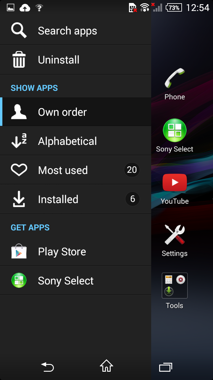
I am particularly fond of the app drawer, as it allows easy navigation though a toolbar located at the far left. It's these little touches that make smartphones feel smart.
The inclusion of themes is also pleasant, giving the Xperia Z1 Compact a slightly different feel and allowing you to change the whole look depending on your mood.

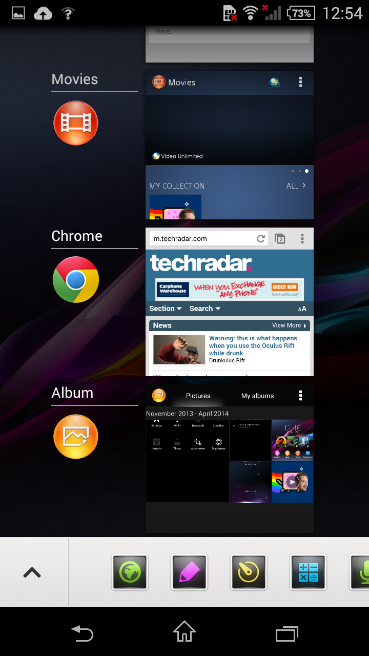
The multitasking pane hides a feature that I think Sony should have made more of a song and dance about, as it rivals the multi-window feature on the Galaxy S5.
The ability to have floating apps such as a browser or screen shot made multitasking a lot easier and have long been a good feature of Sony devices - being able to simply open up a timer or calculator can be a godsend, although not having a torch option there seems weird.
A notification light (with multiple colours) also comes equipped on the Xperia Z1 Compact, giving it a leg up over the HTC One Mini 2 and Galaxy S5 Mini.
For those that like to know whether they have a missed message, this is an almost vital inclusion.
My love for widgets was also well catered for with Sony allowing you to add up to seven home screens, long-pressing open areas to add them. I was disappointed to find that there is no infinite scrolling though, something that makes the Xperia Z1 Compact feel a little less fluid when swiping around.
Fluidity is something that exudes from the phone, aided by the 2.2GHz quad-core CPU and 2GB RAM. Moving between screens is a dream, and I found no hint of slowdown even when downloading large files, playing music and web browsing simultaneously.

Looking at the GeekBench 3 results it is easy to see why; the Sony Xperia Z1 Compact averaged 2731 on multi-core performance.
Interestingly though I did find that before the Android 4.4 KitKat update, the Xperia Z1 Compact had a slightly better average at 2884.
That's not a huge difference, and when it comes to every day performance you won't notice any change between Jelly Bean and KitKat.
Comparing the new score with those listed on the GeekBench site, the Xperia Z1 Compact still scores higher than nearly all the listed devices on multi-core.
This can be attributed to the smaller screen size, with the Adreno 330 GPU not being put under extra strain having to redraw the extra pixels that full HD displays require.
Whilst many may have scoffed at the idea of a handset that 'isn't even full HD', this has been beneficial to the Z1 Compact whilst still providing a crystal clear viewing experience.
Sure, it's not got the razor sharp clarity, but that boost in performance (and, as you'll see later, battery life) is certainly worth having. If you like a smaller screen anyway, this is quickly turning into one of the main phones to be packing.

The hardware within the screen also hides a really nifty feature; the ability to use it with gloves on.
With winter proving that capacitive screens aren't best suited to texting in the cold, the ability to wear normal gloves whilst sending texts is a godsend.
It also means that if you're deft enough, you can pretend to be a Jedi and move the screen without touching it.
This mode does show a larger circle on the screen when activated, which will pop up on occasion even when you're not using gloves.
I'd say it's worth having it turned off most of the time as it also sucks power - unless you're in a particularly icy country. Or just fricking love gloves.
Current page: Interface and performance
Prev Page Big Heart, Big Camera, Small frame Next Page Battery life and the essentials