Why you can trust TechRadar
The interface on the Sony Xperia Z3 is a pretty basic offering, something Sony has pushed as quietly helpful. It's somewhere between a stock Android, naked interface and a complete reimagining by the brand, with updated icons but a relatively familiar user experience.
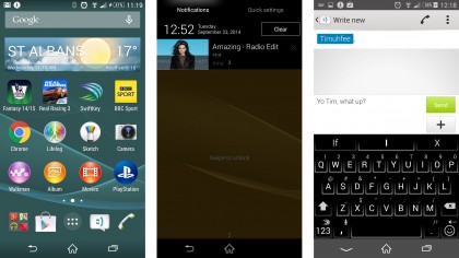
The menu and home screens are very sparse, but there's a 'secret' screen to the left of the apps grid that lets you organise the apps.
It seems like an odd place to put it in terms of intuition, but once you're aware of it, well, it's OK, I guess - but it's things like this that can harm a phone's enchanting first experience for a user to have to hunt for ways to customise your experience.
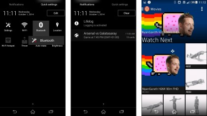
The home screen and notifications bar have been updated slightly, with more clean and usable fonts used for things like the clock, and while the notifications area is nothing new, the upgrades Sony has brought (being able to long press Bluetooth in the 'Quick Settings' area will open an option to mess with those settings, for example) are useful and show that the brand is more aware of what users actually need.
After that, it's hard to really rate or disparage the interface on the Sony Xperia Z3, as it's largely subjective over how users interact with it. Some people loathe Samsung's TouchWiz, others love it. HTC's Sense overlay is clever and intuitive, but to some it masks the native Android experience far too much.

Sony's at least stripped things down from the terrible events of the 'Splines' on the Timescape overlay of years ago - but that doesn't mean it's a perfect system. There are some lovely touches that will delight: for example, open the movies app and the background will autoplay the most recent video you had running, seamlessly blending into the interface while you choose what to watch next.
But then again, there are some misses here: I really like that Android 4.4 lets you have fullscreen album art on the lock screen, but here you're consigned to the dull square album and navigation keys.
Similarly, while everything whizzes around perfectly acceptably under the finger (although not the fastest), there seems to be a touch more lag on jumping between apps, with the camera taking a while to fire up too, for instance.
Performance wise though, the Sony Xperia Z3 should be as good as the competition and its predecessor, as it scored a palatable 2737 on the Geekbench 3 test we run on all phones.
That's a little slower than the Samsung Galaxy S5 and HTC One M8 (if you take into account the latter is slightly duping these tests) but does make me wonder: why is the clockspeed of the CPU higher than the Z2 and yet this phone has a slightly lower result on Geekbench?
We're talking fractions in terms of difference between the two, but why has Sony made the new phone the same speed as the old one? Surely there could have been something done to make it faster and be a real upgrade?
And actually, the Xperia Z3 I had on test was actually a lot more bug-filled than the previous model. Things like the keyboard bouncing up and down, or not responding well to interactions, was a common occurrence. Also the notifications bar would sometimes get stuck halfway down when on the lockscreen too.

And the bad news is the second model didn't seem to solve these issues really - the keyboard was more stable (although the inbuilt offering is still terrible, so you'll need to upgrade that, which you can easily do for free) but the notifications bug still exists and really mars the experience.
So is the Sony Xperia Z3 good enough to be a flagship, high end phone for Sony in terms of how easy it is to use?
The short answer is yes: if you know what you're doing. To the new user, the Sony will seem a bit confusing, with a number of widgets and pre-installed apps (do we really need an Xperia / Garmin tie in when Google Maps resides on the phone?) where what you really need is a slick, interactive but passive system.
There are some clever additions in here that are locked away in the settings menu: for instance, you can set the Xperia Z3 to let you double tap the screen to wake it, which is a much better idea than the need to press the power button to fire the screen. It's odd this is hidden in myriad menu levels rather than being a feature Sony wants to shout about.
It's hard to fault the UI on Sony's smartphones (apart from the slightly buggy software on offer here) as, like I mentioned earlier, it's a perfectly serviceable system - but one that has very few redeeming features other than being unobtrusive.
If you're into making a smartphone work as YOU want it to, but like the additional customisations and links to Sony services that are peppered throughout the phone (will anyone really ever use Video Unlimited, when it competes with Google Play, unless you're completely wedded to the Sony phone / PS4 infrastructure?) then this is a great interface.
Look forward to some changes in the near future too, as the Xperia Z3 is expected to get an upgrade to Android 5.0 Lollipop very soon.
If you've never used a Sony handset before, it might take you a week or so to get your head around how everything works, as is true for most high-end Android phones.

Gareth has been part of the consumer technology world in a career spanning three decades. He started life as a staff writer on the fledgling TechRadar, and has grew with the site (primarily as phones, tablets and wearables editor) until becoming Global Editor in Chief in 2018. Gareth has written over 4,000 articles for TechRadar, has contributed expert insight to a number of other publications, chaired panels on zeitgeist technologies, presented at the Gadget Show Live as well as representing the brand on TV and radio for multiple channels including Sky, BBC, ITV and Al-Jazeera. Passionate about fitness, he can bore anyone rigid about stress management, sleep tracking, heart rate variance as well as bemoaning something about the latest iPhone, Galaxy or OLED TV.
