Why you can trust TechRadar
Performance
- Solid, if unspectacular performance
- Doesn't suffer from overheating issues
Sony's Xperia Z3 Compact had some impressive performance, but the Xperia Z3+ sullied the name with some horrendous overheating issues.
The surprising thing is that Sony kept the same processor from the Xperia Z3+ (a Qualcomm Snapdragon 810 with 3GB of RAM) inside the Xperia Z5 Compact.
Consequently, my expectations were low. I went into this review with trepidation that the phone would crash out at the simplest tasks – but I've been rather surprised.
I've not had any issues with the Xperia Z5 Compact, and it doesn't get anywhere near as warm as the Xperia Z5.
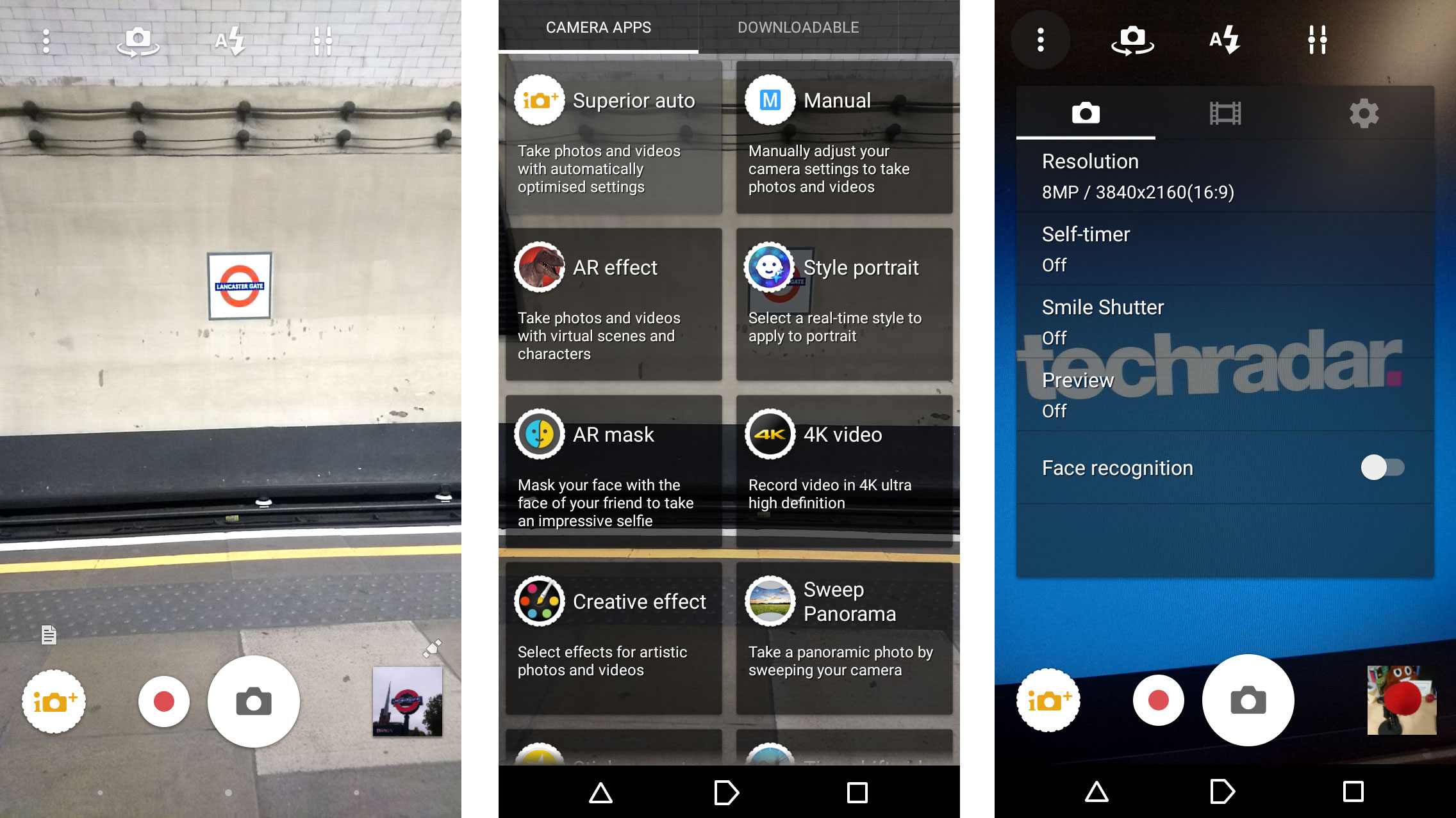
Jumping in and out, from app to app mostly proved fine. The camera took a while to boot up, and switching over to the gallery app within the camera was also slow.
Despite this, there haven't been any truly infuriating issues with Z5 Compact's performance, and overall I'm impressed, especially compared to the Xperia Z3+.
When gaming, the phone handled itself rather well, booting up quickly and not heating up much even after over an hour of playing.
And while the Xperia Z3+ would heat up considerably just from web browsing, the Xperia Z5 Compact was cool even after half an hour of use.
I ran the phone through the GeekBench 3 software and it came out with an average single core score of 1,374 and a multi-core score of 3,881. Compared to the Xperia Z3 Compact that's a staggering score – the previous phone only scored 949 on single core and the multi-core test brought out 2,760.
That's an impressive upgrade considering the Z3 Compact phone only came out a year ago. However, it's difficult to rank the Z5 Compact against the competition because there isn't really anything else in the "premium compact" niche. The Xperia Z5 is a little faster itself, coming in with scores of 1,312 single core and 4,015 multi-core.
Interface
- Sony's Android interface isn't the slickest around
- Can upgrade to Android 7 Nougat
Out of all the Android overlays, I find Sony's the most out of date and ugly. Personally I prefer a stock Android approach, but Sony is too keen to place its own software over the top to leave a good thing alone.
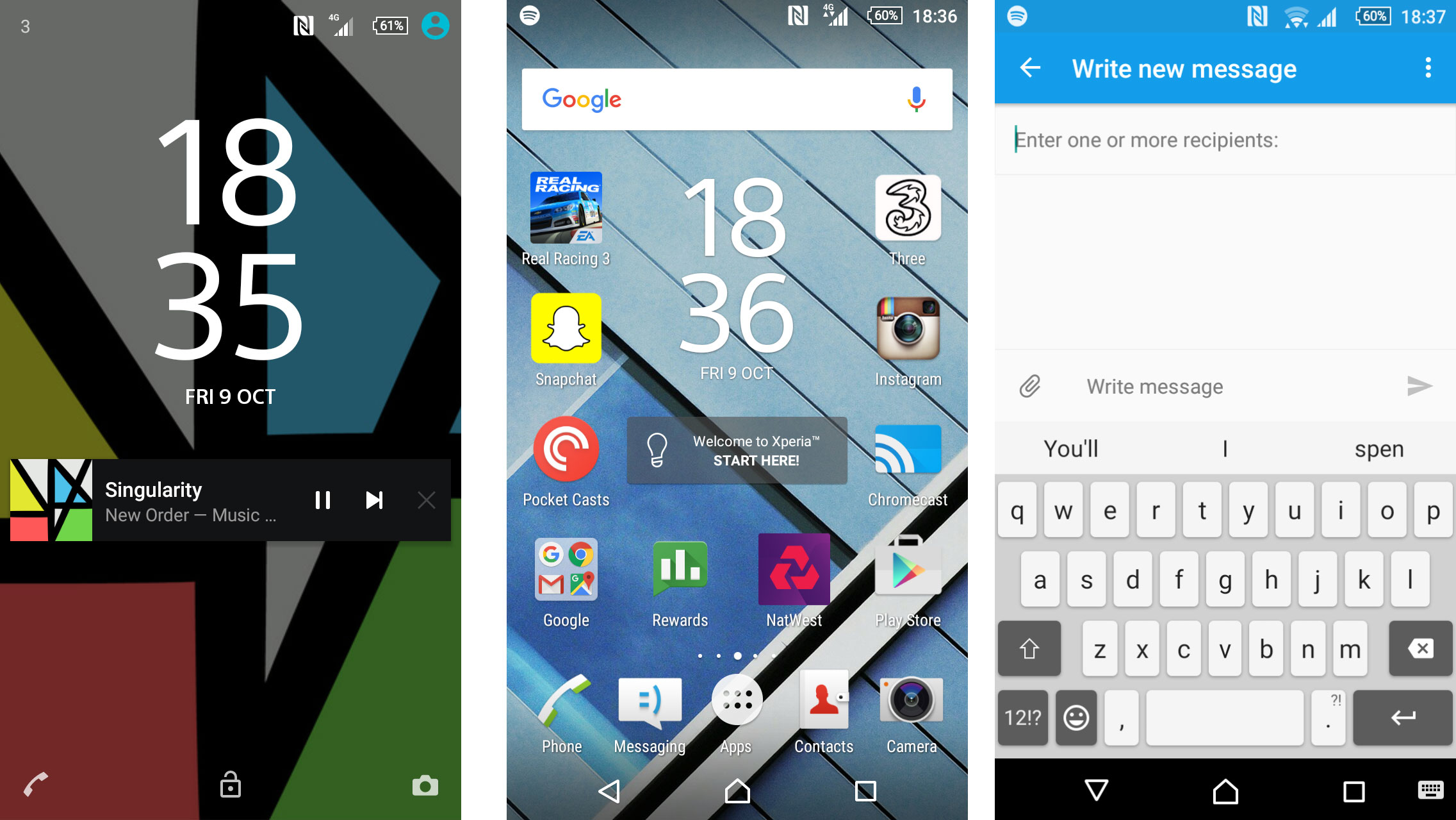
The Xperia Z5 Compact arrived with Android 5.1.1 Lollipop software - but that can now be upgraded all the way to Android 7 Nougat software. That's the latest in Android software available, but the upgrade is only available in some markets at the moment.
Android looks very different to the stock version seen on Nexus phones or Motorola devices. Instead, it's overlaid with Sony's own design and chock-full of bloatware apps.
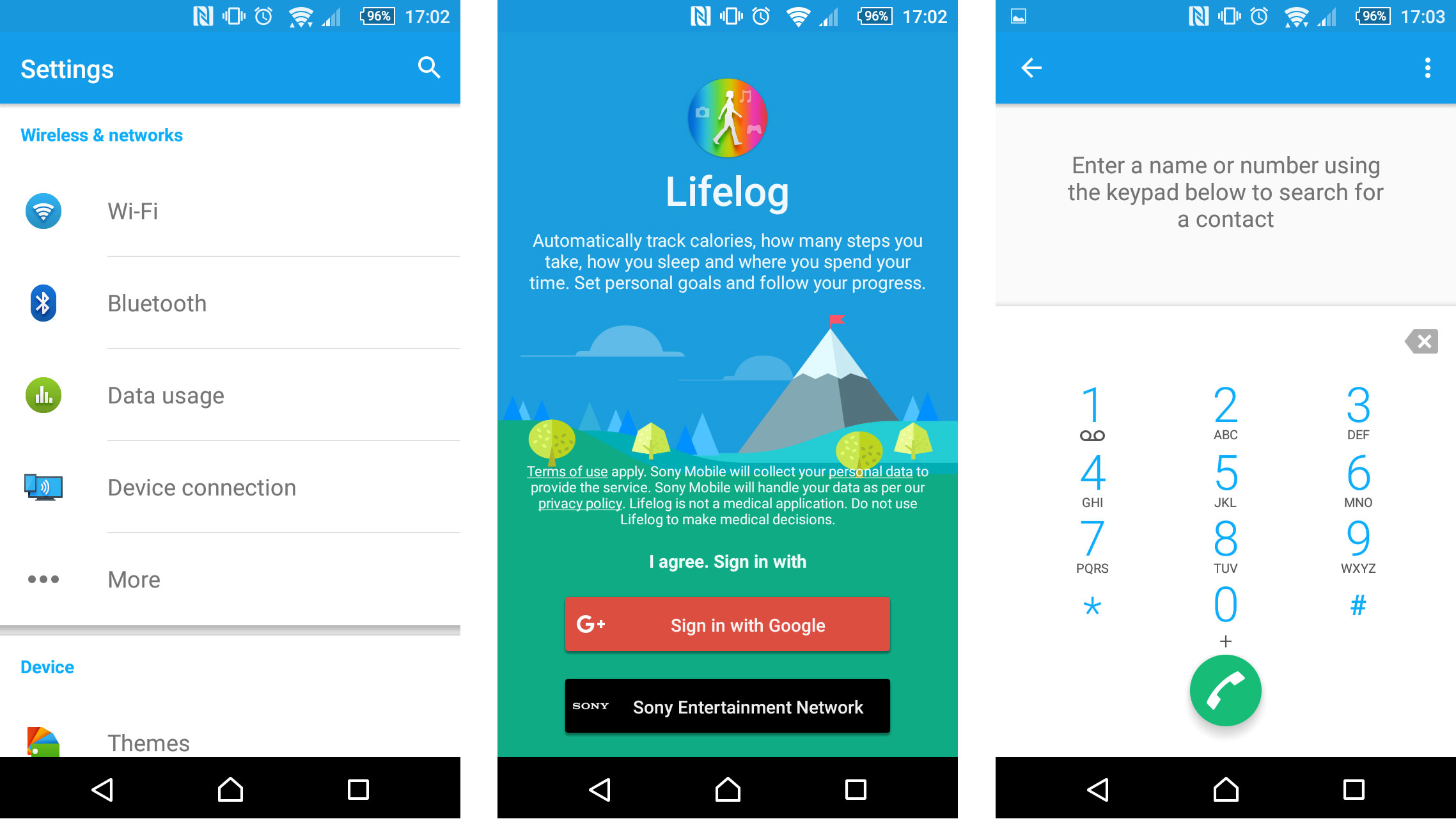
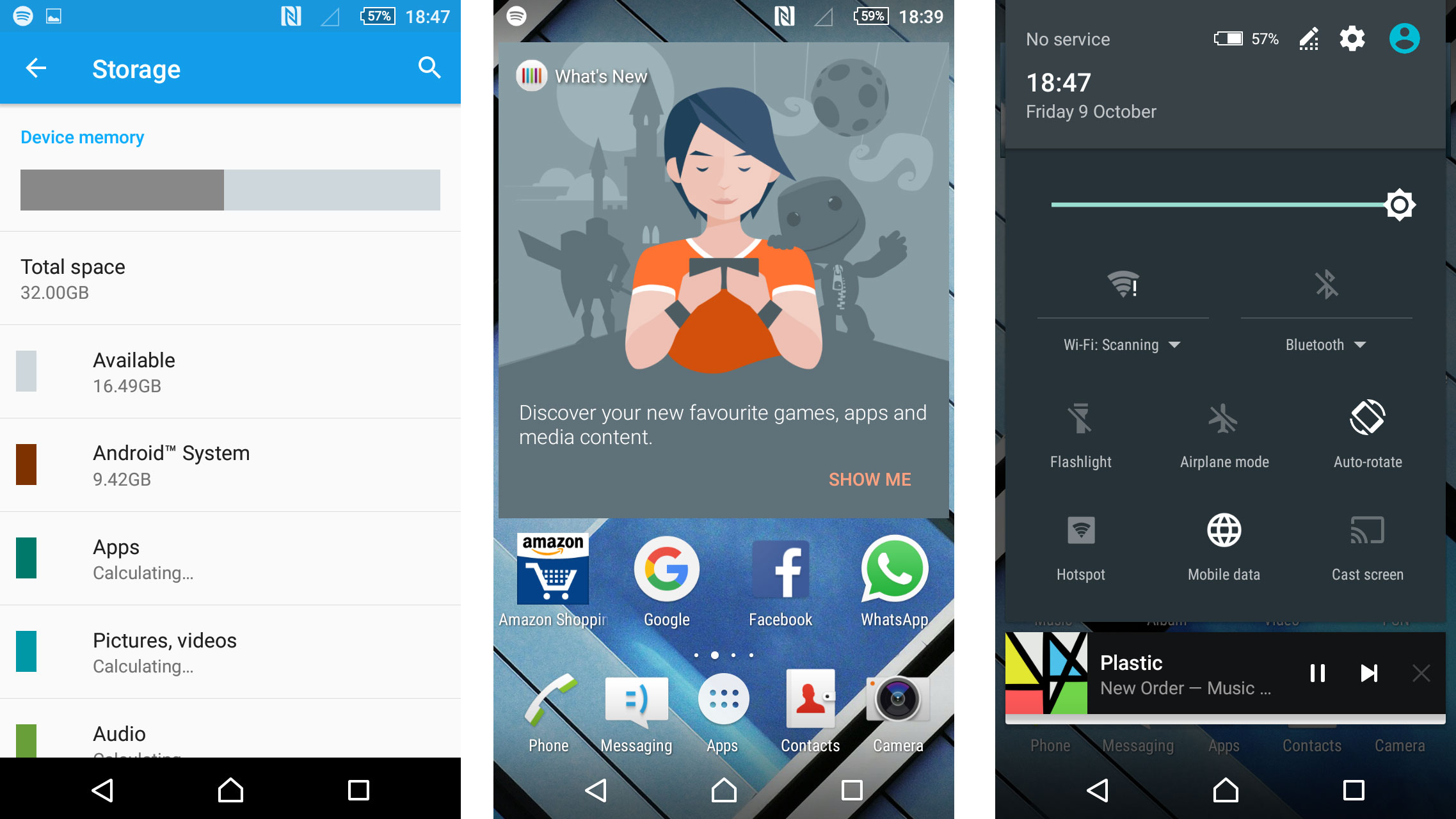
This time there's even more bloatware apps. All the usual culprits are here taking up space – TrackID, Xperia Lounge, What's New – as well as third-party apps such as Dropbox, Amazon, AVG and even Kobo.
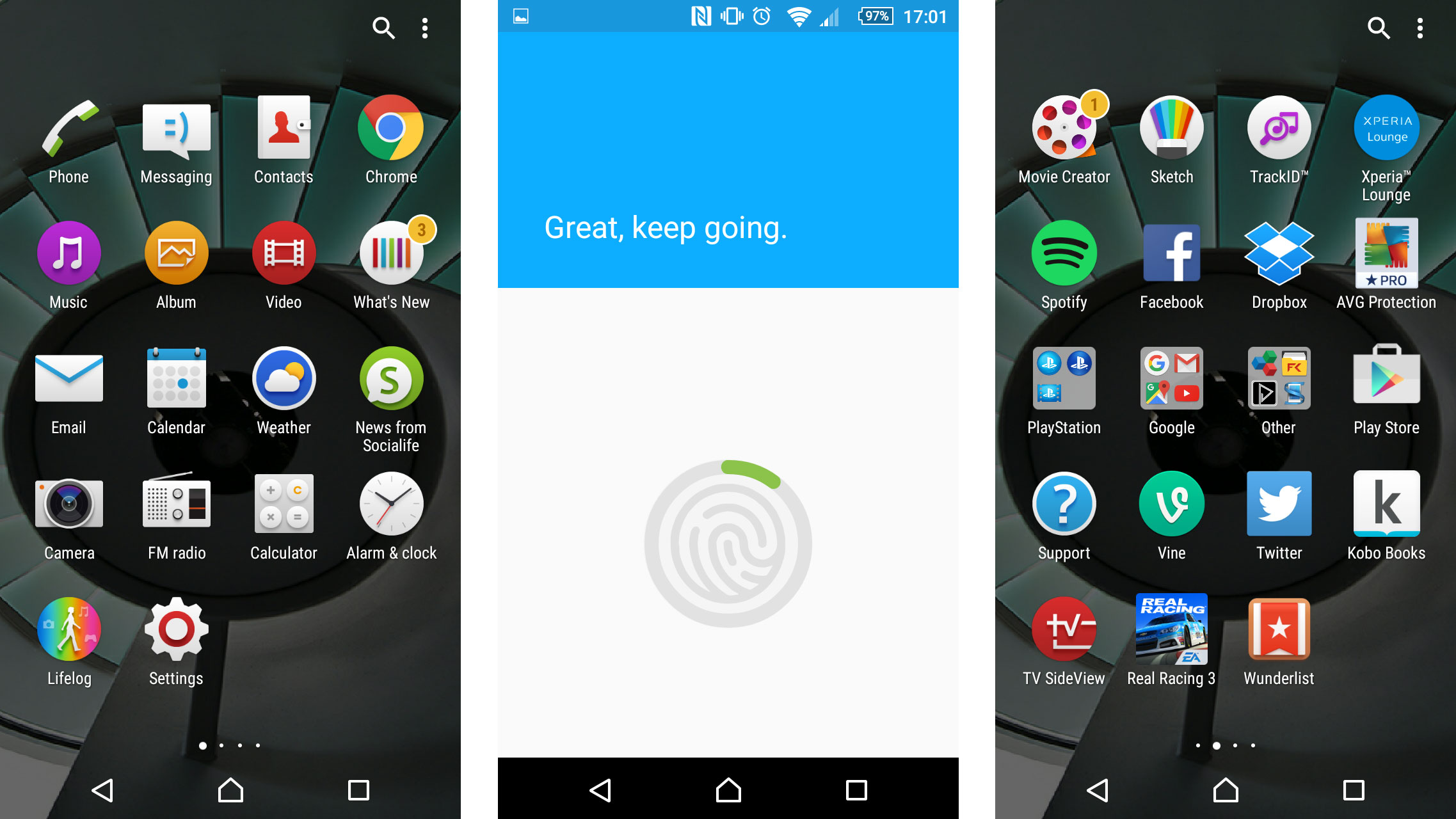
I'd much prefer if Sony took a leaf out of Samsung's book and left these out. If I want the Amazon app, I'll go into the Google Play Store and download it.
You can uninstall the apps to reclaim the space, but it's a pain to go through and remove them one by one. I'd just rather they weren't even there in the first place.
Sony has improved the Xperia keyboard significantly in the last few years, bringing in elements from third party developers like Swype. Even previously unique features such as swiping to make words have been adopted by Sony.
The comma button is still in an awkward position here, and I frequently end up opening the emoji menu instead. It doesn't add a space in automatically like dedicated keyboards do either, so I often find myself editing messages to put in all the omitted spaces.
A nice touch is the addition of emoticons while typing. If you're writing the word "phone," for example, you'll get the suggestion of a little mobile phone. I rarely found myself using the feature, but it highlighted how many emoticons are out there.
Sony has improved the look of stock applications a lot in recent years, but most still look old-fashioned within the app drawer. Inside the applications, there's a lot of the Android Lollipop influence, and I like that.
But on the outside it's a different story. Take the PlayStation app for example: while most stock apps are adopting flat and simple icons, this still has an overworked 3D effect. It differs quite some way from the rest of your Material Design influenced app icons.
It's certainly not to my taste but it may not be as much of a pain to others. I just wish Sony would drop the Xperia overlay for a more natural Google look that you can see it display within the apps themselves.
James is the Editor-in-Chief at Android Police. Previously, he was Senior Phones Editor for TechRadar, and he has covered smartphones and the mobile space for the best part of a decade bringing you news on all the big announcements from top manufacturers making mobile phones and other portable gadgets. James is often testing out and reviewing the latest and greatest mobile phones, smartwatches, tablets, virtual reality headsets, fitness trackers and more. He once fell over.
