Why you can trust TechRadar
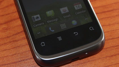
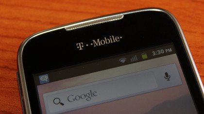
There's a very good reason why T-Mobile's own website excludes key Prism specs. The 3.5-inch touchscreen display ranks near the bottom of the barrel, as shown in several photos we took where the touch panel was clearly visible.
That's hardly a surprise for a modest 320 x 480 pixel display capable of displaying 256,000 colors. With a pixel density equivalent to 165 ppi, no one will mistake the Prism for a cutting-edge, first-class Android smartphone.

Despite being released in mid-2012, the Prism is like going back in time thanks to arriving out of the box with Android 2.3.6 Gingerbread installed. The good news? You won't have to fret over an eventual update to Jelly Bean (or even Ice Cream Sandwich), because it's never coming.
On the positive side, display contrast was better than expected, especially when switched to manual brightness - the screen looked fairly dull and lifeless with auto-brightness enabled. Considering the limited color palette, the saturation and reproduction is acceptable.

However, scrolling on the TFT LCD capacitive touchscreen is something else entirely. Vertical and horizontal scrolling is a janky, blurry mess, particularly with text, although the accelerometer is a bit more responsive than you might expect for the price.
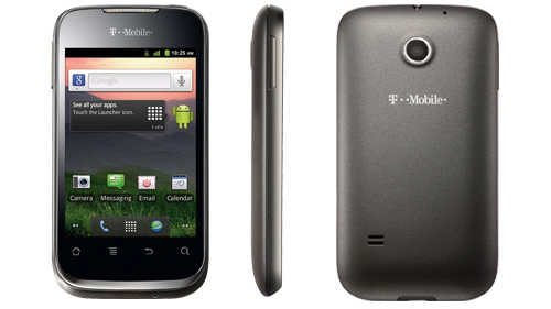
The good news for Android purists is the user interface on the Prism is largely free of third party skinning. Sure, there's the usual assortment of bloatware you can't remove, but this is as close to stock Android as you're likely to get from a major U.S. carrier.
T-Mobile also includes predictive text input by way of pre-installed Swype 3, a method we've never particularly warmed up to. The otherwise stock Gingerbread-era keyboard works just fine, although the keys are a bit cramped when held in portrait mode.
