Why you can trust TechRadar
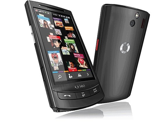
If you're a mobile phone connoisseur (which we doubt anyone would admit to being) then you're in for quite a surprise with the Vodafone 360 Samsung H1. There's no home screen as such, with the three buttons at the bottom giving options to move to the calling and messaging, contacts or applications functions.
When you first turn the phone on, there's an option to sign up to Vodafone 360 – it's pretty imperative you do so, else you'll miss out on a lot of functionality from the H1 (and any future Vodafone models you'll have).
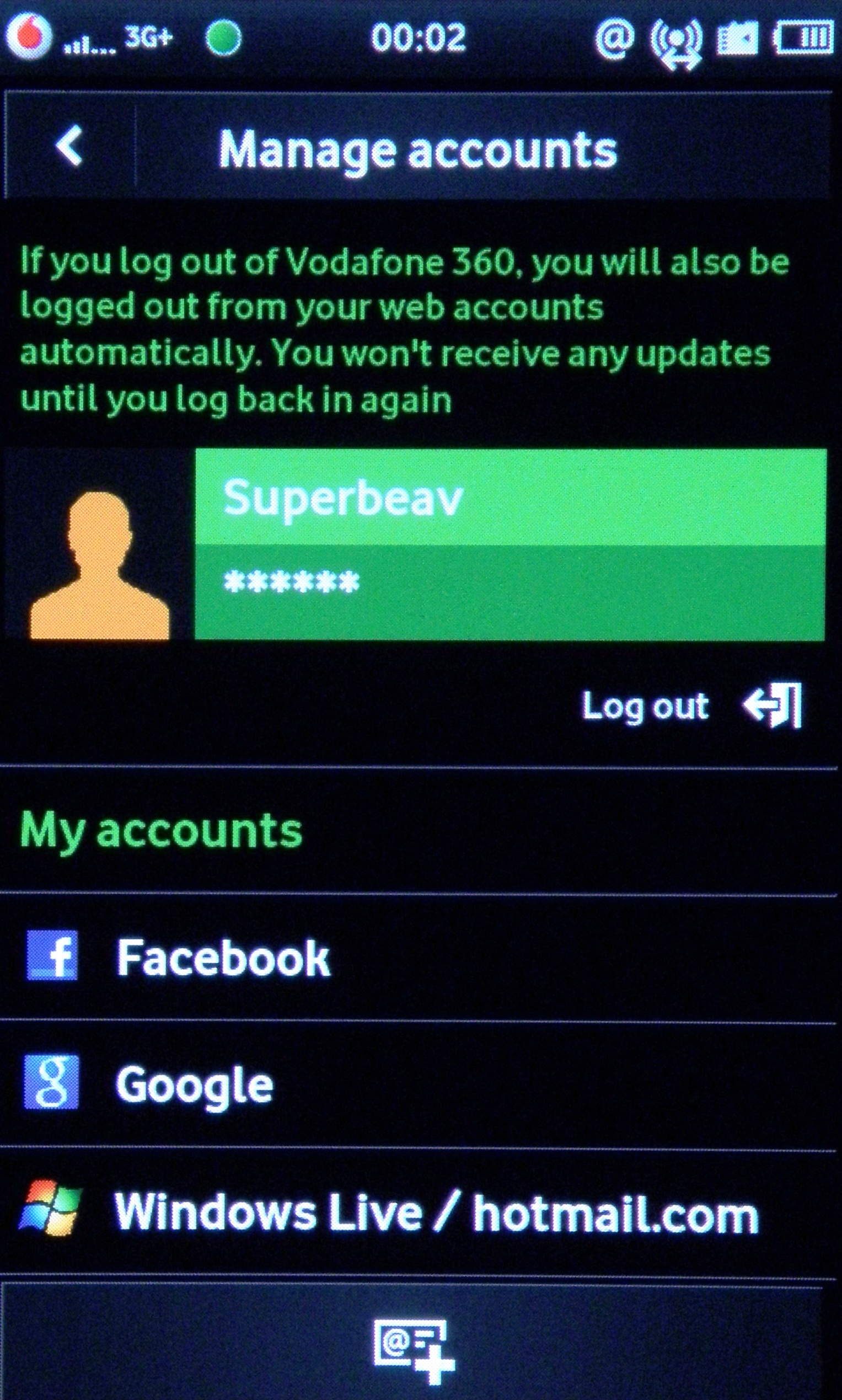
This is a simple sign-up process which you can either do online, or through the phone itself – we would recommend doing it on the PC (at www.360.com) as that way you can add in social network and email accounts with greater ease.
From here you simply log into the likes of Facebook, Google or Windows Live (with the option of Twitter in the near future) and then see those contacts on the phone itself.
The touchscreen is pretty good on the H1, with the capacitive display responding very nicely to touch. It has the annoying Samsung 'springy' haptics inside, meaning that touching the phone, even when off, has a weird rattling feel to it.
However, these are a help in general use as they help to signify inputs, and if you're one of those dead against them then haptic feedback can be turned off.
Turning on the phone takes an oddly long time – not only does booting it up last for around 30 seconds, but then the Samsung H1 needs to parse through all the cloud-based information it needs, meaning that it will hang for a while before you can begin using it.
The lock system is also a little odd – as we mentioned before it's on the power button, but this is so small and recessed that it can be really hard to hit. It also doesn't work the first time you try and lock it either, meaning multiple hits.
However unlocking the phone is a breeze – like the iPhone the H1 requires you to hit any key to awaken the phone from sleep mode, and then a simple swipe across the screen and you're away.
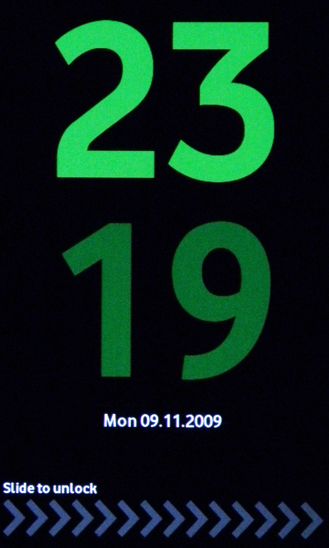
This is a welcome change from the convoluted 'smart unlock' screens found on the likes of the LG Crystal or Samsung Jet, and something we're willing all touchscreen phone manufacturers to offer.
It's almost impossible to know where to begin when trying to describe how the interface works – there are so many different options for each of the three 'home screens'.
For starters, we'll take the left-hand button: calling, messaging and history of the two (it's the best way we can think of to describe it.)
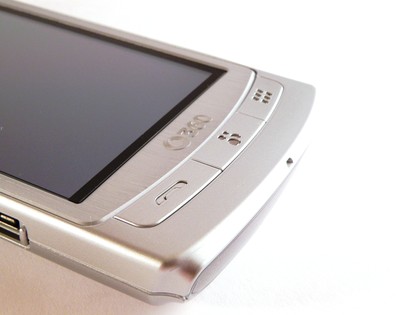
Here's where you'll get your first taste of the 3D UI, and it's really something rather cool. There was a demo video of how Firefox might look in the future which was released a while ago, and one of the notions is a 3D view of all the web pages you've looked at, allowing you to move backwards to observe them chronologically.
That's the same idea that's been used here – on pressing the calling button (that's the shortened name we're giving it) you can see all the messages and phone calls you've made and received.
And swiping the finger up will see the tiles of information cascading forwards as you traverse through time itself, allowing you to see who you called in order.
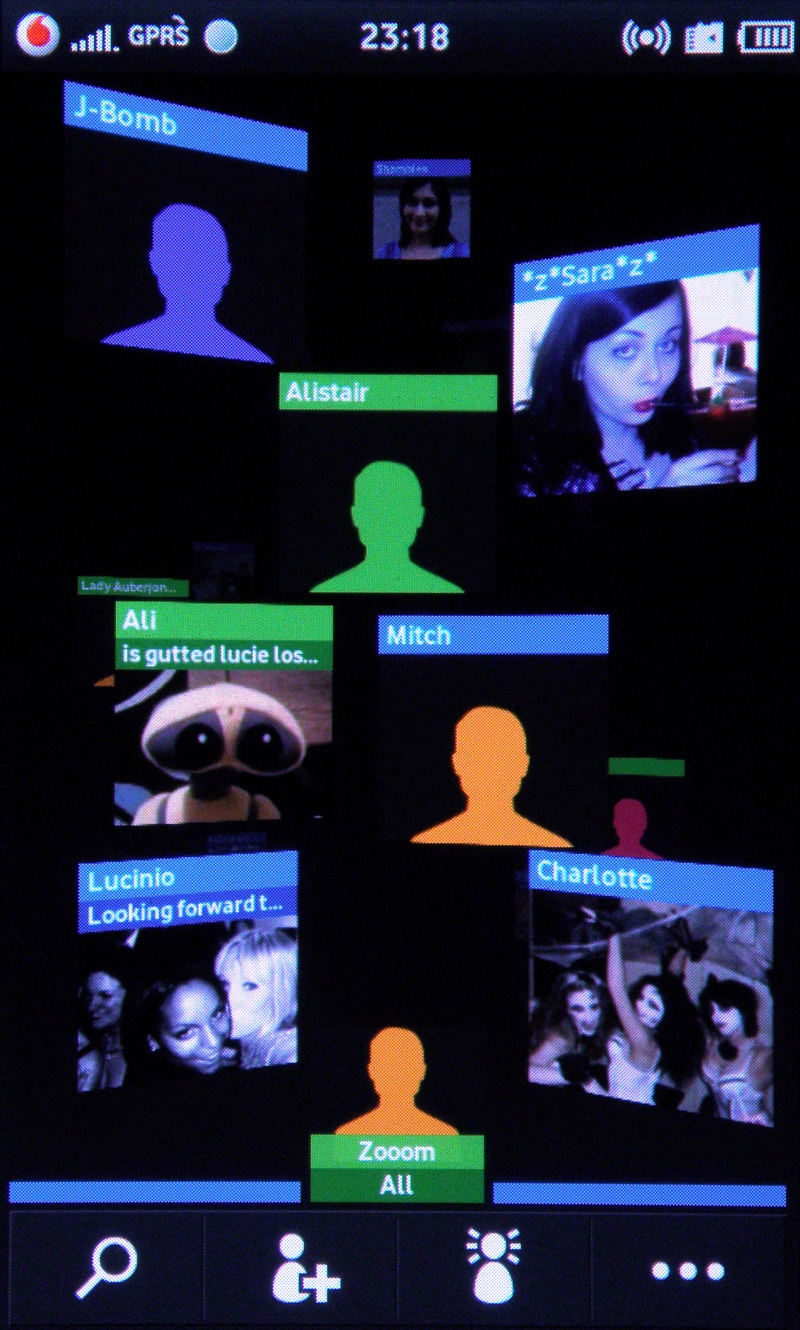
OK, we admit that a list might be a more efficient way of doing this, but we don't care about that – this is much, much cooler.
And if you don't want to see it all at once, you can filter it by email or text or phone call, making it easier to see the relevant information.
Of course, if you're desperate to see things in a list formation, that's easily achieved by pressing the calling button again – but that just seems to lack a sense of adventure.
The same principle is used on the contacts button as well, with the 3D view used to let you scroll through the people you want to communicate with (we'll get on to that in the next section).
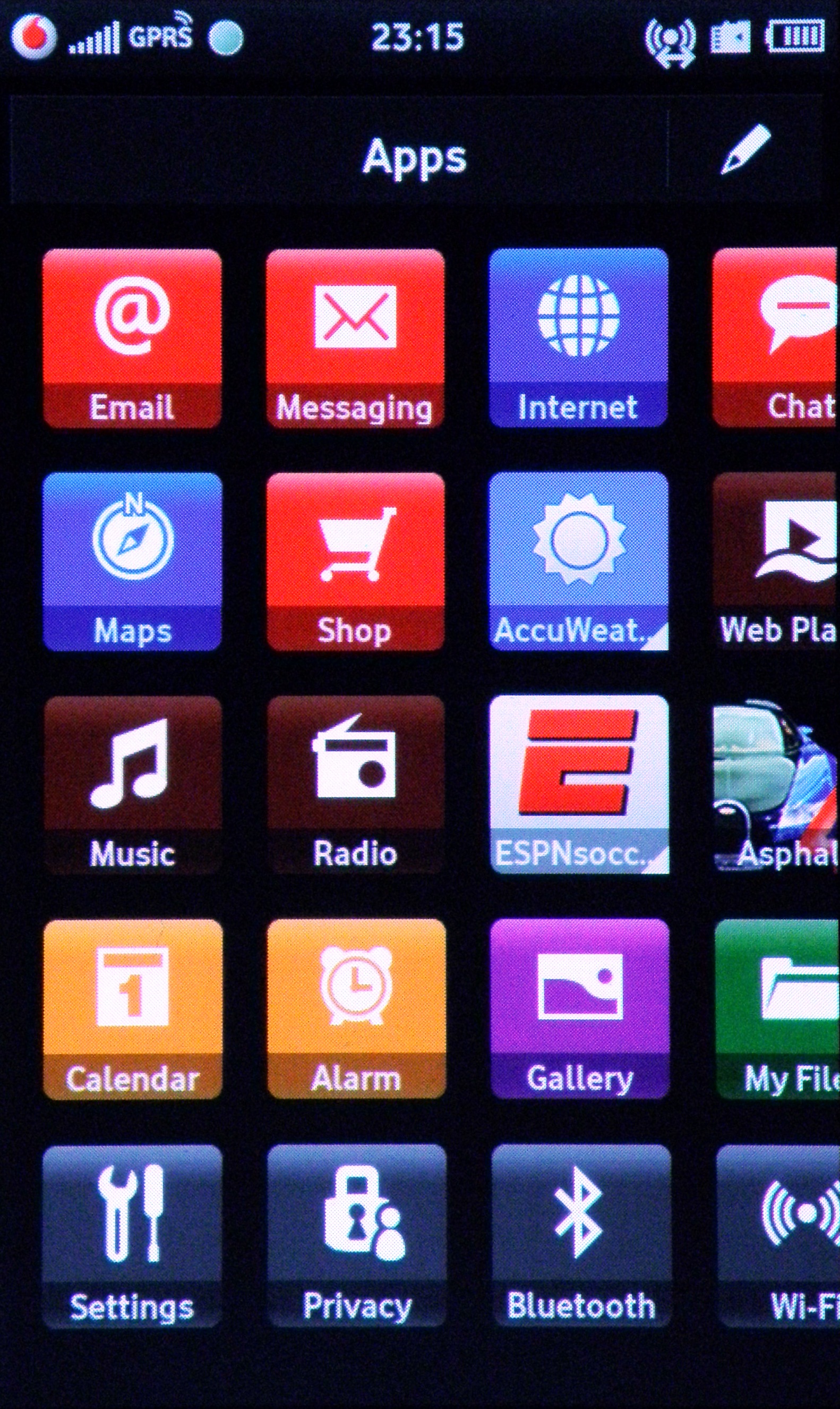
And in a tip of the hat to the iPhone, the third section, Apps, is basically a list of tiles that can be scrolled through, with all the options available in one handy screen.
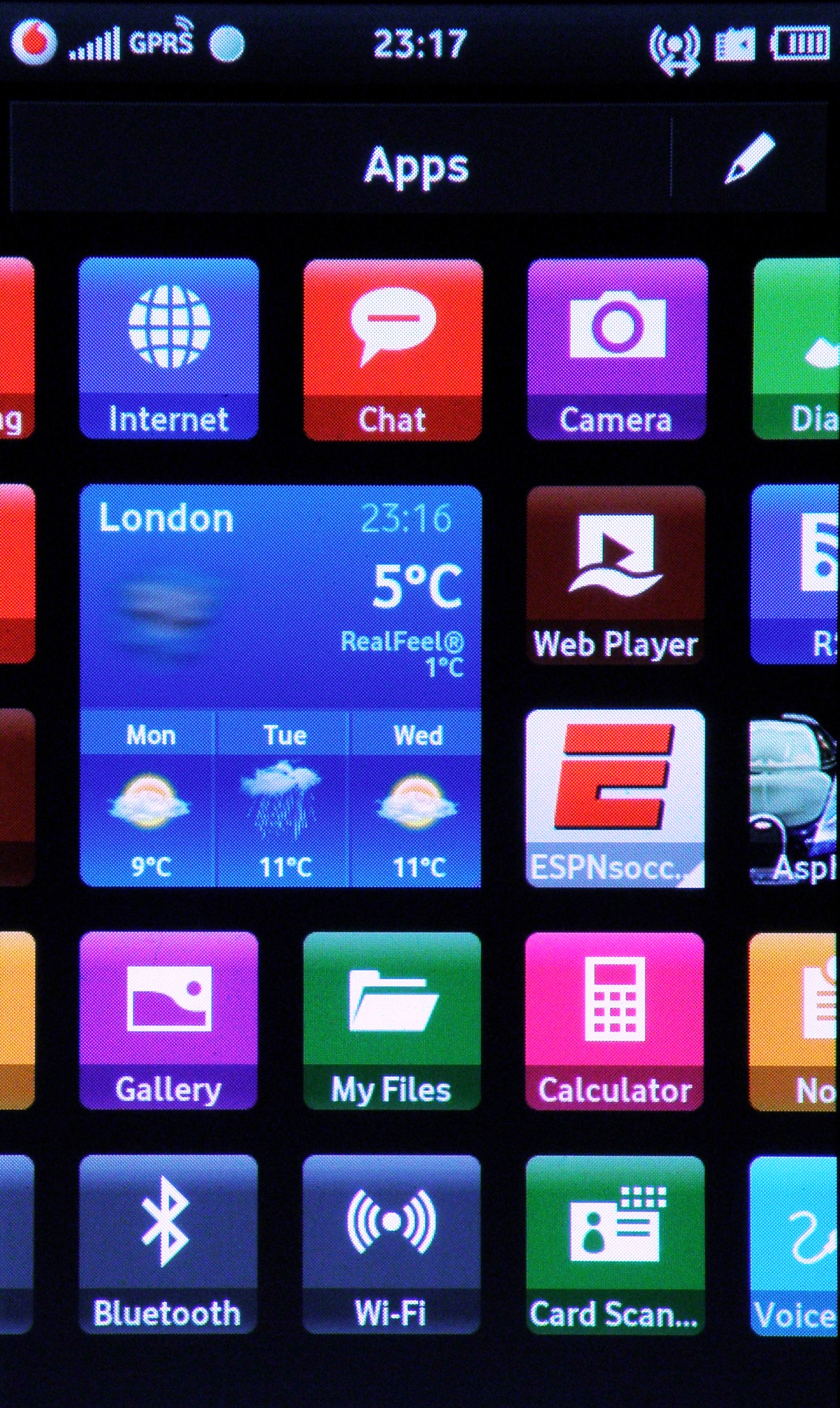
The cool thing about this is certain tiles have a small triangle in the corner, which means they can be expanded to show more information. This means updates from things like weather or football scores can be seen from the Apps screen without the need to open them up (which obviously takes a little time).
You can also re-order these little tiles by pressing the picture of the pen in the top right-hand corner – this is the universal symbol for editing things throughout the phone.
And don't worry if you don't know what an icon means on the H1 – you simply need to hold your finger over it, and a small pop up will tell you.
The navigation system through menus and applications has been re-tooled somewhat in Vodafone's new version of Linux Mobile, whereby you have to navigate forwards and backwards using icons at the top of the screen.
This means having to stab at little crosses or ticks with your thumb, which is a little hard to do. We've no idea why Samsung persists with this method, as it uses a similar system on other phones, but it very much handicaps one hand operation.
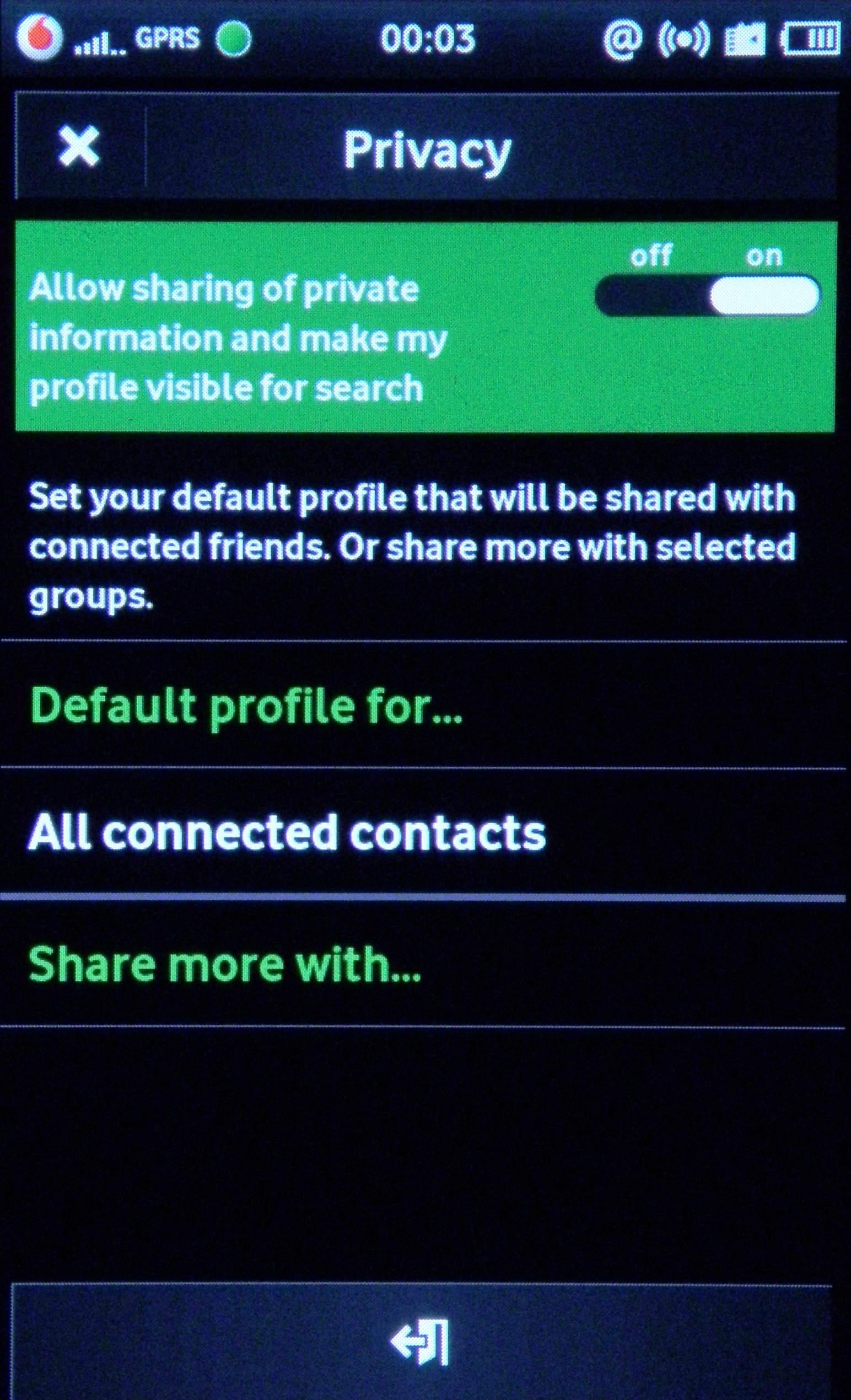
Vodafone has also cocked a snook to Android with the 360 OS, as pulling down a menu from the top of the screen (achieved by simply sliding you finger from the alerts bar at the top) will bring a list of running programs, which is handy when you get a message or a new chat – you don't have to exit the program you're in to check it out.
The interface from Vodafone with the Samsung H1 is interesting, and for the most part works – it clearly takes cues from other operating systems, most notably those from Samsung.
The phone, with its 600MHz processor, might not be the best suited to all the cloud data it needs to pull down to function properly, but it rarely falls apart and is certainly a decent effort.
Current page: Samsung H1: Interface
Prev Page Samsung H1: Overview, design and feel Next Page Samsung H1: Vodafone 360 - Contacts pt 1
Gareth has been part of the consumer technology world in a career spanning three decades. He started life as a staff writer on the fledgling TechRadar, and has grew with the site (primarily as phones, tablets and wearables editor) until becoming Global Editor in Chief in 2018. Gareth has written over 4,000 articles for TechRadar, has contributed expert insight to a number of other publications, chaired panels on zeitgeist technologies, presented at the Gadget Show Live as well as representing the brand on TV and radio for multiple channels including Sky, BBC, ITV and Al-Jazeera. Passionate about fitness, he can bore anyone rigid about stress management, sleep tracking, heart rate variance as well as bemoaning something about the latest iPhone, Galaxy or OLED TV.
