Why you can trust TechRadar
Having been built on a Java-based system designed specifically for this handset, and packing only 200MHz processing power, the user experience of the Vodafone 555 Blue was never going to be particularly speedy.
Setting up Facebook from the second you turn on the phone, you're prompted to log in to the network – or sign up for an account, if you're one of the seemingly few people who don't have one yet.
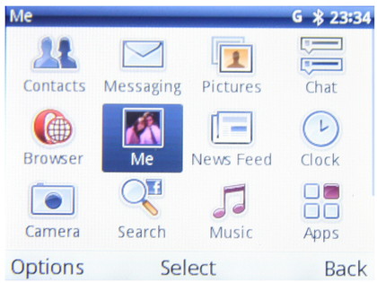
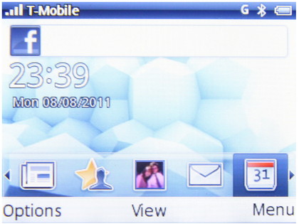
Once you've made it to the home screen, the view is set up like a giant mobile Facebook app, making room for a few extras such as calls, texting, a browser and a music player. All of it, however, is in that familiar design you're already used to.
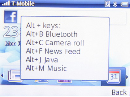
Predictably, with such a small amount of power behind it, the Vodafone 555 Blue is pretty slow to use. Navigation itself is fine, and there are even a couple of cool keyboard shortcuts, such as Alt+M to take you to the Music player. You can also head into the settings to add shortcuts of your own.
But when you dip into things that need a bit of extra juice – such as attempting to view a friend's photo album – things begin to slow to a frustrating pace.
The trackpad is responsive enough, but might end up giving you RSI in your thumb from repeated scrolling, especially if you want to brave a little internet browsing in Opera Mini.
There's one home screen, with a scrolling bar along the bottom for shortcuts to your most-used parts of Facebook (Messaging, News feed, Chat and so on).
Sign up for breaking news, reviews, opinion, top tech deals, and more.
For extra-speedy News feed navigation, just press the Facebook logo soft key. One irritating thing about the News feed itself is the fact that it's supposed to update over the air, but we never found that happened.
Our Profiles? Absolutely fine, and would auto-update whenever we opened them, but not the News feed. We found that you hou had to manually update it – and wait forever while doing so. Not cool, and unlikely to go down well with the target market on account of everyone being used to things being instant.
The menu page is customisable to a small extent, allowing you to choose which apps you want to see in its grid view. However, don't get too excited, as when we say 'apps', we mean… the calculator. Or the notes editor. Adventurous things, those.
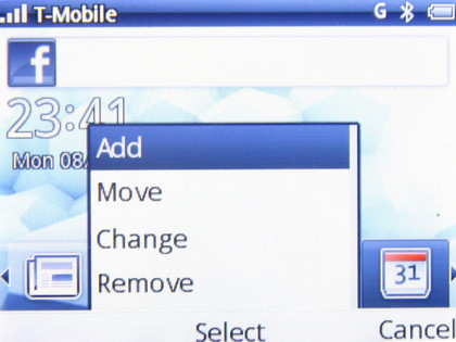
For almost everyone who picks up the Vodafone 555 Blue (because, let's face it, to buy this phone you must already have a pretty severe love of Facebook) navigating around its system will be easy, as you're guided by the familiar.
The softkeys and QWERTY keyboard aid in the ease of it all, and there's nothing here software-wise that's complex enough to get even less techy people in a spin. All in all, having borrowed a familiar interface, it looks cute and will easily attract hardcore but low-tech Facebook fans.
Current page: Vodafone 555 Blue: Interface
Prev Page Vodafone 555 Blue: Overview, design and feel Next Page Vodafone 555 Blue: Contacts and calling