Why you can trust TechRadar
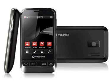
Bringing Android 2.1 to such a competitively-priced device was always going to be the main attraction for the Vodafone 845, but how would it be employed, and how useful it would be on this device was always going to the the key to success.
It would have been easy for Vodafone to just employ a bare-bones version of Android and let it do the work, but that's not the case.
The skin Vodafone has applied to the device takes inspiration from the HTC Sense UI and Nokia Symbian handsets in that it allows a multiple Home screens, but on a much more basic level.
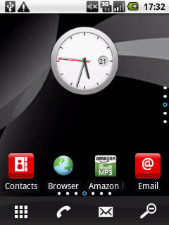
Home screens are infinitely customisable with Android widgets, shortcuts and bookmarks, and you can choose what goes where by just holding down a finger on the touchscreen.
On the multitude of phones that now employ this interface, navigation has always been horizontal, but Vodafone has added now added vertical scanning to the mix.
There are seven horizontal Home screens and, on top or underneath each of those, you can add four additional screens. That means a potential 35 homescreens. Now that's got to be some kind of record?
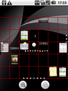
Well, how on Earth are you supposed to navigate through those, we hear you ask, let alone remember where you've placed everything?
Holding down the centre button (or pressing the onmi-present zoom icon on the Home screen) promps mini versions of each Home screen in a grid, which can be zoomed in and out to find your desired applications.
Pressing on the grid takes you to the screen with a neat moving animation. You can also swipe up and down and left and right to get where you want to be, but doing that a great number of times, while trying not to open the apps while applying the necessary pressure is tricky and frustrating.
It's quite impressive, but it's overkill. You'd almost have to download the whole Android market to fill 35 Home screens. Seven would be just fine thank you very much.
However, regardless of which screen you're on, the menu, call, messaging and zoom icons remain present, so you'll always be able to get where you want to be without excessive scanning and searching. It's also easy to rearrange the icons, by holding them down and moving them around.
So what does Android 2.1 bring to this phone, to make even HTC Hero users (who're still waiting for the upgrade) and Dell Streak owners (who only have 1.6) jealous?
Two words. Live wallpapers. We first saw these on the Google Nexus One phone back in January, adding a fun and pretty extra dimension to Android phones.
We loved the Nexus wallpaper of interactive moving streams of colour. It's worth keeping a Home screen blank just to play with it, but it's fair to say the inferior touchscreen and general screen quality doesn't make this as pretty and intuitive an experience as on the higher-specced Android 2.1 phones.
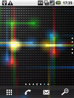
There's also a live Google Maps wallpaper, which is functional and handy to have instant access to, but constant GPS-usage will kill your battery extremely quickly. And it thought we were in North Wales. Despite what armies of opposing football fans would have you think, Shrewsbury is not in North Wales.
Google text-to-speech synthesis should also be available but it isn't. When we tried to install the voice data functionality needed for this, it was inaccessible from within the dedicated text-to-speech settings menu in Android. Strange one, that.
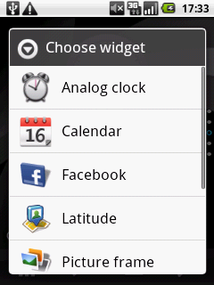
It offers a lot of the widgets served-up on the big name handsets, including a more basic Accuweather clock as seen on HTC's Sense UI, as well as the live Facebook widget, which shows your friends' latest status updates and allows you to update your own.
Scanning between them is nigh on impossible though thanks to some teeny, weeny arrows and the touchscreen is nowhere near good enough to handle that.
There's also an interactive calendar widget (populated by pairing-up with your Google account) which allows you to flick through months live on the Home screen.
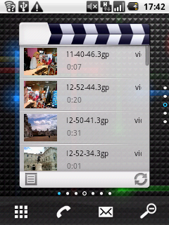
We also liked the multimedia library widget which also lives on the Home screen and the Android control panel which gives instant access to connectivity options and screen brightness.
The Google search bar also works in the same way as Apple's spotlight feature, scanning your phone for relevant content before searching online.
All of this means you get to your favourite content faster, which makes complaints about the multitude of Home screens a little irrelevant.
They're there if you need them and want to use them, but if not, it's so easy to get to everything anyway.
Trying to do so much with a 525MHz processor that offers around half the performance of the top-end smartphones is a bold move.
Couple that with the paltry 128MB of RAM and it means that the experience isn't nearly as fluid as we'd like.
Especially when typing, the phone struggles to live up to our demands and occasionally you can press the screen until the cows come home without and the 845 chooses to ignore you, so you'll need to be patient with it.
After continued use we were reluctant to exit an application we needed to come back to, just because of the extra time, patience and sheer effort it takes.
Opening apps like the camera just takes an absolute age and the he accelerometer takes longer to erm... acceleromate than we'd hope
If you can't be patient with it, spend more than £15 a month for a free smartphone. Simple.
Current page: Vodafone 845: Interface
Prev Page Vodafone 845: Overview Next Page Vodafone 845: Calling and contactsA technology journalist, writer and videographer of many magazines and websites including T3, Gadget Magazine and TechRadar.com. He specializes in applications for smartphones, tablets and handheld devices, with bylines also at The Guardian, WIRED, Trusted Reviews and Wareable. Chris is also the podcast host for The Liverpool Way. As well as tech and football, Chris is a pop-punk fan and enjoys the art of wrasslin'.
