TechRadar Verdict
The Vodafone Smart 2 fails to deliver enough bang for your buck
Pros
- +
Small
- +
Well built
- +
Some nice widgets
- +
Responsive screen
Cons
- -
Poor screen visibility outdoors
- -
Disappointing battery
- -
Limited video shooting
Why you can trust TechRadar
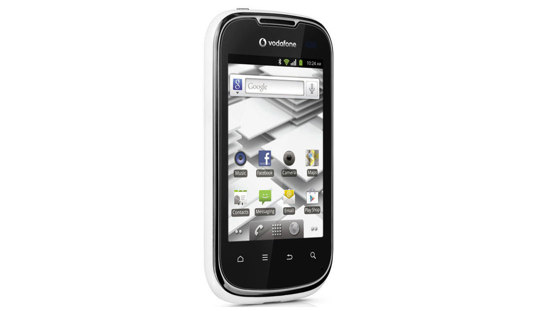
We weren't great fans of the original Vodafone Smart. The general specifications were just too poor to do Android justice. But undaunted, Vodafone has continued with the Smart line, and the new handset, the Vodafone Smart 2 (or Vodafone Smart II, if you prefer), has been launched.
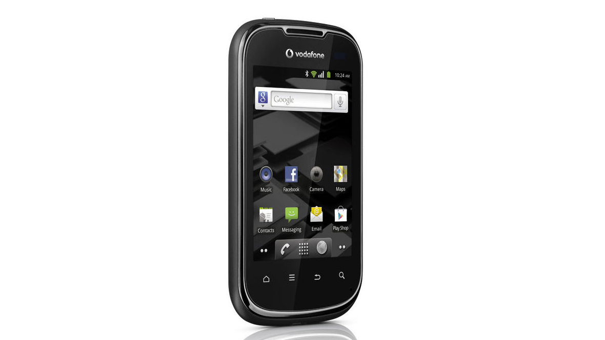
The Vodafone Smart 2 costs £70 (about $108) and comes in either grey or white. Vodafone has upped the dreadful screen resolution of its predecessor and generally raised the specs.
So, with the original Smart having had a price drop to £40 (about $62), is it worth paying the extra for the Vodafone Smart 2? The decision has to be based not only on what the new Vodafone Smart 2 offers, but also on how it compares to other handsets of a similar price. And there are quite a few of them.
For example, the Huawei Ascend G300 is also sold for £100 (around $160) on Pay As You Go, the HTC Wildfire S costs £135/$180 on PAYG, and the Orange San Francisco 2 costs just £85 (around $130) on Pay As You Go. That's not the full spectrum in this crowded segment, either.
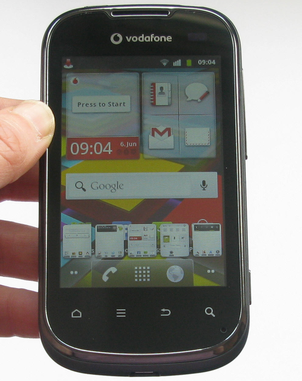
The Vodafone Smart 2 is a small handset - child sized, you might say. The chassis is a bit thick, at 12.35mm, but it is easy to reach across the 58mm of width for full screen usage one-handed, and at 109mm tall the handset is unlikely to poke out the top of a pocket. You probably won't notice the 120g weight either.
The build is really solid - we couldn't flex the phone at all in our hands. Its rounded edges look quite smart, though there's nothing particularly different or alluring about the general design.
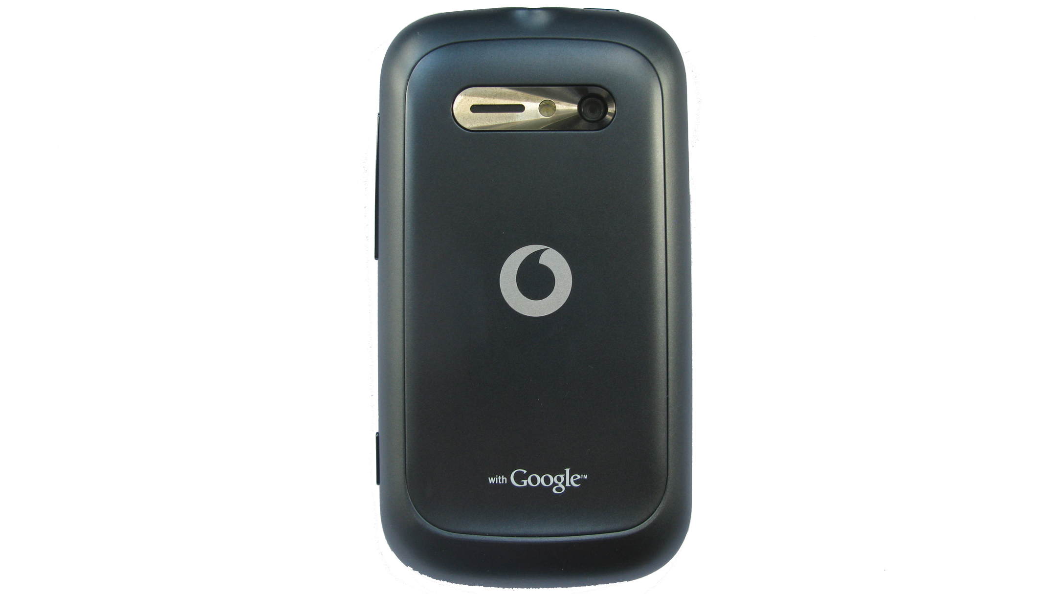
Until you pull the backplate off. It is quite difficult to remove, but when it's off you'll see that the phone's backplate is made from two sections - an outer frame and an inner plate. Vodafone isn't touting a personalisation feature for the backplate as it did for the original Smart, and we can't quite see why there's a two-piece backplate system here.
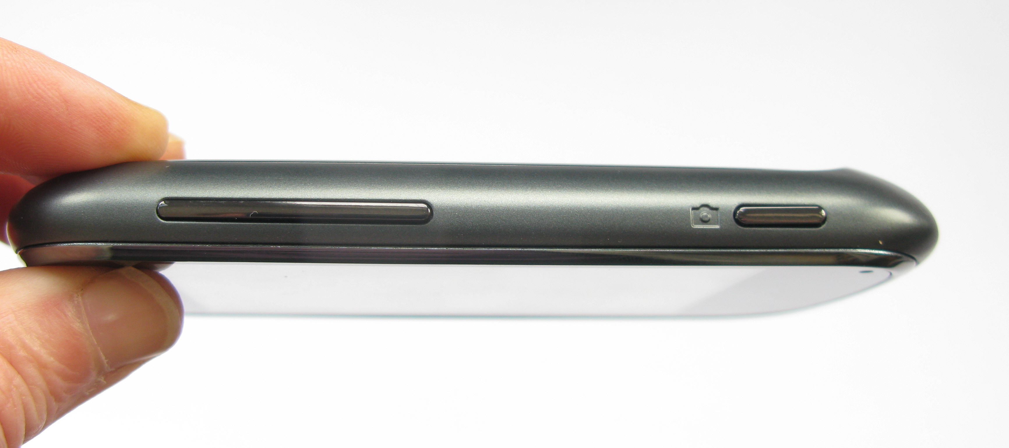
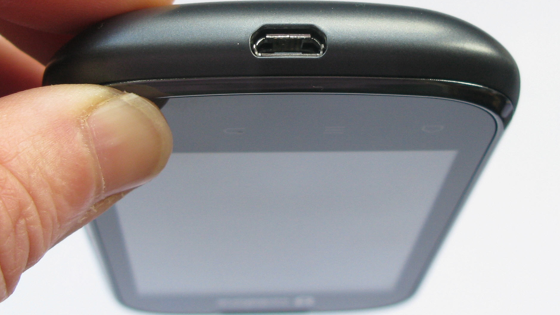
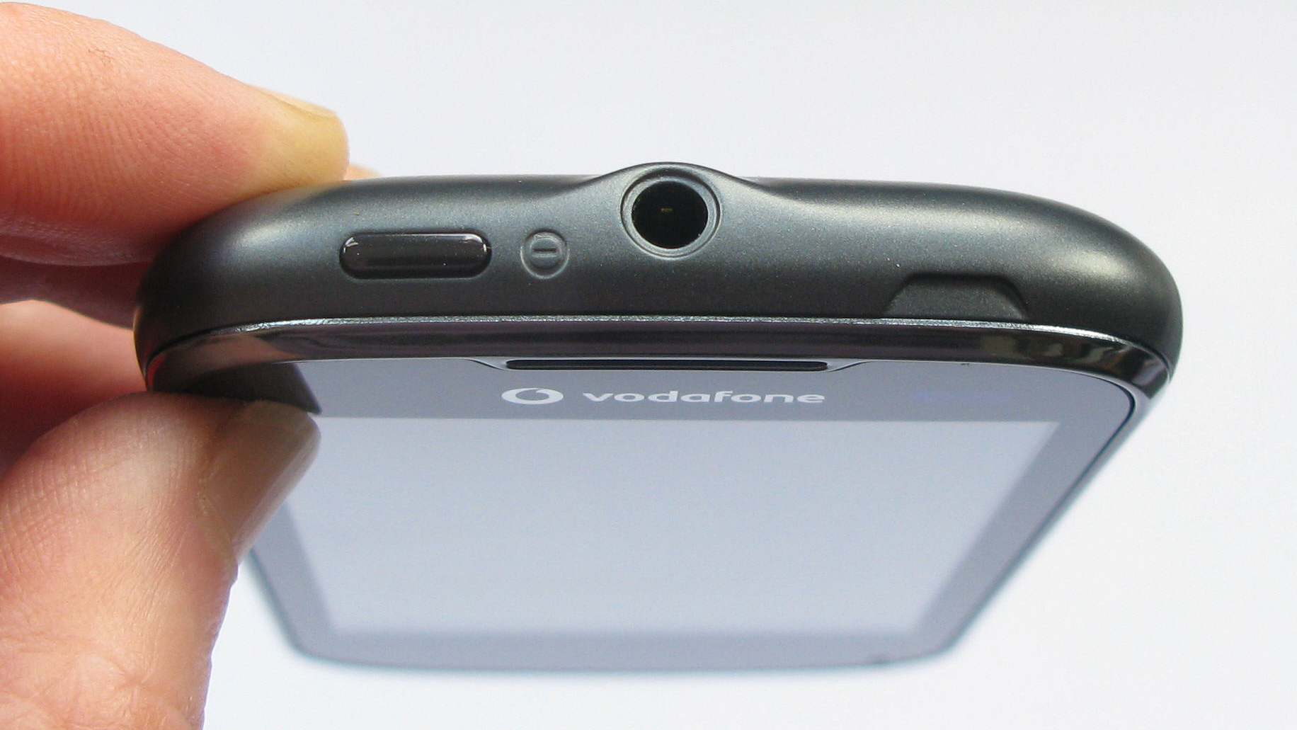
Vodafone seems to have made all the right choices with regards to button placement on the phone. The headset connector is on the top alongside the main power switch, while the USB connector is on the bottom edge. The left edge is clear, while the right edge houses a volume rocker and camera button.
Vodafone has upped the general specifications on the original Smart, with a 3.2-inch 480 x 320 pixel screen replacing the old pretty dire 2.8-inch 240 x 320 display, and a 3 megapixel camera replacing the old 2 megapixel one.
There's also 802.11n support that wasn't there before, a slight raise on internal storage from 130MB to 150MB, and an 832MHz Broadcom processor in place of the old 528MHz model. It isn't a great set of general specs, but it is a step forward.
We say Vodafone has upped the specs, but really it's Alcatel who has done this, since it made the handset for Vodafone to sell.
