Why you can trust TechRadar
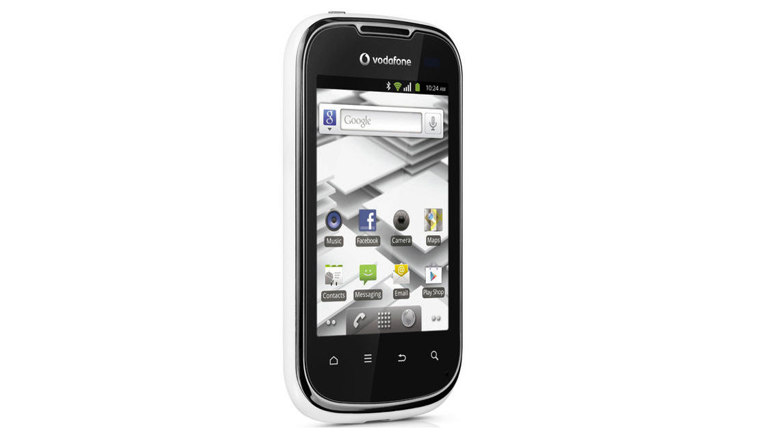
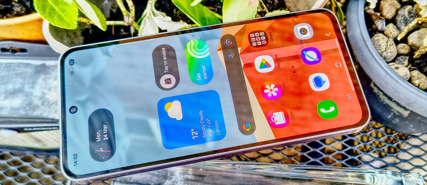
With Android 2.3.5 running the show and this being a budget smartphone, you might expect the Vodafone Smart 2 to look quite familiar. But Vodafone has done a bit of skinning and provided a fair few widgets to help owners feel they've got something quite personal going on here.
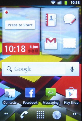
The small screen can get a bit busy, though. Right out of the box the main screen - one of five - is peppered with widgets, and as you scroll left and right there are more to be found. We rather like the way Vodafone has made an effort to enhance Android in this way.
Vodafone hasn't got it all right, though. Pull down the notification bar and there's no quick access to wireless settings. For that you need to occupy part of another home screen with a widget. We prefer the ever-present notification bar option.
Beyond the ability to fill home screens with widgets, you are into pretty standard Android territory. At the bottom of each home screen there's the familiar icon bar with its shortcuts to the dialler, web browser and apps menu.
Hold down the apps icon and tiny thumbnails of each of the home screens pop up, and you can tap one to go directly to it. It isn't that much quicker than sweeping, and the icons are so small that you can barely identify what's on each screen. On a larger screened, higher resolution phone this might be a nice feature, but here it's a bit lost.
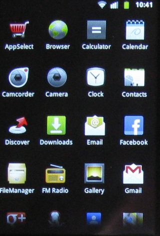
Tap the apps icon and of course you are into the familiar-looking apps menu.
Screen size and quality is a bit of an issue. The screen is fairly small at 3.2 inches, and its 480 x 320 pixels don't give it the highest resolution. It can be tricky to see detail, and outdoors the panel is quite hard to read.
But the touch responsiveness is good, with the handset happy to move swiftly between screens and respond to taps. You might find if your hands are larger than a child's that it can be difficult to hit smaller icons, though.
Beneath the screen the four Android buttons for Home, Menu, Back and Search functions are also responsive.
