Why you can trust TechRadar
Contacts are drawn in from social networks and email accounts, although you are a bit limited on account support on the Vodafone Smart 2 - just Twitter, Facebook, Google and Exchange are supported. It's going to be enough for most of us though, and signing in to these is easy.

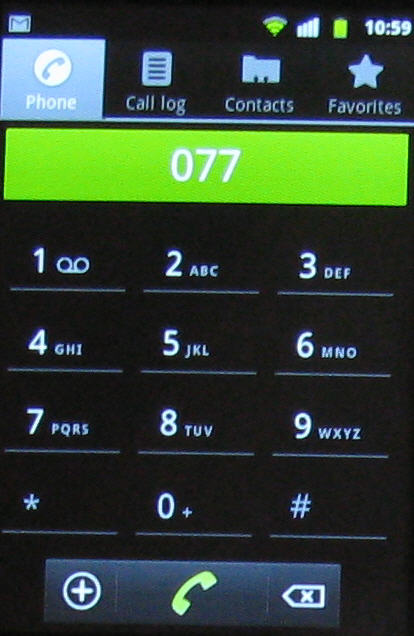
The standard Android user interface is used for contacts, so you've got the dialler, call log, contacts and favourites shortcuts sitting at the head of the screen.
Individuals are named and identified with thumbnail pictures if you have them. If you aren't on any social networks and have no Gmail contacts, then the handset will just pick up existing contacts from your SIM.
It is annoying that there's no smart dialling support. We expect this from even the least expensive handsets, but start to tap out numbers on the dial pad here and it's notably not present.
When you add a new contact to the handset you can either keep it just on the phone or have it sync with Google. That's a nice capability of course, because it means you can get all your new mates into the cloud at the earliest possible moment.
Calling
Call quality was good, and Vodafone has implemented a couple of features we first saw only on the highest quality handsets, which have now filtered down to the sub-£100 smartphone level.
First there's the 'flip to silence' trick: when the phone is ringing and you don't want to take a call, turn it face down and it'll go to voicemail. Second there's the 'louder ringtone' trick. When the Vodafone Smart 2 is in a pocket it rings more loudly than when it is out in the open.
Messaging
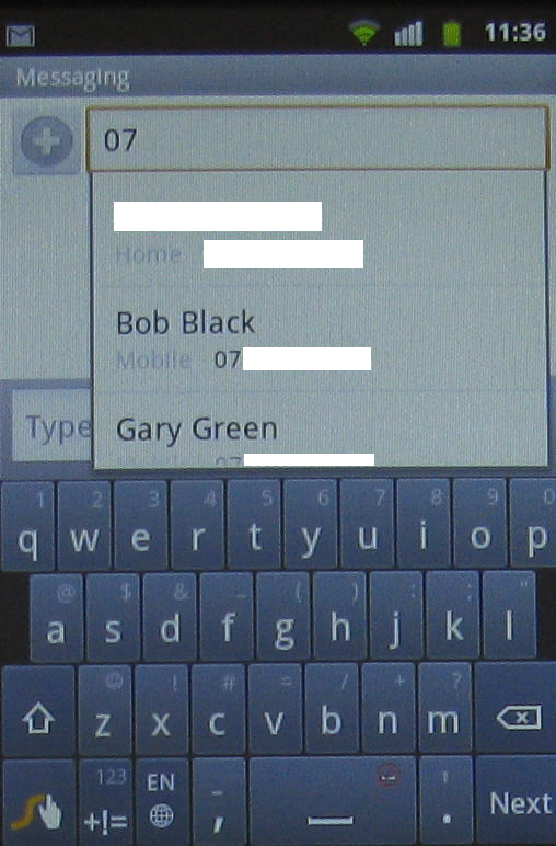
Fortunately the messaging system on the Vodafone Smart 2 does include smart dialling support. Start to tap out a contact name or number and the selection narrows down until only the one you want is listed (unless you somehow know more than one Dan Smith).

We can have screen responsiveness issues with lower cost, small-screened handsets, but that wasn't an issue on the Vodafone Smart 2. When we hit the right keys we were able to tap out messages quite quickly, thanks to good responsiveness.
But the keyboard is just a bit small for us and we found tapping out messages on the screen with complete accuracy a bit of a challenge.
You may be helped by the presence of Swype if you find the system works for you, but we found we were much more comfortable switching from portrait to landscape orientation.
But in doing so we encountered a separate issue. In portrait screen mode you can see some of the message trail, while in landscape screen mode you can't.

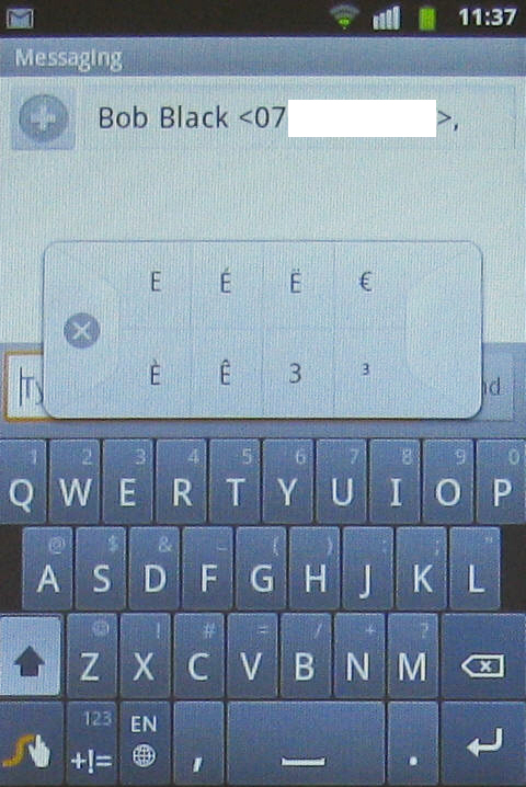
When you're in Swype keyboard mode, there are second characters on the main keys, with a long press bringing up a bank of even more characters for you to choose from. And often the choices are quite expansive.
There's a nice numeric keyboard and an edit keyboard too, which helps particularly with working in longer texts, such as when you are writing an email.
Switch out of Swype mode to the standard Android keyboard and the second functions and edit keyboards are no longer available. Fortunately switching is easily done using a settings key on the keyboard itself.
