Why you can trust TechRadar
The fact that the Vodafone Smart 4 Max runs on stock Android 4.4.4, with all of the attendant pre-loaded apps that entails, means that it's pretty strong when it comes to the smartphone essentials.
Thankfully, items such as the phone and people apps are straight-up Google efforts, with no attempt to improve, modify, or otherwise tinker with them. This means that locating contacts and making calls are clean, smooth experiences.
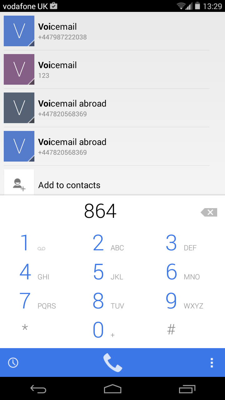
The dialler is much improved over previous versions, with a smart feature that suggests contacts according to the number or alphanumeric letters you start typing.

Call quality was strong during my time with the phone, and I particularly appreciated how loud the Smart 4 Max's speaker was.
One area Vodafone has messed with is messaging, and the results are predictably underwhelming.
In fairness, this is an area that Google has struggled to get to grips with over the years, with two available offerings in the shape of the slightly unwieldy Hangouts and the nice-but-optional Messenger.
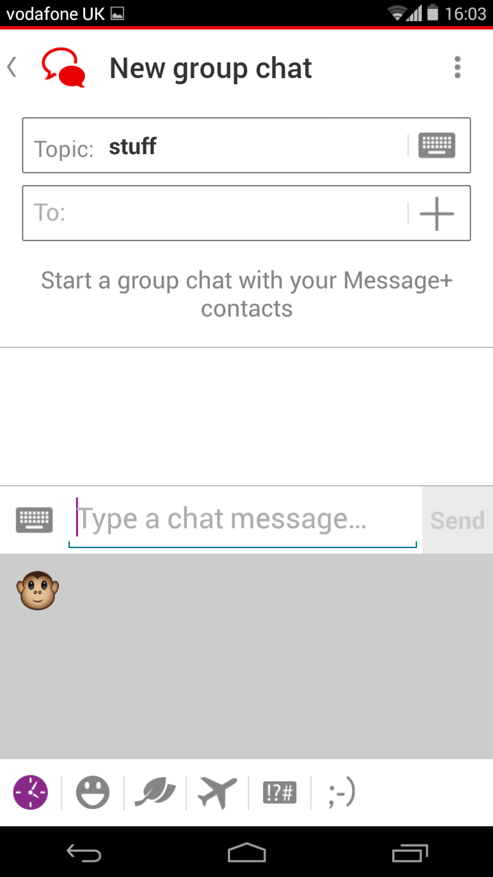
Vodafone has its own established messaging service, Message+, which is placed front and centre here. It seeks to combine simple SMS messaging with the kind of group chat and media sharing options you'd typically find in something such as WhatsApp or iMessage.
It works as such, but it's an ugly and charmless app, and it doesn't appear to have been well optimised for this larger display type, with clumsily blown-up menus and nondescript typography.
On the subject of messaging, Vodafone has opted to include SwiftKey as the default keyboard of the Smart 4 Max. It's one of the strongest and best-established third-party keyboards out there.
Not only is it easy to tap or drag out messages (it has an integrated swipe-to-type system), it's also highly customisable, with different themes and alignments.
You can alter the size of the keyboard, which is particularly useful with such a large screen.

The smallest option still doesn't quite make it possible to type single-handed, but there's also an option to squish the keyboard to one side, which does.
Once again, you get two web browsers – a tedious habit of most Android phones, and one that doesn't get any more justifiable with time.
The stock Android web browser is just fine. You will ignore it in favour of the much more powerful, modern and slick Chrome. Let's move on.
Before I do, though, it's worth lingering for a moment over the Smart 4 Max's performance as a web browsing device. After all, surfing the internet is one of the main tasks that 6-inch display is intended for.
Mobile-friendly websites (such as TechRadar) load up and look just great – but then they're designed to do so on such devices. It's full-sized web pages that phablets such as this should be making light of, and in that respect the Smart 4 Max is a mixed bag.
While full desktop websites load up well and offer a nice overview on the expanded screen space, I still found myself needing to zoom in on specific areas to read smaller text comfortably.
Don't get me wrong, I could read what was there, but the low pixel density brought about by that 720p resolution meant that this was far from optimal.
The TechRadar hive mind. The Megazord. The Voltron. When our powers combine, we become 'TECHRADAR STAFF'. You'll usually see this author name when the entire team has collaborated on a project or an article, whether that's a run-down ranking of our favorite Marvel films, or a round-up of all the coolest things we've collectively seen at annual tech shows like CES and MWC. We are one.
