Why you can trust TechRadar
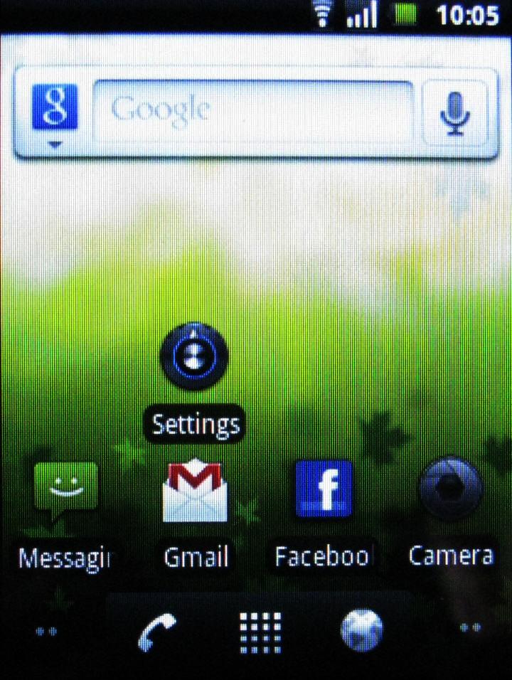
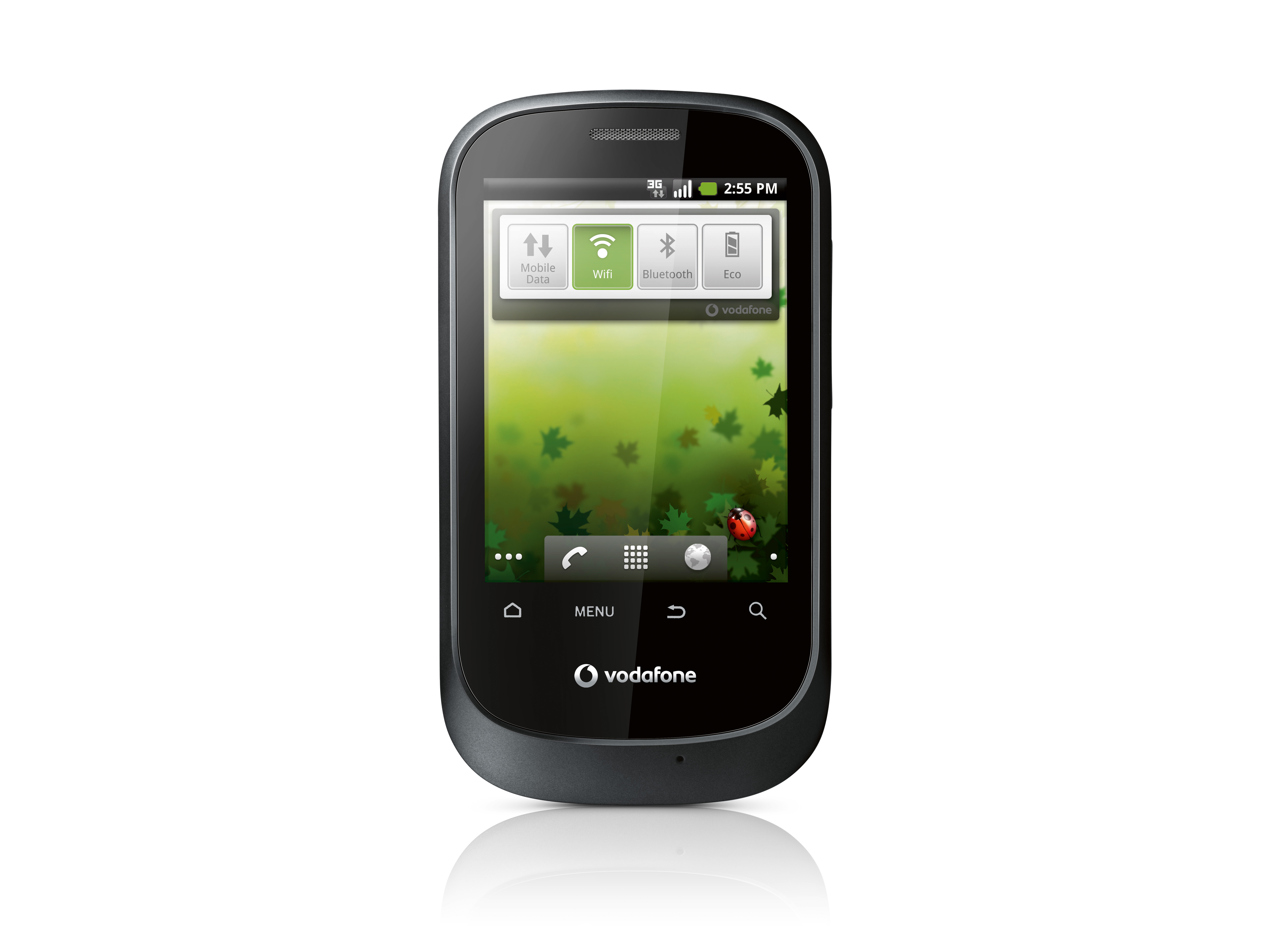
The Vodafone Smart runs Android 2.2 (Froyo) and it isn't skinned. This means that the Android experience doesn't suffer from unnecessary clutter. Or, put another way, there are no pretty enhancements to make your use of Android that bit more personalised.

The 528MHz Qualcomm Processor is rather a long way behind the times. The handset takes an age to boot, and at times it can be slow to respond to finger-presses and sweeps.
That said, moving through the five main screens by fingersweeping is easy and responsive enough, and we suspect that if you're not a particularly demanding user, you probably won't be too irritated by slow responses.
What you will notice is the slow speed at which the screen reorients itself when you turn the Smart in your hand. We were constantly peeved by the wait.
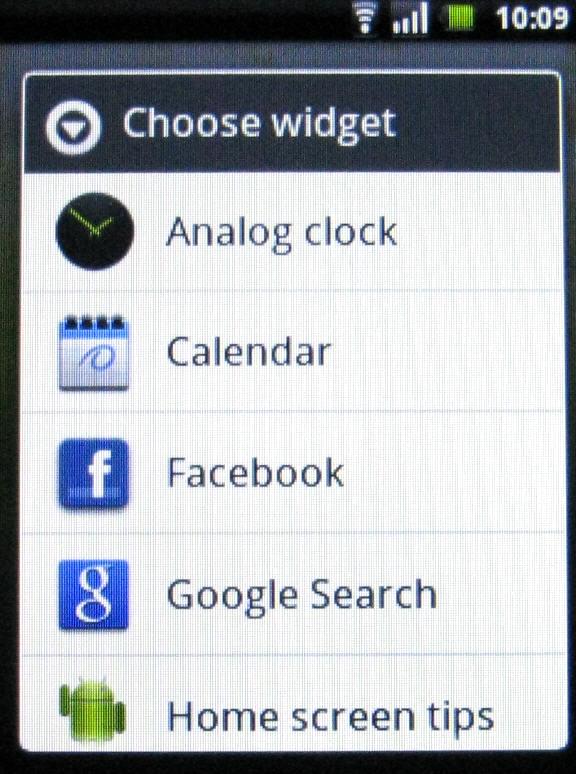
There aren't many widgets over and above the Android basics, although you've always got the Market if you want to add more. Vodafone also provides a few apps of its own to boost the Android ones - we'll get to them later on.

An interesting aspect to the interface that you might easily overlook is the battery charge indicator. This is quite important, actually. It's on the lock screen, and is important because there's no charge indication light on the chassis itself.
Current page: Vodafone Smart: Interface
Prev Page Vodafone Smart: Overview, design and feel Next Page Vodafone Smart: Contacts and calling