Why you can trust TechRadar
The MIUI interface may make the Mi 3 look a little different from most Android devices, but the core experience is much the same underneath.
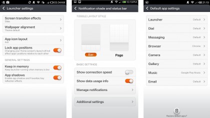
The notifications pull-down bar is completely customisable, with MIUI going so far as to offer two alternative layout options that adjust the size and position of the tabs and toggles on offer.
As is the Android way these system messages can be individually swiped away, leaving some remaining as little reminders, while the toggle bar at the bottom scrolls to let more shortcuts appear.
It's responsive and quick to pull down, plus there's a custom MIUI setting page specifically for adjusting the notifications system. This allows users to deny individual apps from sending you alerts, have it auto-collapse after an action, add a data connection speed display to the status bar and much more. It really is a super-customisable OS.

The calling and contacts section is split into two tabs. The first thing you see when opening the dialler is your recent calls up top, with the actual dial pad beneath.
A second tab at the top lets you access the contacts section, where your lists of everyone you know appears. First on the list are any you've pulled out as favourites by starring them; followed by an alphabetical list of all the other numbers you've amassed.
The settings tab within contacts helps you sort the wheat you often call from the chaff you only occasionally text by accident. From here you can have the list of names sorted by first or second name, choose which social media accounts to mask, or activate the Smart Groups feature that offers to split up your contacts by company name, location or most recently contacted.

The messaging system sees Xiaomi and MIUI offer some nice features. It's nice not to be made to use Google's Hangouts for one, plus there's a nice overlay pop-up notification window that appears if an SMS arrive while you're staring at the phone waiting for it to come.
The default keyboard on the Mi 3 is the TouchPal third-party option. It's not great from a visual or usage perspective, appearing rather clunky and not operating as smoothly as the default Google keyboard. Thankfully, switching keyboards is easy, as long as you know it's possible.
Xiaomi's put on a lot of its own apps here, as smartphone makers tend to do. Many are needless duplicates of the superior Google suite of apps, like the Mi 3's generic music player that offers to play any tunes you've shuffled onto the internal memory. It's really basic, offering just a list of everything, a sorted-by-artist tab and the option to create your own playlists.

Anyone using this over Google's Play Music app would be rather mad, as would anyone who uses the generic webkit browser Xiaomi has pre-loaded instead of the vastly superior Chrome. I found the stock browser would hang while loading pages, taking forever to render even simple sites. There's no such problem using Chrome, which has the Mi 3 functioning perfectly as a swift and usable web browser.
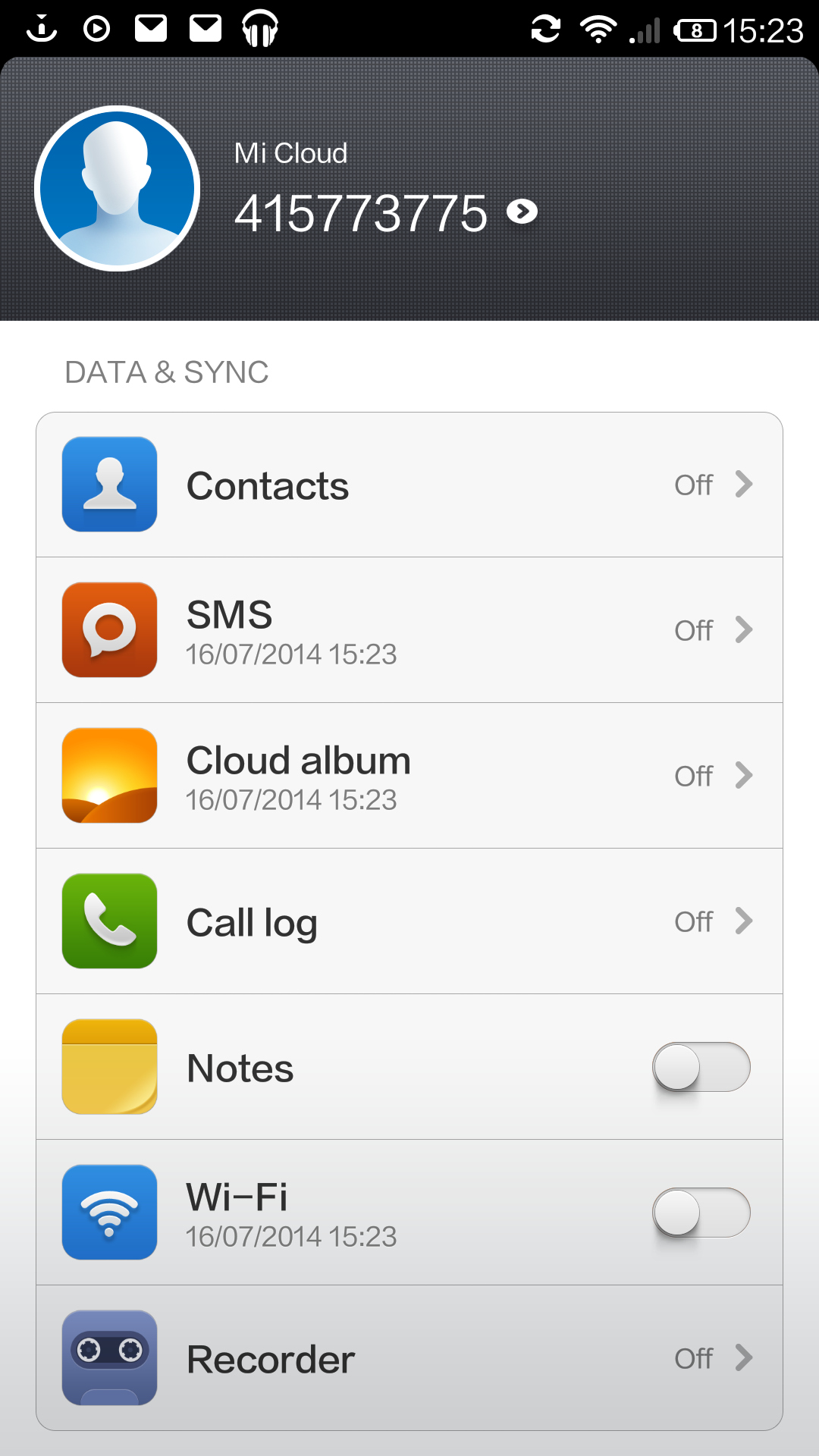
Also exclusive to the Mi 3 from Xiaomi is the Mi Cloud suite. This offers Wi-Fi text messaging, data, photo and SMS backups to some Chinese cloud, remote locking features and more.
Once activated via a password and having a text sent to your phone, the option to sync call logs, contacts, SMS messages, notes and personal notes recorded via the Voice Recorder app to the cloud appears.
Impressively for an import phone from a Chinese maker, this all worked in the UK, with one verification text opening it all up for use, and unlocking 5GB of cloud storage space for photos captured on the Mi 3, too.
There's also a custom gallery as part of the MIUI software, with the developer creating a simple, square-based grid populated with your pics. It looks a little bit like the one Sony sticks in its Xperia models, only without the fancy resizing features.

It's a bit boring, but it's fast and also incorporates a simple editing tool that lets snappers crop and rotate shots, draw over the top of them via a doodle feature, add a selection of vignette and colour/brightness filters and stick the end result in a variety of fairly pointless photo frames.
The email app is a slightly skinned version Google's stock client. It's simple to setup and use, automatically managing account creation for most major providers with only an address and password needed to get it going.
