Why you can trust TechRadar
The Yotaphone 2 is a compelling device and for those looking for something different from a top of the range smartphone this is one of the most left-field options around.
It will turn heads, spark conversation and genuinely impress anyone you show it to. That's all well and good, but it's difficult to actually recommend.
We liked
The innovation and engineering achievement with the Yotaphone 2 is truly impressive, and the folks at Yota Devices have done a sterling job to create such a unique device.
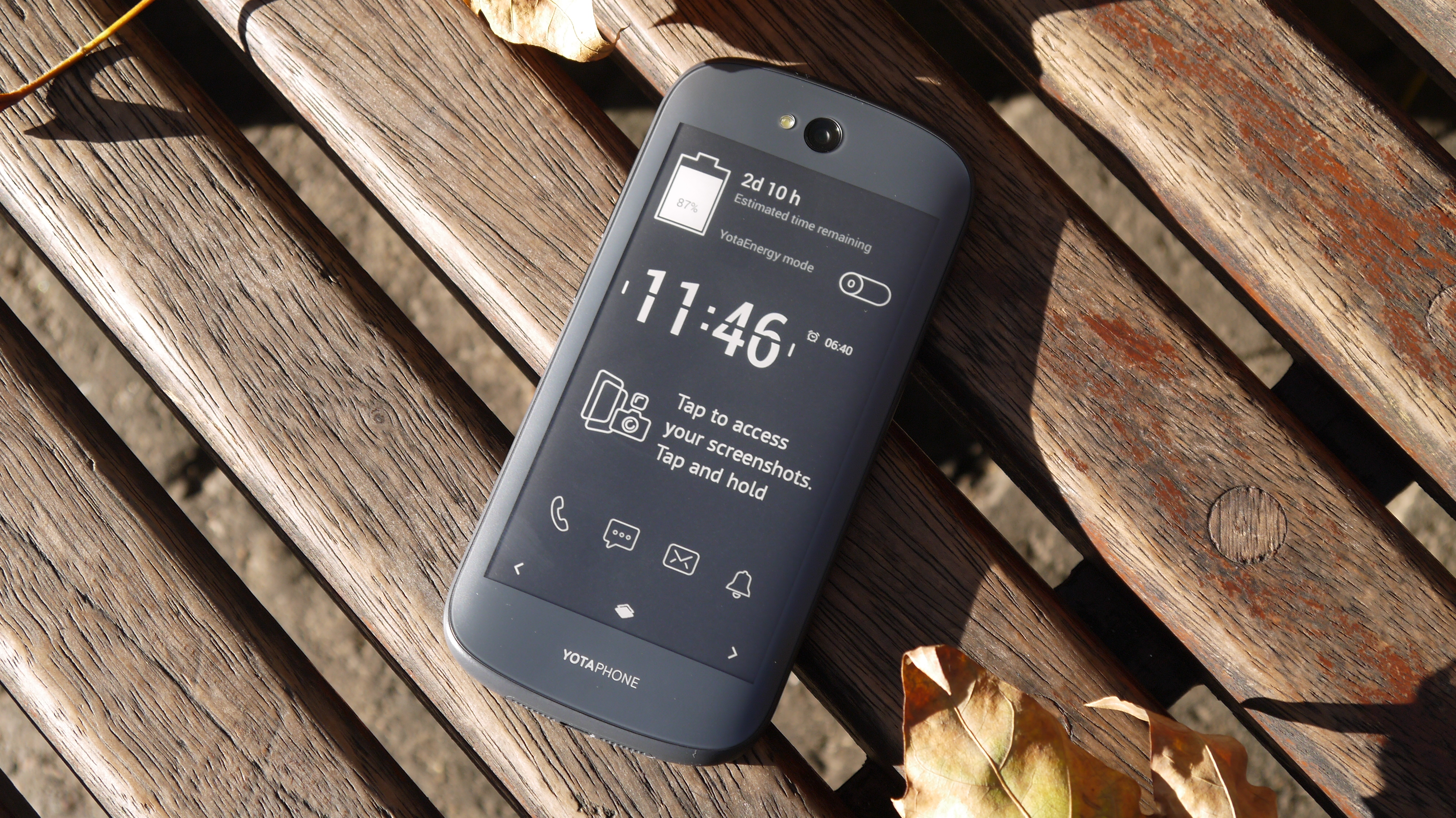
I found the always on screen useful, with vital information popping into view without me having to even touch the handset, and the power saving benefits are a clear plus point.
I was also impressed with YotaMirror - giving full access to the Android interface on the monochrome display. Sure it's not as slick, nor does it look great, but it does work.
We disliked
Favour the colour display on the Yotaphone 2 and battery life takes a beating - you'll be lucky if it lasts a full day on a single charge.
That's partly down to the additional processing power required to keep the rear display constantly updated, but also the older Snapdragon 800 processor. Considering the top phones of 2014 are rocking the power efficient 801 chip, it's a real shame the processor here is over a year and a half old.
The rear display is fun, but I found I wasn't using it as often as Yota would perhaps like. Knowing you have the faster, slicker full HD display on the other is too much of a draw a lot of the time.
Text input on the EPD (Electronic Paper Display) is slow, and browsing can become tedious and you wait for the screen to play catch up. There were times where I did find it useful, but they didn't feel like paying the premium price tag for.
Verdict
I get the benefits of the EPD on the Yotaphone 2, but ultimately it still feels like a work in progress with clear-cut, everyday advantages still missing.
I question just how useful the rear screen is with its slow refresh rates and limited app integration. I'd like to see a slicker interface and some big name developers really get behind it.
Ignore the rear display altogether and it's a competent Android smartphone with a decent level of power, mid-range camera and solid build.
The Yotaphone 2 is a huge leap forward from the original and it's certainly a product which can appeal to a wider consumer base, but unless you're desperate for a dual-screened smartphone there are better options to blow your cash on.
First reviewed: November 2014

TechRadar's former Global Managing Editor, John has been a technology journalist for more than a decade, and over the years has built up a vast knowledge of the tech industry. He’s interviewed CEOs from some of the world’s biggest tech firms, visited their HQs, and appeared on live TV and radio, including Sky News, BBC News, BBC World News, Al Jazeera, LBC, and BBC Radio 4.
