Why you can trust TechRadar
Check out the press blurb surrounding the launch of the Blade S6, and you might be surprised to learn that ZTE views its Smart Sense function as the handset's defining feature.
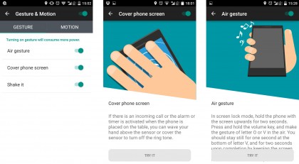
I say surprised, because the feature completely escaped my notice for most of the time I spent with the phone. It's turned off by default, and it's not even labeled as Smart Sense on the phone. Instead, it's buried away as part of the rather unassuming Gesture & Motion app.
Once activated, Smart Sense lets you initiate certain functions with various gestures and motions. These vary in usefulness from "kind of cool I guess" to "why on earth would I want to do that?"
On the gesture front, there are the ultra-fiddly music app shortcuts that let you play and pause tracks by holding the volume down key and moving the Blade S6 in a V and a O shape respectively.

This function is already off to a loser by virtue of the fact that it only works with the stock Music app, which will probably be sidelined by Google Music or your music subscription app of choice.
It's also just a really flaky system, and it's much easier just to hit the power button and used the lock screen music controls that are baked into Android 5.0 Lollipop.
The ability to silence alarms or answer phone calls by swiping over the phone when it's lying flat on a table might have been of some use if it wasn't so hit and miss, and the option to boot up the torch or calculator apps by shaking the phone is possibly the least reliable gesture of the lot.
Smart Sense is a good idea, but the fact that it can be backgrounded and forgotten so readily tells you everything about its practical worth and usability.

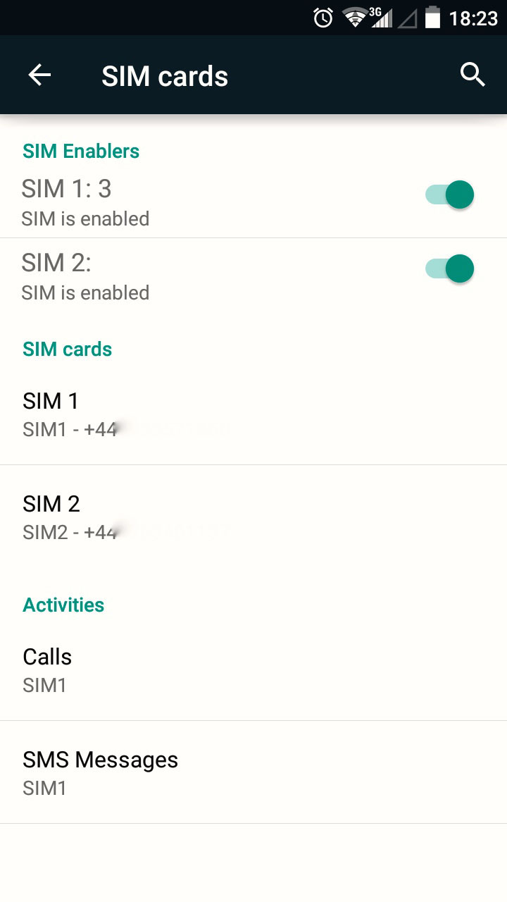
Another defining feature of the ZTE Blade S6 is its dual-SIM set-up. You can sit two nano SIMs side by side the SIM tray, allowing you to run two phone accounts from the one handset.
This feature has been available for years in feature phones and smartphones in the developing world, but we only get the odd niche handset supporting the feature in the west. It's actually very handy if you're someone who has to lug two phones around with you – one for work and one for personal use.
The execution feels a little clunky and shoehorned in here, but with Android 5.1 adding native support for dual-SIM set-ups, the ZTE Blade S6 should only get better in this regard once it receives the update.
Probably of more interests to users in places like the UK, the US and Australia will be the fact that the ZTE Blade S6 runs on Qualcomm's Snapdragon 615 CPU. There'll be more detail on this chip's in the next section, but it's worth pointing out that ZTE is claiming that the Blade S6 is the "World's first Android-L mobile phones powered by Qualcomm Snapdragon 615."
This is notable because the Snapdragon 615, while a decidedly mid-range chip, is built on a 64-bit architecture. This doesn't make a huge difference in practical terms, but it does mean that the Blade S6 is future-friendly and well set-up for the 64-bit Android 5.0 Lollipop OS.
Indeed, the fact that the ZTE Blade S6 comes with Android 5.0 Lollipop is a noteworthy feature in itself. What's more, this is a pretty faithful version of Google's most attractive and advanced mobile OS yet.
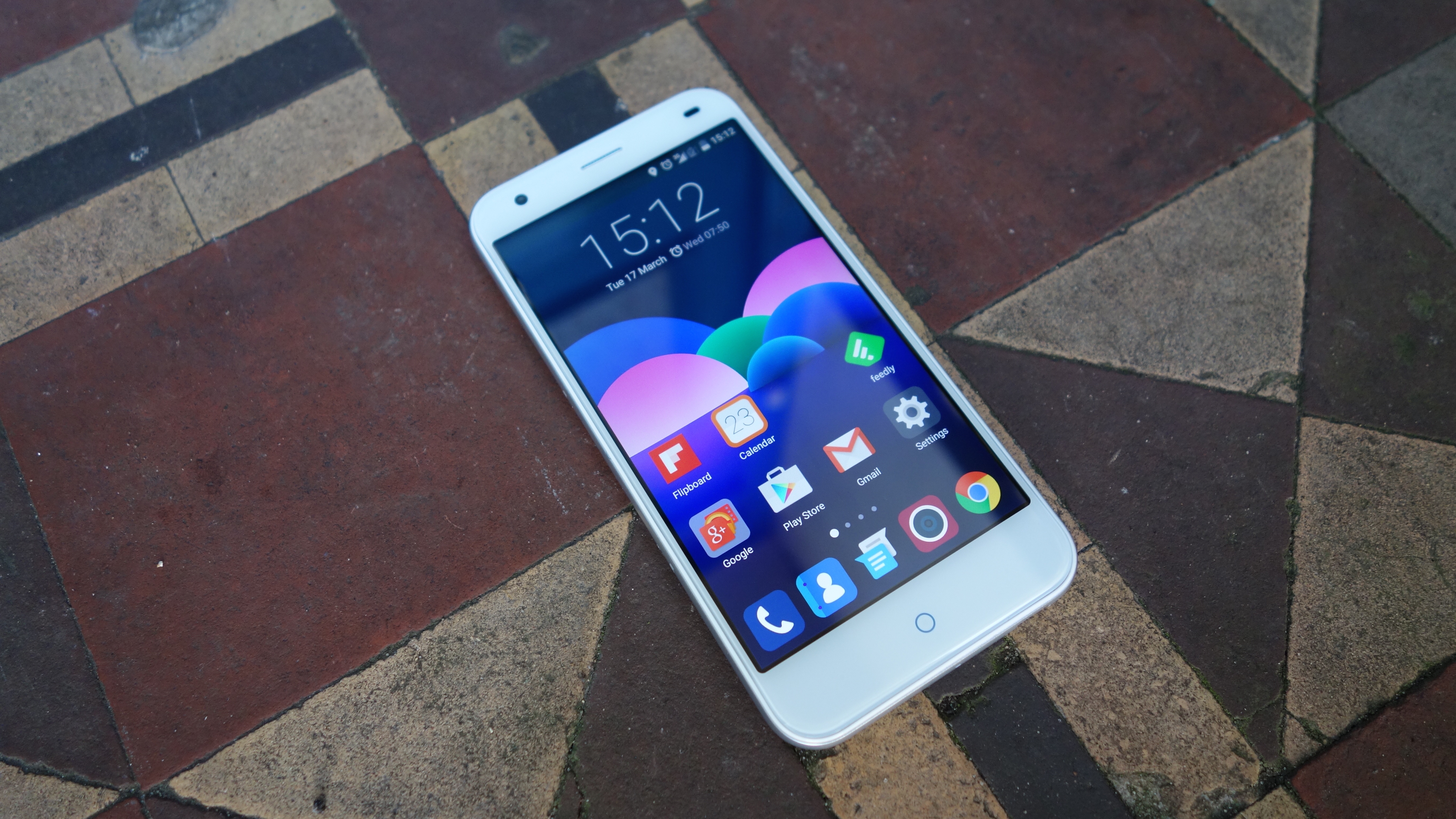
Layered on top is ZTE's MiFavor 3.0 UI, which is one of the less obtrusive and fussy custom Android interfaces manufacturers have come up with.
Android 5.0's core components are pretty much unchanged, including its slick menus, notification bar, and multitasking function. This is a very good thing, and actually makes the Blade S6 nicer to operate (in software terms at least) than many more expensive handsets from more established manufacturers.

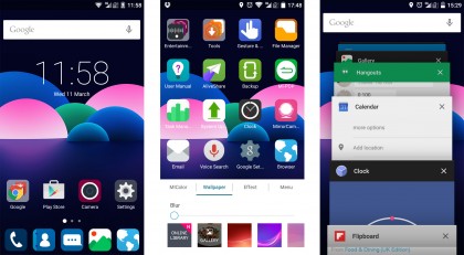
ZTE has made a couple of changes though, the most obvious of which is the fact that there's no app tray. As in iOS, your apps are simply spread across however many home screens they need. You still get access to app folders, though, which can be set up by dragging and dropping the icons onto one another.
There's also a rather pointless personalisation menu here, which is initiated by swiping up on the home screen as in iOS 8's quick settings menu. This offers instant access to background colour, wallpaper and menu animation changes.
I'm not opposed to personalisation, but is this really the best use of such a readily accessible menu? We'd rather ZTE had used this gesture to provide quick access to handy tools such as the torch and the calculator, like in iOS 8.
Still, if you download the Google Now Launcher, Google Camera, and Google Keyboard, you'll essentially get something approaching a stock Android 5.0 Lollipop experience, which is pretty cool – and still all too rare.
