Why you can trust TechRadar
Android Jelly Bean 4.1 is the OS of choice for the ZTE Blade V, and we are less than hopeful for an update to take it to any of the superseding Android Jelly Bean updates, let alone to Android 4.4 KitKat.

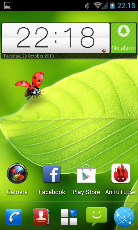
There is a little bit of skinning over the top of Android, there are a few noticeable UI changes such as icons and a new lock screen, but on the whole ZTE has stuck with the vanilla Android.
Whilst this means that there is not a lot of added functionality, it does mean that anybody that has used Android before will feel right at home.
The quad-core processor comes right into play here, and to cut things short, we were a little disappointed. There was none of the nip, buzz or kapow that we have become used to with quad-core chips.
We did notice some difference over the top of other processors, noticeably over that of the Samsung Galaxy Fame, but we somehow expected a little more.
Starting at the lock screen, you can see one of ZTE's biggest changes. Holding the padlock will give a quick animation and unlock the screen. Pinching out will give you a choice of apps to quick launch.
We've seen quick launching into apps done much better, look at TouchWiz on the Galaxy Fame. We found that it felt too fiddly, and didn't always respond.

Throughout the UI, you can see the few custom icons which does help make the Blade V feel a little different, but we're glad that there is still a very Android heavy flavour.
This means that the app drawer is still there. Cue sighs of relief, not least because the Emotion UI on the likes of the Huawei Ascend Y300 omits it.
As we mentioned, standard Android flows through the ZTE Blade V, meaning that populating the nine home screens with widgets and apps is done by long pressing them from the app drawer. Deleting is done by long pressing and swiping upwards.
Notifications are also at the top as usual, with access being done by dragging the bar downwards. Again, being Android Jelly Bean, notifications can be expanded and swiped away.
We weren't blown away by the interface on the ZTE Blade V, the optimal word is probably underwhelmed. It is nowhere near as intuitive as TouchWiz, but far better than the Emotion UI that comes on Huawei devices.
The quad-core chip kept things moving along nicely, but there is no way that it comes close to those that populate the flagship phones. Honestly? We'd rather have seen a larger dual-core chip.
