Why you can trust TechRadar
Contacts
Anybody that has used an Android phone before will feel instantly at home with the ZTE Blade V.
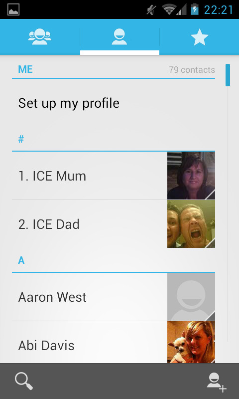
The standard light blue and white screen that is on all standard contacts screen is there, almost identical to that on the Huawei Ascend Y300. The biggest difference we noted was that the contact images were on the right, not the left.

A list of all your friends is presented in a typical fashion, with a standard list of names. It's a functional app, with not a lot that can be pointed out that is different or special compared to others.
That isn't necessarily a bad thing, as it means that it doesn't overload you with hundreds of thousands of added features that you just don't need or want.
Being Android, the ZTE Blade V will pull in all your contacts from all your varying social media apps, such as Facebook and Twitter. These will then be aggregated, and can be joined easily enough.
The Contacts app also comes with the standard Android Groups and Favourites functionality. We can't say that we find it particularly useful, but we haven't got enough contacts, nor are they sorted well enough.
It does mean that you can access and message people a lot easier though, and that can't be a bad thing.
Tapping the contacts image brings up a little contact card which makes things slightly easier when it comes to contacting. It isn't on the same level as swiping left and right to call or message, as in TouchWiz on the Galaxy Fame, but it works well enough.
Calling
From the contacts screen, calling someone is easy as pie. Tap their photo, then their number and the phone will dial them for you.
For those that either don't want to rummage through their contact list, or are dialling a new number, you can access the dialler screen by tapping the little phone icon on the dock.

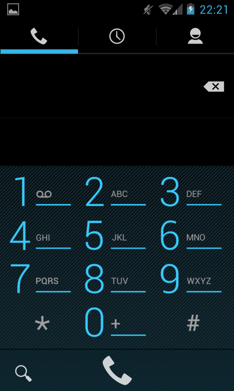
This brings up the standard dialler that every man and his dog will have used. Well, every dog that has ever used a telephone that is.
It is the same standard blue and black dialler that comes with Android, and it still supports smart dialling. Smart dialling is something that we have found to be useful, but only when searching for a number that we've dialled but not saved.
It can also be used to search through your contact list, but we always go via the contacts app for that.
It seems a little odd that there isn't a direct link between the contacts and dialler app, if only because that is something that we have always seen on other devices. Instead, you are greeted with three tabs; the dialler, call logs and most contacted.
For call quality, we can't complain. We talked, the people on the other end heard. Simple really. Being locked to Virgin (that backs off EE) did mean that we didn't really struggle for signal, except in areas that we knew our EE phone suffers.
