Why you can trust TechRadar
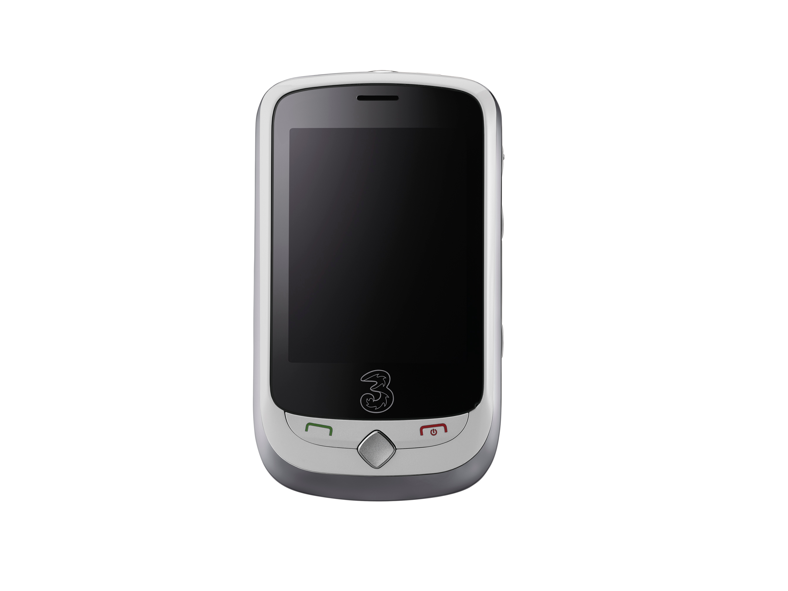
As a touchscreen handset, ZTE has obviously tried to emulate Android and, in some respects, it's done a pretty good job.
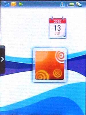
There are three Home screens and you move between them by sweeping left and right.
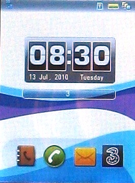
The middle one offers the date and time, as well as shortcuts to the phone book, dialler, messaging and a whole host of online services. Tap the 3 icon and you get taken to a screen offering a choice between online options, for example Google, Facebook, YouTube, Twitter and more.
There are further screens of bookmarks you can scroll to, offering the likes of Wikipedia, eBay, the 3 Music Store, Myspace – a host of bookmarks, in fact.
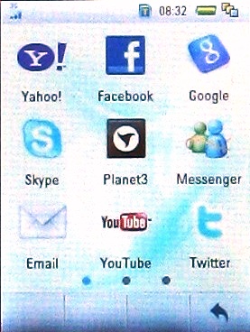
The screen on the right is set up out of the box for access to the 3 Mobile web site, Windows Live Messenger, and Skype services, which are free to 3 Mobile customers.
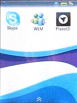
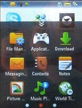
You can add more shortcuts by sweeping upwards and dragging what you want off an icons menu, which looks basically to replicate the entire apps menu. There are three screens of shortcuts to choose from, totalling 25 in all.
The left-hand Home screen is again customisable, though this time via a Samsung TouchWiz-like side menu from which you drag icons onto the screen. The widgets here can be animated and there's a live music control app that enables you to pause and play tunes.
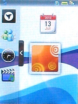
The range of widgets is limited, but it does allow for a modicum of customisation.
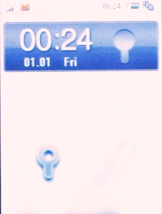
Another neat touch is the unlock screen. Yeah, you could just simply press something or slide a button to the left or right. But ZTE has gone for quirky, and we like the system as much as we liked the fit-a-puzzle-piece-to-unlock system in the Samsung Wave.
In this case you move a sort of stylised key symbol over a similar lock symbol to unlock the handset. We like.
Current page: ZTE F930: Interface
Prev Page ZTE F930: Overview and design Next Page ZTE F930: Contacts, calls and messaging