Why you can trust TechRadar
For our money, the biggest selling point for the ZTE Grand X relates to its interface.
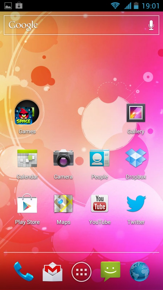
The fact that it ships with Android 4.0 is nice, but that's becoming increasingly common among even mid-range devices now (just as Android 4.1 shows up on high-end devices, but that's a grumble for another time).
No, what really floats our boat here is that the Grand X comes with stock Android 4.0. This means that you're getting pure, unadulterated Ice Cream Sandwich the way Google intended it.
Can you name a high-end Android device that can boast this? There's the Samsung Galaxy Nexus and, umm, that's it.
The reason this is such big news is that stock Android 4.0 is one of the nicest mobile operating systems to use. It's the first Android OS to feel unified, distinctive and classy.
It's got its own original font, called Roboto, which gives the OS its own strong identity, while improved widget support means you can easily resize them according to your needs.
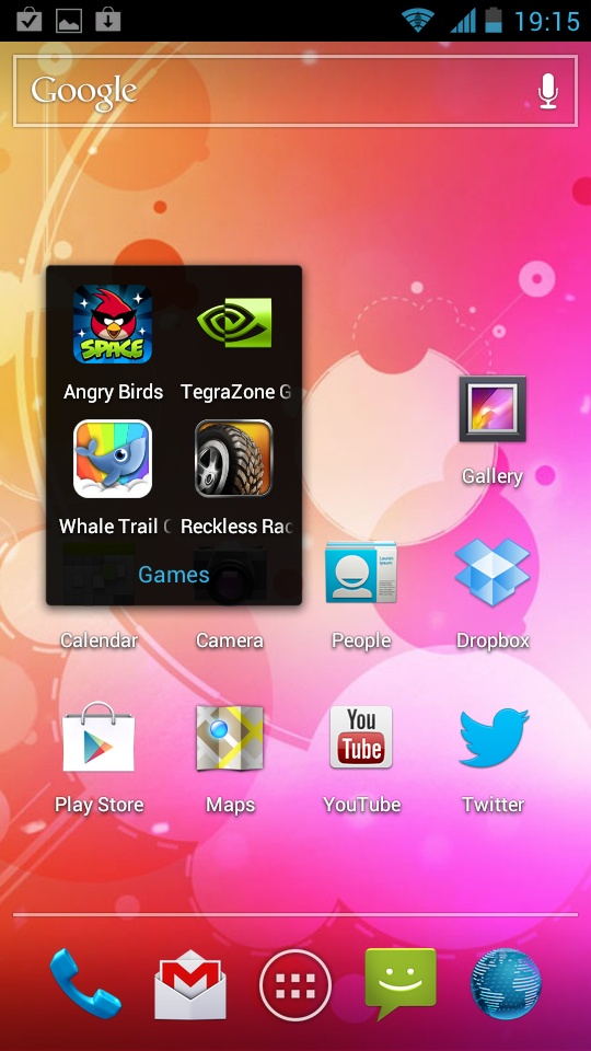
Apps can now be dragged on top of each other to automatically create folders - perfect for keeping all your games or social media apps in one place.
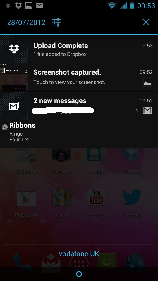
The notification menu, accessed as ever by dragging down from the top, is as useful as it is slick.
Emails, calendar entries, Dropbox uploads, update notifications - you name it, all are handled with distinctive but never in-your-face icons, and each can be dismissed from the menu with a swipe of your finger.
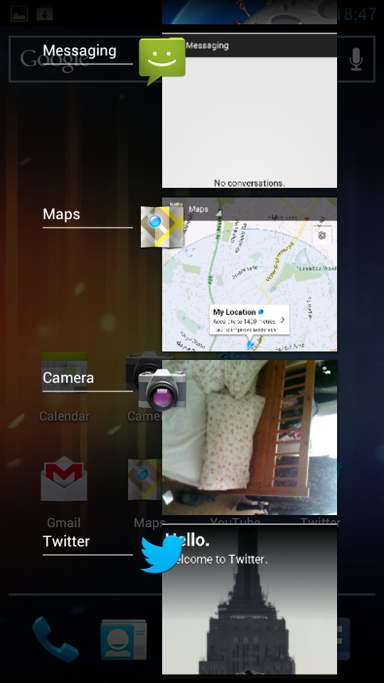
As can recently used apps held in stasis, which can be accessed at any point from the multitasking menu.
The way in which this is accessed on the ZTE Grand X - by touching and holding the Home key - is actually a little unintuitive, and we wonder why ZTE didn't implement a dedicated control in place of the search button.
It's far more useful than either, and it would bring it more in line with the Galaxy Nexus, which, after all, was designed in conjunction with Android 4.0.
Regardless of these niggles, the fact remains that stock Ice Cream Sandwich is an astonishingly good mobile OS, and it gives the ZTE Grand X a massive advantage.
Other Android manufacturers have generally attempted to enhance or differentiate the Android 4.0 OS for their own handsets, but their efforts invariably end in an inferior product.
Yes, we include the very latest versions of Samsung's TouchWiz and HTC's Sense UI in that description, regardless of the improvements both have made.
This leaves us to make the following startling statement: the £189.99 ZTE Grand X has a nicer user interface than the Samsung Galaxy S3 and the HTC One X, which retail for more than twice the price.
Of course, we're not saying that it necessarily feels better than these Android titans.
Our main gripe with stock Android 4.0 on the ZTE Grand X is the phone's qHD screen - it's simply not sharp enough to show Ice Cream Sandwich at its best. The latest Android OS was designed with 720p displays in mind.
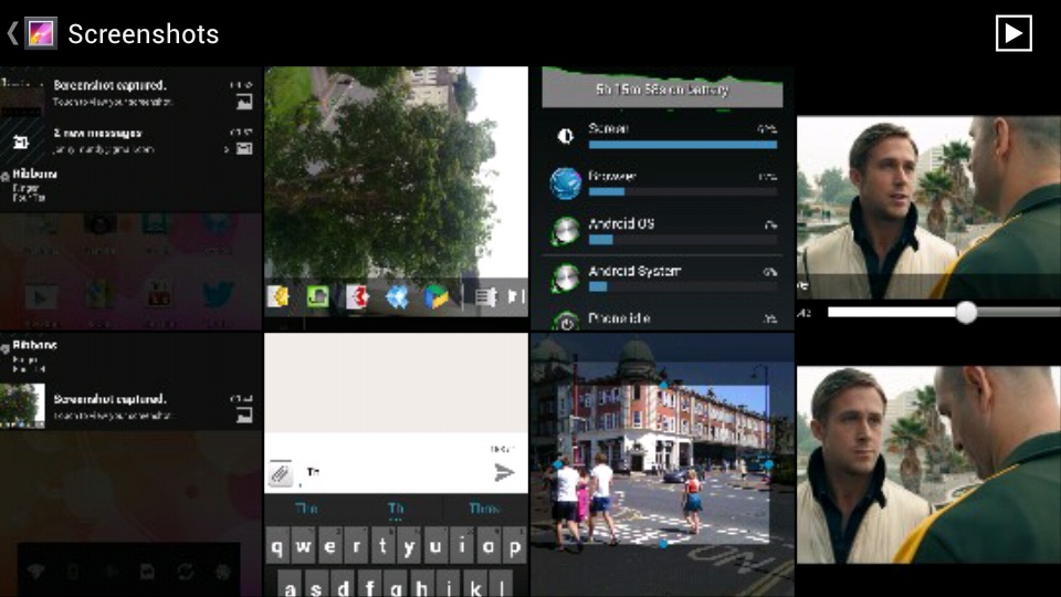
This is most apparent when you initiate the multitasking function or viewing preview thumbnails in the Gallery. Text here appears fuzzy, indistinct and really quite ugly, whereas on the Samsung Galaxy Nexus it remains perfectly legible.
Otherwise we have all the benefits of stock Android 4.0, and it runs almost as well on the ZTE Grand X as it does the Google flagship.
That it's not quite as fluid is likely down to the relatively inferior Tegra 2 SoC, while the fact that it's backed here by half the amount of RAM doesn't help either.
