Why you can trust TechRadar
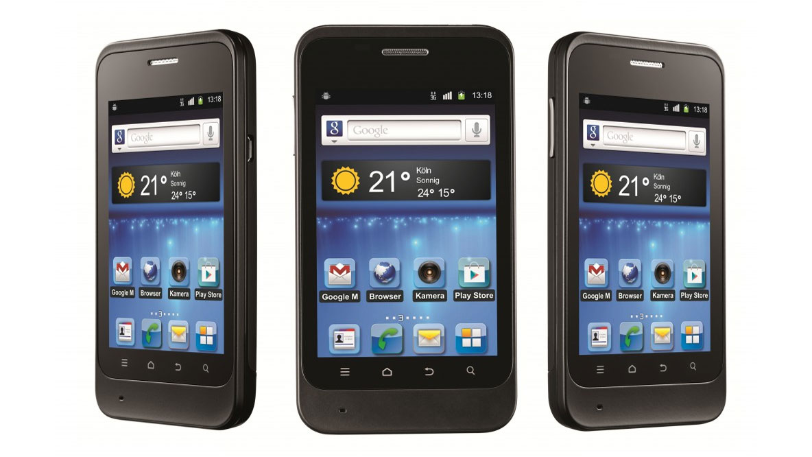
ZTE have put their own custom interface over the standard Android OS, although haven't given it a name like Samsung's TouchWiz, HTC's Sense or even the amazingly-named Huawei Android Platform 5.1 which, you guessed it, graces Huawei devices like the Huawei Ascend G300.
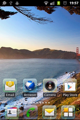
What ZTE's customisation actually brings is very minimal.
Icons throughout the Kis have a lozenge-shaped background that brings a smart uniform feel to the device, but otherwise the icons are the standard Android affair.
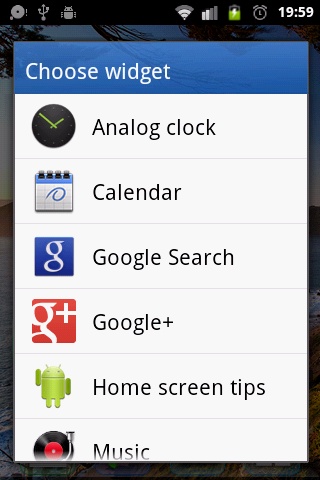
As for widgets, we were more than a little bit shocked to find no digital clock.
Every UI we have used in the past brings a smart digital clock; HTC are well renowned for theirs.
We were also disappointed with the lack of custom widgets: again, just the standard Android offerings.
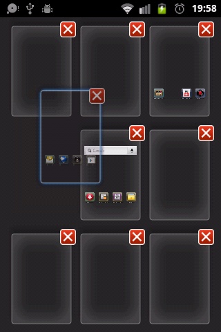
ZTE have chosen to offer an initial seven home screens on the Kis. We love our widgets, so this is a blessing, but given the UI's lack of any real widget offering, this is slightly confusing.
There is no option to choose which of the nine is to be your home screen, but long-pressing means you can move the screens around - handy for setting the phone up the way you want.
Again, there are no custom animations to speak of, just the standard Android offerings, which can be turned off in the settings menu.
Apps don't load up instantaneously, and animations make the device feel slow. With animations off, the Kis is noticeably faster.
The apps drawer is a smart affair, with the home screen dock being persistent in the drawer.
Having an infinite loop on the drawer is a welcome feature too, with the drawer screen number displayed at the bottom of the screen.
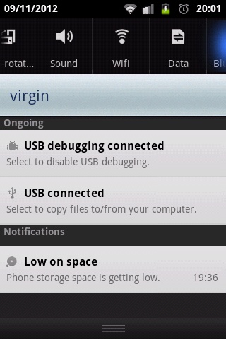
There is a tiny bit of customisation to the notification bar, with the ZTE KIS putting in quick settings on the notification bar. We've seen this on other phones, and we've admired it.
Unfortunately, the tiny screen means you can only see four at a time, and there are nine to choose from.
Selected items are illuminated from grey to white, which isn't always distinguishable, meaning that you can't always tell what's selected.
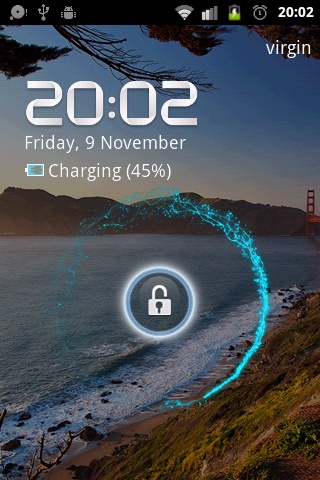
The lock screen is fairly simple to use, by long-pressing the icon in the middle.
A little swirl appears around the icon, which probably made us smile a bit more than it meant to.
It's a small feature, but something that, unlike other areas, hasn't been overlooked.
Being based on Android means that anybody with any knowledge of the OS will be able to immediately navigate.
The simple UI doesn't add a great deal to the OS, but it certainly doesn't detract from its simplicity, making it ideal as a first smartphone.
Despite this, we were still a little disappointed that ZTE haven't fashioned a way of differentiating themselves in the same way that other manufacturers have.
The mobile market is getting packed, especially at the budget end, as last year's high-end models - such as the Samsung Galaxy S2 - suddenly become a lot more affordable.
Every other major handset manufacturer, even ZTE's Chinese cousin Huawei, have managed to skin Android and still keep costs minimal.
The uniform feel may be clean and pleasant to look at, but there is no real added functionality at all. In many ways, this smartphone feels a lot less "smart" because of it.
