TechRadar Verdict
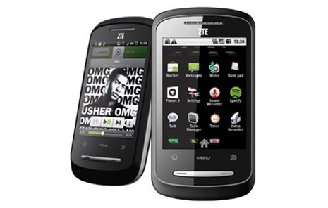
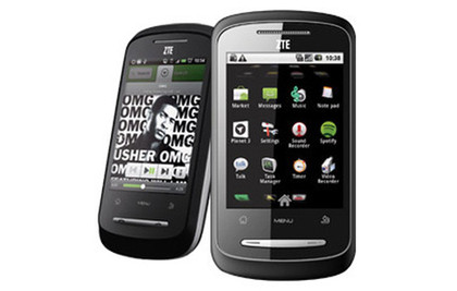
The ZTE racer presents incredible value for first time Android users. It's better than its competitors and boasts the functionality only seen on much more expensive handsets until very recently. It's an ideal first smartphone, but be wary of that middle-ages touchscreen.
Pros
- +
First Android under £100
- +
Good music player
- +
Facebook and Twitter syncing with contacts
- +
Decent build and design
- +
Google Maps Navigation
Cons
- -
Terrible touchscreen
- -
Typing is a chore
- -
Battery life not up to scratch
- -
Poor camera
- -
Buggy accelerometer in media player
Why you can trust TechRadar
The world is going Android crazy, with Google currently registering 200,000 activations per day. Is that a reflection of the popularity of the operating system or the sheer number of phones now jumping on board?
It's probably a mixture of both but, given those figures, we're going to see more and more phones like the ZTE Racer.
This sub-£100 Android 2.1-packing smartphone is the cheapest device to offer the Google operating system yet, and ZTE's first.
Affordable Android appears to be the order of the day. The T-Mobile Pulse Mini, Vodafone 845 and LG Optimus have all offered cheap alternatives to the blockbusting HTC, Samsung and Motorola Android phones, but can ZTE make an impression where those before have failed?
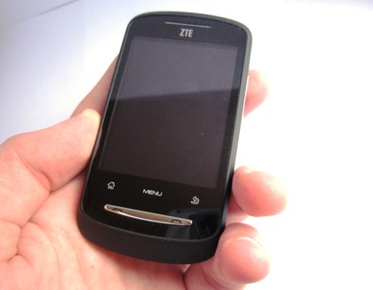
For a budget handset, the ZTE racer has quite a solid feel. Its smooth, matt plastic finish encases a 2.8-inch touchscreen, and below that are three touch-sensitive buttons: Home, Menu and Back.
Strangely, there's no search button. It's something we're used to seeing pretty on much every Android device, and it's missed here. If you want to access the phone's general search functionality, you'll need to do so through the Menu key.
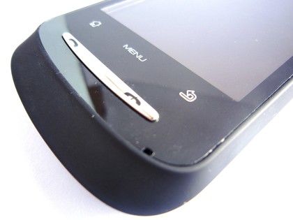
Beneath those buttons sits a backlit plastic strip with a metallic finish, providing the Call and End call functionality. The strip lights up when any of the phone's keys pressed, while holding End call brings up the power menu. Overall it's quite an eye-catching feature.
The back of the device is also very pretty. We really like the matt finish; it gives the phone a pleasant feel, although it does get grubby pretty quickly. Everyone loves the Android robot, so it's nice to see him plastered on the back of the device.
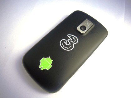
Probably less welcome is the whopping great Three Mobile icon. The underdog network is again partnering with the Chinese manufacturer, as it has on many of its budget devices.
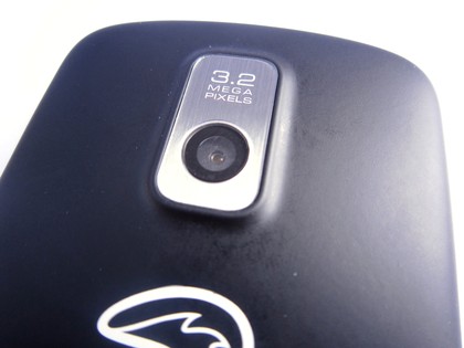
The silver-encased 3.2-megapixel camera's lens sits dead centre at the top of the handset. It's an interesting placement, but not an unwelcome one, because it keeps our paws out of the frame.
At 100g, the device has a reassuringly weighty feel, and most of the weight on this pocket-friendly 102 x 55 x 14.5mm device appears to sit at the thicker top half of the device, which becomes slimmer as it moves to the bottom.
This is a contrast to devices like the Vodafone 845, which serves up a rather flimsy-feeling symmetrical handset. The Racer is better.
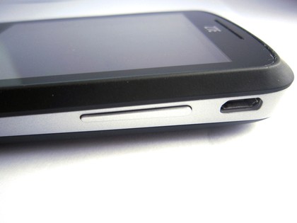
The sides of the device are a stylish silver, the varying width of which reflects the shape of the handset. The left-hand side is clear of controls, while the right side has an uncovered micro-USB charging port and the volume bar. There's no hard camera button.
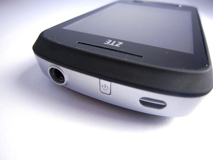
On top of the device is a 3.5mm jack and an extremely small power and screen-lock key. It's really too small and awkward to get at when using the device. Thankfully, you can wake the screen by pressing the touch-sensitive panel if the screen has timed out, rather than locking.
Overall, however, the candybar design feels comfortable to use and sits very nicely in the hand. The varying weight of the top and the bottom lends itself to quite a high grip.
Something that lets the phone down a little is how visible the edges of the touchscreen panel are. It goes a little way to cheapening what is definitely one of the most well designed budget handsets on the market.
Current page: ZTE Racer: Overview, design and feel
Next Page ZTE Racer: InterfaceA technology journalist, writer and videographer of many magazines and websites including T3, Gadget Magazine and TechRadar.com. He specializes in applications for smartphones, tablets and handheld devices, with bylines also at The Guardian, WIRED, Trusted Reviews and Wareable. Chris is also the podcast host for The Liverpool Way. As well as tech and football, Chris is a pop-punk fan and enjoys the art of wrasslin'.
