Why you can trust TechRadar
Android is an open source operating system, meaning that manufacturers can do an awful lot with the bare bones interface to make it their own, or very little and still have an awesome OS.
Motoblur on the Motorola Dext is an excellent social networking UI, Sony Ericsson's Timescape on the Xperia X10 series is very attractive, while Sense on the HTC Desire et al sets the benchmark for everyone.
The lower-end Android devices have, understandably, not gone overboard on producing their own UIs. Indeed, there's a very real risk of a multitude of cheap identikit Android handsets, manufactured by any man and his dog.
It's incredibly simple to get an Android phone on the market with very little work, and even less thought.
The Acer Liquid E, Vodafone 845 and T-Mobile Pulse Mini have done very little with the OS. The ZTE Racer does even less. This is Android 2.1 in its most vanilla form.
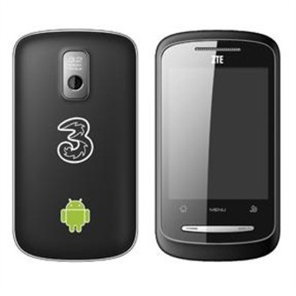
There's no overlay whatsoever. But still, this is Android 2.1 for a penny shy of £100, which is an incredibly positive thing.
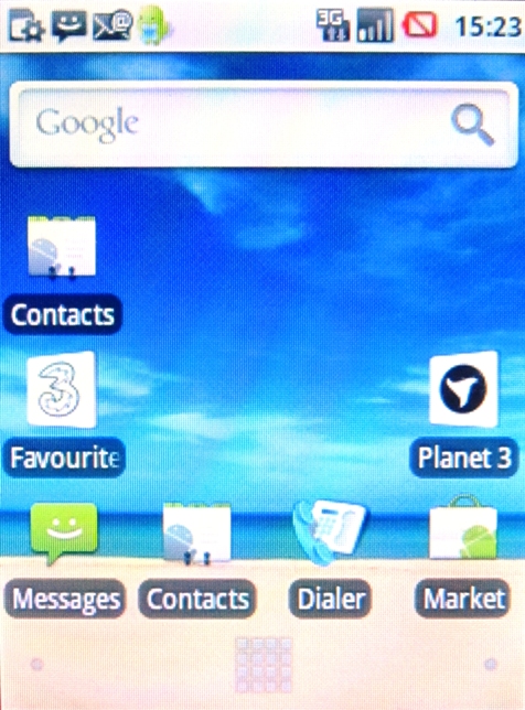
The Racer opts for the basic three Home screen approach, all of which are highly customisable.
Preloaded onto the interface is the indispensable Google search bar, which sadly lacks the speech-to-text functionality we've seen on most Android phones lately.
We've also got Messages, Contacts, Dialler and Market, as well as a couple of Three Mobile widgets, which are the only things that distinguish this handset from plain Android.
When we began using the device, the first thing that became apparent is just how resistive the 2.8-inch resistive really touchscreen is.
An iPhone 4-like flick of the thumb has about as much effect as attacking The Incredible Hulk with a Polo mint. It seems that the only thing this handset takes notice of is a bit of tough love because it takes a really solid press to achieve anything.
This is especially apparent when swiping through the Home screens and menus, but also when pushing the on-screen apps and widgets. Your thumb is going to get a real workout and it really gets to be a drag after a while.
The extra force you'll need to exert will leave the screen badly smeared, and littered with fingerprints.
At the foot of each is the grid icon to summon the main Android menu, which appears in the rather attractive conveyor belt system that showcases your apps in a rolling manner, but again it's hindered by the lack of responsiveness.
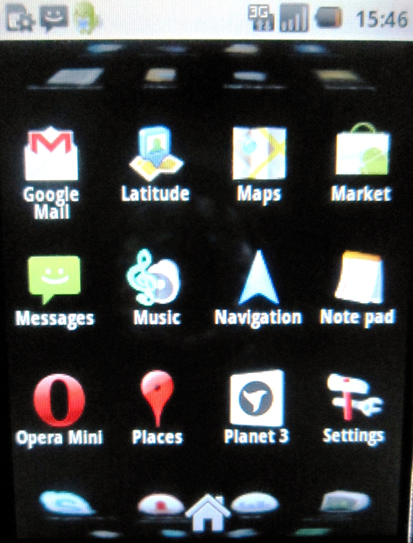
You almost have to press and hold the screen and scroll from there, which can often lead to inadvertently opening applications. It's nowhere near as smooth as on handsets like the Vodafone 845.
Dragging your finger down from the top of the screen brings forth the ever-useful notifications menu, which alerts you to new messages, emails or the progress of your app downloads.
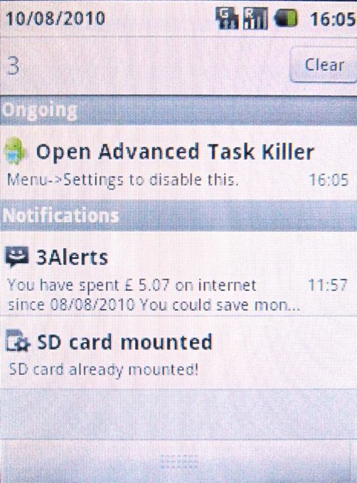
As we mentioned before, you can search the phone's general functionality, which is much like Apple's Spotlight service on the iPhone. Typing in the box will search for apps and contacts, while tapping the magnifying glass will prompt a Google search.
Also on offer in this incarnation of Android are Live Wallpapers, such as Google Maps and the addictive Nexus tap-to-redirect-the-coloured-streams wallpaper, which shot to fame on the Google Nexus One.
They're a nice touch, but we're used to them now, so the novelty of playing with them has worn off.
Another familiar feature is the handy Android control bar, which allows functionality like brightness, Wi-Fi and GPS to be switched on and off without the need for delving deep into the OS.
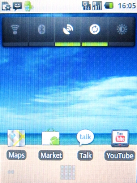
The familiarity is not something we can hold against the ZTE Racer though, it's great to have it on such an affordable handset.
Apps launch quickly and we experienced very few glitches when using the phone. The Android Market crashed a couple of times, but it didn't affect the current download, which kept on ticking.
The 600Mhz processor and 256MB RAM on the device keeps everything moving at a pretty decent pace, as long as you're realistic about how many apps can run without it grinding to a halt.
Overall, the beauty of this interface is that the same functionality seen on a £500 handset can also be achieved in a £100 device. It's the ease and enjoyment of use that will decide which end of that spectrum you'll go for, and for anyone that has used the HTC Desire, you'll know where that extra dime went.
Current page: ZTE Racer: Interface
Prev Page ZTE Racer: Overview, design and feel Next Page ZTE Racer: Contacts and callingA technology journalist, writer and videographer of many magazines and websites including T3, Gadget Magazine and TechRadar.com. He specializes in applications for smartphones, tablets and handheld devices, with bylines also at The Guardian, WIRED, Trusted Reviews and Wareable. Chris is also the podcast host for The Liverpool Way. As well as tech and football, Chris is a pop-punk fan and enjoys the art of wrasslin'.
