Why you can trust TechRadar
Interface and reliability
- Android 6.0.1 is a little old, but still capable
- TouchWiz UI is still here in all its busyness
- Physical home key has useful shortcuts
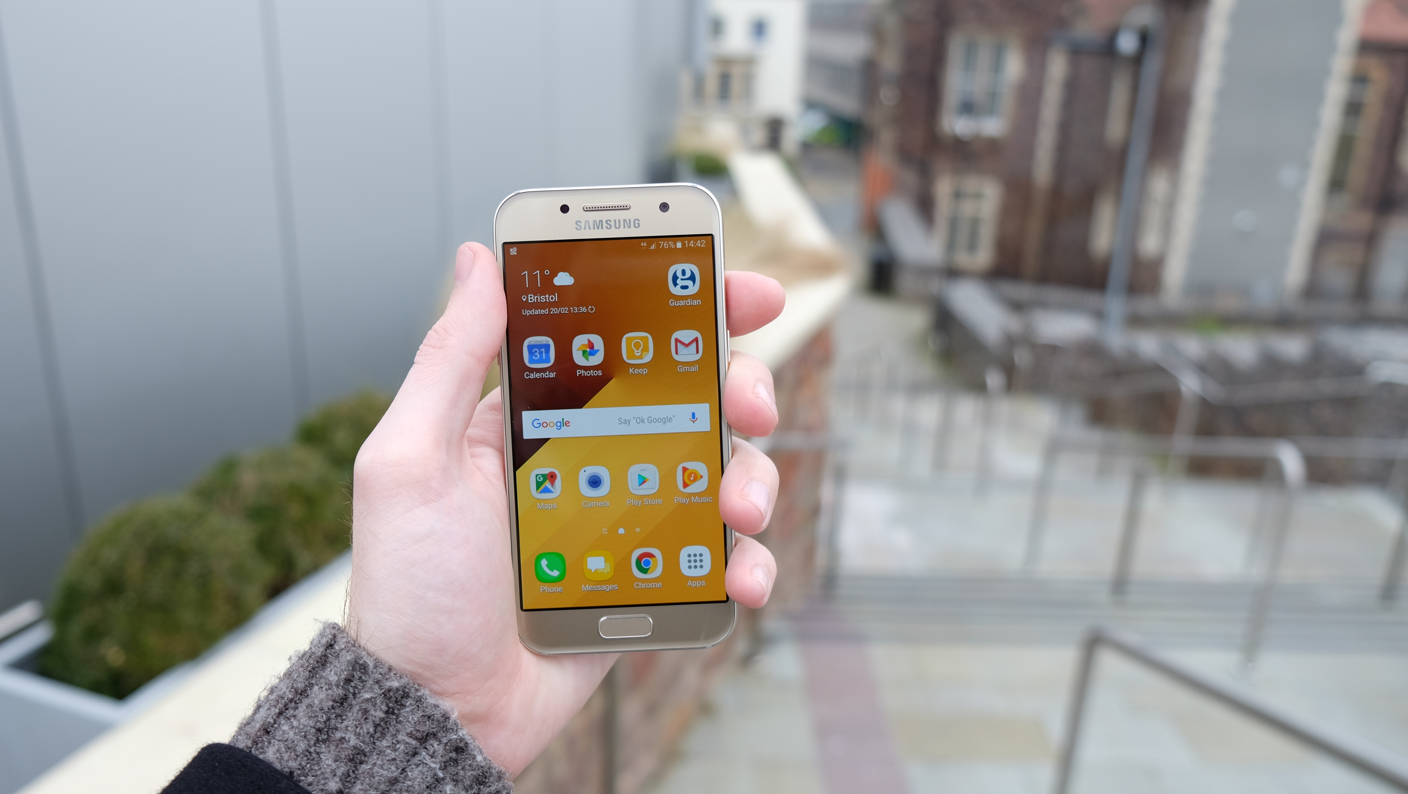
Straight out of the box you’ll find Android 6.0.1 Marshmallow installed on the Samsung Galaxy A3 2017. That’s not the latest version, as Google officially released Android 7.0 Nougat back in August 2016. But in the achingly sluggish world of Android updates, it’s still relatively fresh.
Especially when you consider that Samsung, as always, has spread its gloopy TouchWiz UI on top. Cards on the table: we’ve never been a massive fan, particularly ever since stock Android started getting really good a few versions ago.
TouchWiz has always felt too cluttered and artlessly constructed, and it tends to clog up Samsung’s otherwise highly capable hardware.
To Samsung’s credit, it has slowly but traceably listened to such criticisms of TouchWiz over the years, and what we have on the latest Galaxy A3 is much less obnoxious than the UI used to be.

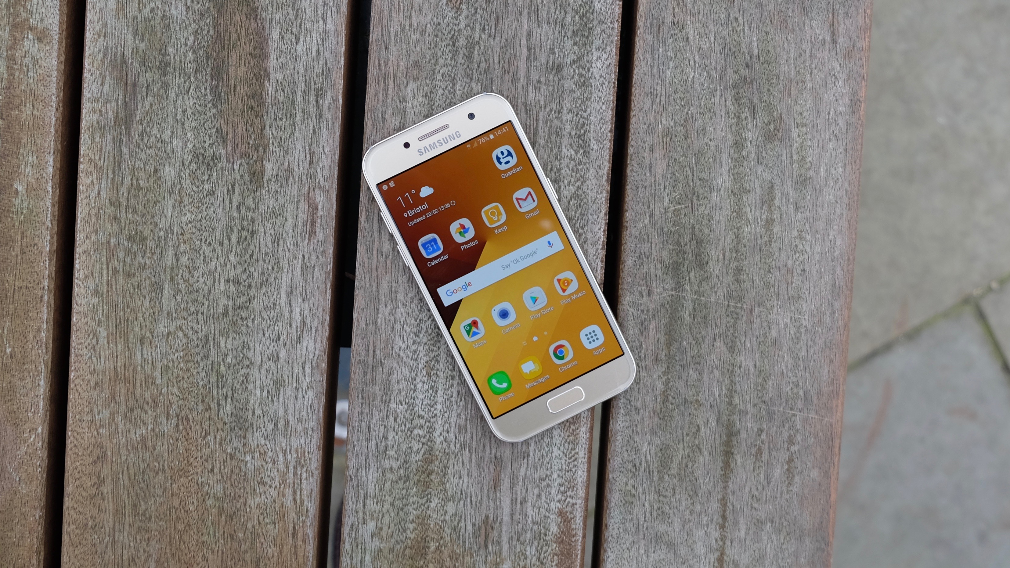
There are just two home screens from the off, and of the three default widgets one is a Google search bar and another is an unassuming weather tool. The third widget is a wholly unnecessary and oversized link to the Galaxy Essentials store for all those Samsung-specific apps you almost certainly don’t need. But as ever, you’re free to remove it.
Samsung’s own take on the drop-down notification bar is still too busy, but it provides all the settings toggles and core functions of stock Android, plus a few more. There’s a Finder bar up there that lets you search for native apps and files stored on the phone, as well as scanning for nearby devices.
We would question why it’s shaped like a search bar when it’s actually a link to a dedicated Finder app, but you come to expect such decisions in TouchWiz, and it’s not a massive hinderance.
Another rather unwelcome provision is the dedicated Upday screen, located to the left of the main homescreen. Upday is a news aggregator service, pulling together stories from around the web and presenting them in a magazine-like format. These stories are apparently selected according to your interests.

We say ‘apparently’ because we don’t recall ever showing the slightest interest in news of the world’s fattest woman, or in Trinny Woodall’s latest wardrobe malfunction.
This can be rectified by going through and hiding news from unwanted sources and marking individual stories as uninteresting or interesting, so that the app learns more about your tastes.
Alternatively, you can switch Upday off by pressing and holding on an empty area of the home screen and scrolling across to it, which was our preference. Unfortunately, there doesn’t seem to be an option to replace it with the ever-useful Google Now. You’ll have to use the aforementioned Google widget instead.
You can access Google Now On Tap with a press and hold of the home button. This provides contextual information based on what’s on the screen at that particular time - though it’s still a somewhat hit and miss offering from Google.
Our favorite Samsung interface choice actually relates to that physical home button. Pressing it twice quickly will jump you straight to the camera, even from the lock screen. It’s a brilliantly snappy and reliable way to grab a picture in a pinch, and we wish every manufacturer with a physical home button did the same thing (hear that Apple?).

Speaking of the home button, it contains a fingerprint sensor for secure access and mobile payments. It works quite well, if not as quickly as the Samsung Galaxy S7 and the iPhone 7 - which you’d expect. The point is that it’s sufficiently reliable, so we didn’t once consider turning the feature off, as we often do with such a feature on cheaper phones.
Having said that, the lozenge shape Samsung goes with ensures you have to be a little more precise with your finger placement than you do with Apple’s phones.
We still much prefer this over rear-mounted Android alternatives, as you can quickly unlock the phone even when it’s on a desk or table rather than in your hand.
Movies, music and gaming
- More than capable media performance
- Screen doesn’t show video or games at their best
- Speaker weirdly placed
- 16GB storage isn’t a lot even at this price
The Samsung Galaxy A3 2017 will handle all media comfortably, but that’s really not the focus with this phone. If you’re really into watching videos or playing games on the go, in particular, there are better options for the money.
It’s not that the Galaxy A3 struggles to output such content - its Exynos 7870 CPU is more than up to the task. We’ll discuss this more in the following section, suffice to say that gaming performance is rock solid.
We managed to play demanding 3D games like Dead Trigger 2 and Reckless Racing 3 on high graphical settings with only the odd stutter.
As gamers, we also found Samsung’s Game Tools function to be genuinely useful. This enables you to do things like block notifications and lock the phone’s capacitive back and recent keys while you’re playing.

However, the main issue with the phone’s gaming and video performance is down to that 4.7-inch 720p display, which doesn’t show visual media at its best.
Netflix and YouTube content looks just fine on the display, with colours that pop and absolutely no performance issues. But as we’ve already touched upon, there’s a certain softness and fuzziness to the edges if you hold the phone close to your face.
Which, thanks to its size, you’ll probably be naturally inclined to do more than your average 5.5-inch Android phone.

Another thing that limits the phone’s effectiveness as a media player is its weedy and oddly placed speaker. It’s just a small, solitary unit placed peculiarly just above the power button on the right-hand edge.
When watching or playing landscape content, we found that we would frequently cover this speaker with either our right thumb or left forefinger, depending on the phone’s orientation.
What’s more, if the speaker was pointing up, the sound would tend to get lost as it was naturally directed away from our face.

Plug in a set of earphones, of course, and the problem goes away. As a personal audio player, the Galaxy A3 2017 is as accomplished as any other modern mid-range phone. You get Google Play Music as your default audio player, which is as pleasant to use as ever, whether dealing with your own locally stored files or a Play Music streaming account.
Talking of storage, the phone comes with 16GB as standard. That’s not an awful lot in truth, and there are phones out there that provide more for less money, like the Wileyfox Swift 2 X with 32GB and the Bush Spira E3X with 64GB.
Still, there is ample room for expansion in the A3, with a microSD card slot permitting up to 256GB of extra storage to be added on.
Performance and benchmarks
- Exynos 7870 CPU yields middling benchmark results
- Real world performance, however, can’t be faulted
Samsung has gone with its own custom Exynos 7870 CPU for the Galaxy A3 2017, which makes an interesting change from all those mid-range Snapdragons that have flooded the market. In raw stat-crunching terms, however, it hasn’t led to a massive leap.
An average Geekbench 4 multicore score of 3347 is just fine, but it’s far from impressive. In fact, that places it roughly in the ballpark of slightly cheaper phones like the Honor 6X (which scored 3275) and the Moto G4 Plus (on 3047). What’s more, both of those phones are having to drive crisper 1080p displays.

That score may have something to do with the A3’s somewhat meagre memory allotment. Just 2GB of RAM seems somewhat stingy when there are £200/$250/AU$300 phones out there with 3GB or more.
Of course, a phone’s performance is about a lot more than benchmarking results and raw specs. Far more important is how it feels and responds in the hand, and in that regard we had few complaints with the 2017 Galaxy A3.
As we’ve just mentioned, gaming performance was perfectly decent, with 3D games like Reckless Racing 3 and PinOut running at a decent lick without distracting frame rate issues.

By using its own chip, Samsung has evidently been able to optimize the experience to a large extent. Sure enough, flicking through the A3’s home screens, browsing the internet, and opening apps was a largely lag-free experience.
Jumping to the phone’s camera through that double-press shortcut, meanwhile, wasn’t exactly instantaneous, but it was appreciably swift.
Current page: What's it like to use?
Prev Page Introduction, key features and design Next Page Battery life and camera