Why you can trust TechRadar
Specs and performance
- 4GB of RAM never felt like too little
- The Snapdragon 835 cruises along
- 64GB is plenty of space for apps, with a microSD slot for everything else
I’m not an insane smartphone multitasker, going from app to app to app for hours on end. For my uses, the Galaxy S8 Active was ready and able. Once on the home screen, whatever app I needed opened in a flash, so I could get in, get my business done, and get on with my day.

Putting the Galaxy S8 Active through its paces in Geekbench 4, it scored a single-core CPU score of 1,824 and a multi-core score of 6,130. A second test resulted in slightly higher scores of 1,862 for single core and 6,383 for multi-core. While these are fast, they lag behind our tests of the Galaxy S8 and Galaxy Note 8 and my own tests of my OnePlus 5. All the same, it never felt slow loading apps and switching between them, so it’s hard to give the benchmark scores too much thought.
Thanks to the high-quality display and high-performance Snapdragon 835, the Galaxy S8 Active handled Android games easily, loading them up in what felt like reasonable times, and playing with no noticeable slow-downs. Video also ran smoothly, with the display continuing to demonstrate its greatness, though it wasn’t comfortable to hold the phone up for long streaming sessions. The speaker at the base of the phone was enough to fill a quiet room with tunes, but isn’t a bluetooth speaker replacement for bike commuters, as it can’t compete with even a single passing car.
Interface and reliability
- App Drawer is readily organizable, but starts off messy
- Bixby is all too easy to access, while Notification Shade is too hard
- On-screen buttons get in the way
- Doesn’t make improvements on stock Android
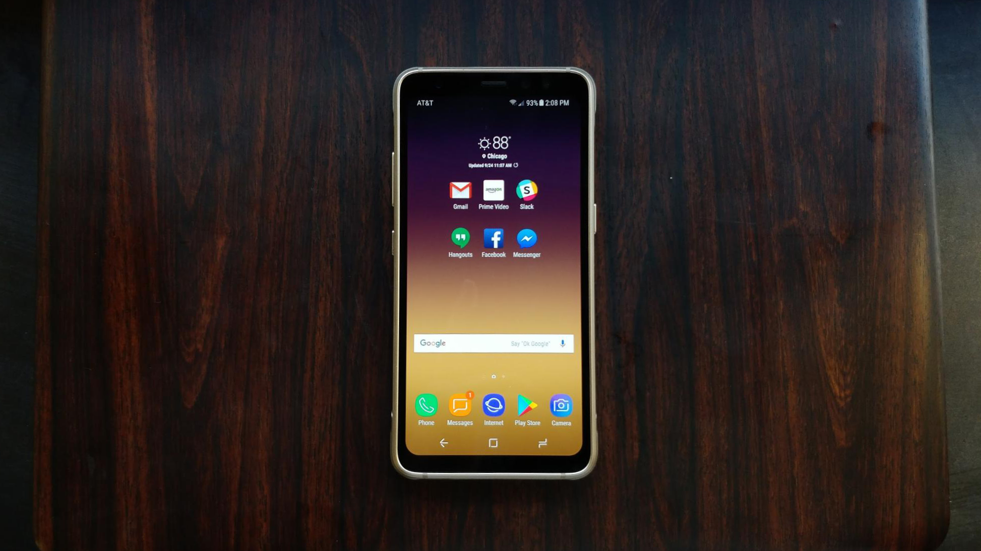
Anyone coming from another Samsung smartphone is going to feel plenty comfortable with the interface of the Galaxy S8 Active, as will the larger Android community, too. While it no longer has the physical buttons at the bottom of the device, it replaces them with on-screen buttons. Thankfully, it even allows you to switch the position of the Back and App Switch buttons in case you’re used to having them the other way around. One unfortunate problem with the onscreen buttons is that they sometimes appear on top of buttons in apps, rather than pushing up the app’s content.
The App Drawer is easier than ever to access, with a simple swipe up or down on the home screen to open it. But this is effectively where my issues with the interface begin. Apart from the App Drawer causing the phone to stutter when opened, it came poorly organized, with apps randomly grouped or ungrouped. YouTube and Play Music had their own places in the App Drawer while a folder dedicated to Google apps also existed (which surprisingly held Play Movies & TV). The same went for Samsung Pay and a Samsung folder.
Organization issues can easily be resolved by simply reorganizing, but when first getting started with the phone, it was troublesome trying to find some basic apps. The ability to colorize folders is a nice touch anyone who wants to organize apps in the drawer rather than on the home screen.
The redundancy of App Drawer access methods, swiping either up or down, may not have been an issue if it weren’t for the size of the screen. Pulling down the Notification Shade, which is a key feature of any Android phone, requires reaching all the way to the top of the 5.8-inch screen. Even with my large hands, it wasn’t a comfortable reach to make one-handed. And the Galaxy S8 Active is a real stickler, as swiping down from even the notification bar isn’t high enough – it has to be the very top of the screen or nothing. If the Notification Shade was accessible with a swipe down anywhere on the home screen, the Galaxy S8 Active would be far more comfortable to use.
Coming from Motorola and OnePlus phones with an experience closer to stock Android, the choices Samsung made with its software didn’t feel like improvements to the experience.The further I got into using the phone, the more the redundancies and awkward design of the phone stood out and worsened the experience.
Biometrics and Bixby
Fancy ways of unlocking phones using biometrics are all the rage right now, and Samsung has added iris scanning as an alternative to its fingerprint scanner. The Galaxy S8 Active features both, and neither is pleasant to use.
At first, the iris scanner simply required too many steps to be useful. First, I had to turn on the screen, then tap to let the phone know I wanted to scan my eyes, and still had to get the alignment right. Samsung has settings that make this process smoother, taking out one of the steps, but it took some digging, and left the iris scanner feeling only slightly less slow.

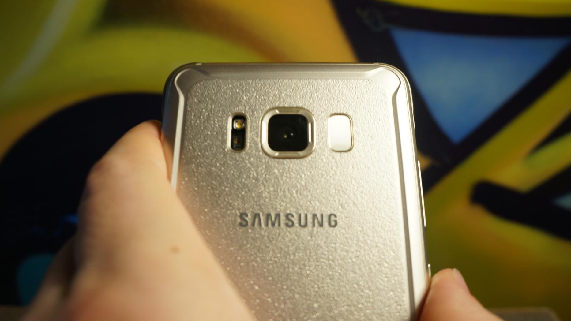
The Galaxy S8 Active still has the fingerprint scanner like the last generation, expect now it’s awkwardly on the back. It’s nearly impossible to reach from a normal grip on the phone, and it makes it easy to smudge the camera lens. Making matters worse, it seemed to have a tendency to respond slowly. These biometric unlock methods made this otherwise zippy phone feel rather clunky to use.
A fingerprint sensor on the side of the phone may have been a better option. The Galaxy S8 Active is a thicker phone than its siblings, and it seems like a scanner could fit on the side, but that’s where Samsung’s smart assistant Bixby comes in and continues to be a let down.
Bixby brings the redundancies in the Galaxy S8 Active to a peak, with not one, not two, but three ways of activating Bixby. The first method is using the dedicated button on the left side of the phone, which is painfully easy to press on accident while struggling to press the fingerprint scanner on purpose. The second method of activating Bixby is simply to say, “Hey, Bixby” or “Yo, Bixby,” or whatever else. The third way to activate Bixby is the worst.
Swiping between pages on the home screen of the Galaxy S8 active is an easy way to accidentally swipe over to the Bixby page, which the Bixby button also directs you to. Once on the Bixby page, you can’t simply swipe back to the home page. Instead, you have to press the Back or Home buttons. Why can’t you swipe back? The truth is you can, but it took me a while to realize it because landing on the Bixby page makes the Galaxy S8 Active momentarily crumble under the weight of things Bixby is loading in (even after cleaning out the default clutter, like Giphy).
So, while Bixby is meant to help, it does anything but and can be a bit unresponsive in the first second after swiping to the page. Sometimes it freezes for a second before even showing that you swiped over to Bixby. Never mind that the Bixby camera didn’t recognize much, and Bixby understood everything I said about as well as I understand Samsung’s choice of fingerprint scanner placement.
Current page: What it's like to use
Prev Page Introduction, design and display Next Page Camera and battery lifeOver the last several years, Mark has been tasked as a writer, an editor, and a manager, interacting with published content from all angles. He is intimately familiar with the editorial process from the inception of an article idea, through the iterative process, past publishing, and down the road into performance analysis.

