Why you can trust TechRadar
Interface and apps
- Stop hating on TouchWiz. It’s great software now.
- Everything’s cleaner looking and new gestures offer menu shortcuts
- The default keyboard could use improvements like emoji suggestions
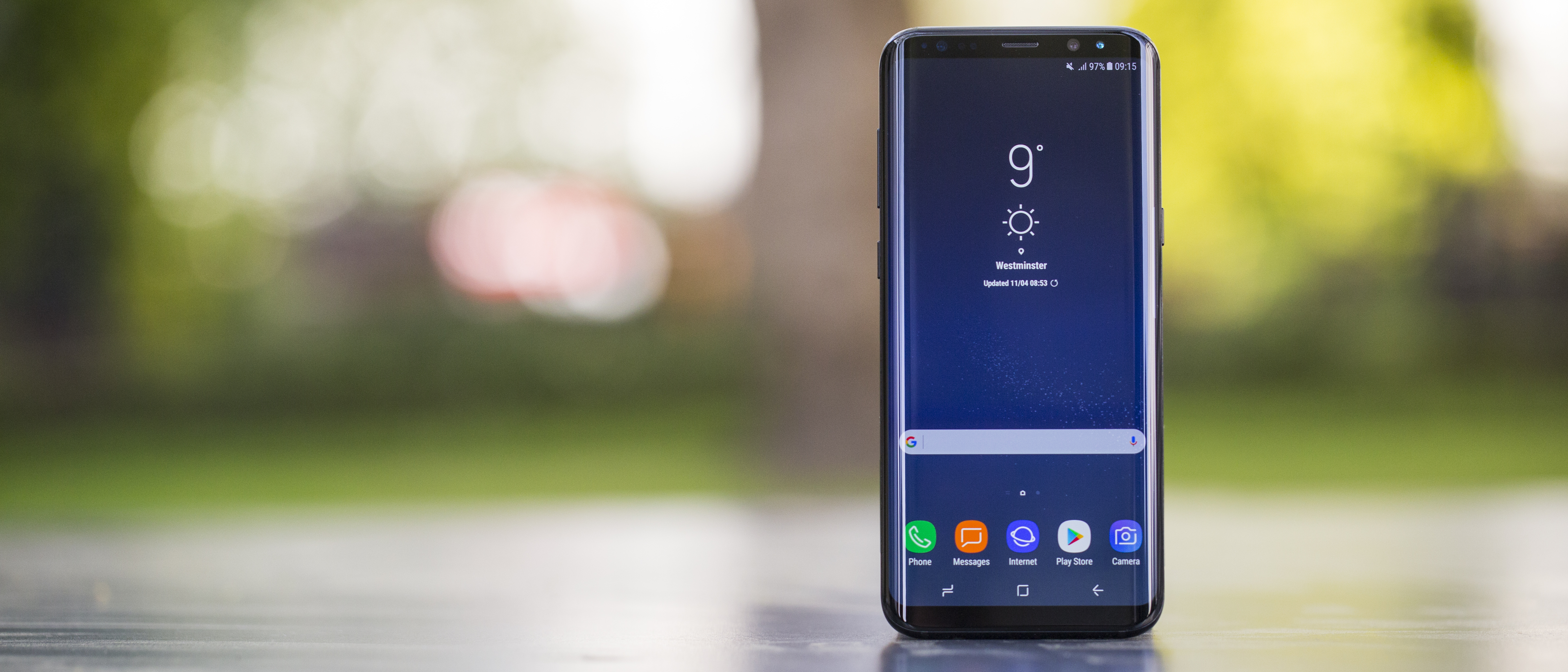
The Samsung Galaxy S8 Plus is as powerful as it is big. It’s debuting with the best specs and the slickest interface we’ve seen from the company yet.
You can stop hating on Samsung’s TouchWiz user interface now, too – in fact, it’s not even called TouchWiz anymore. Samsung has renamed its stylization of Android ‘Samsung Experience’, and it’s pretty great.
It takes Google’s Android 7.0 Nougat operating system and makes it a little more robust, yet it’s able to scale everything to keep it looking clean. It has logically laid-out settings menus, and helpful suggestions when you can’t find what you want. Search is everywhere, too.
New this year is the ability to swipe up or down anywhere on the home screen to trigger an internal search box and the full app drawer. This handy shortcut replaces the virtual app drawer button on the home screen, since you really don’t need that any more. And we’re loving the fact that you can search your phone so quickly, like you can with iOS 10.
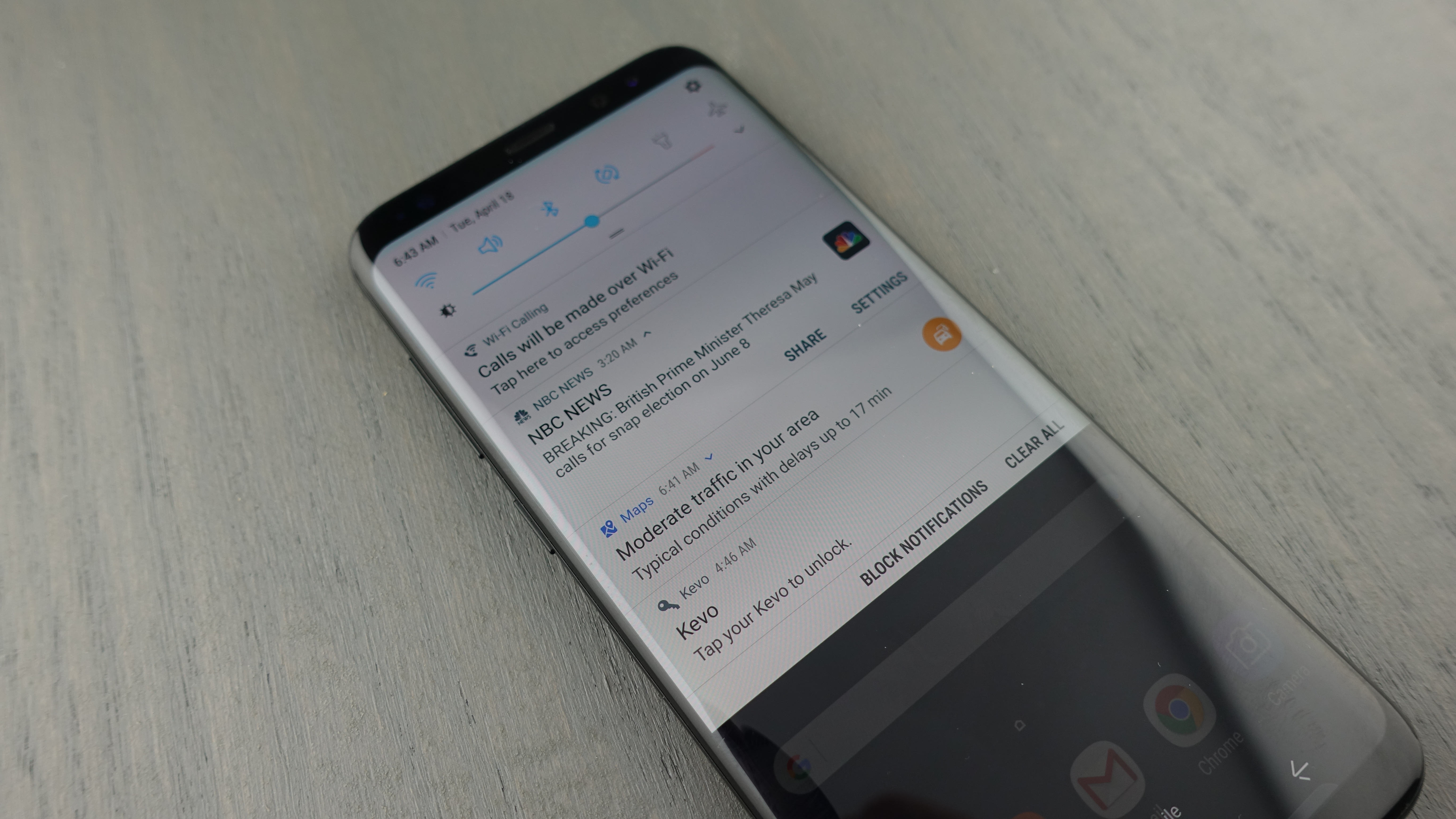
We’re able to access apps more quickly, and take action on them with fewer touches. You can now long-press on app tiles to bring up additional options – not unlike a computer’s right-click menu or the iPhone’s 3D Touch mechanic. From here you can remove, uninstall or select multiple apps, allowing you to easily rearrange apps to the desired home screen. Remember when you had to do that one at a time? Small touches like this make Samsung’s UI stand out.
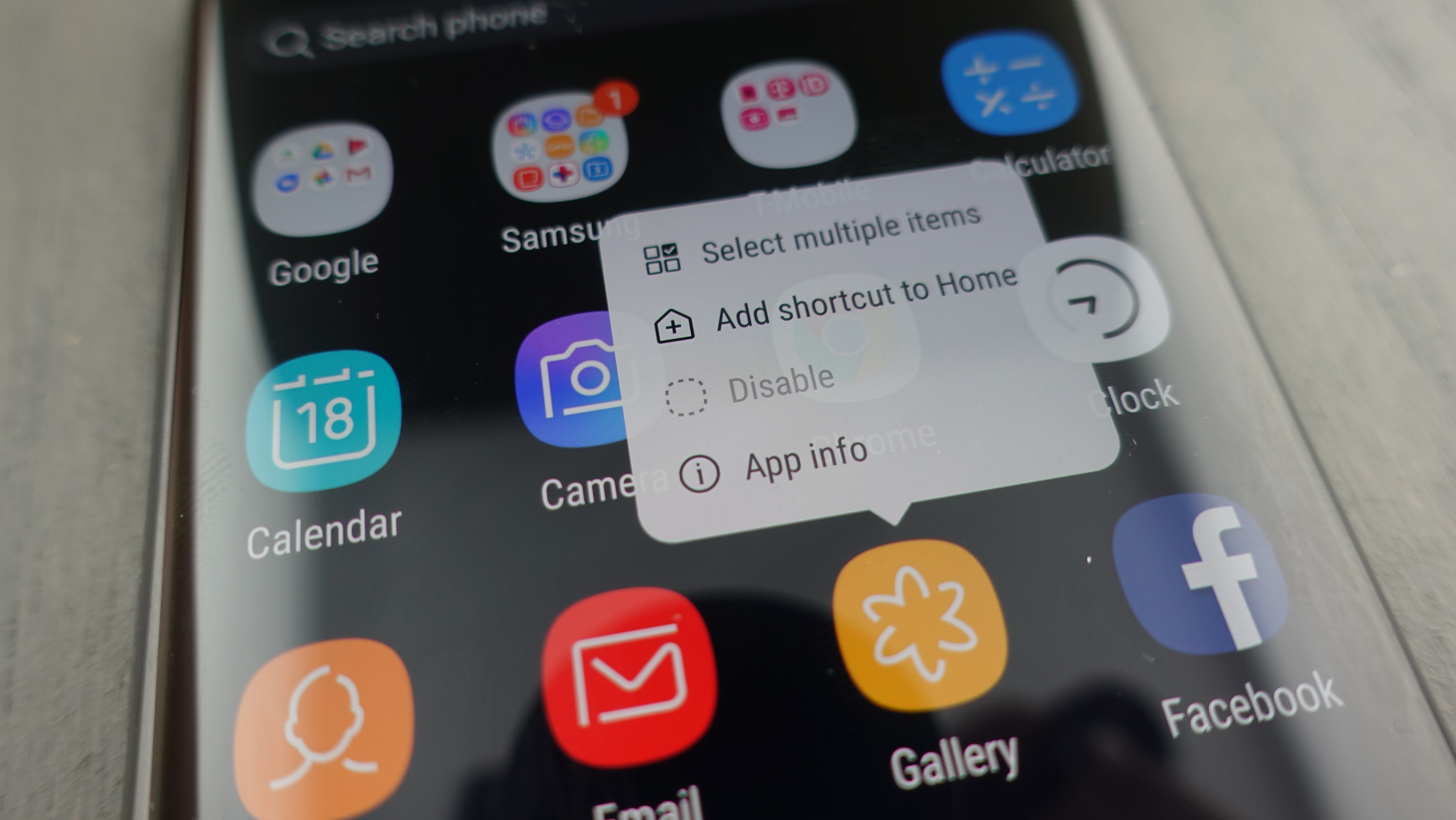
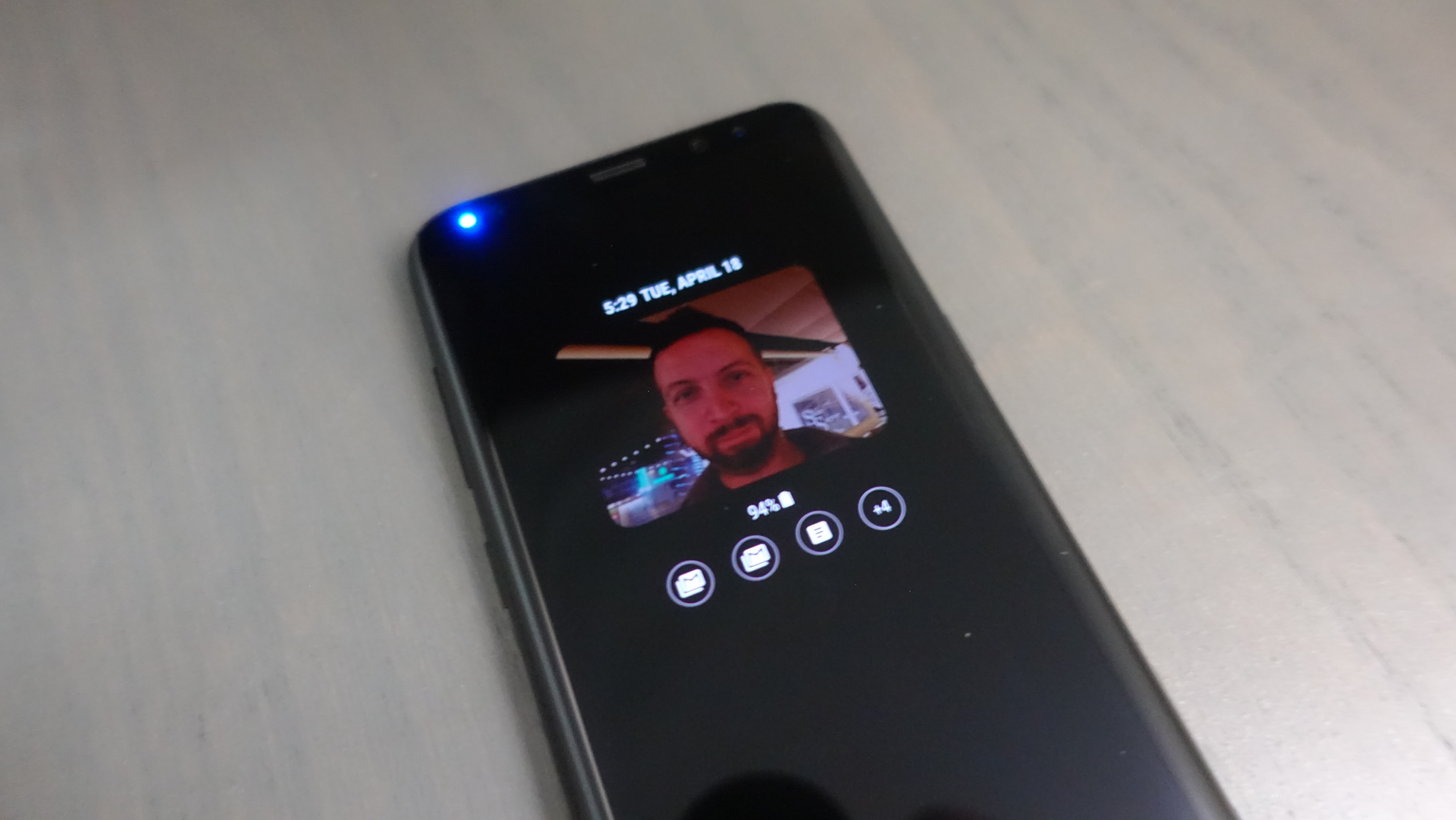
Samsung’s notifications shade and customizable quick settings tray are easy to read, and strike the right tone with a white-and-light-blue color scheme (remember when all of this was neon green three years ago?). iOS 10 still does messaging better with iMessages, and we miss Apple's smarter, emoji-filled keyboard suggestions, but Samsung has almost everything else down, including a Blue Light filter that’s better than the one on the Google Pixel and Google Pixel XL.
Google’s Android Nougat update also means notifications are now grouped together, and while split-screen multitasking is new for other phones, Samsung owners have had that for several iterations. Android O is getting notification badge count over top of individual app tiles, but Samsung has that too. All of a sudden, Samsung and stock Android aren’t that different.
Bixby
- Bixby Voice has now launched, but Google Assistant is also on board
- Its Home, Reminders and Vision features are pre-loaded, but do very little
- The physical Bixby button only serves to get confused with volume down
Bixby is Samsung’s promising AI counterweight to Apple’s Siri and Google’s Assistant, and it’s the company’s overdue replacement for S Voice.
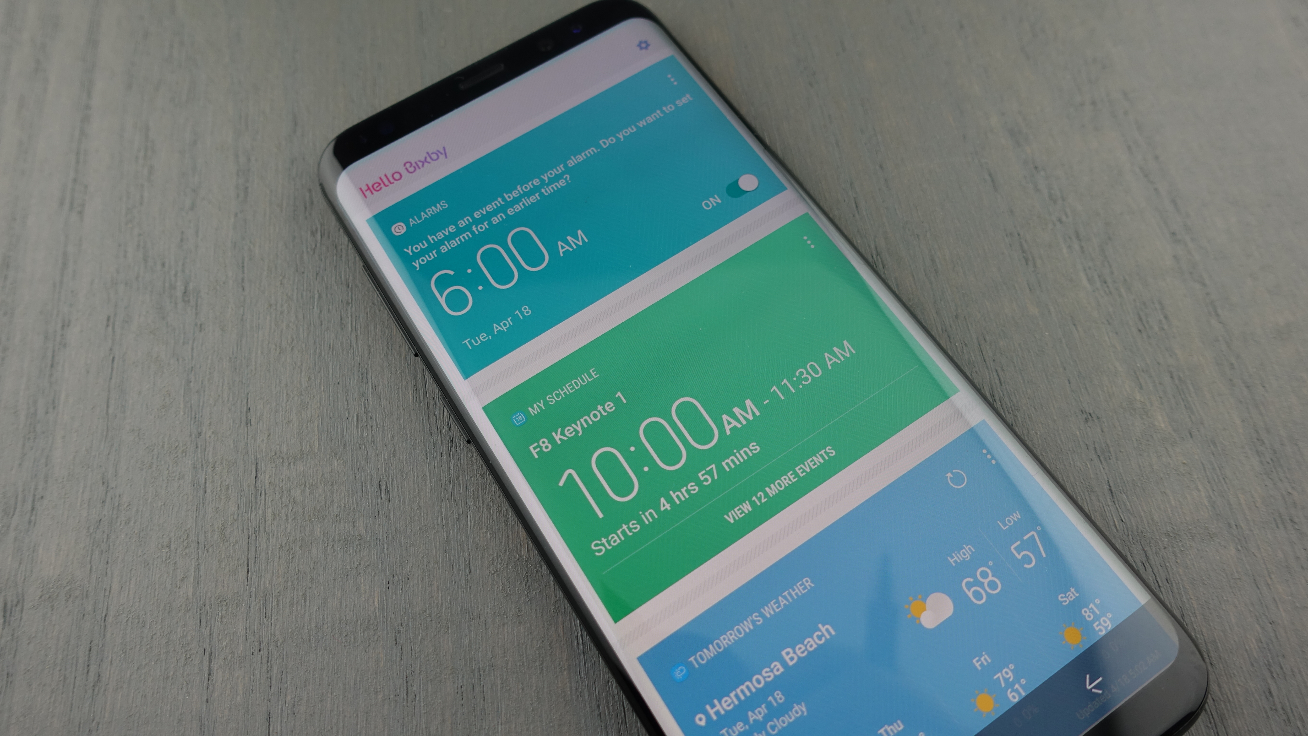
Bixby Voice is the ringleader for Samsung’s virtual assistant, which we're currently testing and we'll update this review with how it works very soon. But there's also Bixby’s less exciting posse: Bixby Home, Bixby Reminders, and Bixby Vision.
Bixby Home is the leftmost menu, and takes cues from Google Now by contextually surfacing information: your local weather, schedule and activity. It also lays out news stories you might want to read, but it’s all less convincing than the more graphically-appealing Flipboard, which occupied this space before.
Bixby Reminders is a basic reminders app that can also pull text from the web and other apps as part of the ‘Share’ button. You can add a time or a geolocation to the reminder.

Bixby Vision can an identify object with the camera and bring up Pinterest images of the thing you already have, or locate stores where you can buy... the thing you already have. It may be helpful for reading up on a certain wine, but it’s really difficult to see the everyday usefulness of this feature right now.
What’s even more confusing is that there’s a dedicated Bixby button right under the volume rocker on the left side of the phone. Hit it twice and it’ll instantly transport you to the Bixby Home screen (confusing labeled Bixby Today).
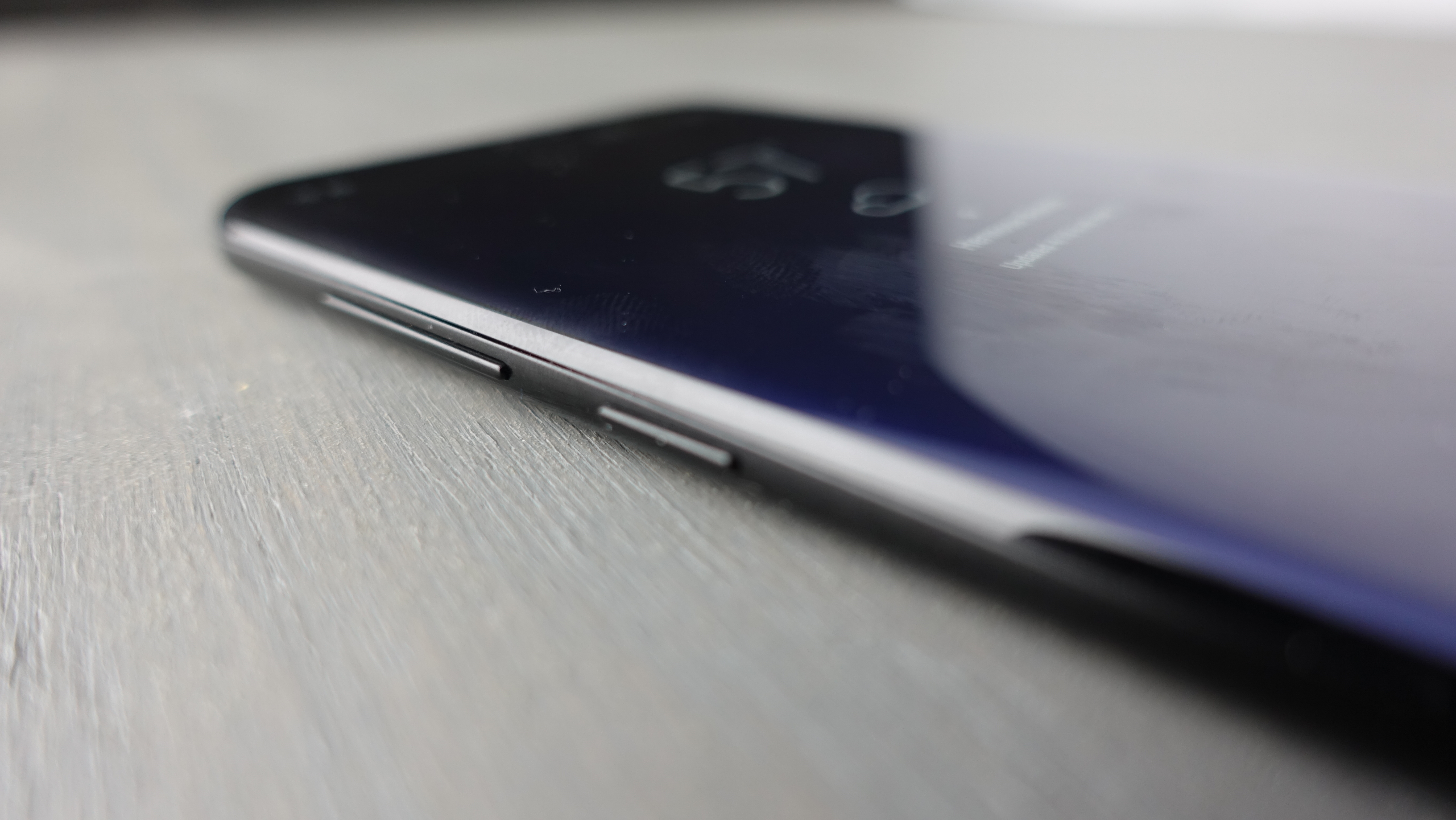
The button only really serves to get confused for volume down during calls, and thwart your ability to take screenshots (long-time Samsung users are going to be mildly irritated here, because taking screenshots used to be a matter of holding the home button and power button – now it’s the power button plus volume down). The Bixby button just gets in the way.
Moreover, Google Assistant is onboard from the start, meaning Samsung now has competing voice assistants on the Galaxy S8 and S8 Plus. And Google’s AI gets top billing; it’s activated by long-pressing on the home button – no need for Samsung’s invented Bixby button.
Specs and performance
- The best chipset we’ve tested, even if the phone only has 4GB of RAM
- Promises to power the next generation of Samsung Gear VR games
- 64GB of internal storage and a microSD card slot for more room
- Stream audio to two bluetooth headphones at once
The Samsung Galaxy S8 Plus is the fastest and most powerful phone we’ve ever tested. It doesn’t have 6GB of RAM outside of China, but it doesn’t really need it.
The proof is in the performance. 4GB of RAM coupled with either the speedy Qualcomm 835 (US) or even faster Samsung Exynos 8895 (UK and everywhere else) chipset topped all of our benchmark tests.
It’s these smaller 10nm chipsets that make this phone more powerful, and they also draw less energy than 2016’s 14nm chips. Samsung’s Exynos chips are always a little more powerful, but Qualcomm’s have the US-essential CDMA capabilities to work with Verizon and Sprint.
Our Geekbench benchmarking gave the Exynos chipset a 6,630 multi-core score, while the Qualcomm chipset averaged a 6,000 multi-core score. More importantly, we experienced no slowdown other than gradually appearing Bixby animations – that’s not actual slowdown.
That’s great news for anyone who wants to step into the future of mobile virtual reality with the new Samsung Gear VR, or simply avoid slowdown two to three years down the road. The S8 and S8 Plus have fully capable chipsets to power’s VR next generation the 3D graphics, and everyone benefits from this smartphone powerhouse.
Both chipsets are future-proofed with Gigabit LTE modems and are Gigabit Wi-Fi-ready, which will make your phone faster at home and on the road one day. Right now, you can also take advantage of Bluetooth Dual Audio, which can output audio to two sets of headphones at the same time.
Samsung is charging you more than ever for this phone, but it is offering better value when it comes to internal storage space. There’s just one option: 64GB, up from the 32GB entry-level S7 Edge. You don’t need to chose between 32GB, 64GB, and 128GB this year.
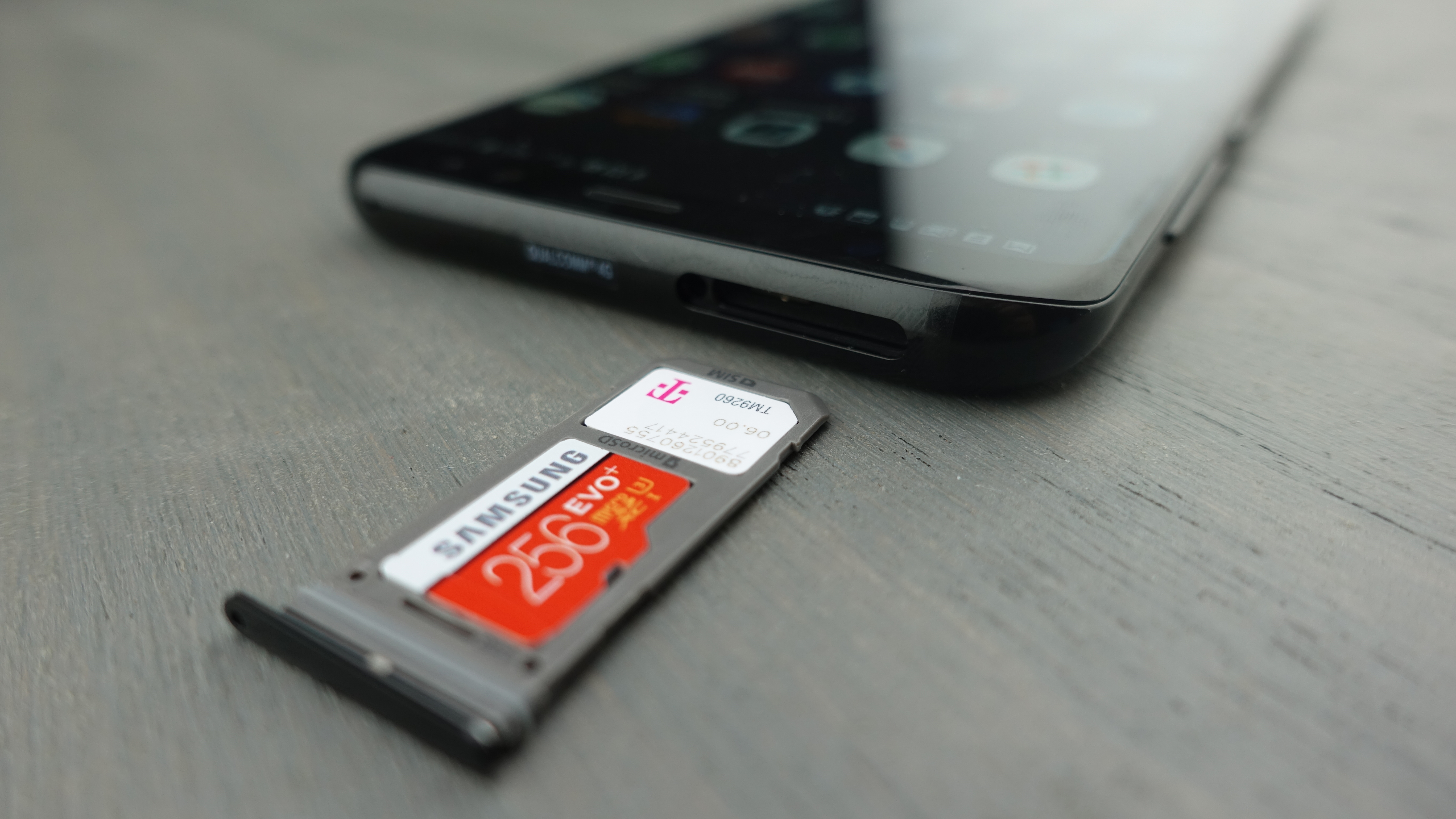
What if you want more space? Thankfully, the microSD card slot returns, giving you ample expandable storage (up to 256GB more). Apple’s iPhone 7 Plus and Google’s Pixel XL don’t support microSD cards, so this is a nice perk.
See how the Samsung Galaxy S8 Plus performs in our big Samsung speed test video below.
Current page: What's it like to use
Prev Page Introduction, design, fingerprint sensor, display Next Page Camera, battery life and cases