Why you can trust TechRadar
- Refined user interface is fun to use
- 'Swipe to open' app drawer is great
- The most powerful phone on the market
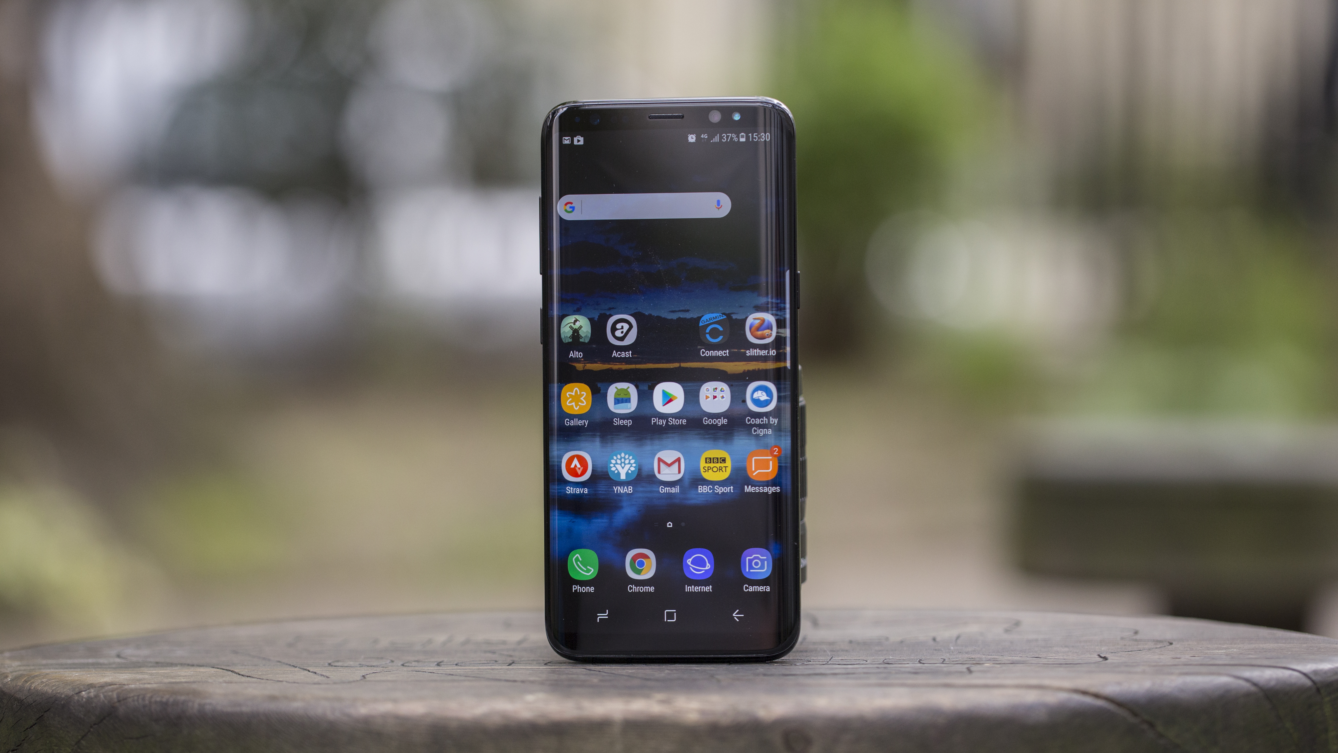
The Samsung Galaxy S8 is still one of the more powerful phones we've tested, even in 2018, and anyone who doesn't buy a Samsung because of the user interface is living in the past.
That's not to say that everyone is going to love the Samsung Experience UI straight away, but to not even bother checking out a Samsung phone because you didn't like the user interface in 2013 is pointless.
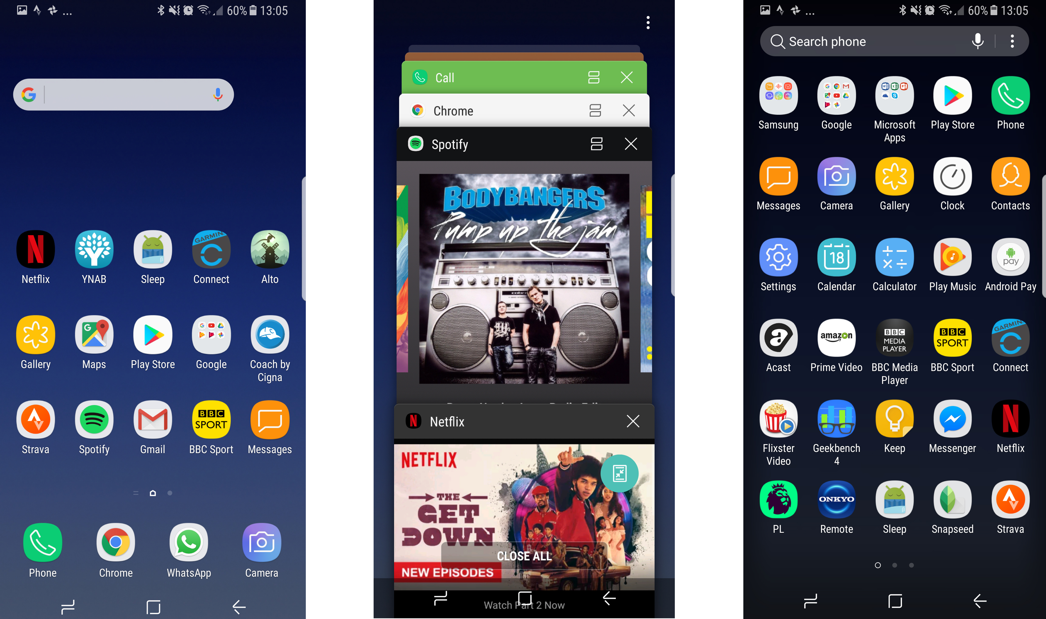
Things are miles better now in the interface, and Samsung has worked hard making everything appear where it should.
If Bixby was as powerful as the brand was promising it eventually will be, the interface would be even less of a thing to talk about, as you could just bark all your commands at your phone and it would do what you needed.
But for now you have to keep exercising those digit muscles and swipe around the display to order your favorite takeaway.
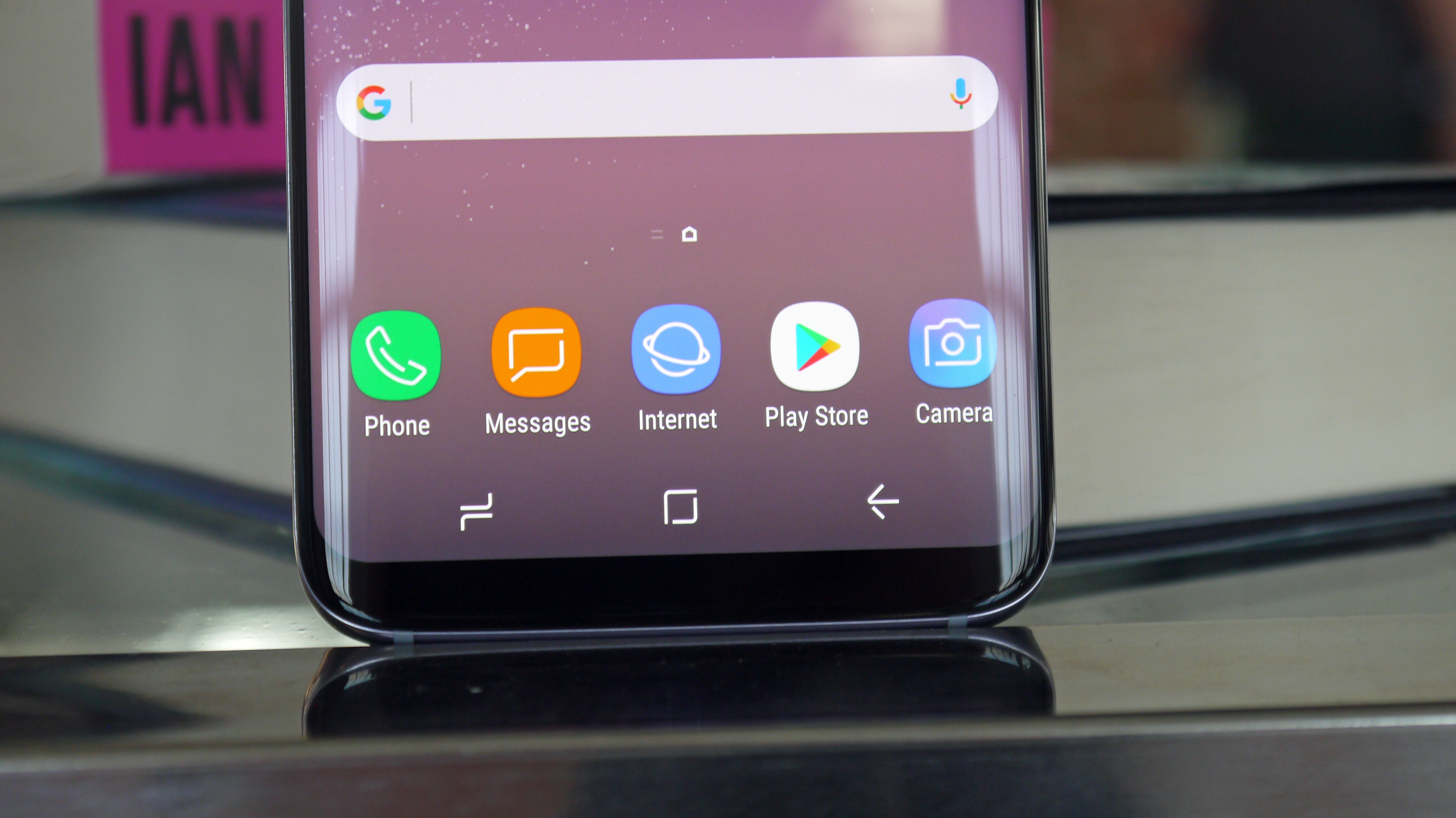
The new user interface on the Samsung Galaxy S8 is more sleek and understated than ever before. It's running on top of Android Nougat, but you'd struggle to see that... this is not a phone for the Android purists.
Android 8 Oreo has now launched for the Galaxy S8 along with Samsung Experience 9.0, and they brought new software features carried over from the Galaxy S9. You can rotate apps on the home screen, use picture-in-picture, see notification dots and get fixes to many of our biggest Bixby problems – it's still not perfect, however.
The Galaxy S8 will also get updated to Android 9 Pie, but this hasn't happened yet.
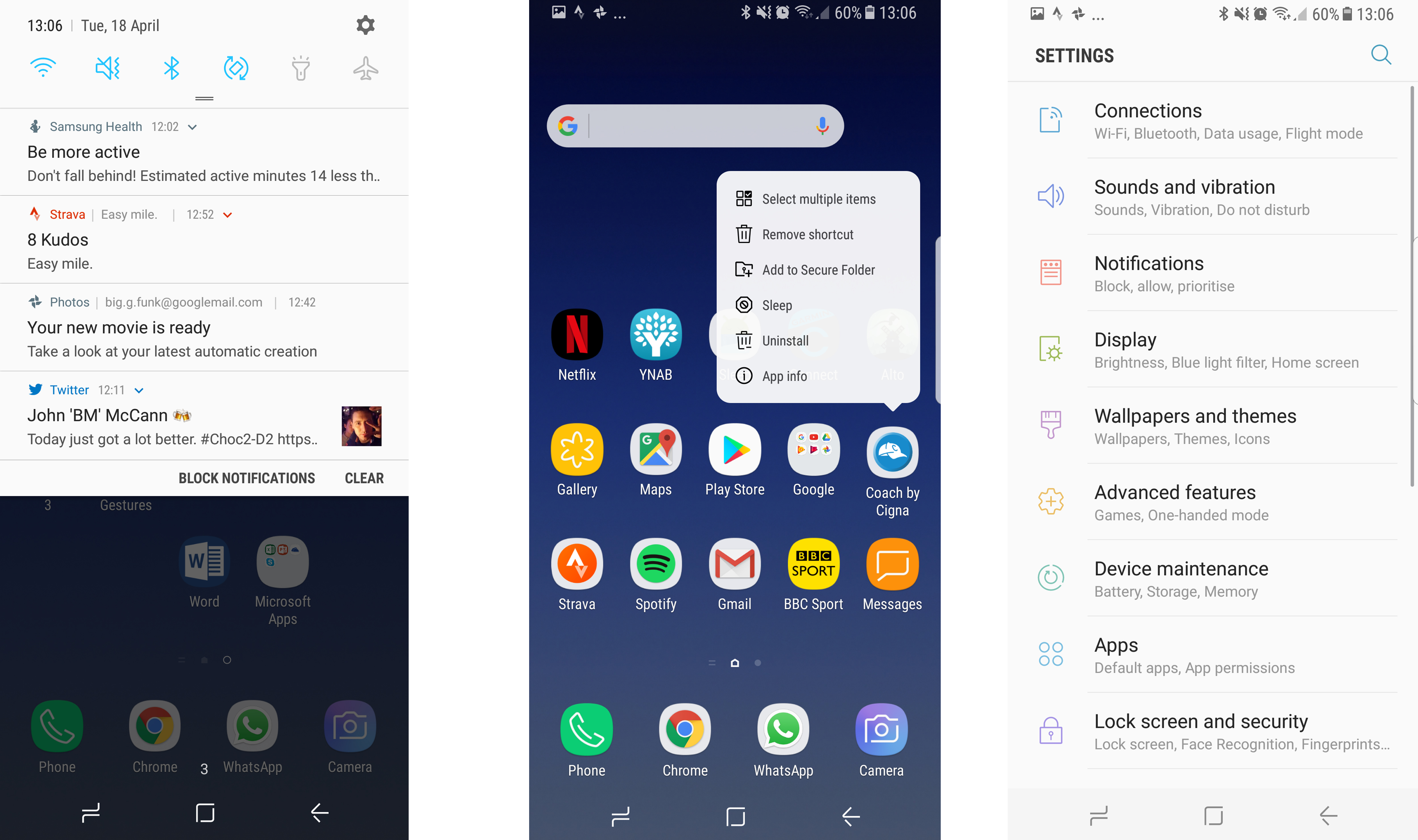
With Android 7, we got long-pressing on the icons brings up contextual menus (3D Touch from the iPhone, anyone?). The notifications shade design looked premium, even if it was a little bit complex.
One of the biggest problems Samsung will face with the Galaxy S8 and S8 Plus is the loss of the physical and soft buttons on the front of its handsets.
Samsung fans will be used to having a phone with a home button and back / menu buttons stuck below the screen, but the Infinity Display has seen to it that we don't have those any more.
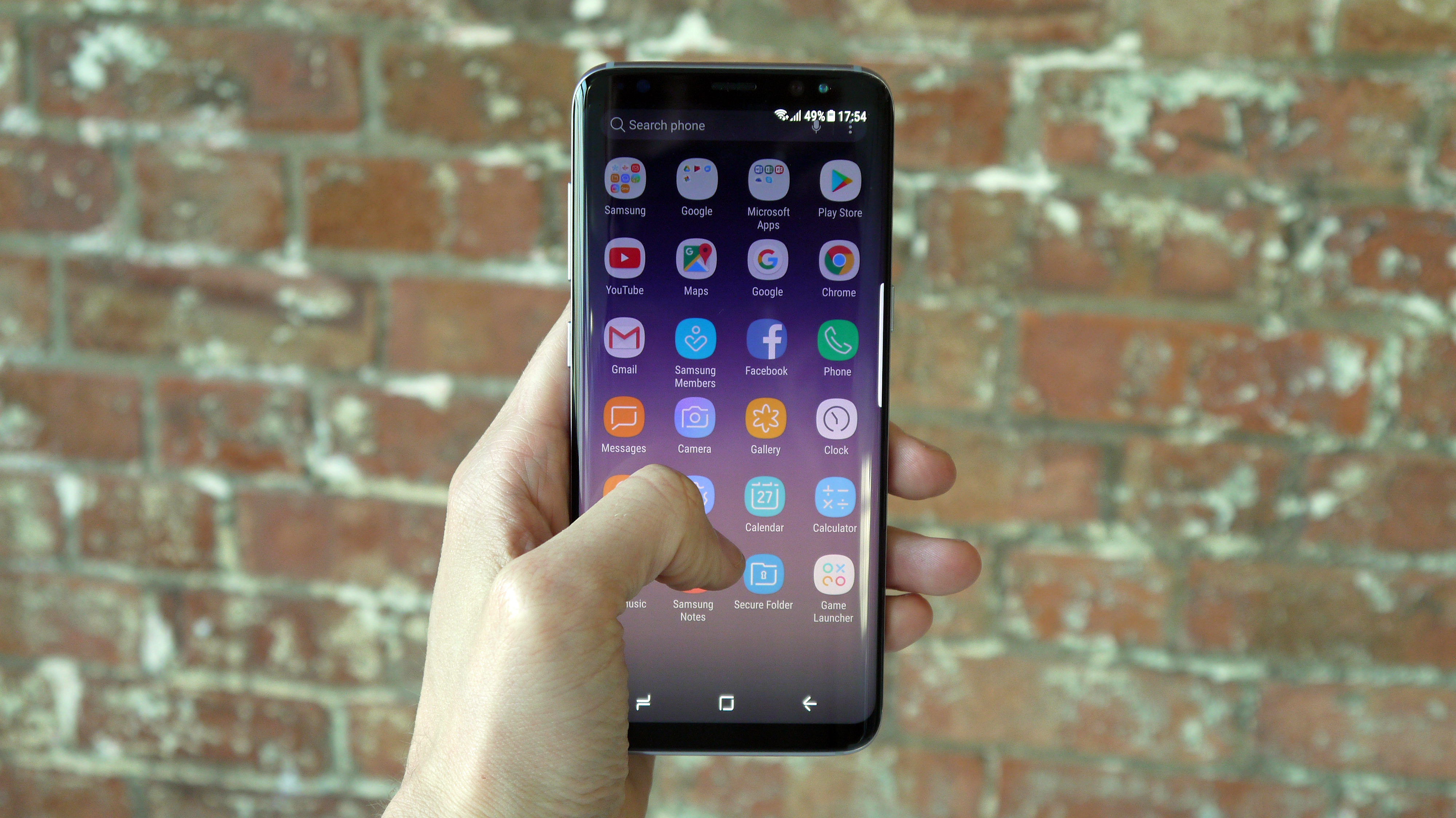
Instead the buttons are virtual, called up with a swipe of the finger whenever you're using a full-screen app. Samsung has offered a number of tutorials to help users get to grips with this new system, but it takes some getting used to.
There are some nice touches throughout the Samsung Galaxy S8's interface – for instance, when searching through the menus there's a search option at the top, and menus end with options for related settings.
The main change is the loss of the app drawer button – but the tray is still there, it's just accessed with a swipe up or down on the home screen. It's weird to think that this hasn't been used in the past on other mainstream phones, as it makes so much sense and is really intuitive.
Sadly, another potentially cool feature is marred by the poor positioning of the fingerprint scanner.
You can swipe down on this sensor to pull down the notifications shade, which saves you jiggling the phone about in the hand to swipe from the top of the screen… well, it would save it if you didn't have to bounce the phone about in your palm in order to hit the fingerprint sensor in the first place.
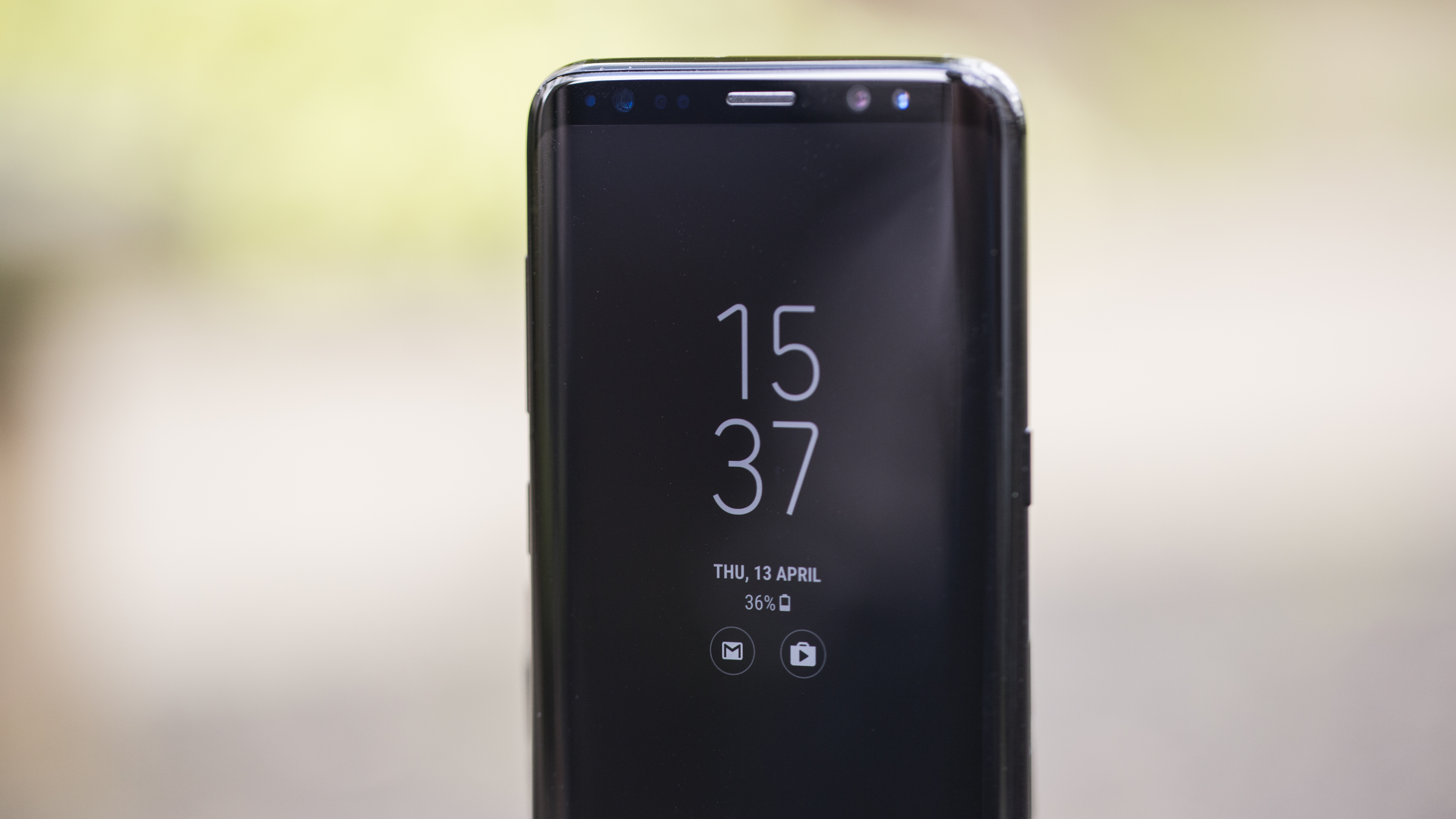
The Always-on Display, one of our favorite features of the Galaxy S7, has been included and upgraded – now you can even have your favorite photos saved on there to always look at when your phone’s display is turned off.
Device Maintenance is also another neat feature, gamifying your efforts to keep the phone running at optimal levels. This scans your device and offers a score out of 100 depending on the performance of the battery, apps and CPU – encouraging you to keep everything clean and hit 100%.
Every so often you'll be pinged with a note that less-used apps are being put to sleep (which sounds a bit dark) and you won't get notifications until you reopen them, but that's a small price to pay to keep the phone running optimally.
The main thing that's improved with the Samsung Galaxy S8's interface, though, is the overall look and feel of it. The font is clean and crisp, the app drawer sliding up and down is smart, and while the notifications shade can feel like a raucous mess at times, everything has a useful place and there's rarely anything superfluous there.
(Oh, we could mention that the heart rate sensor on the rear of the phone just doesn't work over two different units. For some reason it would recognize a pulse, but be unable to give a readout of an actual number).
If you've been keeping away from Samsung phones because of the interface, then you're a fool. You've been missing out on excellent phones, and they're even better now.
Specs
Weirdly the Samsung Galaxy S8 didn't have the best spec list out there even at launch – but it was pretty close. The phone will come with either a Qualcomm Snapdragon 835 or Samsung's own Exynos 8895 chipset inside, both paired with 4GB of RAM.
While the only storage capacity on offer is 64GB, the SIM tray has a slot for a microSD card which can handle anything up to 256GB of additional memory.
The battery is a 3000mAh affair and the screen comes in at 1440 x 2960 pixels, which equates to 570 dots per inch (DPI) of sharpness.
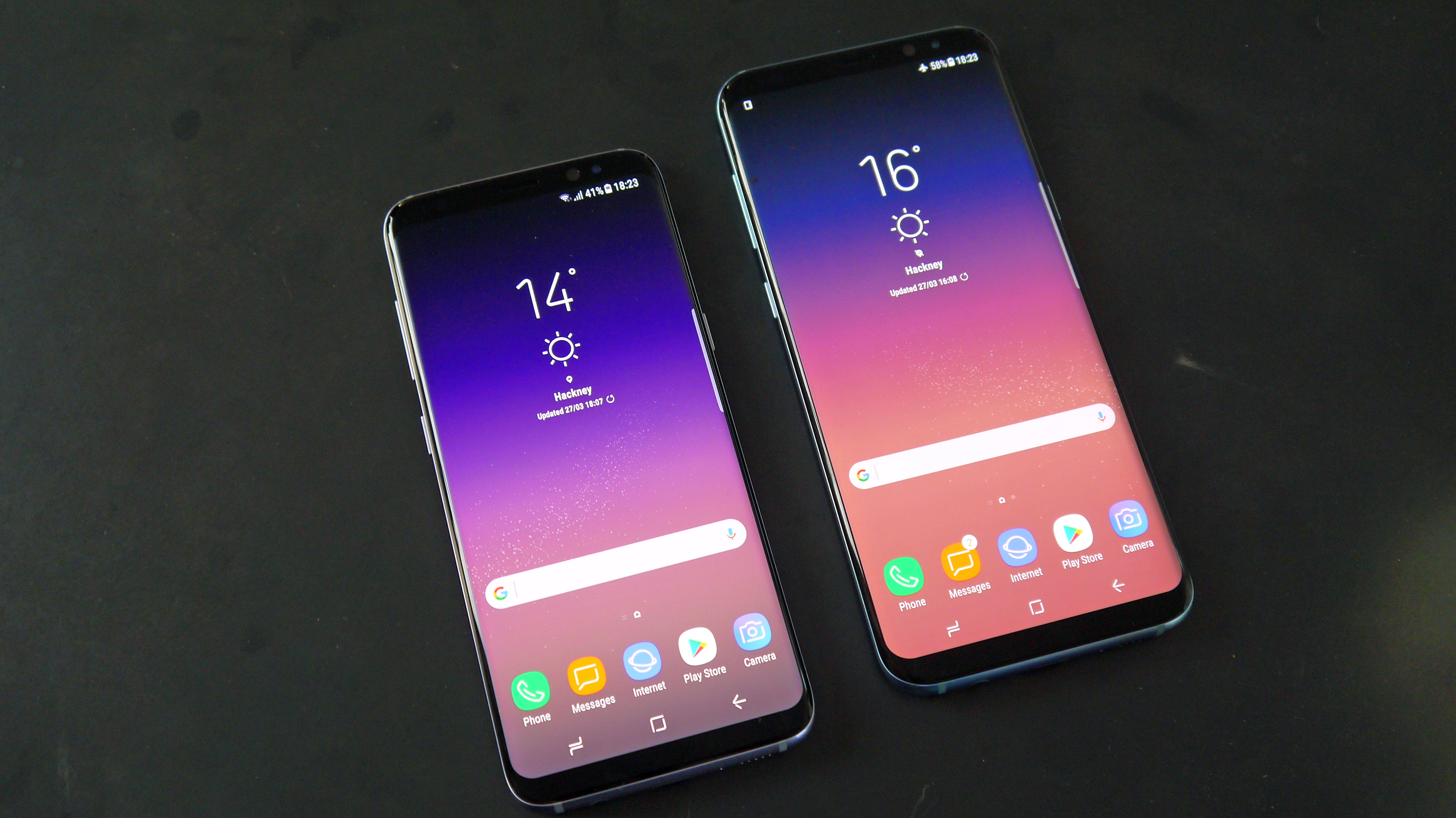
But what does all that mean in the real world? Well, it basically means that Samsung has made what was at launch one of the world's most powerful phones, with a battery that lasts through a day, a high-res display and loads of storage and which exhibits a real snappiness under the finger.
Our Geekbench tests returned a single-core score of 2008 and a multi-core score of 6630, which was one of the best we'd ever seen at time of testing, though newer flagships have now topped it.
All new Bluetooth
OK - bear with us here. The idea of a new Bluetooth standard on the Samsung Galaxy S8 isn't going to be that exciting to many users - but it really should be.
The new S8 uses Bluetooth 5, and that confers some pretty nifty options. Firstly, with the Galaxy S8 you can pair bluetooth headphones and have the volume controls sync with the phone.
It sounds minor, but this is something that really makes a big difference. It's been a feature of the iPhone and iPad for a while, but having total control over your audio levels without having to drag your phone out is great.
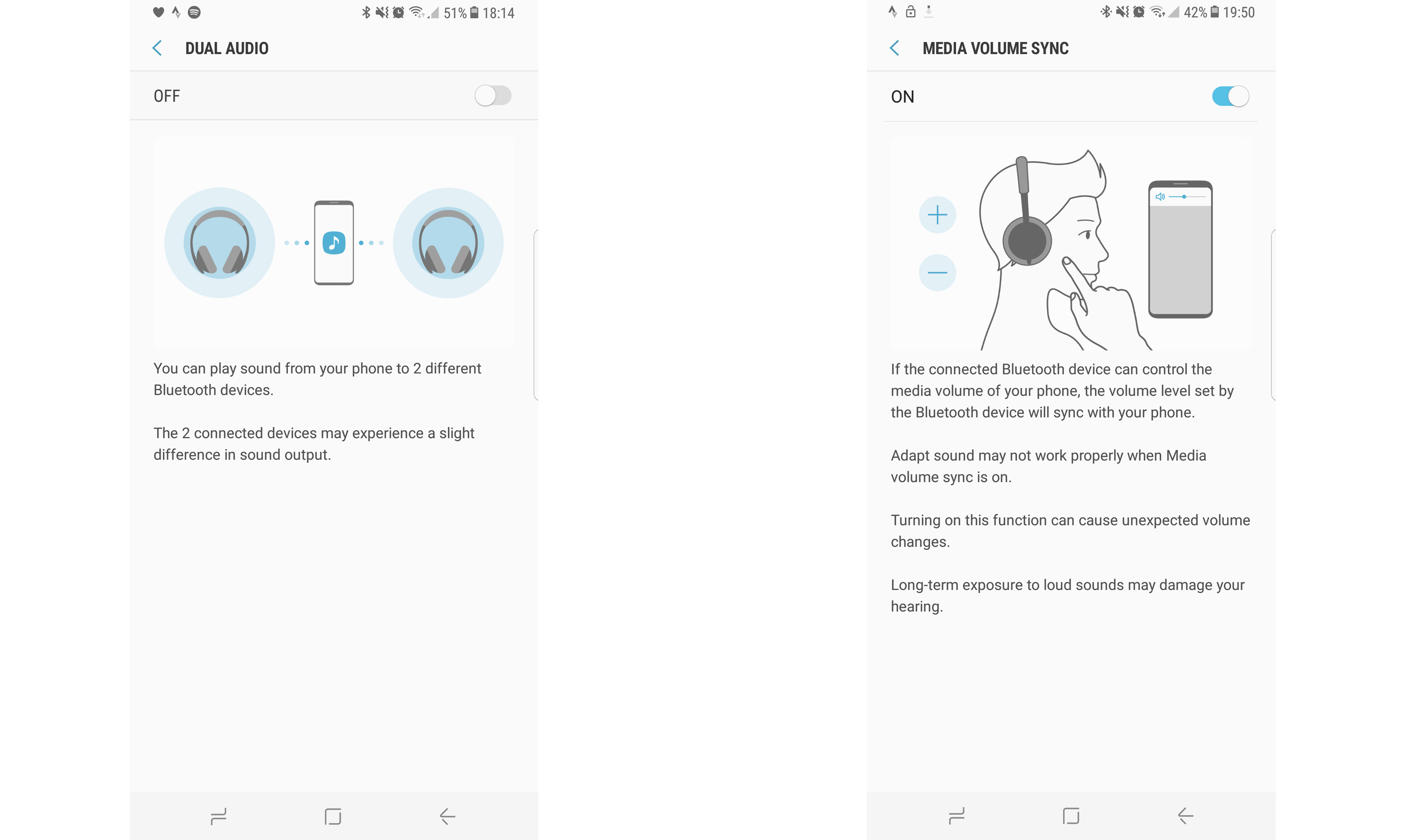
The second feature that the S8 offers is dual speaker output, something that has been enabled with the new version of Bluetooth being on board.
You can connect two Bluetooth speakers at once, but be warned: they're not synced together perfectly (which, in fairness, the phone does warn you about).
This is a feature that really only works well when you're in a large outdoor space and want to spread the sonic love, and nobody can really hear both speakers at once.
It's not terribly out of sync, but you certainly don't want to listen to podcasts using the new feature.

Gareth has been part of the consumer technology world in a career spanning three decades. He started life as a staff writer on the fledgling TechRadar, and has grew with the site (primarily as phones, tablets and wearables editor) until becoming Global Editor in Chief in 2018. Gareth has written over 4,000 articles for TechRadar, has contributed expert insight to a number of other publications, chaired panels on zeitgeist technologies, presented at the Gadget Show Live as well as representing the brand on TV and radio for multiple channels including Sky, BBC, ITV and Al-Jazeera. Passionate about fitness, he can bore anyone rigid about stress management, sleep tracking, heart rate variance as well as bemoaning something about the latest iPhone, Galaxy or OLED TV.
