TechRadar Verdict
A free, regularly updated multi-platform video editing application, filled with interesting ideas, powerful features, and the odd niggle. Definitely worth trying out.
Pros
- +
Free and multi-platform
- +
Customisable
- +
Full featured
Cons
- -
Can’t automatically create new layers
- -
No thumbnail previews for effects or transitions
- -
Changing an effect’s value can take a few seconds to reflect the changes
Why you can trust TechRadar
Update: This review is for an older version.
For the latest release, see our Shotcut 22.03 review.
-------
Shotcut is easily one of the best free video editing software for Linux, Mac and Windows. As such, it can be of interest to those who would rather not be dependent on giant software corporations, but prefer the continual regular upgrades of a community of enthusiastic and dedicated developers.
- Want to try Shotcut? Download it here
This doesn’t mean to say that Shotcut would be intimidating to newcomer to this field. Far from it. So let’s take a look at the latest version and see what this software has to offer.
And for more creative tools, check out our reviews of the best video editing software.
The interface
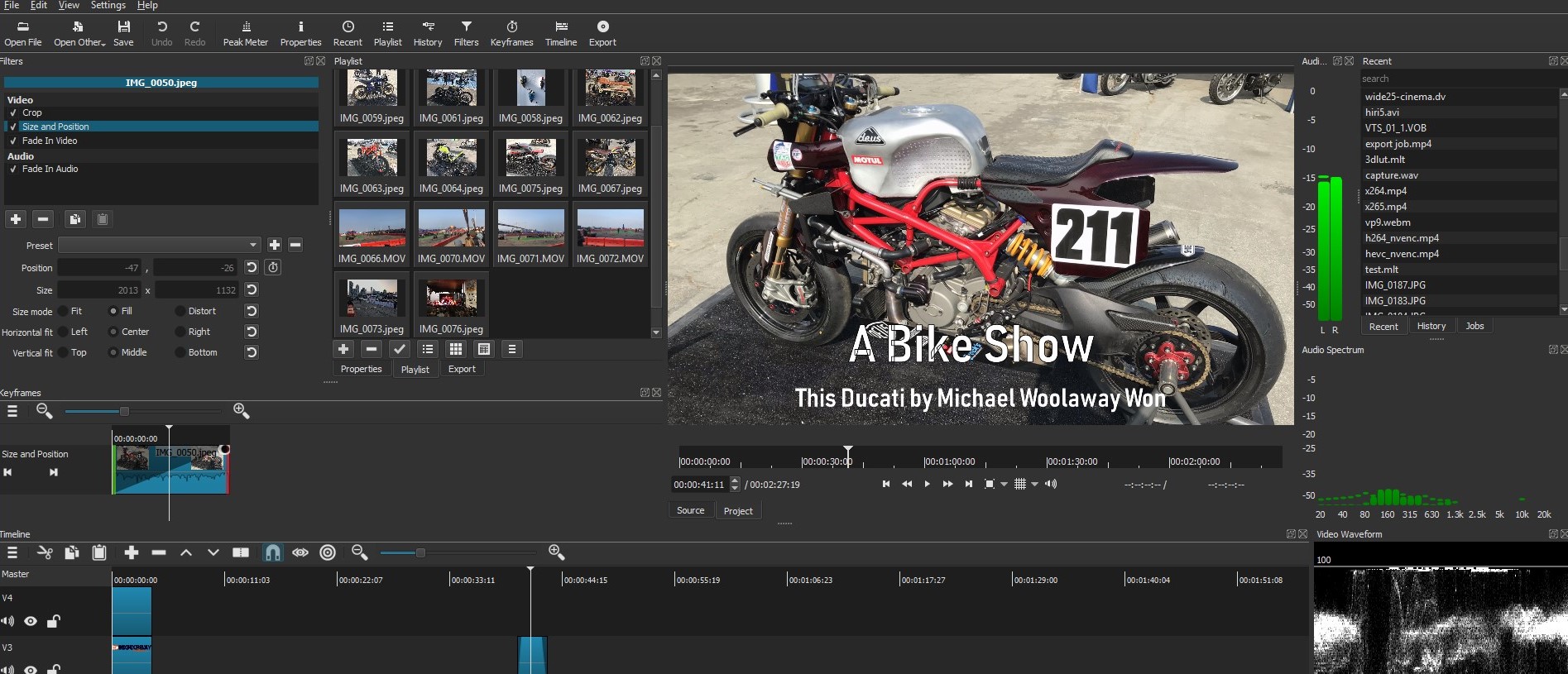
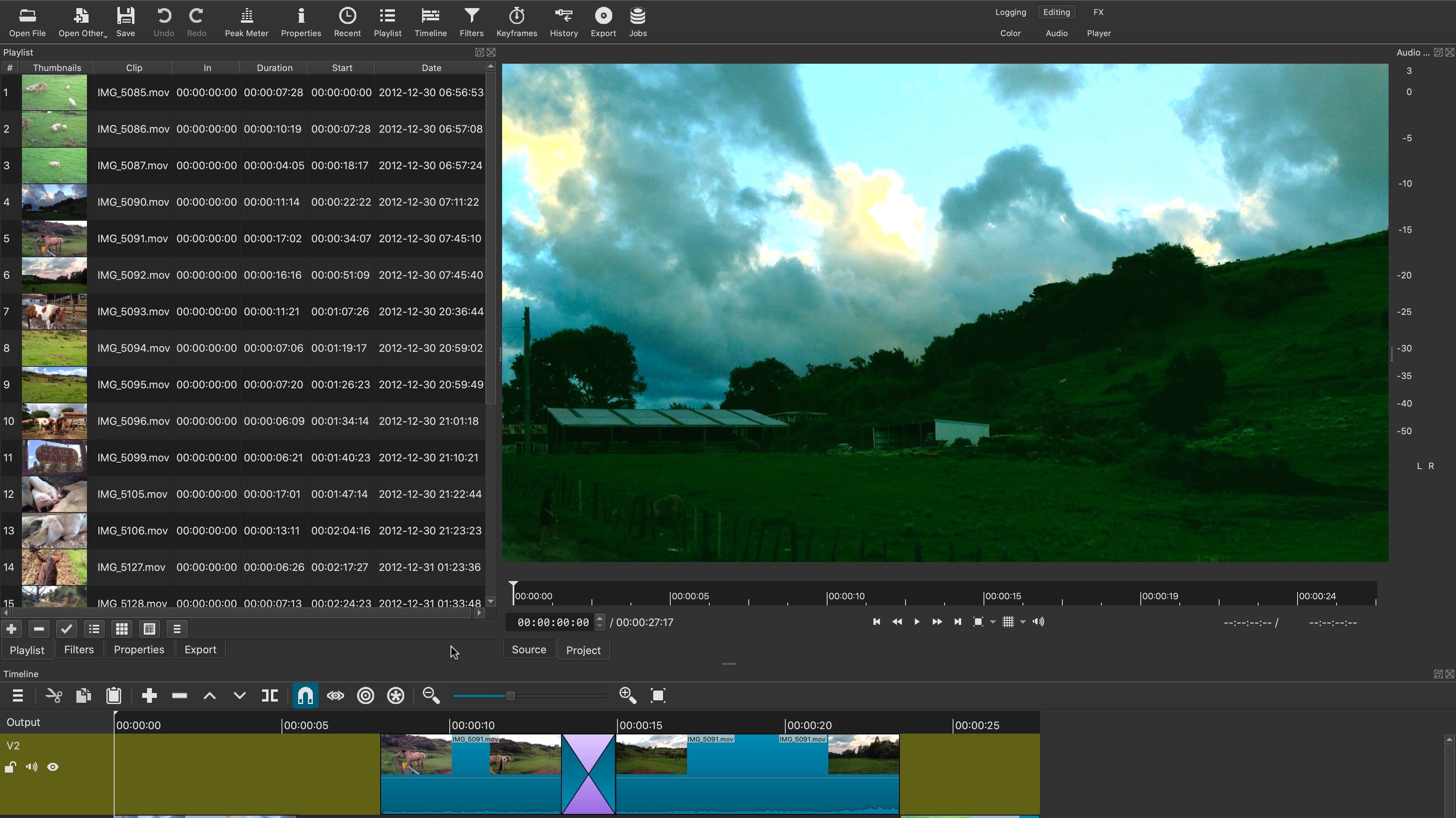
The application appears pretty simple, yet hide a complex array of features. All commands appear on the screen, with various menus on the top, and tools above the timeline. The various panels can be repositioned, or even made as floating windows, and additional panels can be brought to the fore to add even more information on the screen at any one time.
These include audio meters and video scopes to monitor various aspect of your clips.
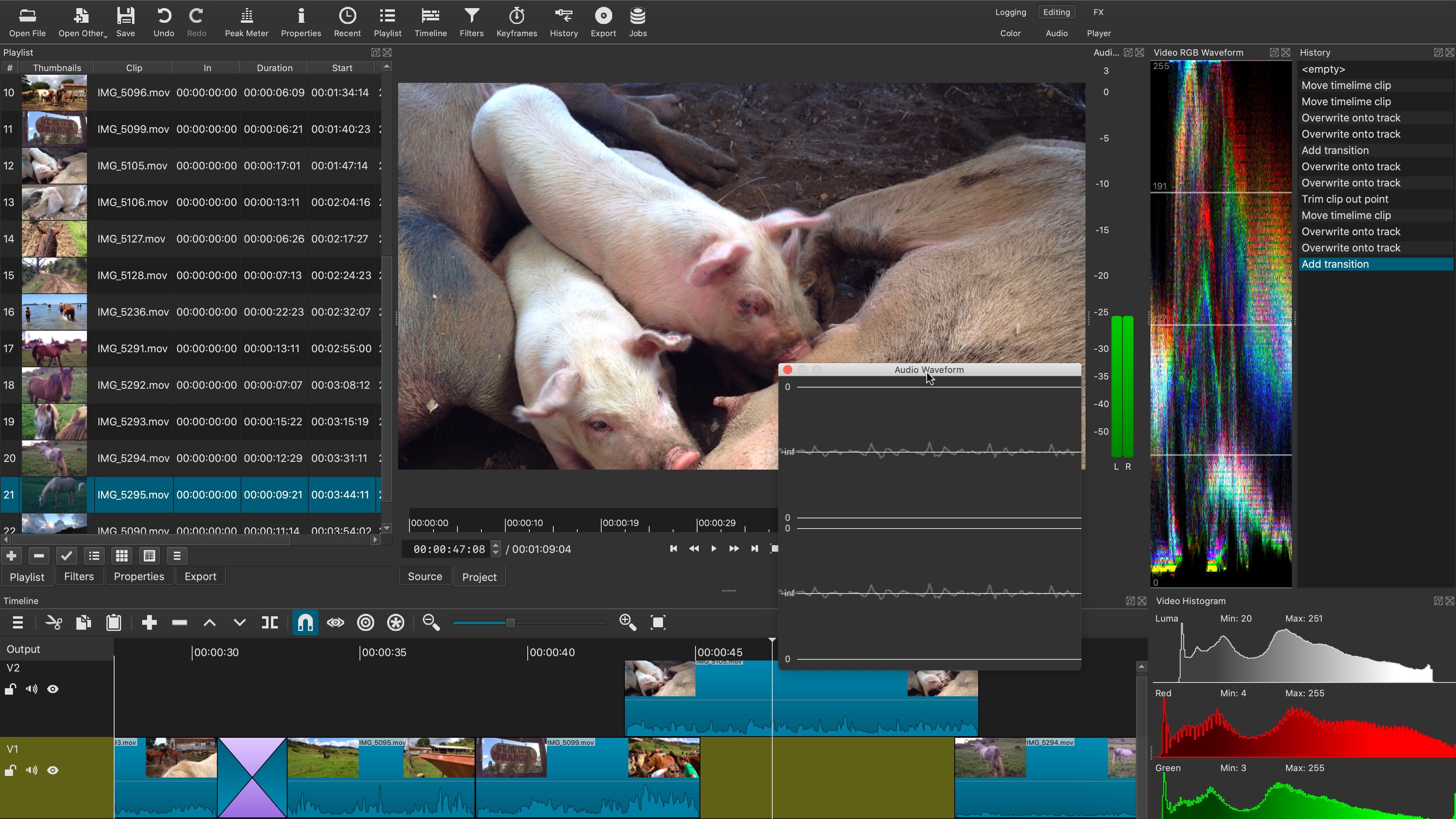
It's design can be as complex or as simple as you need it to be, and such versatility is always a big plus as it’s an easy way to make you feel as if the interface works for you, and not the other way around.
Tools
When you start a new project, you’re given the option of either leaving the resolution to ‘automatic’ (Shotcut will select the best one depending on the footage used), or set it to a specific dimension. You have a wide choice of presets, right up to 4K at 60fps, or you can also set it to ‘custom’ and specify the exact resolution and frame rate you want to work with.
Adding media is as easy as dragging and dropping. From there you can preview each by double-clicking on them, set In and Out points and drag the file from the preview pane directly onto the timeline. It’s all pretty organic and intuitive, and works as you’d expect most professional video editors to.
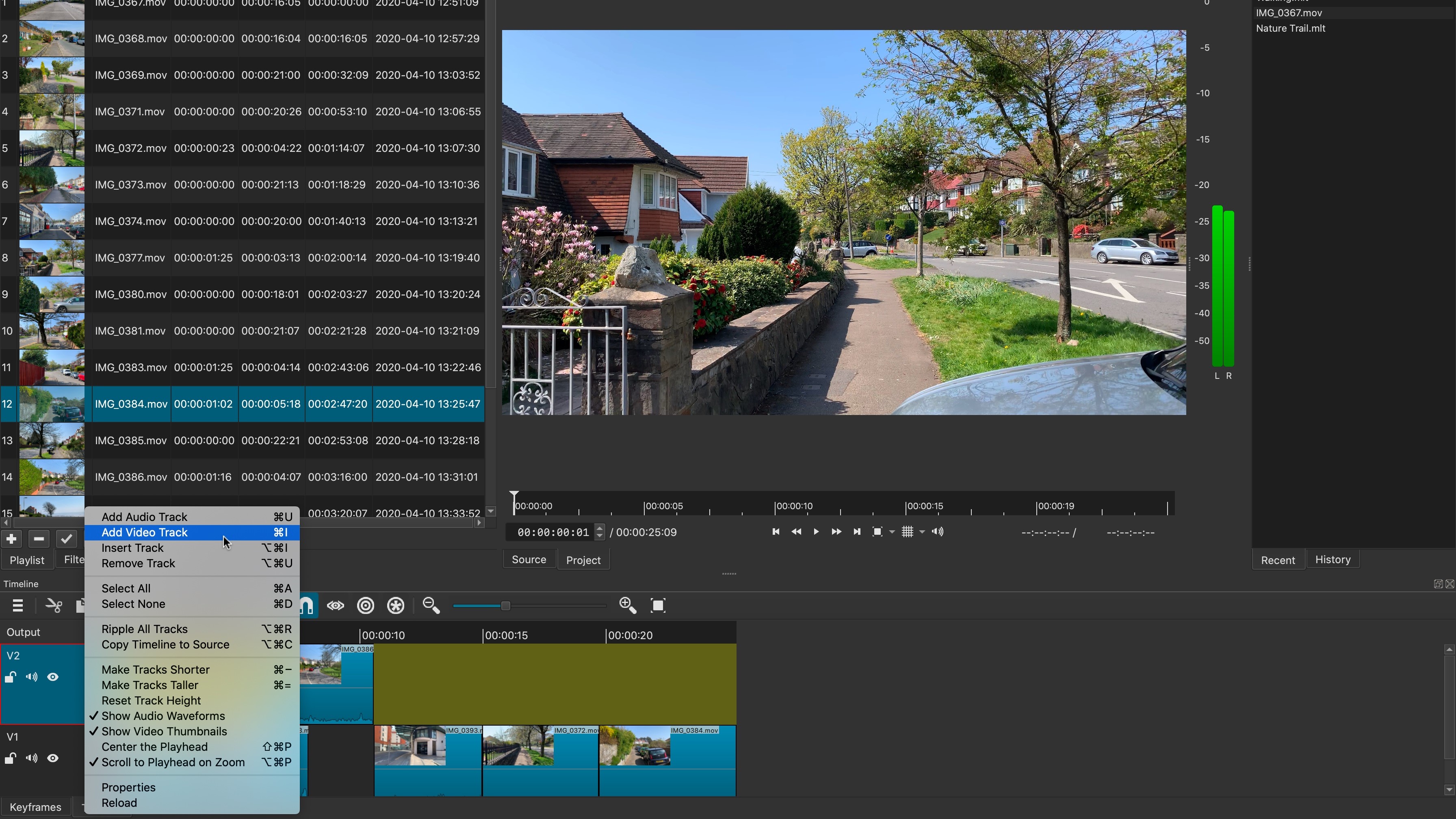
At first glance, it appears as if you’ve only got one video layer to work with, but you can add as many video and audio layers as you need - the only catch is you need to do this manually. You can’t, for instance, drop a clip above another in the timeline and have a new layer automatically appear for that clip to be added to. It’s a shame that this isn’t happening, but is a minor, although somewhat frustrating quibble.
Populating the timeline is very straightforward, and you can build an edit quickly with a combination of mouse, keyboard and icon controls.
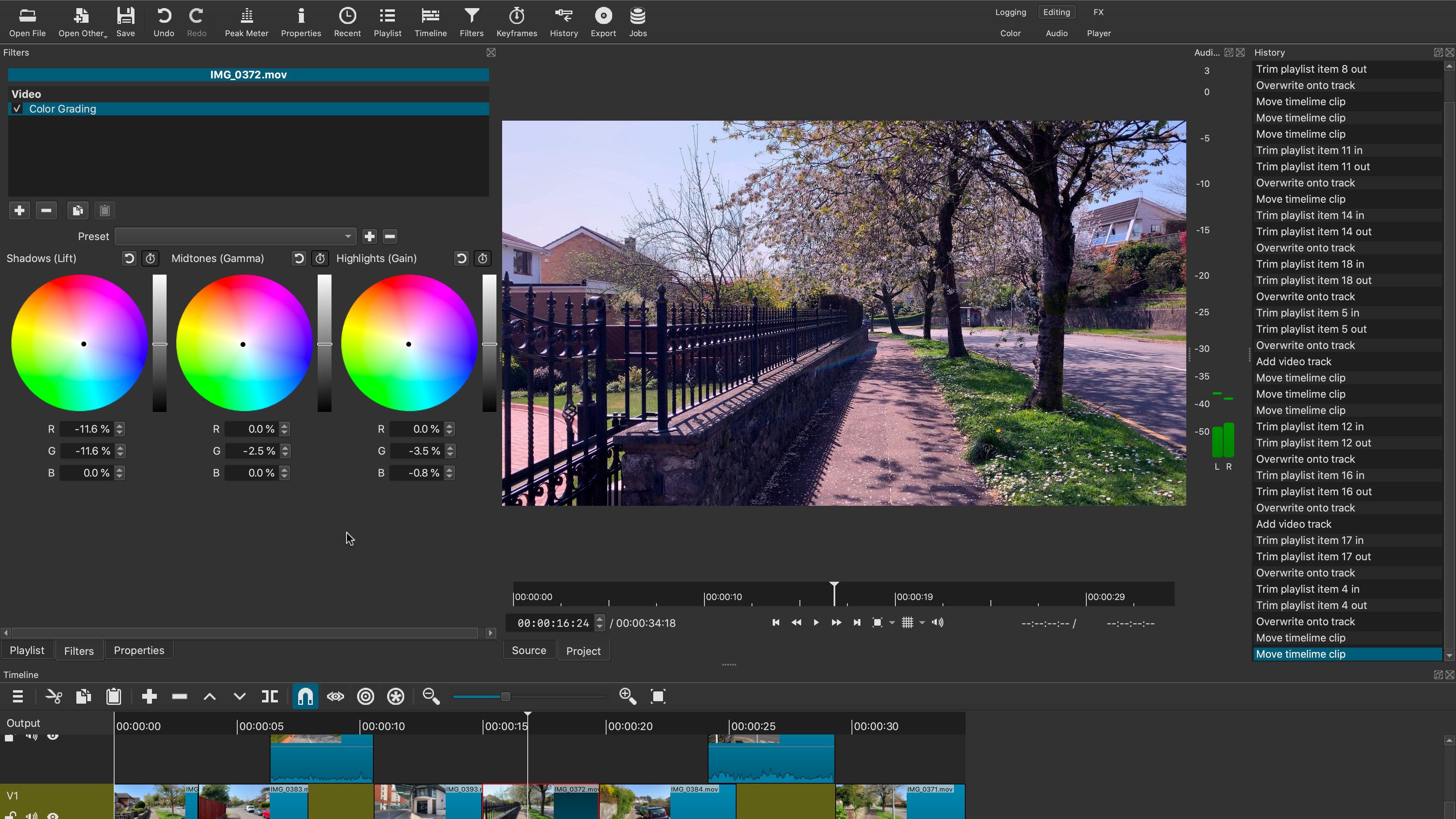
When you’re ready to apply effects to your clips, click on the Filters tab, bottom left of the interface, or on the Filters icon top of the interface (they both lead you to the same place). In order to see all available filters, you need to click on the ‘+’ button, having selected a clip first. Filters are divided into tabs with the ‘Favourites’ being chosen by default, so don’t think that those are the only ones available to you. You actually have a large selection of effects to choose from, from cropping and positioning, to three-way colour correction, chroma keying, and everything in between. There are even filters for working with 360 video. This is also the place where you can find text tools.
Regretfully there are no thumbnails to help you find what you’re looking for, just a scrolling list. Thankfully, there’s a search field at the top you can use to narrow down your search.
Keyframing
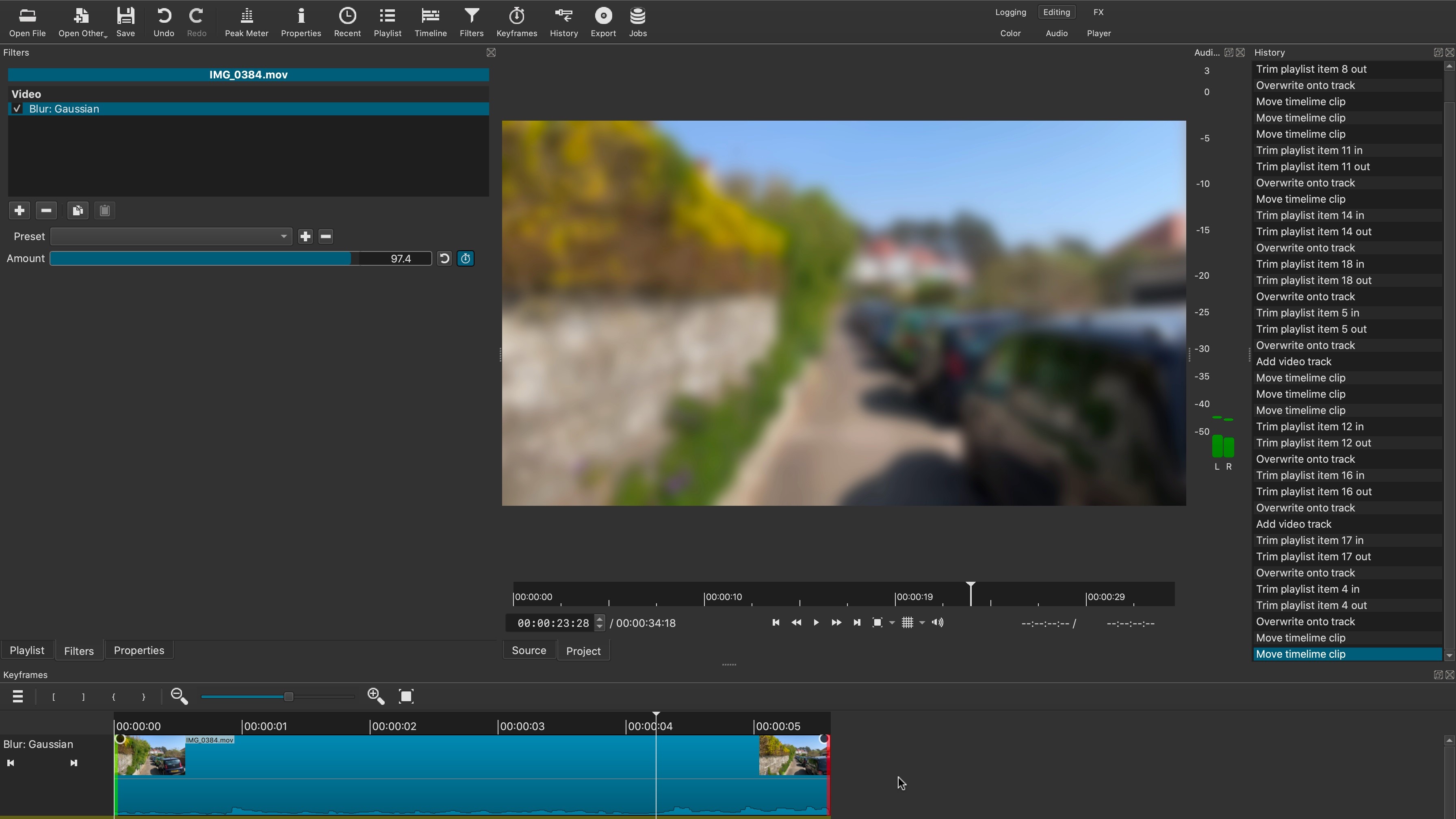
It’s also incredibly easy to add keyframes to any value and alter it over time. Triggering the keyframe function replaces the timeline with the selected clip. Move the playhead and alter the value at the position to see the filter gradually change over time. You can also create more keyframes by double-clicking on the line itself in the timeline, and dragging the point up, down, left or right.
We did notice that the effect can take a few seconds to update, even on a modern machine.
Transitions
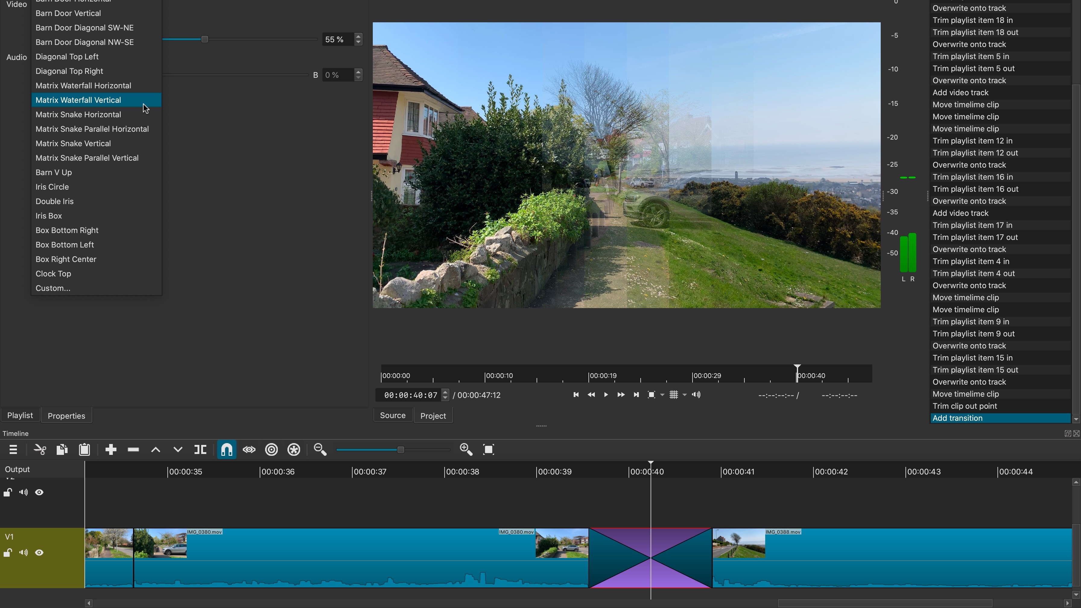
It’s not clear at first how to add transitions, but the process is actually remarkably easy: just move a clip already in your timeline, over another. The further into the other clip you drag, the longer the transition will be. It’s easy, although don’t do this as you drag a clip in from the playlist, as this will merely overwrite the existing clip in the timeline: both clips must already be in the timeline for this process to work.
By default, the transition is a basic cross dissolve. To gain access to all the others Shotcut has available, right-click on the transition in the timeline and select ‘Properties’.
Not as intuitive as it could be, but once you know, it’s a pretty simple matter.
Export
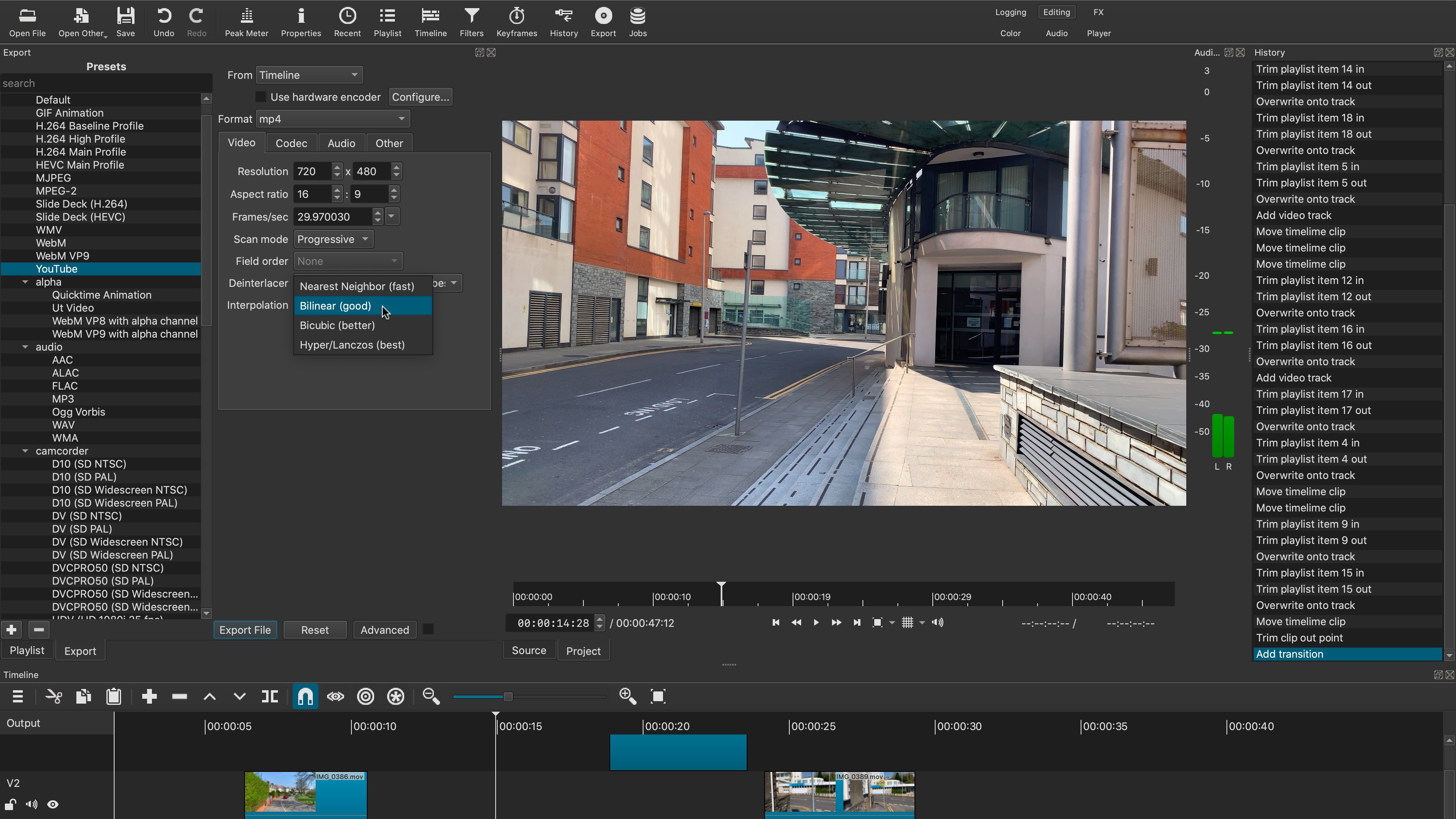
When it’s time to share your work with others, the Export feature is there, ready and waiting. It comes with a vast assortment of presets, from the standard H.264 or YouTube options, to animation presets (which preserve a project’s transparency), audio only choices, exporting back onto a camcorder, onto a DVD, and even has legacy, lossless and stills options.
And that’s not all: with the Advanced button selected, you can also fine tune your chosen preset - although this would be solely recommended for those who know what they’re doing!
Final verdict
Shotcut is a very good well rounded video editor. Many free alternatives can leave a lot to be desired, adding veracity to the old adage that “you get what you pay for”. Shotcut however bucks that trend. Yes there are a few niggling glitches and design decisions, but that’s true for any software - paid or free.
As it currently stands, Shotcut is a very robust and stable video editing package (it only crashed on us once when we were trying it out), with numerous features, and a good amount of flexibility you help you customise the interface to suit your needs.
The fact it gets updated monthly is merely icing on the cake.
It’s definitely worth taking it out for a spin.
- We've also reviewed the best video editing software for beginners
Steve has been writing about technology since 2003. Starting with Digital Creative Arts, he's since added his tech expertise at titles such as iCreate, MacFormat, MacWorld, MacLife, and TechRadar. His focus is on the creative arts, like website builders, image manipulation, and filmmaking software, but he hasn’t shied away from more business-oriented software either. He uses many of the apps he writes about in his personal and professional life. Steve loves how computers have enabled everyone to delve into creative possibilities, and is always delighted to share his knowledge, expertise, and experience with readers.
