TechRadar Verdict
Site123 is an extremely simple website builder that’s great for anyone creating a website for the first time. There’s an online chat where you can ask questions, and you can use the free plan as long as you like. If you’re looking to get your feet wet in building your own site, Site123 is an easy place to start.
Pros
- +
Clean interface
- +
Easy to customise
- +
Free plan
Cons
- -
No email in the free version
- -
Templates are pretty simple
Why you can trust TechRadar
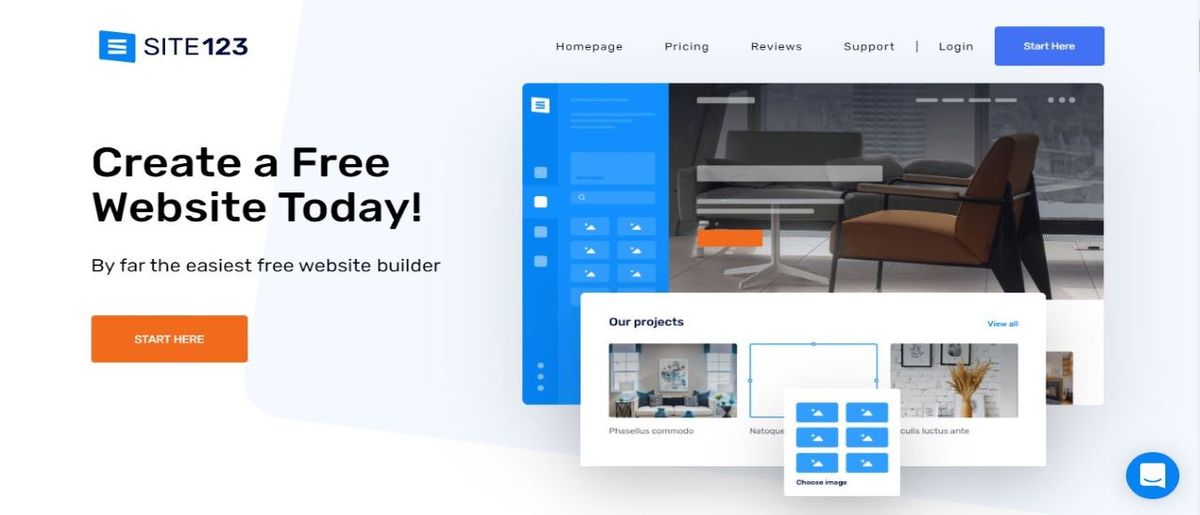
The homepage of Site123 states that it’s “by far the easiest free website builder”. Better put that claim to the test, and best of all, you can do so without spending a penny.
- Interested in Site123? Check out the website here
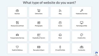
Click on the service’s welcome page’s ‘Start here’ to grab yourself 250MB of storage, 250MB of bandwidth a month and your first design decision: what type of website do you want to create? You have to choose from one of sixteen options, from Business, to Online Store, Blog, Music, and Creativity, amongst others.
- Also check out our roundup of the best website builders

The interface
Once your site is created, you’ll be graced with a large preview of the template Site123 has designed for you. As you’d expect, it’s fully customisable, and you can even delete those pages and start afresh.
Click on some placeholder text to change it. The selection box has a couple of white squares which are used to resize your text, Some basic formatting tools appear above, while more detailed options are presented to the left of the screen. You could for instance select to animate your selection, browse through a list of various styles, or choose from one of hundreds of available fonts.
That part is easy. Others can be frustrating. Click on the ‘gear’ icon for instance. This reveals the various Background Settings of your selected page. You’ll be graced with 25 tiny preview thumbnails of the same image altered in some minor way. It’s impossible to see clearly what each of them offers, and it’s really best to click on them in turn, to see what they look like as they’re implemented in the main preview section of the interface.
Pages
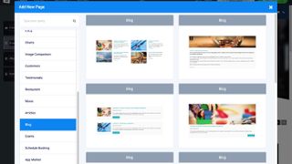
Expanding your site is a simple matter of clicking on the Pages menu and choosing to add additional ones. You’ll find a long list of categories, with various templates within each. These include Music, Testimonials, Articles, Events and Blog. Click on the style you’re interested in, and it’ll be automatically added at the bottom of your site.
One thing to bear in mind though: pages aren’t technically pages; they’re more like sections, each added under the other. This means your site is actually one giant scrolling page, and the more sections you add to it, the longer it becomes.
You’re also not limited to a single type of the above pages: you could have multiple blogs, galleries and e-commerce pages within the same website should you so choose. As long as you give them different names, it won’t get too confusing in the navigation menu.
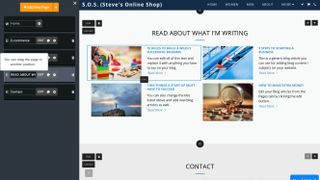
That menu, locked at the top of the page, just takes you straight to these various sections, but you can also scroll up or down to get to where you want to go. Reordering sections is a simple matter of dragging their handle from the sidebar and repositioning them elsewhere.
However the more you populate your site, the more confusing it can get, especially as you add more posts to your blogs or additional photos in your galleries. Although the customisation invites complexity and numerous sections, we wouldn’t recommend you go too crazy, and limit your design to just a handful of them.
Features
Looking at the blog options, the design will feel familiar to anyone who’s used a word processor. Click on the blog section’s ‘Edit’ button to see all posts already created. You’ll see that a few are already there - examples to show you how the blog looks like and works. Click on them to edit them, or just get rid and start anew. You can add images and videos, include tags and a featured image. It’s all pretty easy and straightforward, enabling you to get started in no time at all.
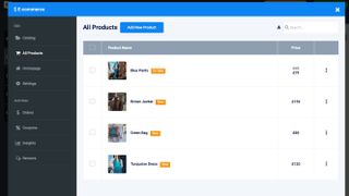
What stands out the most about Site123 is its ecommerce abilities. While there’s plenty of web builders out there with the ability to create your own store (like Jimdo, Fasthosts, and SimpleSite), not many web hosts have ecommerce options that are so flexible and easy to customise.
You can add new items, create new categories, highlight the fact some products are new or for sale, etc. The free version of the service only allows your customers to pay by bank transfer, cash on delivery, check, money order, in person, or by phone. The more vital features for an online business, like PayPal, AmazonPay, or Stripe, amongst others, can only be accessed if you upgrade to the ‘Premium’ plan.
Site 123 gives you a free ‘temporary subdomain’ to publish your site to, but it’s as far from memorable as you can get - just a series of random letter and numbers, followed by ‘.site123.me'. If you want a more catchy URL, or if you already have one and would like to link your site to it, you have to pay for the privilege.
Plans and pricing
Site123 has two main web hosting plans on their website. They also offer a 14 day money-back guarantee, so you can easily test Site123 to see if it’s right for you. Here’s a quick overview of both of them:
As its name implies, ’Free' comes with no charge. This option grants you 250MB of storage, 250MB of bandwidth, and one subdomain. Best if all, there’s no credit card required to sign up for it. This plan works best for those just starting on their online journey.
‘Premium’ is $12.80 per month. It includes your own domain name (for the first year), 10GB of storage space, 5GB of bandwidth, grants you more advanced ecommerce capabilities, and removes ‘Site123’ branding. This plan is great for small business, entrepreneurs, and freelancers who want more storage space and enjoy having their own domain.
Final verdict
Overall, Site123 is easy to use. Although somewhat limited, your customisation options are clear and easy to implement. The main preview of your website as you create it and experiment works great, but the layout options don’t favour a complex site with too many sections. If your needs are simple, and want something that looks good with little effort, Site123 is worth checking out.
- We've featured the best small business website builder
You might also want to check out our other web hosting buying guides:
Chyelle works as a freelance writer for The Daily Beast and edited articles for Forbes, Inc.com, Fox News and other review sites. She researches products and services related to internet consumption and works on TechRadar Pro on SAAS offerings.
