TechRadar Verdict
Considering its strong and well-rounded level of processing control and the single upfront fee, Luminar 3 achieves its goal of offering a compelling alternative to Lightroom. The new DAM system makes things easier too, and while there’s room for improvement, this is thankfully more in relation to a handful of minor niggles rather than any more serious oversights.
Pros
- +
Very good level of control offered
- +
Cataloging makes things much easier
- +
One-off fee (no subscription)
- +
AI sliders can work impressively well
Cons
- -
Still a bit slow at times
- -
Info panel could be better utilised
- -
AI arguably not that important for target audience
- -
No specific, selectable lens profiles
Why you can trust TechRadar
The Essential Review
This is TechRadar’s review summary that gives you all the key information you need if you’re looking for quick buying advice in 30 seconds; our usual full, in-depth review follows.
In the space of just a few years, Skylum’s Luminar has become one of the most popular editing programs for photographers. The company has made no secret about its ambition to dethrone Lightroom as the default option for those taking their image editing more seriously, and its latest attempt to do so comes through Luminar 3.
Available as a free update to users of Luminar 2018, and currently for just £64/$69 (at the time of writing) for anyone new to the software, this latest version is notable for two things.
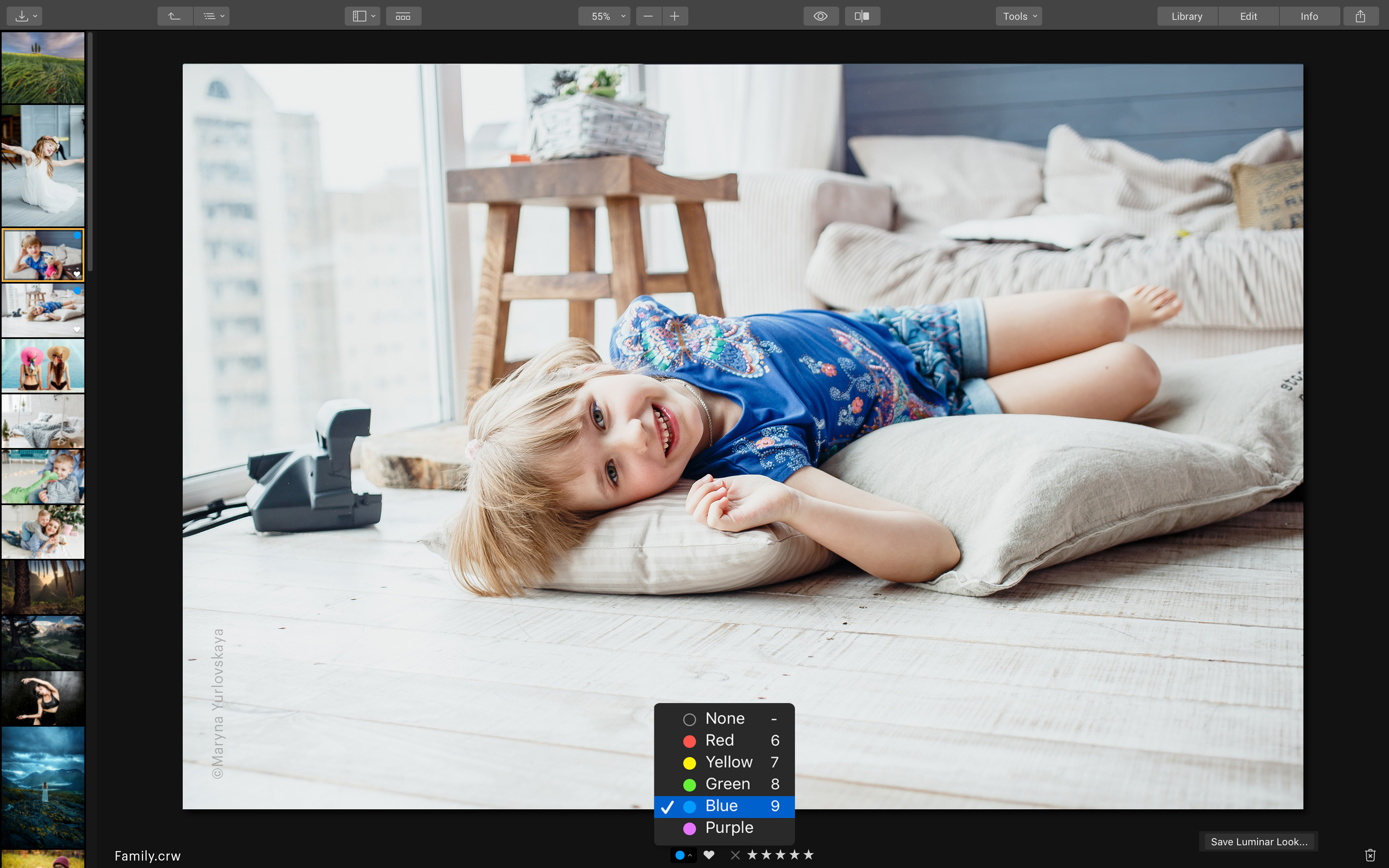
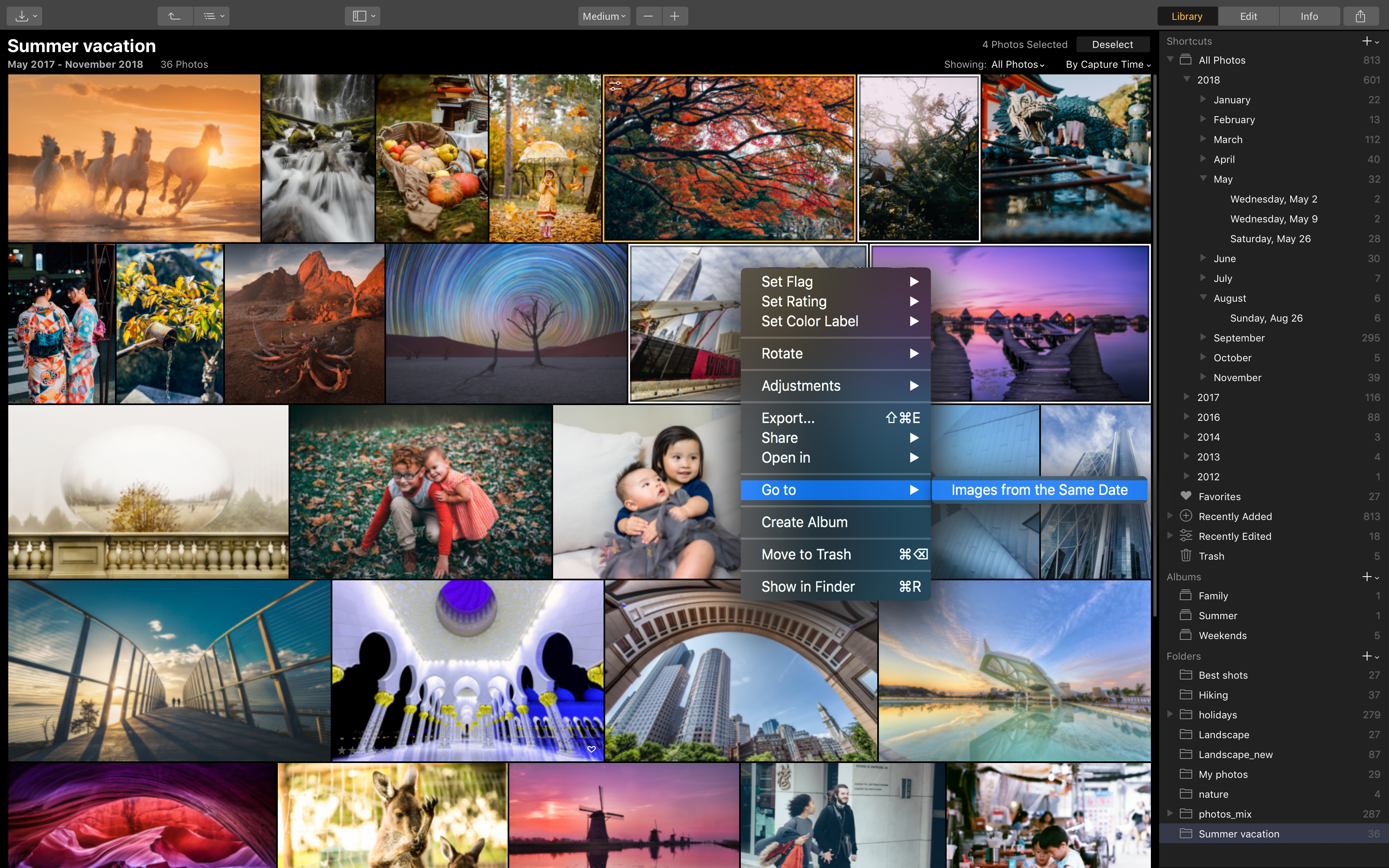
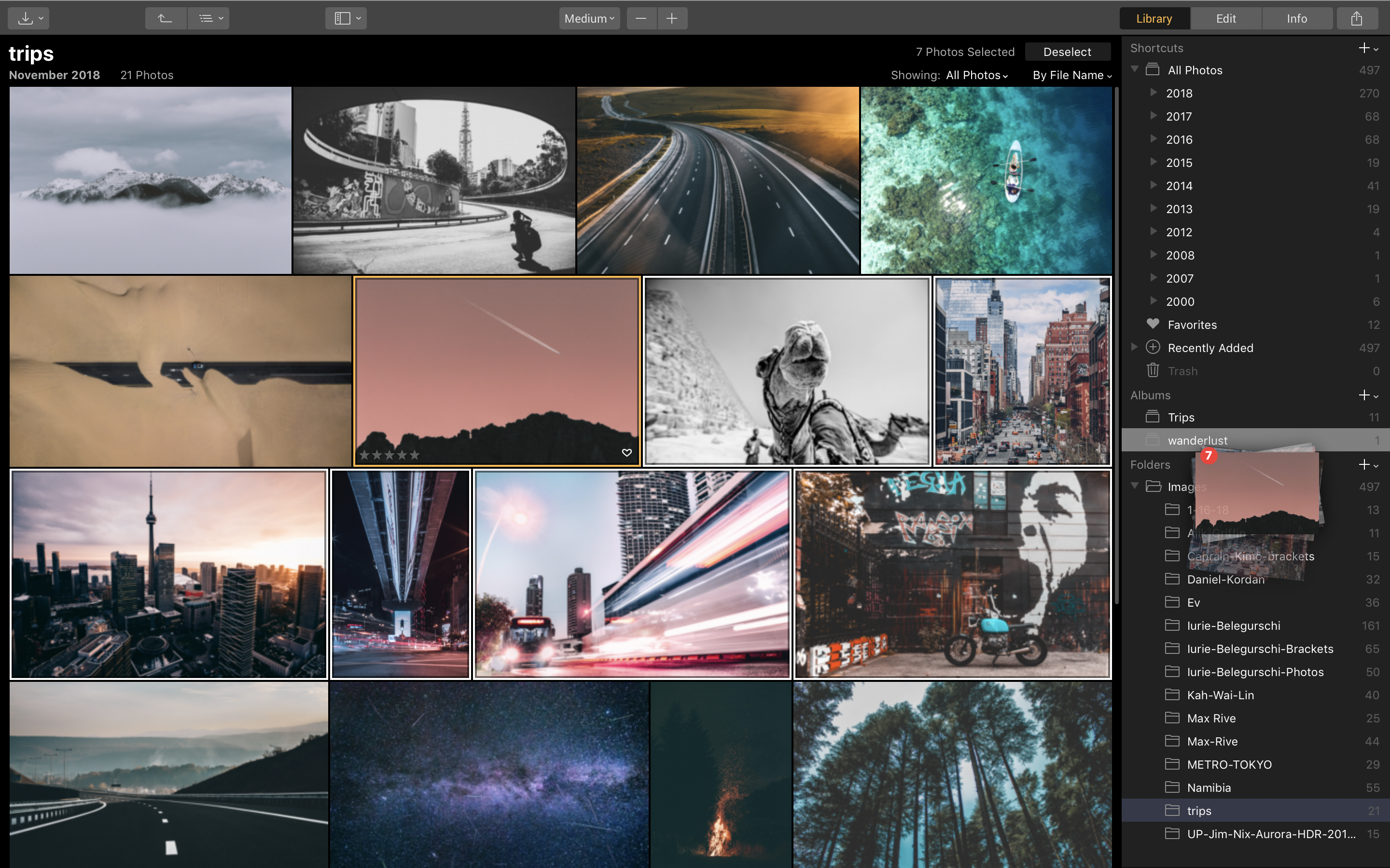
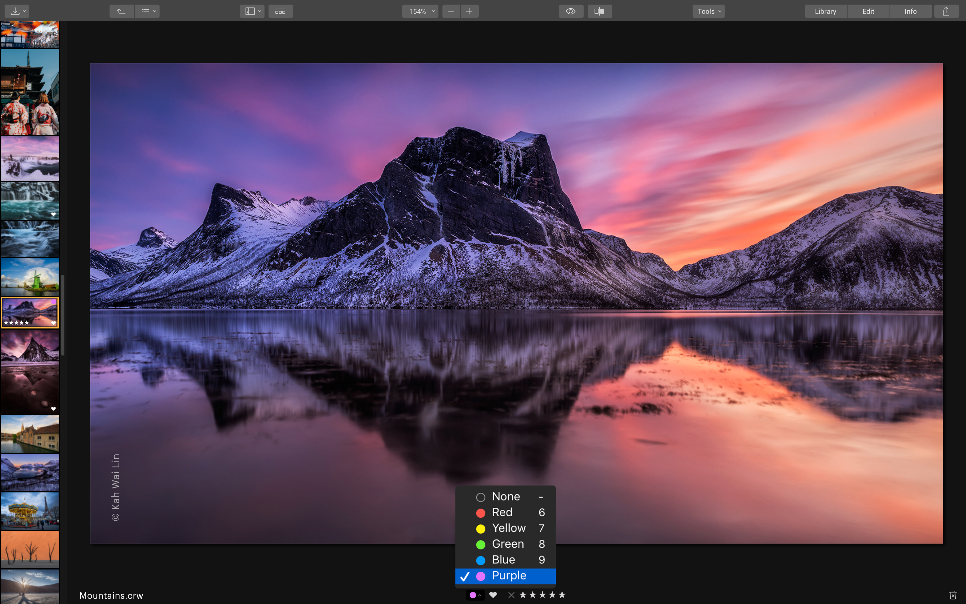
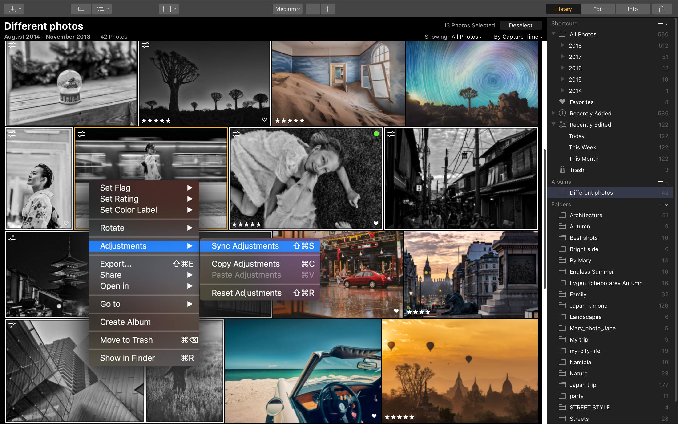
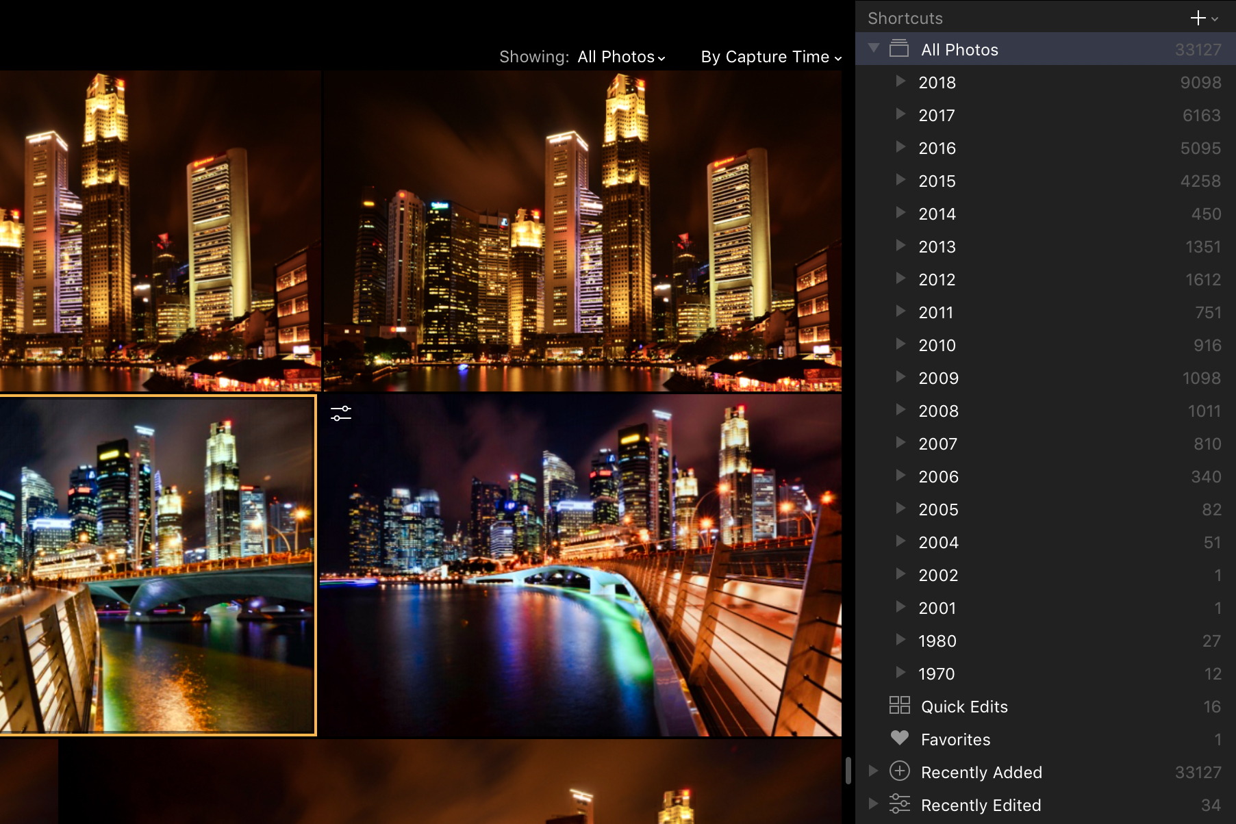
First, in addition to taking on Lightroom’s editing functionality, it also now offers a digital asset management (DAM) system, which has long been a draw of Adobe’s software. With this, images are automatically sorted into dated folders, and you can create you own structures, rate and label your shots and more, all helping you to organise and find what you need with ease.
The other noteworthy addition is some new AI-powered features, which seek to make processing more straightforward and intuitive. This doesn't, however, come at the cost of controls you'd expect for more precise control and fine-tuning – they simply sit alongside these so you can call upon them wherever you feel the need to.
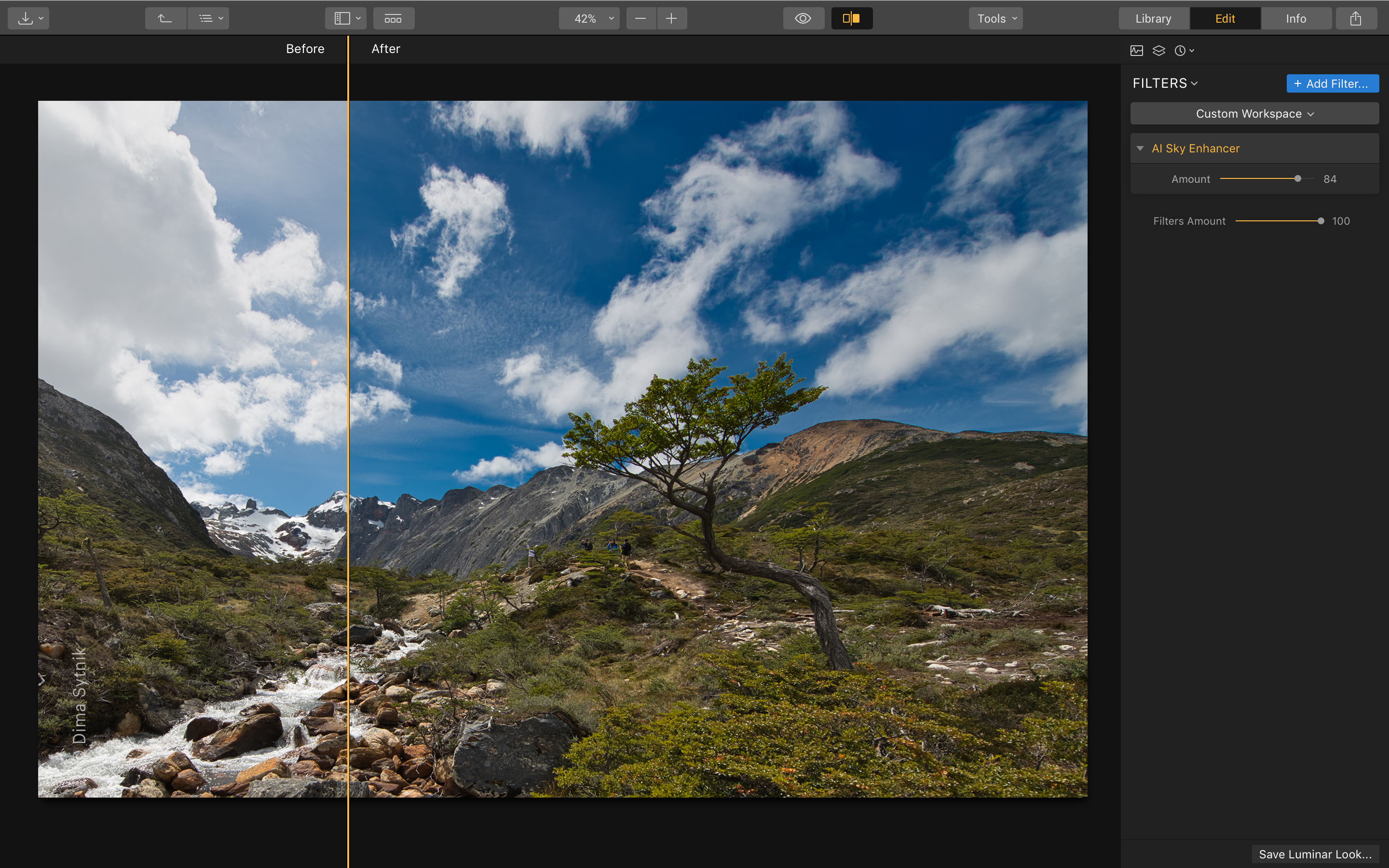
In use, these AI controls can work impressively well. The AI Sky Enhancer does a wonderful job to find the sky and boost its colour (or definition of clouds) without affecting the rest of the image too greatly, while the Accent AI Filter works well to spruce up a raw file to a far more agreeable colour, exposure and balance between areas of light and dark, with sliders for both features on hand to regulate the strength of adjustment.
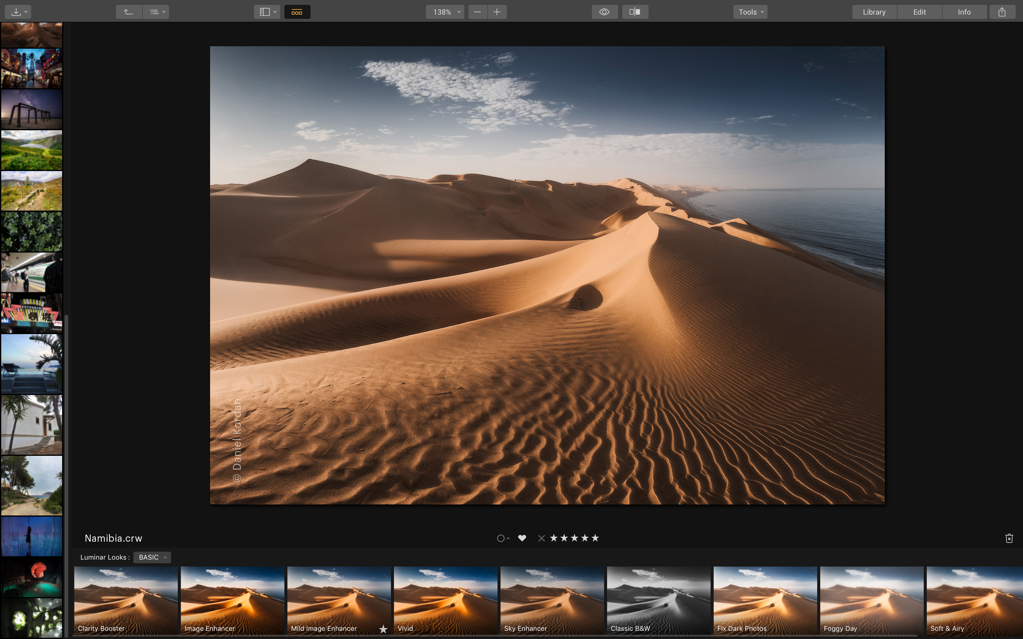
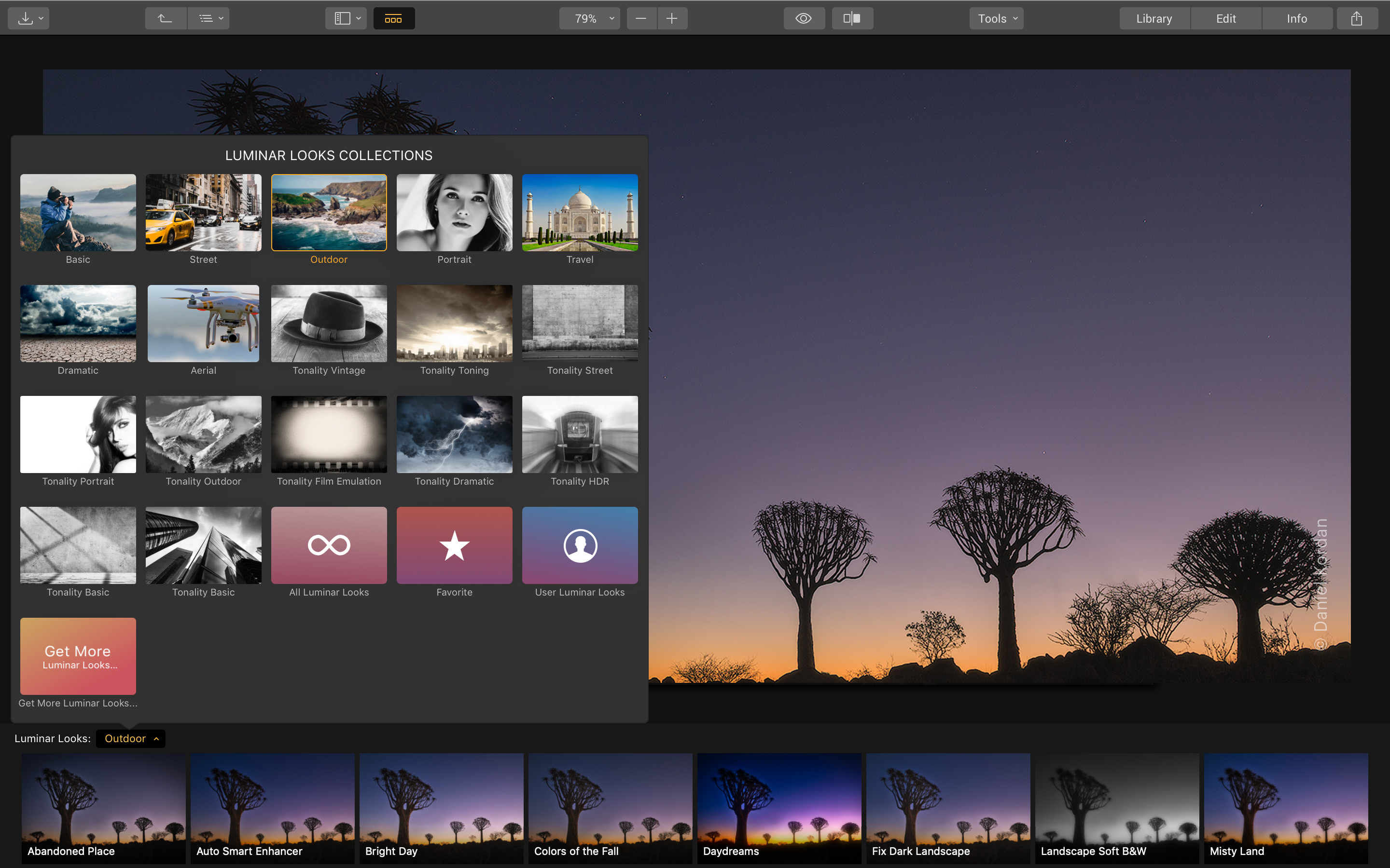
When processing images manually, you have a very good level of control over all aspects of editing, although we'd like to see specific lens profiles and control over chromatic aberration beyond a simple checkbox. Adjustments are made quickly, however, and whole there's a little lagging here and there in general operation, speed isn't as much of an issue as we've found in previous Luminar iterations. The included filters – or 'LOOKs' as they're called here – for portraits, landscapes and street screens among others are a lot of fun.
Overall, if you just want to pay a one-off fee and have a good level of control over processing your images while keeping everything organised, Luminar 3 is worth checking out. What is lacks in advanced controls it easily makes up in fun, ease of use and intunitiveness.
Who’s it for and should I buy it?
Luminar 3 is designed for anyone interested in editing their raw files who also wants a simple way to organise their images. While the enthusiast-level Lightroom option from Adobe is arguably the program's main competitor, the range of LOOKs and ease of use of Luminar 3 – together with its reasonable price tag – mean that it should also serve the needs well of those just getting started with processing that want a little room to grow.
Luminar 3 price
- Current price: £64 / $69 / AU$69
A new DAM and a range of LOOKs in addition to core processing tools
- DAM system for organising images
- AI tools for fast and intuitive processing
- Over 60 LOOKs

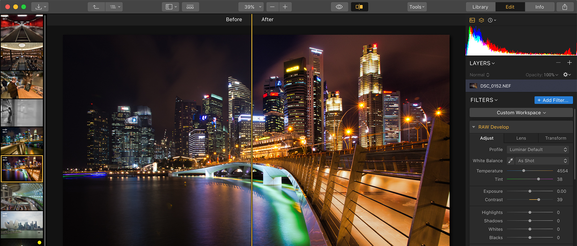
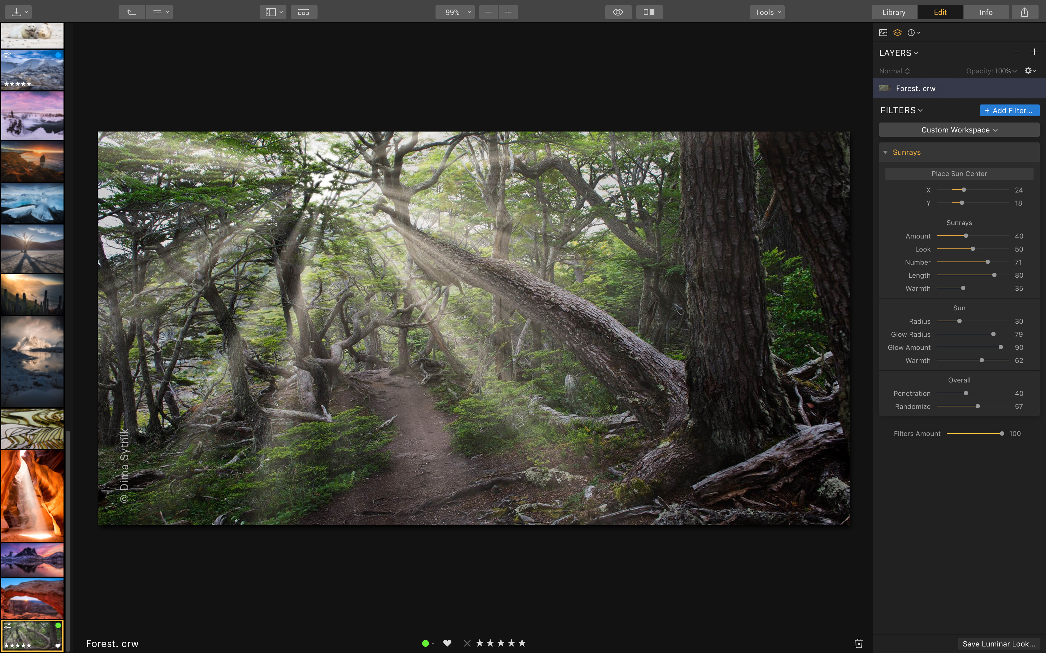
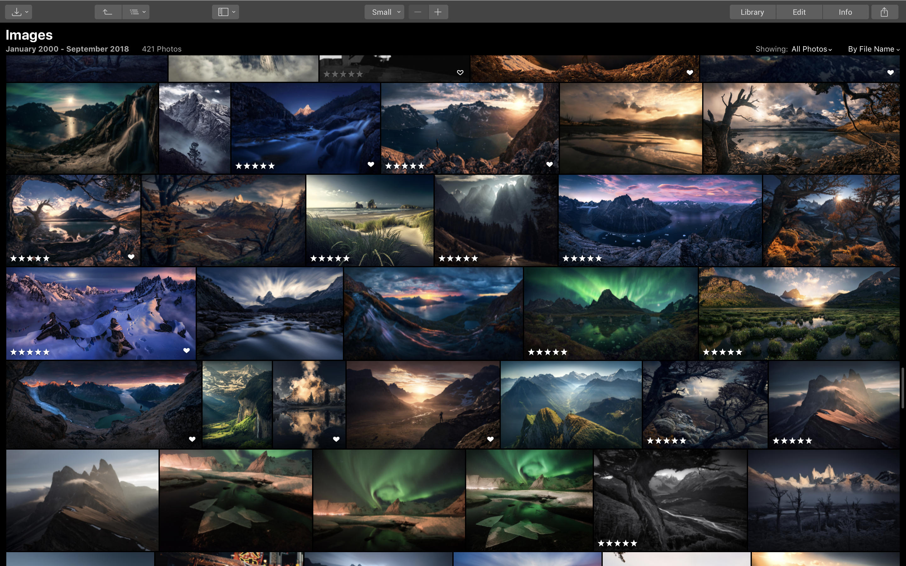
The default setup of the workspace has a panel of images running along the left-hand side and folders on the right, with the selected image displayed in the centre. That's when you're editing – otherwise, images from your folders on the right-hand-side fill the remaining space (above), to a magnification of your choosing.
The right-hand-side of the application also features the workspaces used for processing. The most comprehensive option is Professional, although there’s a Quick and Awesome alternative if you just want basic adjustment options, as well as further options for specific scenarios (street, portraits and so on).
If you’re used to the level of control offered by Lightroom or Adobe Camera Raw, you may be impressed to see just how much you’re getting here – even if the odd tool is unavailable.
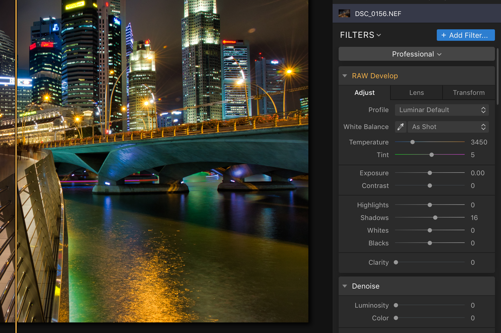
With regards to raw file processing, all expected key options are on offer, from exposure and white balance through to curves and split toning and vignetting. Further Lens and Transform tabs allow you to iron out optical aberrations and adjust perspective, scale and so on. Assuming your camera’s raw files are supported, you also have your camera’s profiles and the option to import your own DCP profiles if you’ve created any.
Interface and ease of use
- Customisable workspace
- Images can be viewed as Favourites, Recently edited and so on
- Info panel wastes space
The interface presented when editing images has a row of controls lining the top of the workspace. In addition to those for general navigation, an eye button gives you a quick and convenient before-and-after view, while a slider control next to it lets you view this affect across different parts of the image as you swipe across.
You can quickly amend the workspace to add or remove panels, zoom in and out of images, crop and transform all from the same general area, although you’ll find the odd keyboard shortcut makes things faster here and there. Sure, you could perhaps squeeze a few extra options in this space to get the most out of it, but this clutter-free design makes a lot of sense.
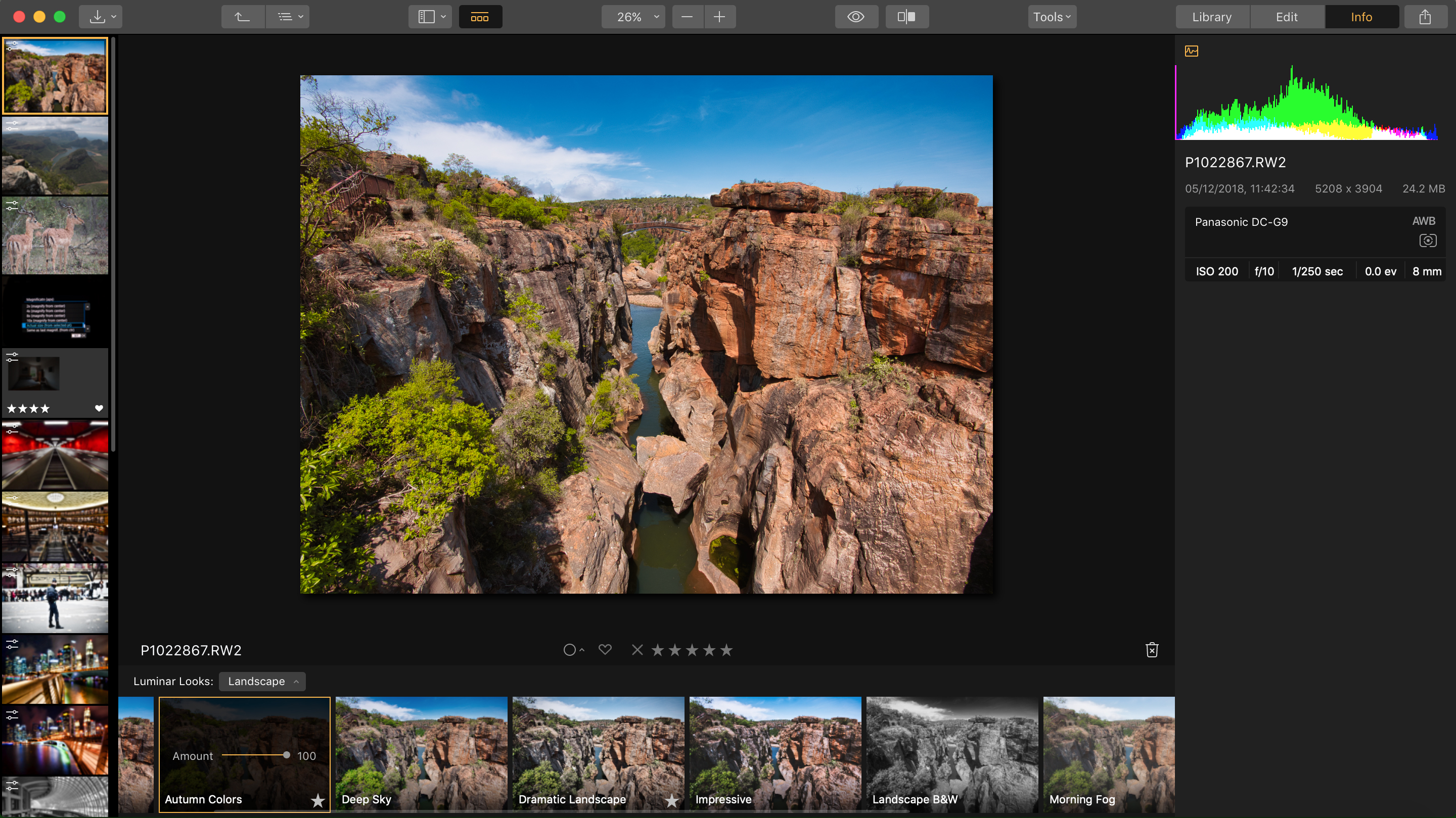
The Info panel, which shows an image's metadata, also only displays key exposure information, with the majority of this panel remaining blank and wasting space. Focal length is always displayed but lens names often don’t pull through, even if they have done so in previous images in the same set. The fact that there is so little information here makes it seem like this would work better being on display at all times, rather than something you have to click into, particularly as it can be useful to glance at things like ISO and shutter speed while you edit.
Performance and results
- AI tools work surprisingly well
- Slight lagging here and there
- More control over lens corrections would be nice
The tools on offer should satisfy the average user looking for a comprehensive level of control, although here and there you’ll see a few areas where something like Adobe Camera Raw retains an advantage. Control over noise is essential limited to luminosity and colour sliders, for example, while chromatic aberrations can only be tackled with a single checkbox control, rather than through a combination of different colour sliders to deal with different hues.
When you consider the cost of the software next to an Adobe CC subscription you can see that it’s not exactly reasonable to expect every similar feature, but it’s probably something worth bearing in mind if you’ve grown accustomed to these kinds of controls and you’re thinking of making the switch.
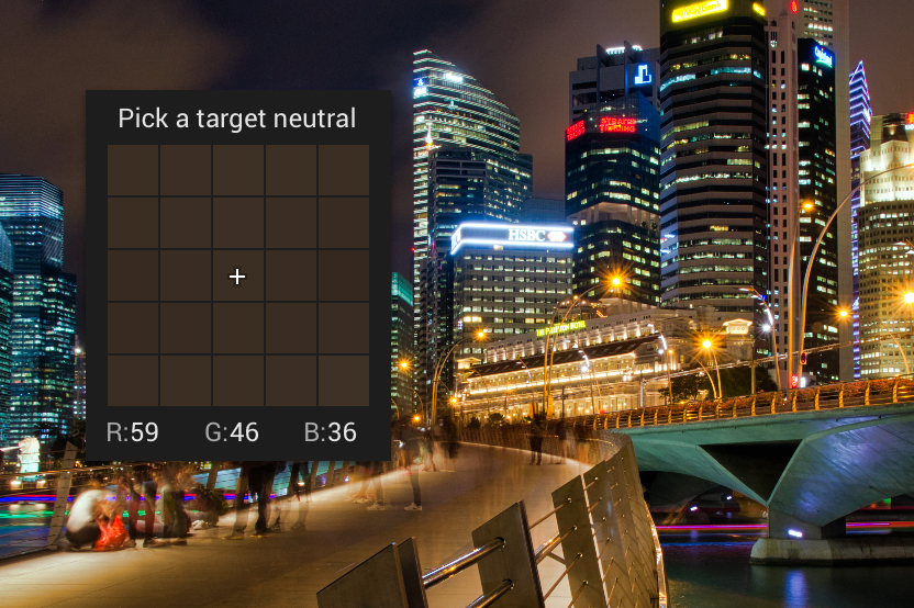
One very neat feature is the custom white balance control. While this isn’t different in principle to that offered in, for example, Adobe Camera Raw, the way it’s been implemented is much better, showing you red, green and blue values all in the same place as your selections. It’s a small detail, but you notice and soon appreciate these little things peppered throughout the software.
When processing raw files, the program generally does what it does well. Previous versions of the program have been criticised for slowness, and a little of this evident, such as when re-opening Quick Edited images with many adjustments or when moving around images at 100% and waiting for them to fully render. Still, when it comes to working on images themselves, this isn't an issue, with adjustments applied without delay.
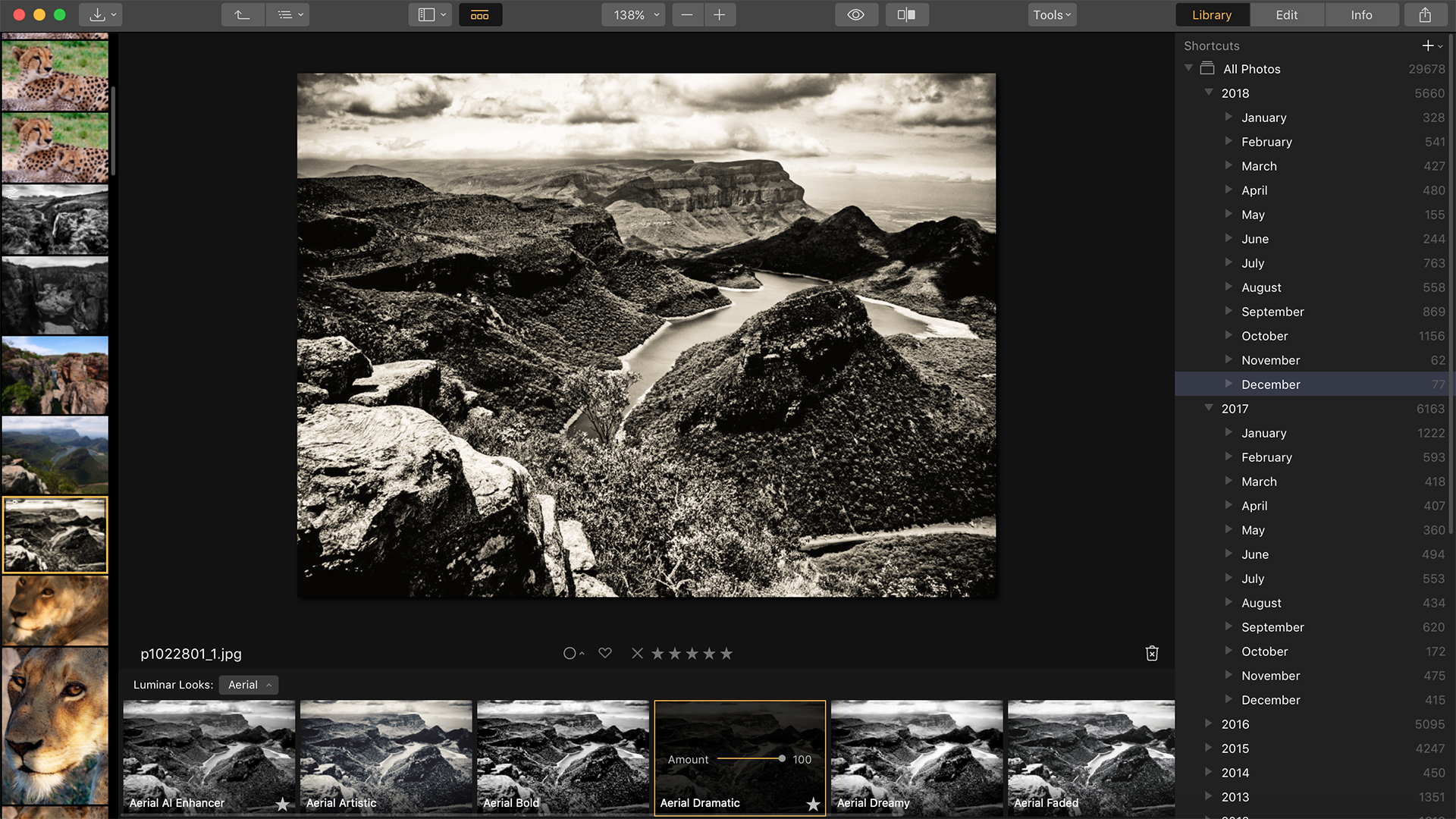
Feeling lazy? Various AI tools are on hand to make processing fast and straightforward, and while some of these may be a little too automated for the target audience, they can work impressively well.
The AI Sky Enhancer, for example, does a remarkable job to boost the blues in the skies while leaving the remained of the scene relatively untroubled, although it works very well to bring out clouds in overcast conditions where no sky is visible.
The Accent AI Filter also does a great job to pull back highlights, lift shadows, boost contrast and tweak saturation with a simple slider. You're unlikely to want to leave your editing there, nor use it to its full 100% setting as this can bring out noise in many shadow areas, but it’s a great thing to play with and it also worth calling on when you can see an image might benefit from a touch of something but you’re not quite sure what that is.
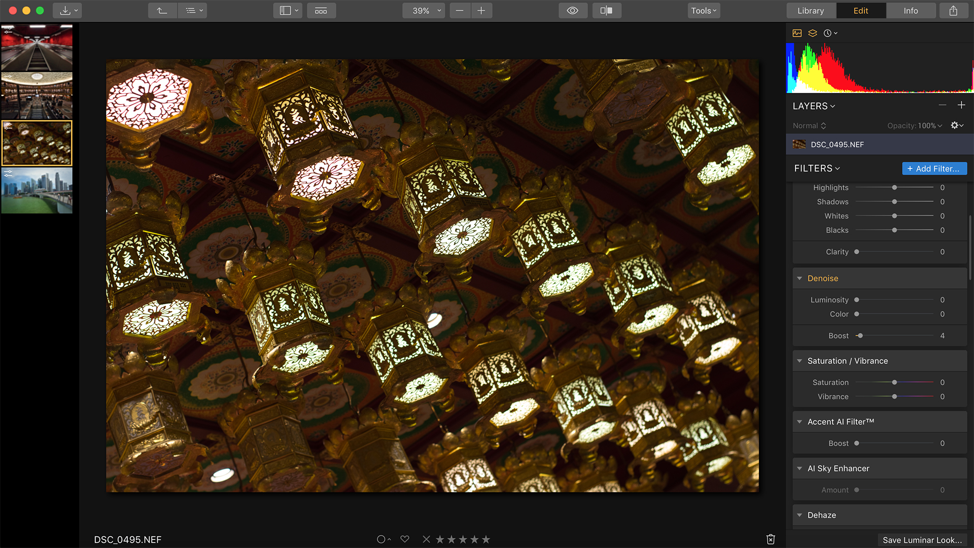
The original raw file is a little underexposed and in need of adjustments to colour
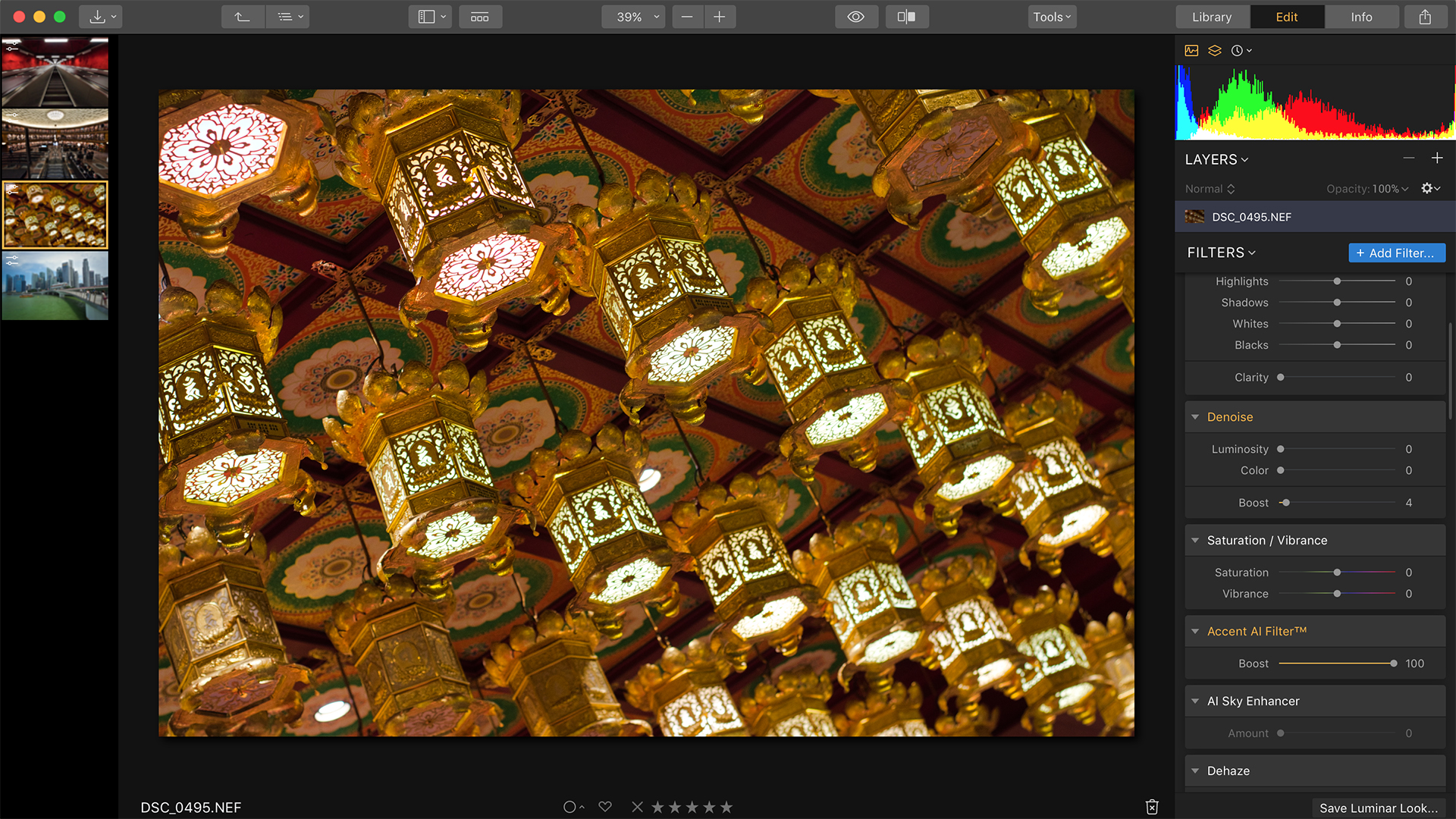
Using the Accent AI Filter alone has done a great job to bring the image close to output, with no detrimental effect on highlight detail
Verdict
While anyone who needs the highest level of control over they image editing may be better served by Photoshop CC or an alternative, Luminar 3 combines many useful and effective processing features with an easy-to-grasp interface, handy automated features and a logical cataloguing system. We'd like it to be a little faster and for some of the kinks to be ironed out, but if you're put off by the subscription-based approach adopted by Adobe and just want a powerful alternative, Luminar 3 is well worth a shot.
Competition
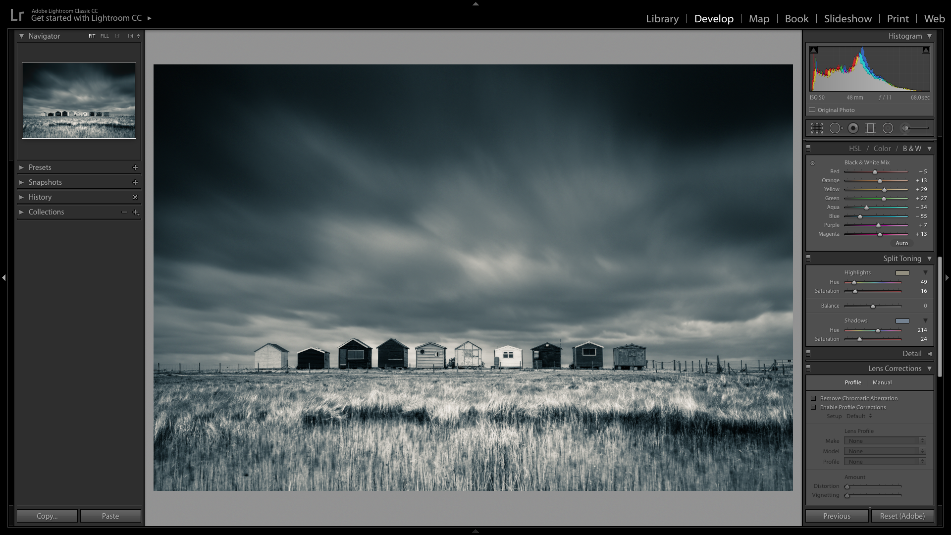
Adobe Lightroom CC
Powerful, renowned and constantly updated to support the latest cameras, but the subscription-based model that Adobe has moved to isn't for everyone.
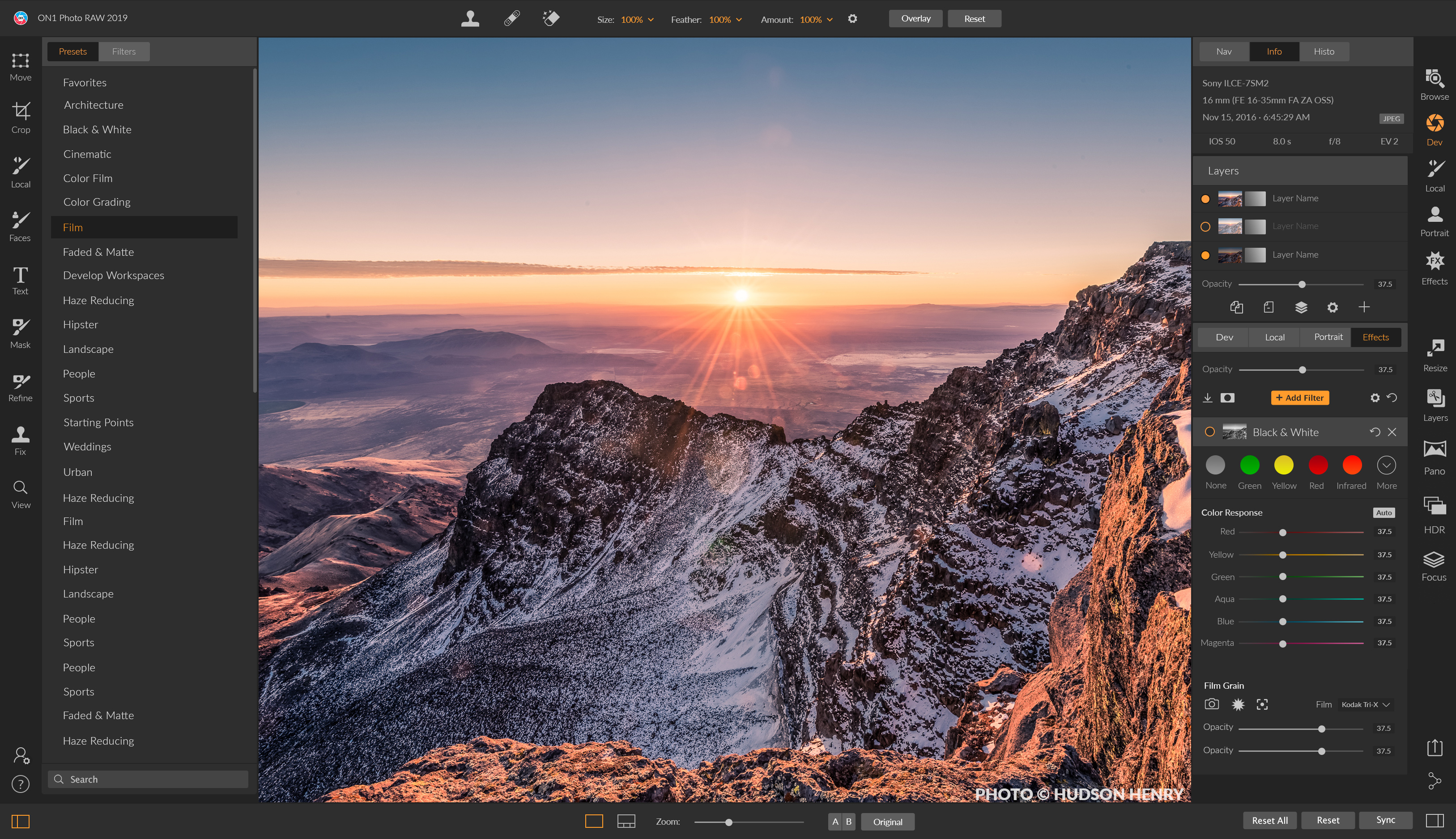
ON1 Photo RAW 2019
Another subscription-free option, ON1's Photo Raw 2019 also boasts a digital asset management system and is loaded with tools for HDR merging, panorama stitching and even editing using layers.
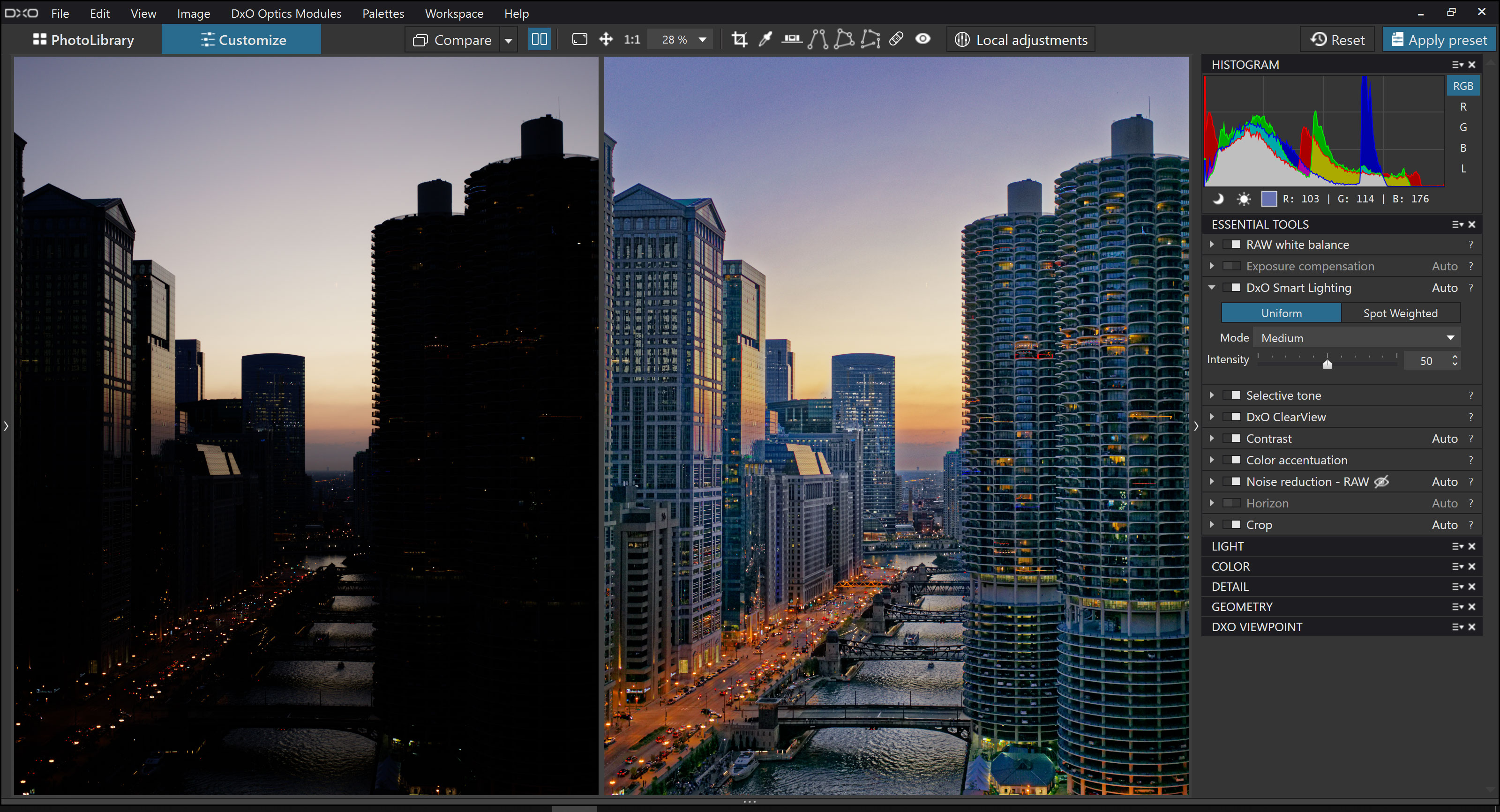
DxO PhotoLab 2
With the popular U Point adjustments inherited from the Nik Software collection acquired by DxO, and DxO's own Smart Lighting option and Film Pack treatments among other goodies thrown in, you get a lot for your money here.
