TechRadar Verdict
It's a powerful and well-equipped wearable with a good screen and reasonable battery life. If it could do all that while looking like an actual wristwatch it would be a real winner.
Pros
- +
Slick performance
- +
Built in GPS
- +
Good screen
Cons
- -
Not super stylish
- -
Iffy GPS performance
- -
Fiddly charging port
Why you can trust TechRadar
Update: Almost four years after the Smartwatch 3 was released, Sony's last top-end wearable is very difficult to find on sale. The company hasn't updated the watch to Android Wear 2.0 or Wear OS and its general age makes this a very difficult watch to recommend searching for in 2018.
The company has shown no intention of releasing a Sony SmartWatch 4 either, so if you want a smartwatch from Sony you may be disappointed and you can also take a look at our guide to the best Wear OS watches right now.
Below you'll find our original review from December 2014, which was then updated in July 2016.
The Sony SmartWatch 3 is more than just a smartwatch, it's also got ambitions as a capable fitness watch, thanks to the inclusion of GPS.
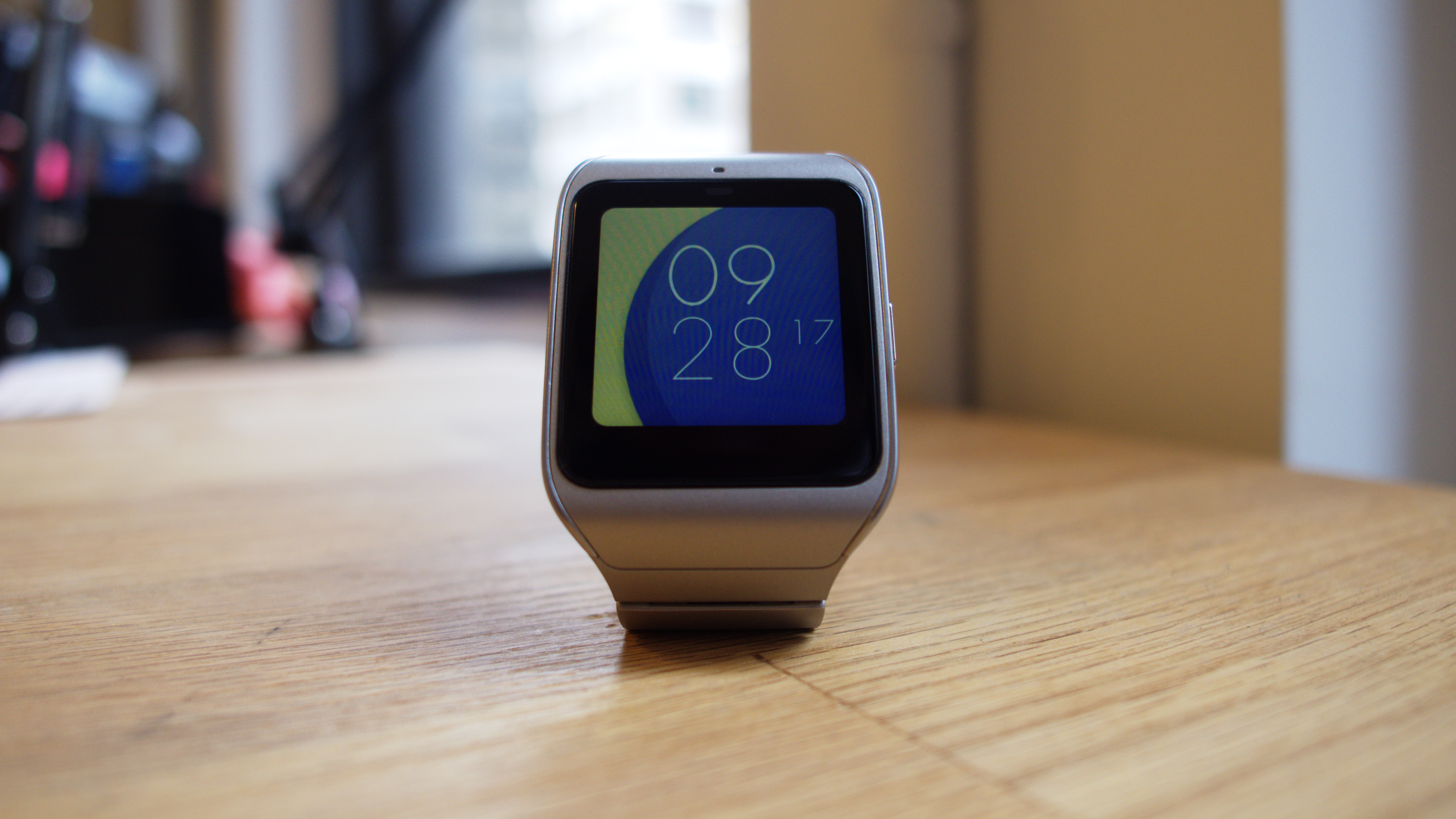
It doesn't make the most stunning first impression, especially when compared to the more traditional circular stylings of the Moto 360 and Huawei Watch. The Sony SmartWatch 3 rocks a square shape that's more similar to the Pebble Time than other Android Wear devices.
But, where its appearance might fall flat, it surprises in other ways. For one thing, the mere fact that it runs Android Wear is a bit of a shock, given that Sony has spent the last few years shying away from it, attempting to perfect its own system instead.
But it's a decision that I welcome. Android Wear is still finding its footing and with Sony jumping into the mix can only be a good thing.
Its 1.2GHz quad-core processor and 512MB of RAM pack it with power, even to today's standards. And with GPS built in, it's a more fully-functional fitness accessory than most other smartwatches available.

Of course, all that power doesn't come cheap, as the Sony SmartWatch 3 retails for £189.99 (about US$250, AU$299.99). However, if you do some digging, you can probably find yourself a big discount.
All in all, it's not quite the most expensive smartwatch. The aforementioned Moto 360 and Huawei Watch both edge it out, seemingly charging a premium for a circular, fashionable styling.

Each Android Wear watch is, functionally, very similar to the other and Sony's SmartWatch 3 is no exception. Android Wear is far more locked down than the version of Android found on smartphones.
In many ways that's a good thing, as it keeps bloat down on a system which really can't afford to be bloated, but it can also make it hard to stand out, which could be a problem when you're asking people to pay an above average price. Read on to find out if and how Sony's latest stands out.

Display
The Sony SmartWatch 3 has a 1.6-inch 320 x 320 transflective display. That's the same resolution and almost exactly the same size as the similarly square Gear Live, as well as being the same resolution as the G Watch R and a slightly higher resolution than the Moto 360. Fast forward to 2016 and the resolution standard hasn't changed all that much. The Huawei Watch reigns supreme with 400 x 400.
As smartwatches go, it remains crisp and clear. But even on such a small screen, there's still room for improvement, with text and images being noticeably less sharp than on a 1080p smartphone.
Being transflective makes it easier to read in direct sunlight than most competing smartwatches. Or it should anyway, December in England and New York City didn't prove the optimal time to test this, but I certainly had no problem reading the screen when outside.

The display has a number of brightness settings and can pump out quite a lot of light at its brightest, but auto mode does a decent job of regulating it. It's also always on, unless you deactivate that feature. As standard it will dim but still be readable when not in active use, while tapping on it, raising your wrist to your face or receiving a notification will cause it to light up.
Unless you really want to stretch out the battery life I can't see why you'd want to turn the screen off completely, as it reduces its usefulness as a watch because you can no longer see the time at a glance, but it's nice to know the ability is there if you want it.

On the whole the screen impressed, delivering a relatively good resolution and a decent amount of brightness, though the colours could be richer. And while the square shape might not be as aesthetically pleasing as a round display it does mean more apps are compatible with it, ones that might get chopped off with the Moto 360's flat tire.
James is a freelance phones, tablets and wearables writer and sub-editor at TechRadar. He has a love for everything ‘smart’, from watches to lights, and can often be found arguing with AI assistants or drowning in the latest apps. James also contributes to 3G.co.uk, 4G.co.uk and 5G.co.uk and has written for T3, Digital Camera World, Clarity Media and others, with work on the web, in print and on TV.
