TechRadar Verdict
The Ticwatch S exceeds expectations for a cheap smartwatch. It's well designed, a pleasure to use, and packs in a surprising amount of features for its price. It supports a number of features you'd expect from a fitness tracker as well as most of the things you'd hope to find in a smartwatch.
Pros
- +
Very affordable
- +
Easy to use
- +
Comfortable
Cons
- -
Lacks LTE and NFC
- -
Non-changeable straps
- -
No bezel controls
Why you can trust TechRadar
It may not be a household name yet, but Chinese company Mobvoi has quietly been making moves worthy of your attention.
Founded by ex-Google employees, with interesting work in AI and one of the few wearable success stories on Kickstarter, it's now launched its TicWatch S and E smartwatches into what is already a very crowded market.
Themselves Kickstarter-funded projects, the two watches are very slightly different versions of the same watch, with the S (sport) having a strap tailored towards more active use as the GPS is located in the band to give more accurate readings.
If you're in the market for a sporty new Google-powered wearable that won't break the bank, you'll want to read on.
Price and availability
- Launch price: $199.99 (around £150, AU$250)
- Available from Mobvoi and other retailers
- Available now in US, UK and AU
The Ticwatch S is available direct from Mobvoi and other third-party retailers – including Amazon if you're in the US – at a recommended RRP of $199.99 (around £150, AU$250).
For comparison, the Ticwatch E is $159.99 (around £120, AU$200), so if you're not wanting the sporty styling and improved GPS performance of the S, you can save yourself a further few pennies.
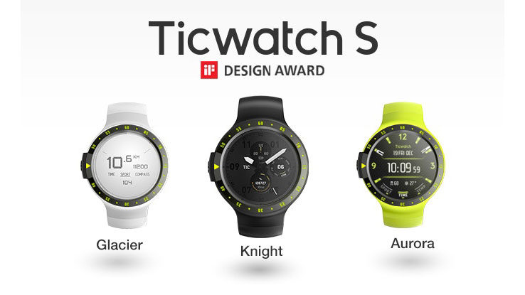
The Ticwatch S is available in three different colors; Knight (black), Glacier (white), and Auora (green).
Design
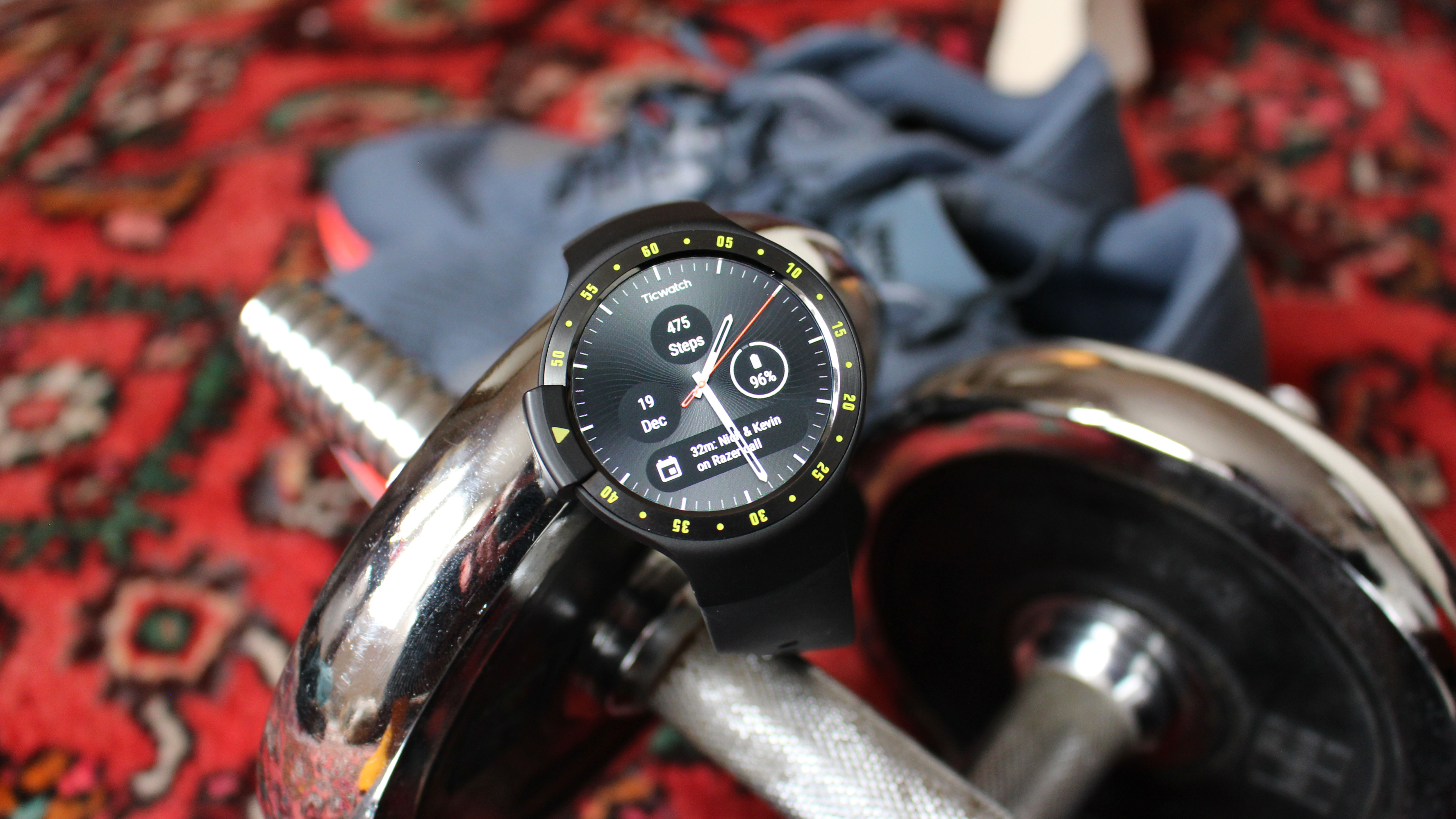
The Ticwatch S has a circular 1.4-inch OLED display, sitting within a brushed chrome-looking bezel emblazoned with bright green numbers and dots, that stop it from looking bland, and give it a sporty feel.
The bright green is a very definite style choice, and it feels interesting to have such a strong choice for a bezel seeing as one of the chief selling points of smartwatches is the ability to change the watch face to suit your personal style. That said, it's not uncommon for smartwatches to adopt this style.

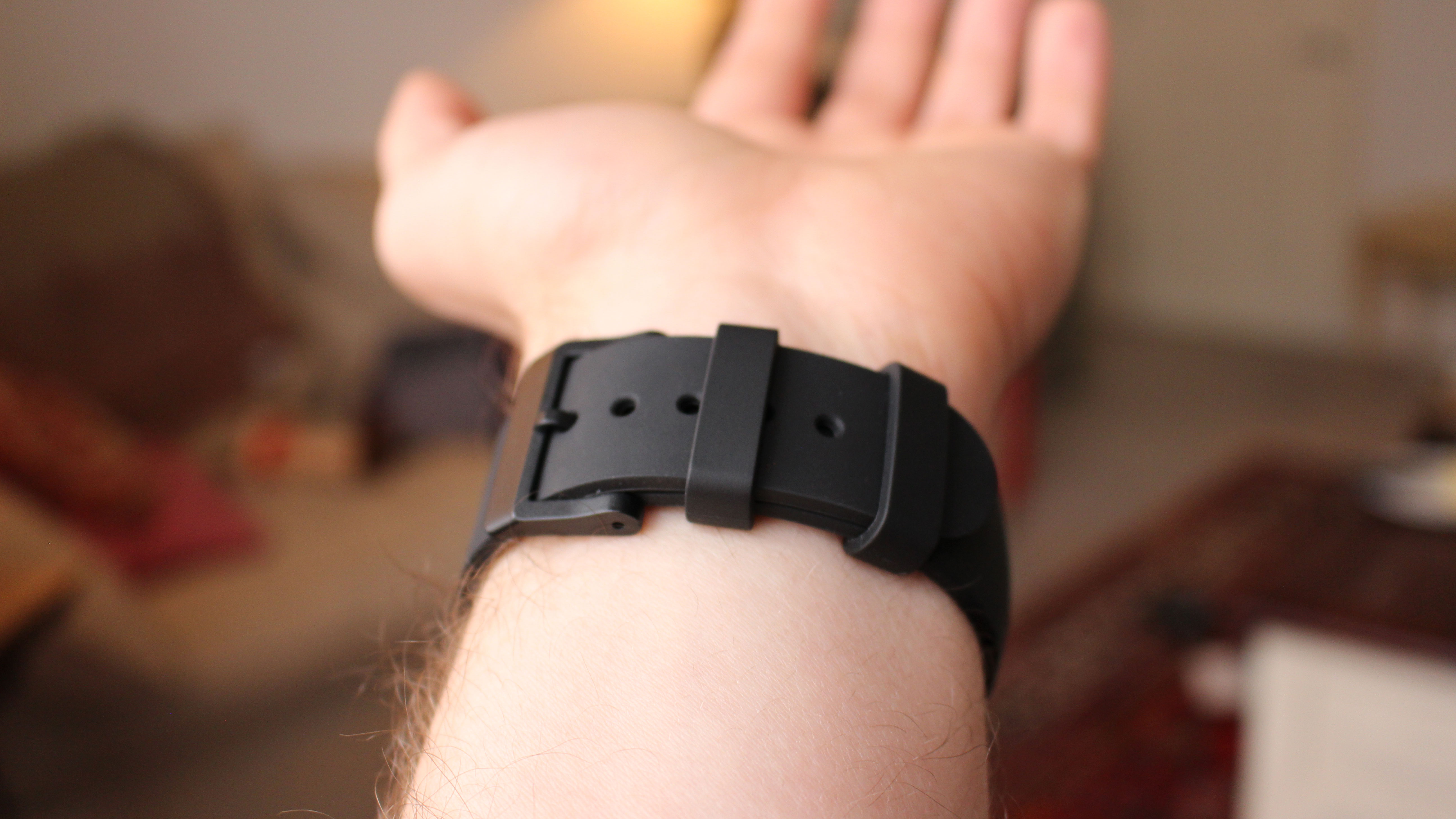
Continuing the sporty styling is the strap, crafted out of TPU – a durable composite made from soft silicone and hard plastic, which is breathable and hard-wearing. The strap blends nicely with the color and dimensions of the main body of the watch, and feels very high quality.
It fastens using a metal clasp, with two additional loops keeping any surplus strap tidy, stopping it from getting caught on your top mid-run. It's at its most comfortable when worn in the 'wrong' position for heart rate tracking (directly on the wrist), but still wears well higher up the wrist.
The body of the Ticwatch S is 13mm thick, which is relatively thick for a smartwatch.
It's a good couple of millimeters thicker than the Apple Watch 3, and a little thicker than the Samsung Gear S3, which does mean it doesn't slip comfortably under a jacket sleeve, but it's been designed in such a way that it doesn't feel bulky on your wrist.
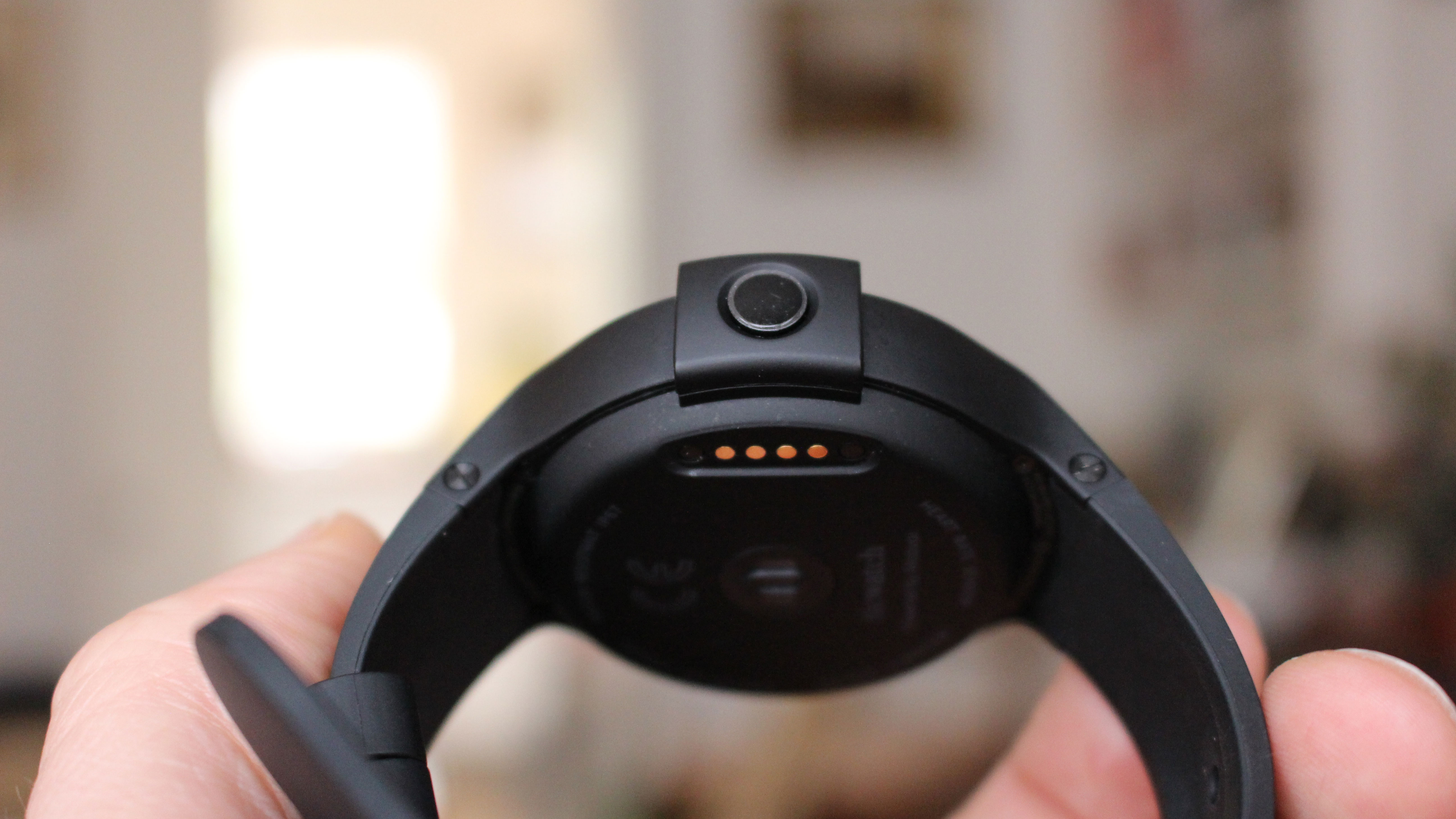
Sitting to the side of the screen is a protruding plastic surround for the Ticwatch's one button.
The small plastic element has a green arrow on it, harking back to the adjustable bezels of diving watches, but on the Ticwatch it is all fashion, no function.
That's because the bezel is entirely fixed, meaning the control of the watch relies entirely on the use of the touchscreen, which not only means you need dexterous digits, but also have to deal with a fingerprint covered screen.
Display
The screen is a capacitive multi-touch display made from a scratch resistant glass, which works very well but in our experience was very fingerprint hungry which is a shame, because otherwise it's a real beauty to look at.
Thankfully smartwatches on the whole seem to have abandoned the 'flat tire' approach to display that left a straight black line on the bottom of a round screen, and we're happy to report that the Ticwatch S utilizes the whole screen.
It doesn't even have a black bezel before you get to the physical bezel like the Fossil Q Venture.
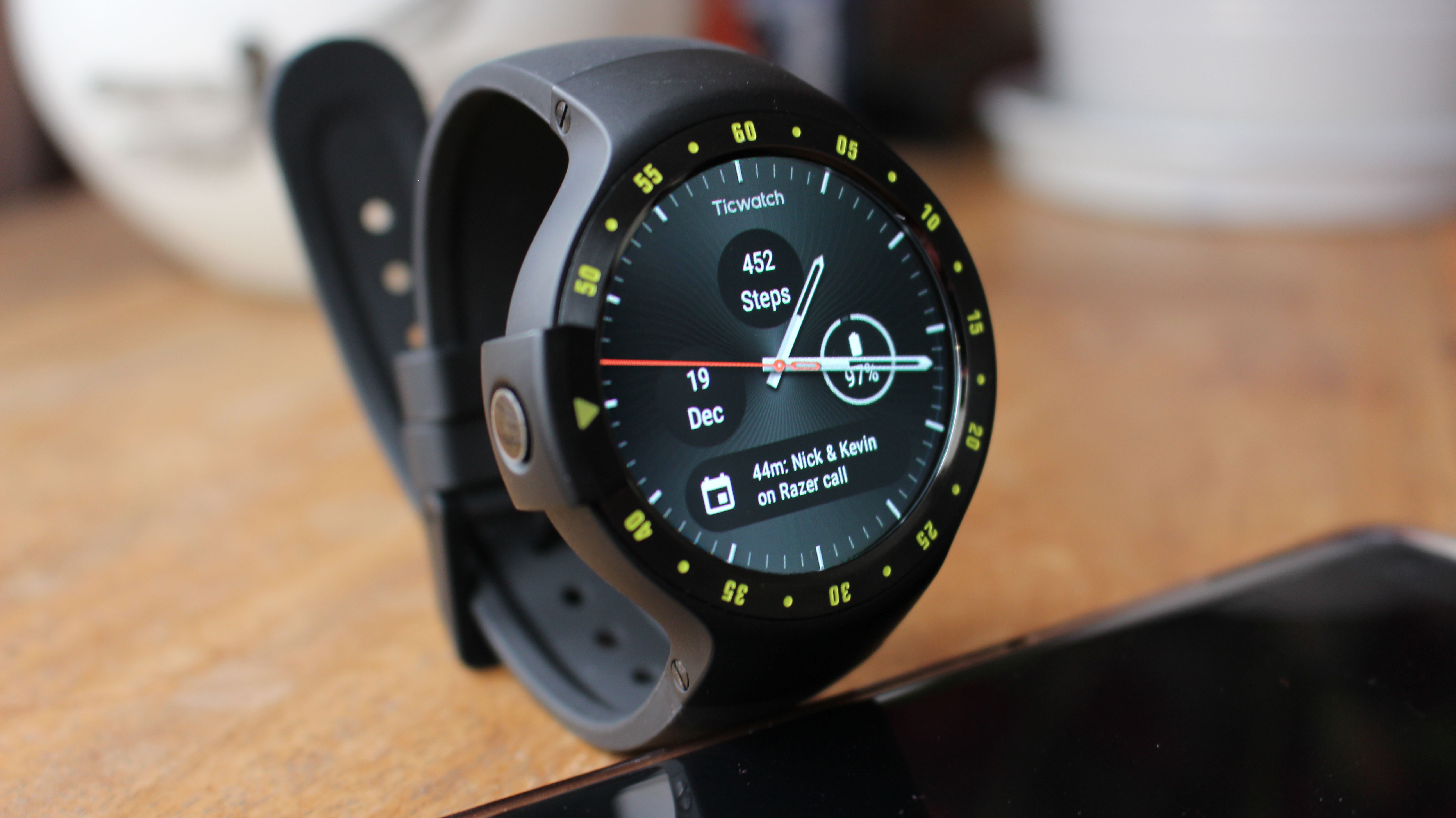
As mentioned, the screen is a 1.4-inch OLED, with a resolution of 400 x 400, giving it 287 dots per inch. The outcome of this is that there is great clarity on the little screen, meaning you can have intricate designed watch faces that really sing.
It has the option to adjust brightness, font size, and watch face, with a number pre-loaded and the almost limitless options available on the Google Play store.
There is also the option to have always-on display, which will affect your battery life, but means you don’t have to fully wake the watch up in order to see essential bits of information like the time and date.
What's nice about the Ticwatch S is that (depending on which watch face you've chosen) you're able to choose what information the complications show. The choices are too many to list here but include date, step count, battery life, diary, alarms, weather, and many many more.
Andrew London is a writer at Velocity Partners. Prior to Velocity Partners, he was a staff writer at Future plc.
