TechRadar Verdict
A good, versatile design software which will allow you to create your home and surrounding terrain quickly and easily, sadly marred by a couple of interface design decisions.
Pros
- +
Easy to use
- +
Useful wizards
- +
Lots of customisation options
Cons
- -
Frustrating 3D navigation
- -
Annoying tutor
Why you can trust TechRadar
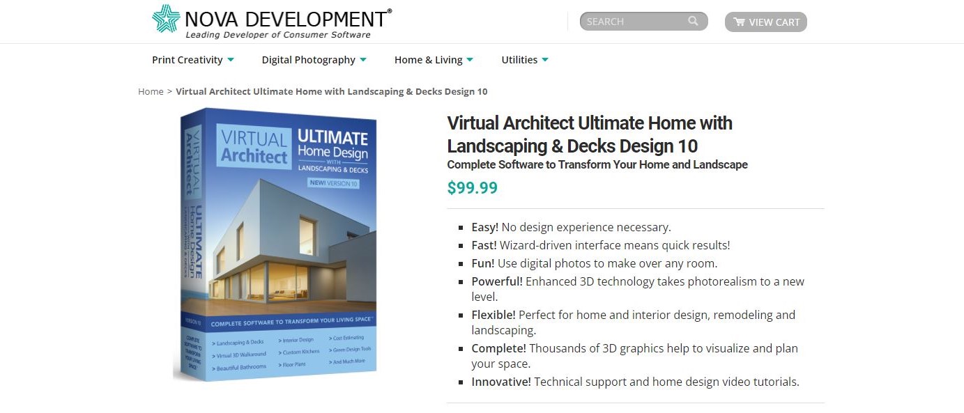
Designing a home virtually can be a lot of fun, and unsurprisingly, there are numerous companies trying to serve this need with their home interior design software. One of these is Nova Development, and we’ll be talking a look at Virtual Architect Ultimate with Landscaping and Decks Design 10.
As its name implies, it aims to offer everything in one place, be it the inside of a home or the outside, including the garden. That’s quite an extensive goal, and at a penny under $100, it’s a good price for such ambition. It’ll work on a machine running Windows 7, 8 or 10, with a 2GHz 64 bit processor, 8GB of RAM, 2GB video card, and at least 10GB of storage space.
Getting started
The software comes with a few sample creations to give you an idea what it can achieve, but the best way to figure it out, is to dive in with a blank slate. And for that, you have a choice of an empty project based on inches and feet, or millimetres (it’s a bit of a puzzle why you can’t work in centimetres or metres - sure the decimal system makes it easy to compensate for that, but it would’ve been a nice option to have from the get go).
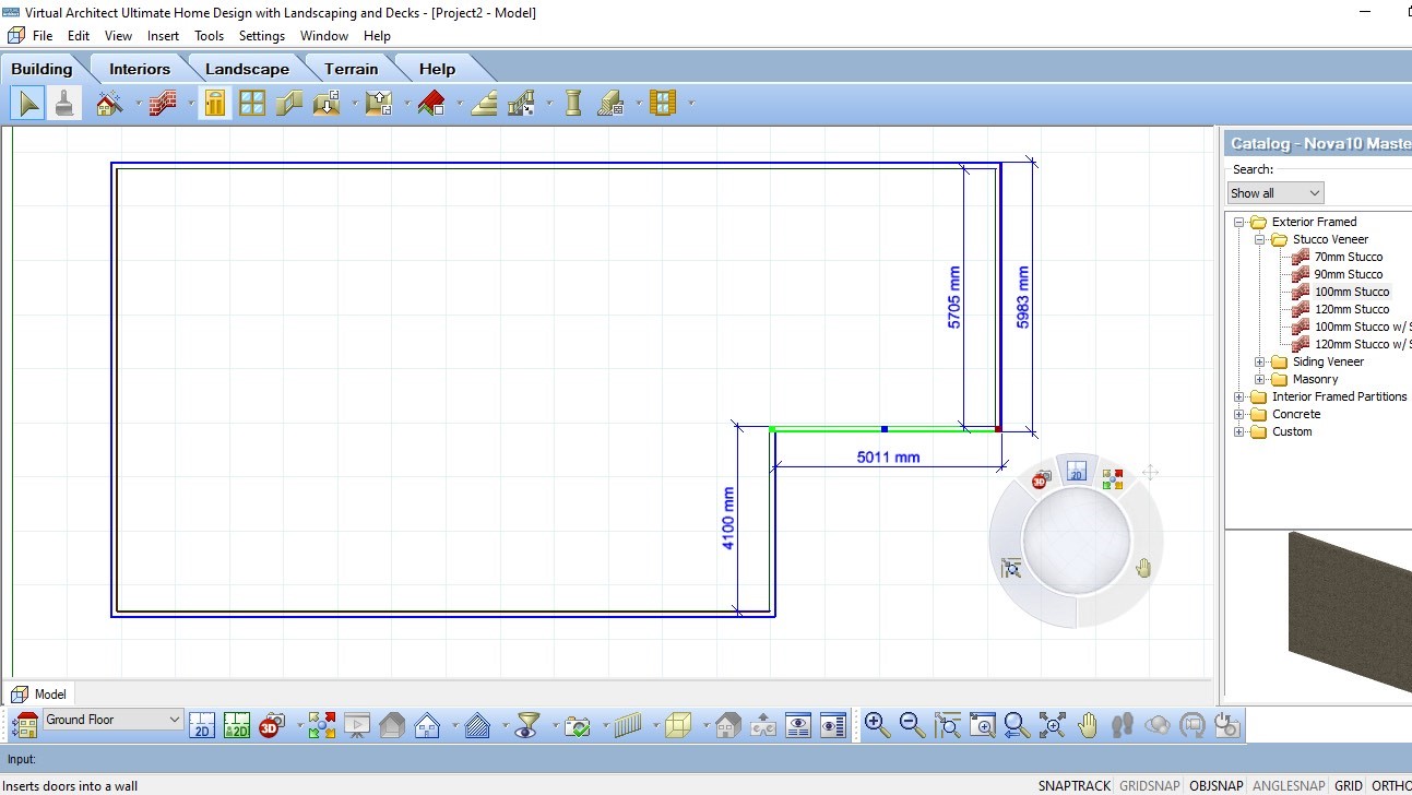
And creating something is incredibly easy: choose what you need from the row of tabs and icons, at the top, then apply it to the top-down 2D plan that takes up most of your screen.
The interface is well designed and those tabs allow you to progress through the creation process. Each contains a series of tools relevant to the task at hand. Plants, edging and fences are in Landscape, for instance, while Electrical, Plumbing and Furniture, are in Interiors. It’s all very self explanatory.
If you need to add a wall, don’t click and drag, just click once, then move the mouse and click again to place your first length. You also have the ability of typing a value to get exact measurements. Resizing walls is just as easy: select the one you need to alter to highlight it, then drag away.
A lot of what makes this a smooth process lies with a few controls which are actually pretty easy to miss: lower right of the interface is a series of words: snaptrack, gridsnap, ortho and collision to name but four. With ortho on for instance (it is by default), you create walls at perfect 90 degree angles. As most houses are based around the concept of right angles, this is an ideal option, but you’re at liberty to forgo this concept, click on ortho to switch that feature off, and create the odd angled home you’ve always dreamed of!
Doors and windows
Adding these is a very simple process and works in pretty much the same way. We did like how easy it is to instruct the program to centre the object on a wall, or set a specific offset distance from the edge of another. But you’re also completely free to place them wherever you feel like.
Values appear as you drag such an object, showing you how far away from the nearest corner, or from other nearby objects, your door or window is (you get both the outside and inside measurement which was most welcomed).
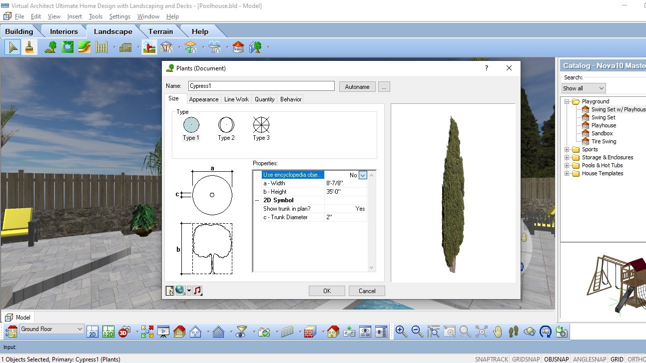
You have a library of different types of doors or windows to choose from, which all come with set dimensions. Open its Properties window to find out which parameters you can customise, which is of great interest should you wish to make your home a little more unique.
Furniture
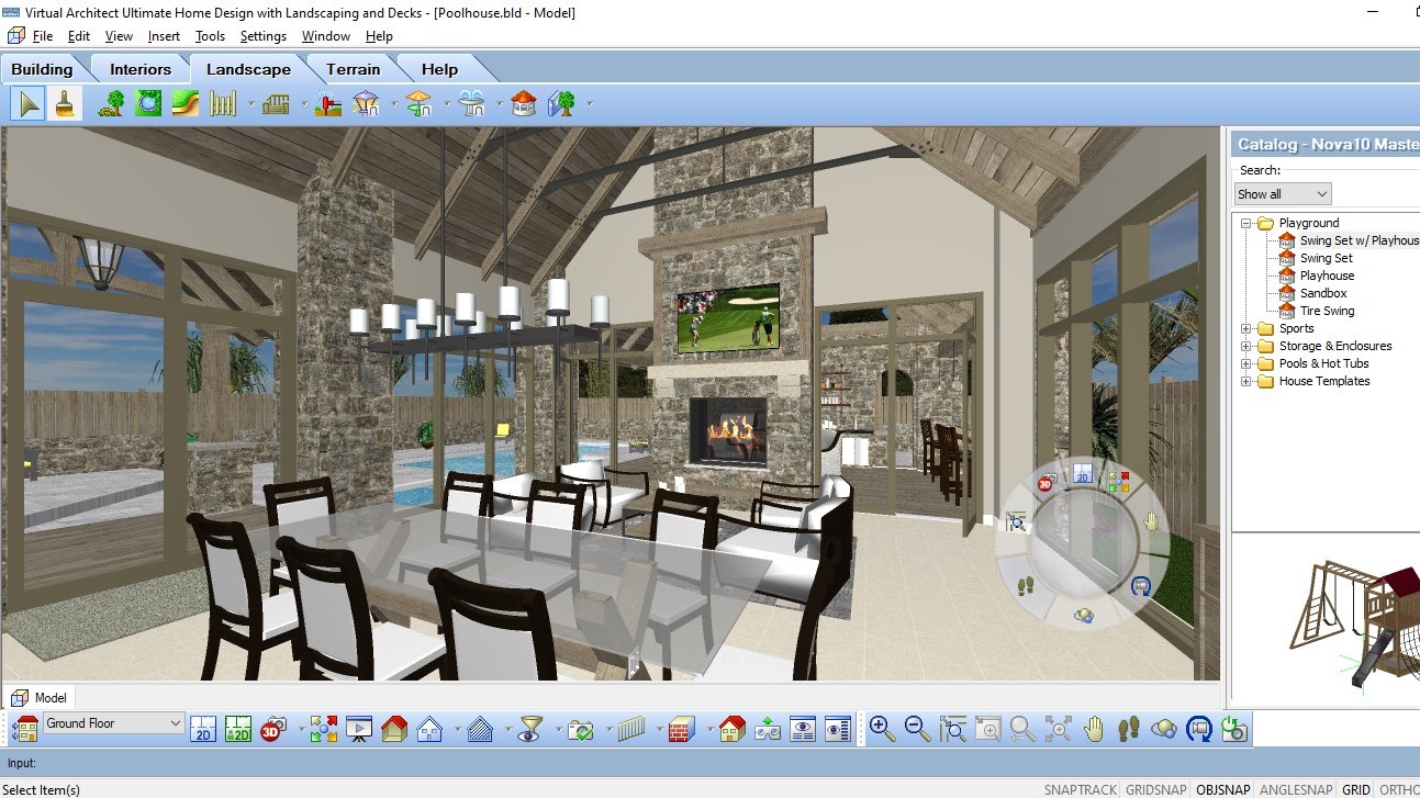
As you’d expect, Virtual Architect comes with a lot of choices when it comes to furniture. Thankfully there’s a handy search field in the catalog to help you find what you need quickly, and just as for above, you aren’t restricted to the default dimensions your desired object comes in.
Materials
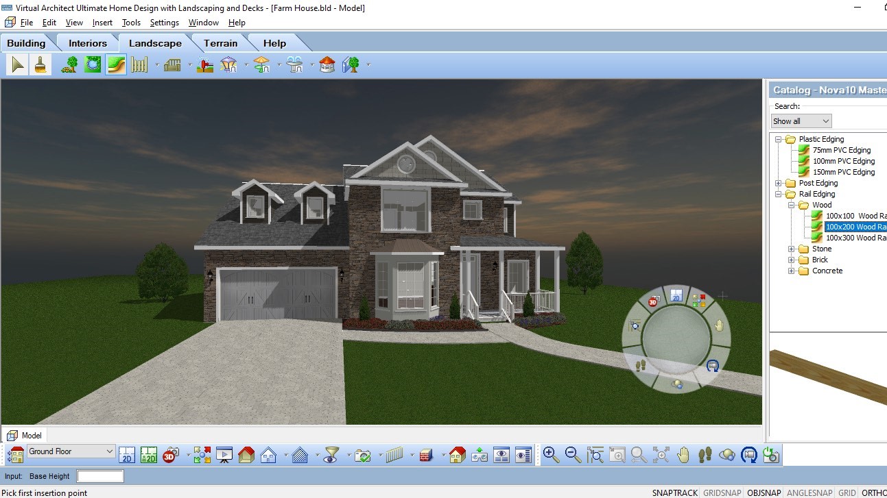
And of course, you also have materials, which you can add to existing elements as easily as using a virtual paintbrush: select what you’re looking for in the material catalog, then click where you want it to be applied. We did appreciate the option to ‘apply to all similar’, so if you want all the walls to have the same wallpaper, for instance, that ability is but a click away.
Wizards
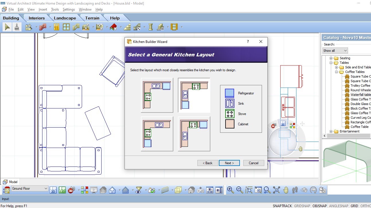
To speed up the creation process the app comes with six wizards. The first one is the whole house package, walking you through a series of simple choices to create the guts of a house for you in seconds. The others are more focused, narrowing down their process to specific sections, like a kitchen, a bathroom, or a deck. The concept is exactly the same as for the first, and once added to your home, you’re obviously free to alter or otherwise customise what the wizard delivered.
Views
Aside from the traditional top down 2D blueprint view, you also have a couple of others: your second option is another top down one, only this time you get to see any chosen material applied to your elements. The other is 3D view, which is self explanatory.
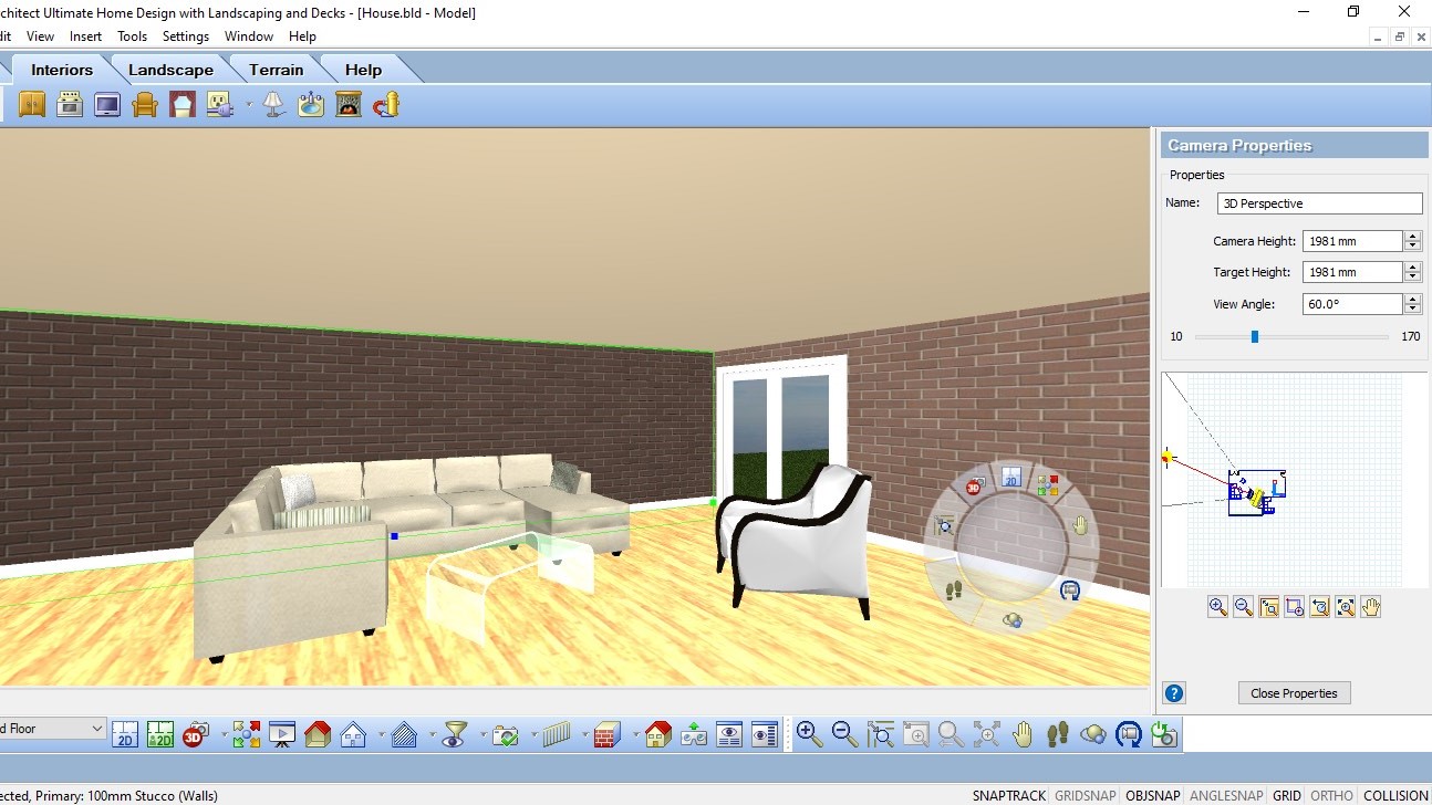
The only issue we had was difficulty navigating in 3D. Yes you have the arrow keys which you can use for all views, but to properly wander around in three dimensions, you need to make use of the large dial lower right of the interface. It has various uses, but the large central knob’s purpose is to help you move around a 3D landscape, and maybe it’s us, but it felt very frustrating attempting to use it. Somehow it reminded us of those little red buttons some laptops used to have in the middle of the keyboard, designed to replace a mouse or trackpad…although to be fair, it wasn’t actually as bad as those abominations, but it really removed the joy out of exploring our creations. Why couldn’t you use the mouse to navigate like pretty much all other similar apps do?
Help
Virtual Architect comes with a handful of good tutorials to help you get started, as well as a help tab that contains multiple online resources. However there was one thing we found particularly annoying: by default, every time you click on a tool, whether for the first time or the hundredth, a ‘Tutor’ window would open up offering you help and advice. There is a ‘don’t show the Tutor again’ option but what if you need it for a different tool you haven’t used yet? This feature feels either overly helpful or frustratingly in the way. You can activate or deactivate the Tutor from the Help tab, although puzzlingly it’s not clear when you click on it if it did anything at all: having a button that changes state so you can see if the tool is on or not would be, well, you know, helpful, as opposed to letting the user guess if their click had any affect at all on the interface.
Final verdict
Virtual Architect Ultimate with Landscaping and Decks Design 10 is mostly a good program, with many features designed to help you create easily and effectively. It’s only marred a little by a couple of annoying interface decisions, but the advantages certainly outweigh the disadvantages.
Need help on your next creative project around your home? Check out our roundups of the best home interior design software and the best architecture software
Steve has been writing about technology since 2003. Starting with Digital Creative Arts, he's since added his tech expertise at titles such as iCreate, MacFormat, MacWorld, MacLife, and TechRadar. His focus is on the creative arts, like website builders, image manipulation, and filmmaking software, but he hasn’t shied away from more business-oriented software either. He uses many of the apps he writes about in his personal and professional life. Steve loves how computers have enabled everyone to delve into creative possibilities, and is always delighted to share his knowledge, expertise, and experience with readers.
