TechRadar Verdict
The Vivo V9 underperforms in many aspects but if anything is overhyped, it’s the phones camera. It does take good photos but isn’t enough to justify the price tag it comes with. Running on the Snapdragon 626, the phone doesn’t feel slow but if the camera app crashes during the first week of usage, you have to wonder how reliable the phone will be in the long-run.
Pros
- +
Slim
- +
Android Oreo 8.1
- +
Big screen
Cons
- -
Inconsistent camera
- -
Short battery life
- -
Fingerprint magnet
Why you can trust TechRadar
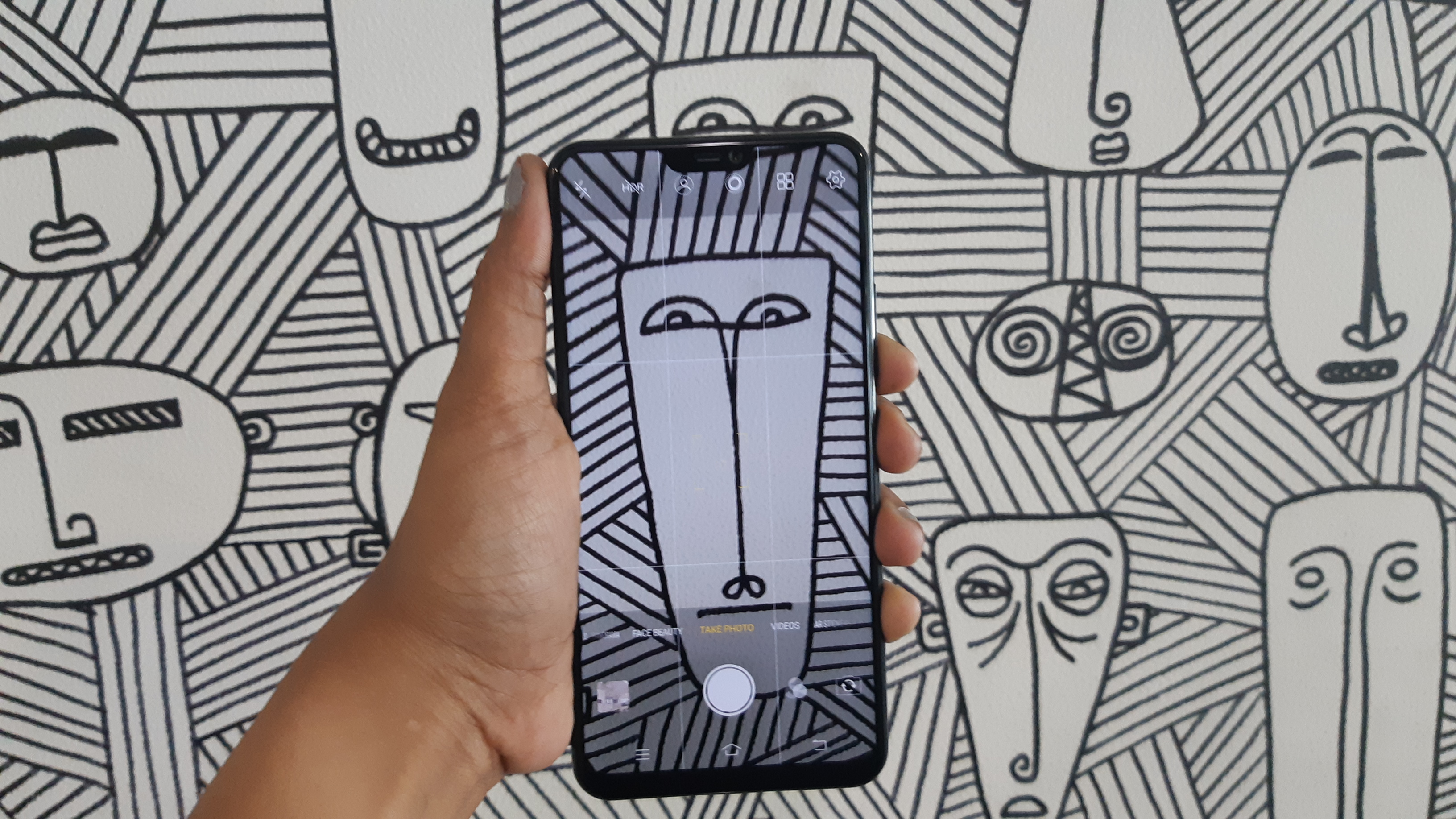
Every brand, at one point or another, has borrowed something from the Apple design portfolio but no other brand imitates the American tech company like Vivo. It’s all the more apparent with the Vivo V9, which features the iPhone X-type notch, vertical dual camera and an identical settings menu.
Like the Oppo F-series, the Vivo V9 also boasts of a camera that will give you incredible shots. Meanwhile, the Oppo F7 undercuts the Vivo V9 price of Rs 22,990 by Rs 1,000.
The smartphone looks interesting enough but it remains to be seen whether or not it can prove itself to be worth the price tag.
Price and availability
The Vivo V9 costs Rs 22,990 and there’s only the one version of the phone with 4GB RAM and 64GB storage. It’s been available on Flipkart and Amazon since April 2.
You have the choice between Champagne Gold, Pearl Black And Sapphire Blue.
Design and display

Let’s start with the notch on the Vivo V9. The whole point of employing the notch design on a smartphone is that users have more screen space allowing for better immersion.
Ideally the phone should support a 19:9 aspect ratio but instead it runs apps at 18:9 or 16:9, depending on what the app itself supports.
Dimensions: 154.8 x 75.1 x 7.9 mm
OS: Android 8.1 (Oreo)
Screen size: 6.3 inches
Resolution: 1080 x 2280 pixels
CPU: Snapdragon 626
RAM: 4GB
Storage: 64GB
Battery: 3,260mAh
Rear camera: 16MP + 5MP
Front camera: 24MP
The area to the left of the notch shows the time, network connectivity and notification icons while the area on the right has the battery, alarm, and net connectivity icons.
The Oppo F7, on the other hand, allows compatible apps to run at a 19:9 aspect ratio but can even force apps that only support 16:9 or 18:9 to function within the 19:9 format.
Vivo V9’s notch includes a notification LED light which adds a level of convenience to the phone.
The only real use of the top, since it allows the display to be on either side is so that the company can claim that the screen measures 6.3-inches. That being said, the phone isn’t compact or ergonomic but doesn’t feel bulky either thanks to its curved edges.

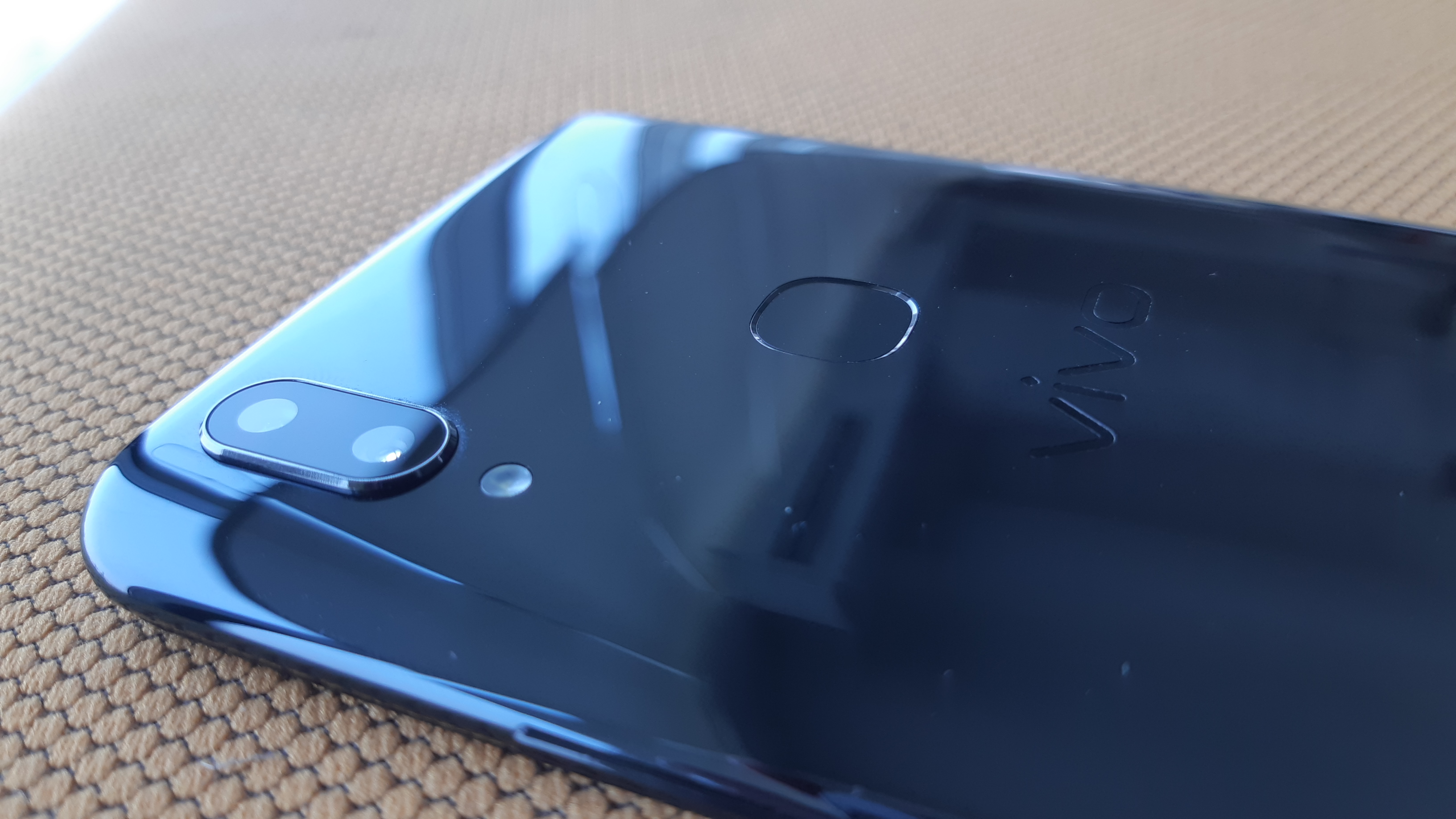
Even the build of the phone isn’t too impressive. It has a plastic body, with coating on the rear to give the impression of a glass back. It catches way too many fingerprints consistently and you immediately reach for the phone cover that comes in the box so that it stops happening.
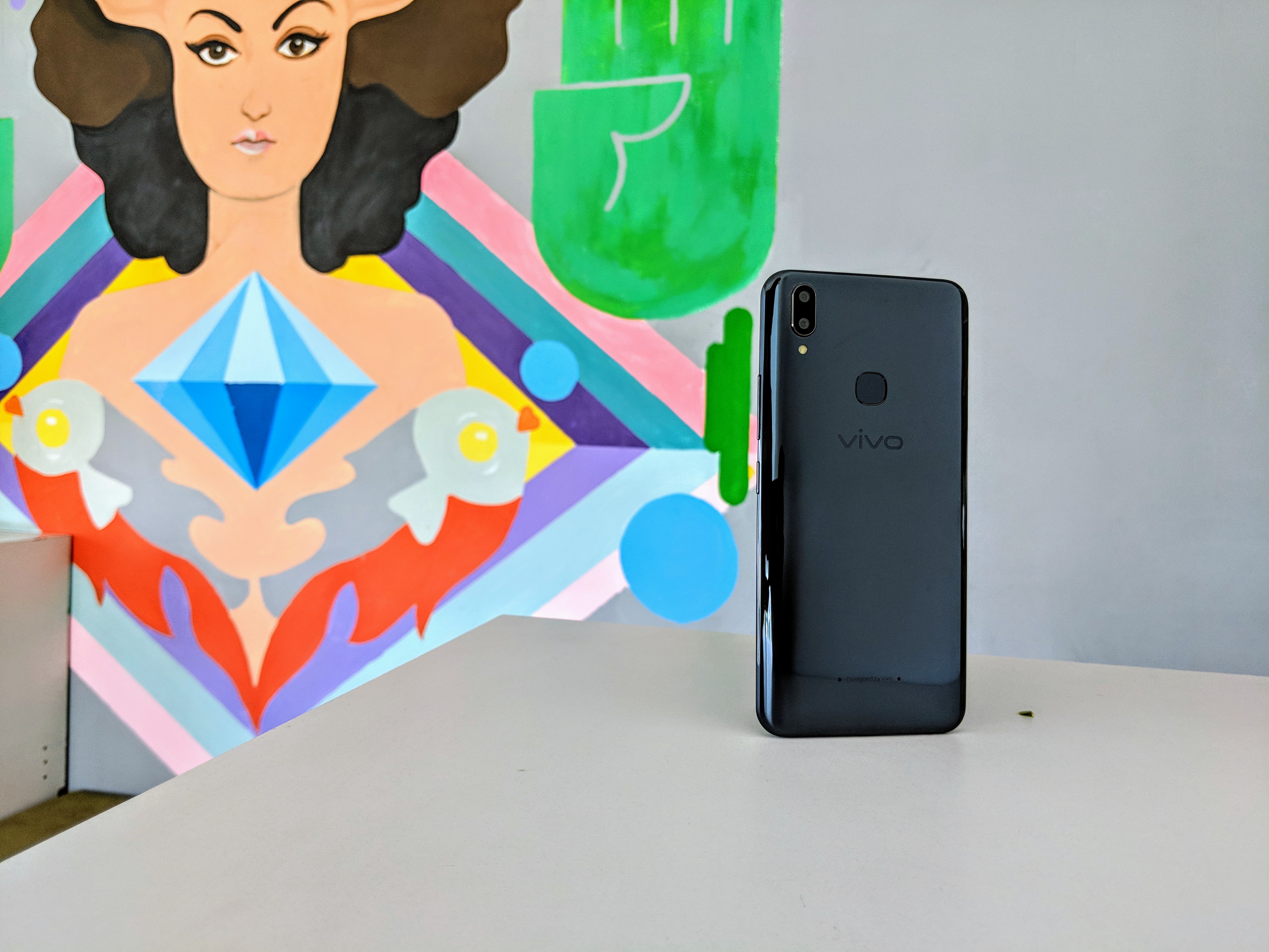
Since it’s made out of the plastic, the phone’s relatively light as well. The Pearl Black model that we were privy to, looked like a mid-range phone, which it is. That is to say, there’s nothing so unique about it that it can convince you of being a premium device but it’s not so shoddy that it could be confused for an entry level smartphone.
The power and volume buttons are stacked on the right side, with the SIM tray across on the left. The MIcroUSB port along the bottom is a little bit of a let down since USB Type-C is far more efficient and honestly expected in a device that’s in the 20K segment. Along with the charging port, the 3.5mm headphone jack and speakers are along the bottom as well.
At the back, the Vivo V9 sports a vertical dual camera setup with a LED flash, and a fingerprint sensor.
Prabhjote Gill is the Senior Journalist at Business Insider India. She covering everything space, tech and defence at Business Insider India. She is also in-charge of allocating stories to junior writers.
