TechRadar Verdict
The Vodafone Smart N9 impresses with its large display and sharp design, which seem to come from a much pricier model. However, poor performance and a terrible camera leave you in little doubt where it really stands.
Pros
- +
Large, bright display
- +
Sharp design
- +
Relatively unadorned UI
Cons
- -
Sluggish performance
- -
Very poor camera
- -
Considerable price bump from N8
Why you can trust TechRadar
UK mobile operator Vodafone has quietly become one of the most reliable budget smartphone suppliers in recent years. The Vodafone Smart N9 continues that trend in many ways, but it’s not quite an unreserved recommendation.
Once again we’re looking at a smart, well-designed phone with the kind of features that you’d expect to see on more prestigious models. Despite this, it’s available for a mere £109 on Pay As You Go.
Those with good memories might note that this is actually around £25 more expensive than last year’s Vodafone Smart N8. That might not sound like a lot, but it’s actually a 30% price bump.
Fortunately, it doesn’t take too long to see where the extra money is going. This is a step up from the previous model in a number of important ways - though a couple of disappointing shortfalls hold it back.

More for less
- A surprisingly stylish design
- Android 8.1 Oreo
- An 18:9 screen, NFC and a fingerprint scanner
It’s not unusual to see a competent £100 smartphone in 2018, but Vodafone’s aim with the Smart N9 seems to be to imbue it with an uncommon sense of style and panache.
The rather utilitarian plastic looks of the Vodafone Smart N8 have given way to a bold, shiny back and textured metal rim with machined speaker holes.
We’ll discuss that design in more detail in the next section, but it actually looks and feels way more expensive than it is.

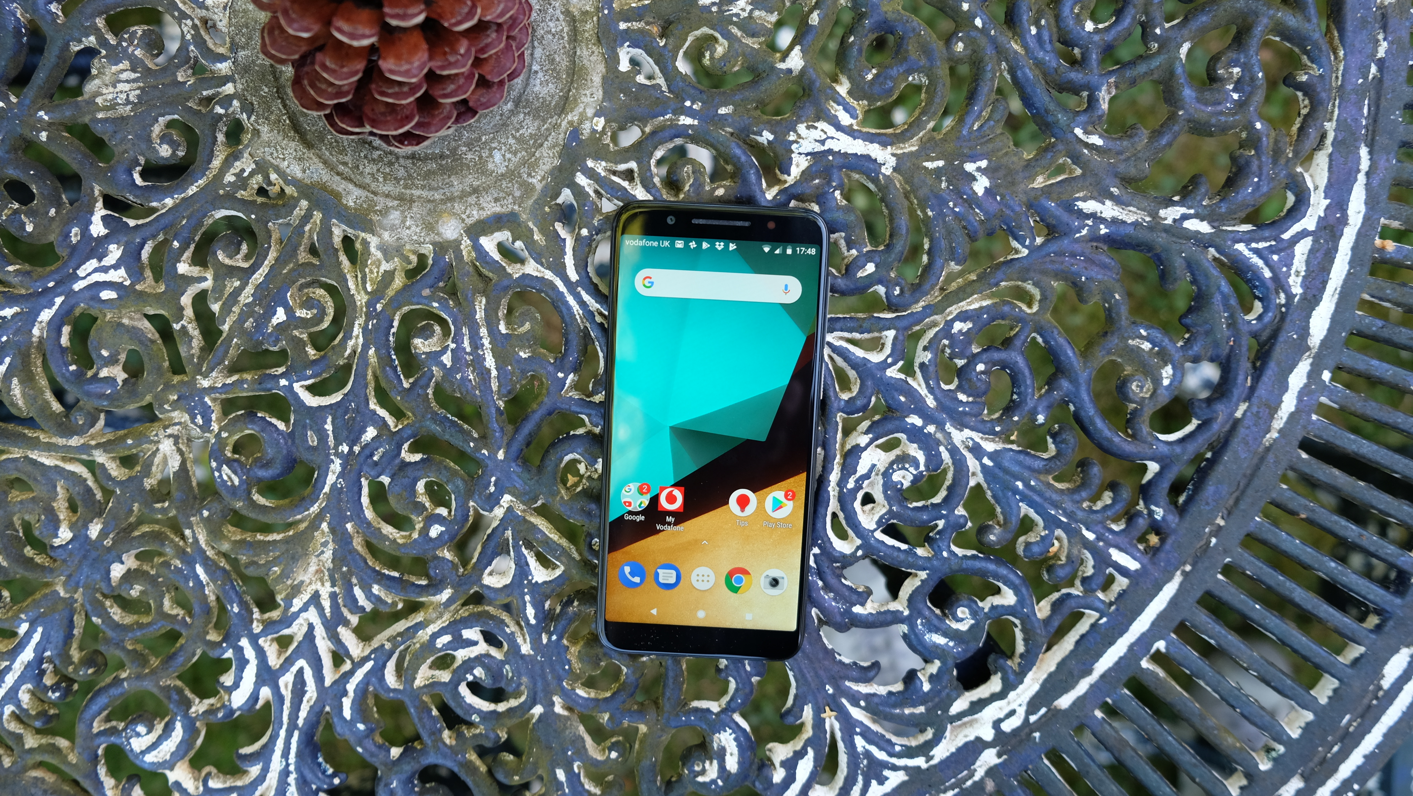
This sensation continues with a decent 18:9 screen that fills the front of the device. It’s not what you’d call bezel-less by any means, but it certainly justifies Vodafone’s description of a 'more screen, less frame' display.
The operator also boasts of the Smart N9’s 'Latest technology to enhance your moments'. We’re not entirely sure what it means by that, but we’d identify the Smart N9’s fast and reliable fingerprint scanner, NFC, and 8MP wide-angle selfie cam as meeting that strangely worded description.
Another technological advantage the Vodafone Smart N9 would seem to have over the majority of its contemporaries would be the very latest version of the Android OS, which is version 8.1 Oreo.
We know of certain flagship phones that still aren’t running this iteration at the time of writing, so it’s a fairly big deal.
Design and display
- Impressive design with distinctive ribbed metal rim
- 5.5-inch 18:9 display is bigger and longer than before
The Vodafone Smart N9 represents a considerable step forward for the network’s entry-level phone range in terms of design.
This is a thoroughly pleasant phone to hold, thanks largely to its non-creaky build quality and palm-friendly dimensions of 147.1 x 68.8. It’s just 8.7mm thick and it weighs 145g, so it’s far from a skinny lightweight, but nor is it remotely unwieldy.

Taking a closer look at the materials used, the phone’s shiny (and this time non-removable) rear cover isn’t the fashionable glass component you might initially assume it to be.
It’s actually a clear, highly reflective form of plastic, which rapidly picks up scuffs and smudges.
The phone’s rim is far more pleasant to hold. Vodafone has gone with a curious, finely ribbed metal here. Combined with the matt black colour of our model, and a slight angle at the phone’s mid-point, it has a certain stealth fighter look to it. We’re huge fans.

Also impressive are the volume and power buttons housed within that rim. They’re firm and clicky and distinctively textured in a way that so few budget phone buttons are. It’s often the little things that separate the super-budget phones from the budget phones, but the Vodafone Smart N9 gets most of those things right.
Most, but not all. On the bottom of the phone, in between the two stylishly drilled speaker grilles (only the right of which is an actual speaker grille), you’ll find a micro USB port for charging purposes. No, USB-C still hasn’t reached the entire span of the smartphone market, which is a shame.
Let’s get back to larger and more positive territory, though, because the Vodafone Smart N9 has a really impressive display. It’s big, bright, and well balanced.
At 5.5-inches it’s significantly larger than the Smart N8’s screen, and that comes down to its stretched-out 18:9 aspect ratio. This in itself is another thoroughly modern touch from the N9.

In terms of practical use, 18:9 is more a case of improving the screen-to-body ratio or optimising space rather than massively improving media content. On that front alone, the N9 screen comes up trumps - particularly as Vodafone has done away with the thick black borders that plagued the N8.
The resolution isn’t anything to write home about. At 720 x 1440 or HD+, it’s basically a stretched out form of 720p. That doesn’t have the negative impact on legibility that you might be expecting, though.
Would we have preferred a 1080p or FHD+ display? Of course, but at this price point we certainly don’t demand one. What really matters is that the N9 display gets plenty bright, and that colours pop way more than you might expect from a £100 phone.
