Why you can trust TechRadar
There's something a little more complicated about this shrunken Apple product compared to the now familiar iPhone and iPad. It took a few days to wrap my head around the interface, which is surprising for an Apple product. The Watch is nowhere near as intuitive as most will expect.
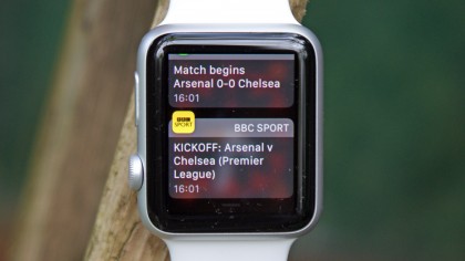
I immediately started receiving texts and emails on my wrist, as expected, and I could easily dismiss what wasn't vital. This sudden flurry of notifications was actually welcomed. However, to do much with these alerts, I had to learn to bounce between three menus: watch face, app launcher and glances, and the methods of flicking between them doesn't feel natural.
This learning curve exists because the software tries to do too much at once, and smartwatches offer extremely limited interface real estate. Plus, the Apple Watch is part of a brand new product category for everyone.
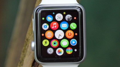
Remembering to swipe down to see my backlog of notifications or swipe up to see my pinned "Glances" widgets is complicated by the fact that this only works when in the watch face menu. It doesn't work in any other app or the app launcher menu, where with the iPhone swiping up or down is pervasive.
Sometimes I hit the side button because it looks like the iPhone sleep/wake button only to realize that it brings up my contacts list. Pressing in the digital crown does the trick here. Double tapping the crown will switch between apps, but it's a soft press and doesn't always feel like it's registered, and the easiest way to get back to time is to let the watch dangle by the wrist and then bring it back up again.
That's not intuitive, and is the sort of thing that gives the Watch naysayers (of which there appear to be a few) ammunition when you're having to jump through hoops just to tell them the time on your watch.
Double tapping the side button now brings up your Apple Pay card, stored on the device, to allow you pay for things contactlessly quickly. It's a speedy transaction and one that works pretty well. You'll have to have the passcode set up so the Watch knows it's being worn by the right person though.
There's also the issue of slowdown that flickers intermittently throughout Watch use, with opening the settings menu the biggest offender. Hit the teeny icon (you can scroll the digital crown to make things bigger, but that feels like an odd extra step) and you're greeting with icons that have no words next to them, and a couple of seconds later everything blinks into view.
The same happens with most lists, where using the digital crown to scroll through is fluid, using the finger (the more intuitive way to do things) lags and jumps a bit.
With the newer processor in the Watch Series 1 though, you'll find the interface to be much slicker, and load times much reduced - although make sure you're buying a series 1 wearable, rather than the original.
The setup is fairly seamless too. I booted up my iPhone's Watch app, and it asked me to take a photo of my new Apple Watch. Done. It was paired.
Syncing my existing apps happened automatically too, but took a couple of minutes. After that, I was able to customize my watch face and load up a springboard of circular apps. The device connects using a weird fusion of Wi-Fi and Bluetooth, but unlike the phone, you can't use Bluetooth when the Watch is in flight mode, which makes Bluetooth music streaming a no-no when in mid-air.
The My Watch menu within the iPhone companion app is astonishingly complex, which may end up being a good thing once I get the hang of it but will displease Apple fans who crave simplicity, where the thing just works.
I can disable notifications for specific apps and just about every setting can be mirrored from the iPhone or be set up individually, from Do Not Disturb to Messages notifications. Texts can repeat twice all the way up to ten times if I hate myself.
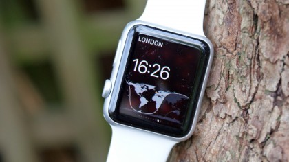
Apple Watch doesn't contain all of the intricate gears of a Swiss watch, but it has a lot of moving parts to its software. It took a few days to learn and configure to my liking, but I feel as though the less-interested iPhone audience, like my new smartphone-owning parents, needs to wait until it's further refined and more apps come to the Apple Watch app store.
Current page: Using the Watch day to day
Prev Page Battery life and clever charging Next Page A brilliant new breed of apps