Why you can trust TechRadar
- Faster dual-core processor feels snappier
- New watchOS features are useful
- Breathe is a really great idea on a wearable
The big spec upgrade on the Apple Watch 2 is the S2 dual-core processor inside and it ensures the Series 2 whips along under the finger compared to the original.
That said, the response isn't instant – it's a single beat when you press the dock button or hit the main menu. When flipping between apps it's great, but opening the dock with the apps you use the most isn't as speedy as I'd expected.
That said, the combination of improved processing, graphical prowess and general efficiency improvements from the new operating system mean the Watch 2 is a stable and useful platform.
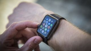
If you don't know much about the Apple Watch, then here are a few things you should pick up: the screen is blank on your wrist until you raise it to see the time, or to catch a notification when you feel a buzz on your skin.
The action of raising your arm to fire up the screen feels odd at first, but you'll get used to it. Sadly Apple hasn't added an always-on display here to make the whole issue moot – presumably that's to save battery life.
The buzzing sensation comes from Apple's Taptic feedback engine, a vibrating system that feels more like taps on your wrist that simple buzzes. It's actually quite pleasant and feels more 'targeted', mimicking what you're actually being notified to do. So an alarm ringing mimics the sensation of a ringing alarm clock, and that works nicely.
We found the performance of the new Watch 2 to be pretty good for any task. Some apps require a little too much syncing, with a little icon swirling in the center of the screen while the Watch catches up when opening Bluetooth or the timer - but it's not a deal-breaker.
With the arrival of watchOS 4, you can now control some more settings on the watch itself, though if you want to change anything significant relating to most apps, you'll still need to slip into your iPhone and the immensely complex Watch app. There are settings all over the place here, with some crossover from the earlier version of the watchOS left in there as well.
If you need to get something done, like changing settings or removing an app from the mix, then it's all possible here, but very little is possible on the Watch itself.
watchOS 3
Update: Watch OS 4 is now available for those wanting to get the next generation of Apple Watch smarts.
WatchOS 3 is the platform the Apple Watch has been crying out for. It's the right blend of hardware and software, and comes with some nifty tricks that really make use of the additional hardware of the Watch 2.
It beggars belief that Apple didn't launch the original Watch with the dock, a place for your 10 most-used apps (which you can set manually) that's accessed by pressing the power button.
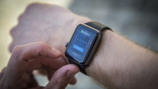
Why on earth was this originally a place to find your friends? Especially when so few had an Apple Watch, and even then it was only used to send creepy heart beats and rude pictures?
One can only surmise that this was because the battery life effect was so huge that Apple couldn't put it out there, where now it's managed to minimise the risk.
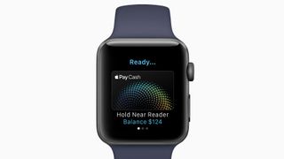
- Siri built right into the watch face to show you relevant information at the right time
- Monthly health challenges
- High intensity interval training support
- Flashlight support, making the whole display white to help you find your shoes in the dark
- New Toy Story watch faces
Whatever it's done, the dock is great on the Watch 2. While, as mentioned, it doesn't open instantly, it's at least consistent.
Then there's Breathe, the prompt every few hours to lean back and take a few breaths. This is one of the nicest features of the new watchOS, giving you permission to take some time out from the stress.
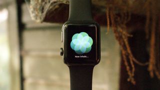
It's a simple solution: instead of being prompted to stand every hour (although that still remains) now you're also asked to just focus on your breathing, and the haptic feedback will buzz as you need to breathe in, allowing you to exhale easily.
At the end of the session, you get your heart rate – so there's a self-competing element too. It really does relax you, and the guilt that comes with snoozing the notification is assuaged by just getting on and doing it – and it can be done in a meeting, at your desk or in a car.
It's weird when you initiate the new session and someone tries to talk to you though – you just have to ignore them breathlessly for a while.
After a few weeks you'll start to ignore this feature - but try to spend some time with it when you get a few idle moments and you'll start to really feel the benefit.
Apart from those two features, watchOS 3 is pretty much just a clean-up of the operating system, with a few little tweaks to make it feel a bit more intuitive.
There are still the same annoying limitations: you can't see WhatsApp photos you've been sent on the smaller screen (despite being able to see your own snaps quite happily), Facebook updates are just notifications that you need to look at your phone, and you can't properly browse tweets.
The app experience on the Apple Watch 2, while better, is still a long way from being indispensable; there are some nice tweaks but nothing that will make you say "Thank HEAVENS I didn't have to pull my phone from my pocket / bag".
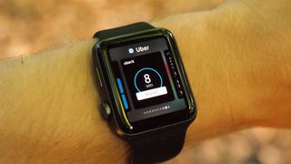
What's odd is how few third-party apps still aren't native (as in, working without the phone attached) – you can't open Google Maps, or message through Slack or order an Uber if your iPhone isn't around, even when connected to Wi-Fi.
However, this does seem to be changing, and with watchOS 3.2 you can ask Siri to send a Whatsapp message to a contact, rather than just an iMessage, or call a cab (using Lyft at the moment, so it's limited to the US).
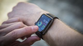
That said, the app experience is still slick thanks to Force Touch, with most of the stock apps offering clever extra functionality when you prod the screen a little bit harder.
With watchOS 3 there's now an emergency SOS number that can be called right from the power-off screen – and some people have been complaining that it's really easy to activate this easily. Apparently if you hold the side button down for too long your Apple Watch will automatically call the number – but we were unable to replicate this problem, no matter which way we tried to angle our hand.
If something lodged in the way it could possibly be an issue, but if you do want to get rid of the auto-call feature then you can easily do so in the settings. You don't want to end up like these guys...
It's worth knowing that the watch can be updated to both watchOS 5 and watchOS 6 once it's unveiled later this year. That new software will bring an App Store to your wrist for the first time, a menstrual cycle tracker and the ability to monitor volumes in loud locations.
Current page: Specs, watchOS 3 and performance
Prev Page Introduction, design and screen Next Page Running
Gareth has been part of the consumer technology world in a career spanning three decades. He started life as a staff writer on the fledgling TechRadar, and has grew with the site (primarily as phones, tablets and wearables editor) until becoming Global Editor in Chief in 2018. Gareth has written over 4,000 articles for TechRadar, has contributed expert insight to a number of other publications, chaired panels on zeitgeist technologies, presented at the Gadget Show Live as well as representing the brand on TV and radio for multiple channels including Sky, BBC, ITV and Al-Jazeera. Passionate about fitness, he can bore anyone rigid about stress management, sleep tracking, heart rate variance as well as bemoaning something about the latest iPhone, Galaxy or OLED TV.
