Why you can trust TechRadar
The Fitbit Blaze raises expectations, and then dashes them somewhat. The idea of a smartwatch designed by one of the biggest wearable manufacturers in the world was an exciting one, and the fact that Fitbit didn't go the whole way is a disappointment.
The Fitbit Ionic has definitely addressed some of these issues and if you're in for a Fitbit smartwatch that should be on your consideration list too.
We liked

The biggest hurdle wearable devices need to clear is battery life, and the Fitbit Blaze seems to have managed that. I'm still stunned when I realise this is a smartwatch with a color display that will last me a minimum of four days, and probably a little longer.
Not having to charge the device every night is a godsend, especially when you want to start getting into sleep tracking as well as monitoring your exercise.
The Fitbit Blaze is also competitively priced when you consider that it only costs a little more than some of the company's other fitness trackers, and gives you the color display plus a little more functionality. I'd be tempted to get one of these over a Fitbit Charge, Flex or Surge.
Finally, the thing Fitbit does brilliantly is, of course, fitness tracking. The introduction of Fitstar here is a really interesting addition, and looks like being one of the make or break features for the Blaze.
If you're bored of your gym workout and want to try something different you can spend hours Googling workouts on your phone while in the gym – but on the Blaze you can just fire up Fitstar, choose 10 minute abs, and you'll be straight into a workout.
We disliked

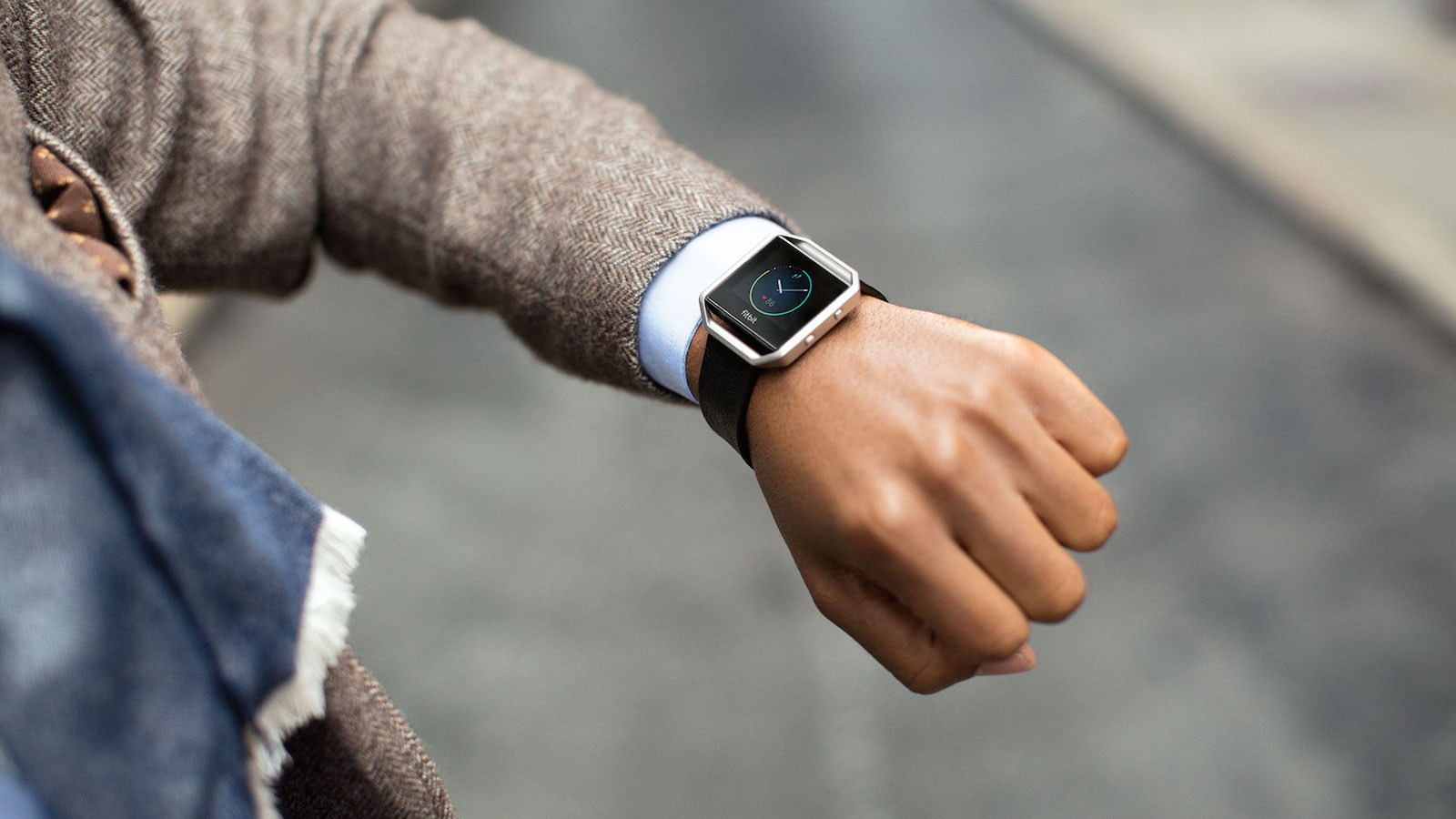
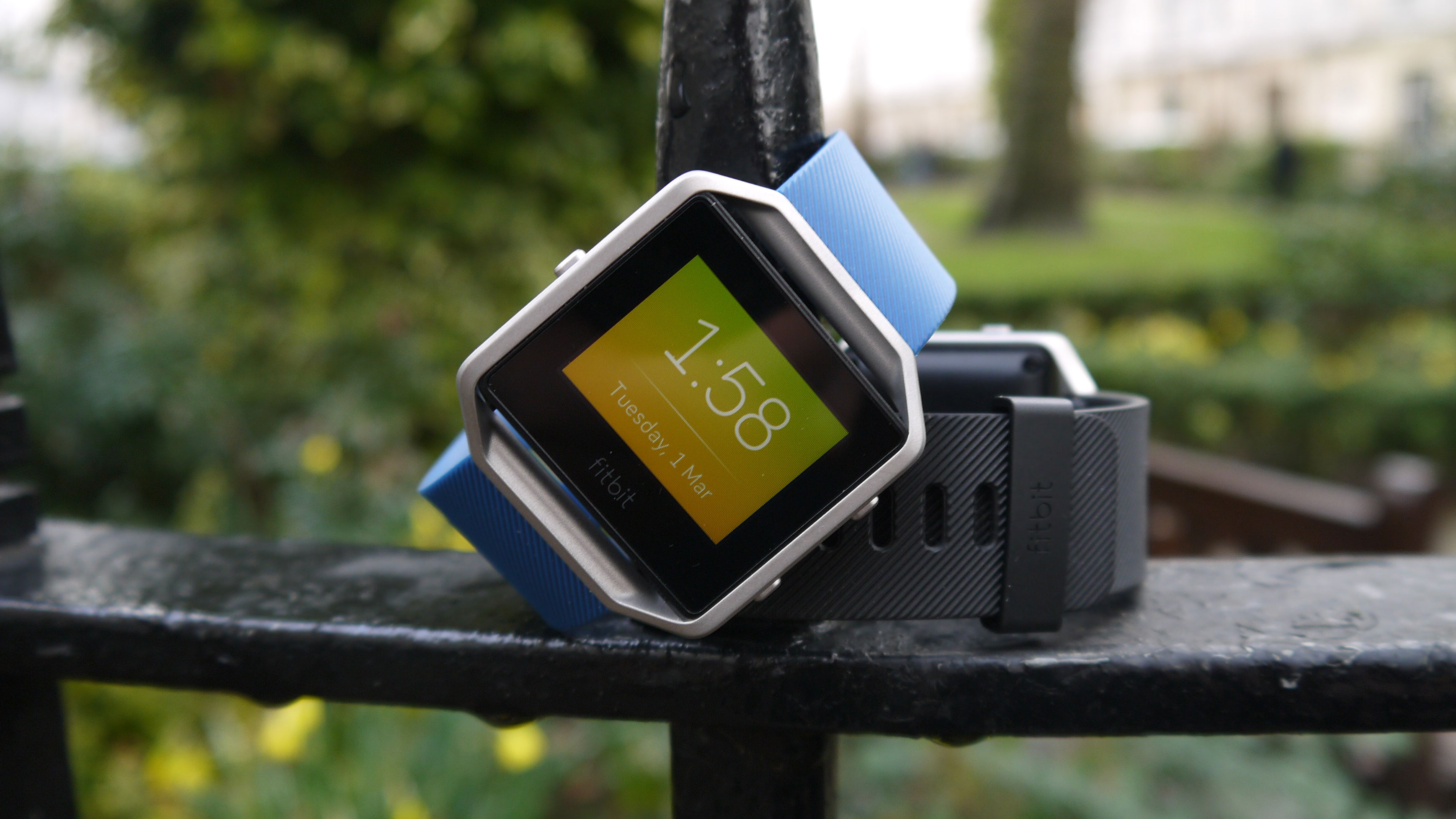
In all honesty, I think the Fitbit Blaze is rather ugly. There are so many good looking wearable devices out there right now – look at the Apple Watch and you see something that has a really well thought out and attractive design.
Here it feels like Fitbit looked at the Watch, and decided to not go the whole way. I still don't understand why it's a square device – and the metal parts of the strap don't look nice at all.
And those bezels between the edges of the screen and the frame make it look like someone didn't think through the design fully.
That said, the strap is comfortable, and I found myself leaving the Blaze on my wrist even when typing.
The display on the Fitbit Blaze is also frustrating. I was often left tapping in vain on the display, trying to get it to respond. This would be frustrating at the best of times, but mid-workout is certainly not when you want your screen to be playing up.
I was expecting more of a smartwatch experience with the Fitbit Blaze. That's partly down to my own perceptions, but also to the pre-launch hype suggesting it would be a fully rounded smartwatch, and it's a little disappointing.
Notifications are limited, and given that I barely receive texts any longer because I use instant messaging platforms so much, it feels particularly dated that I just get the odd buzz on the wrist to tell me I've got a text message, or spam from Pizza Hut.
Final verdict
After quite a bit of time with the Blaze, I can see why Fitbit is being a little bit vague about how they categorize it. It most definitely isn't a smartwatch, although it is a bit smarter than your average fitness tracker.
And not surprisingly Fitbit has nailed the fitness side of things. The step tracker, heart rate monitor and calorie counter are as accurate and useful as ever, as on all its devices – and the Fitstar app is a nice extra selling point.

I'm just a little let down there isn't more here on the smartwatch side. It's something the company could perhaps address with future software updates, but for now there just isn't enough functionality when it comes to notifications.
And it makes me wonder why Fitbit chose to go for a color screen here. If I can't get third-party app messages on this screen, why does it need to be in color?
Ultimately, this is still a solid fitness trackers, though newcomers in this space like the Ionic, the Samsung Gear Fit 2 Pro and the Garmin Forerunner 645 do make it look a little dated. It has a different design to the more traditional-looking Fitbit, and it doesn't cost all that much more than some of the company's other wares.
Then there's the fitness watch versus smartwatch debate. If you're looking for something to track your fitness and help you achieve your goals in that area, by all means go for the Fitbit Blaze. But if you want a genuine smartwatch that puts a lot of the functionality of your phone on your wrist, look elsewhere.
First reviewed: March 2016
The competition
Don't like the look of the Fitbit Blaze? Tempted, but want to know what else is out there? Here are what we see as its main rivals for your affections.
- Check out the other best Fitbit trackers we recommend
Samsung Gear Fit 2 Pro

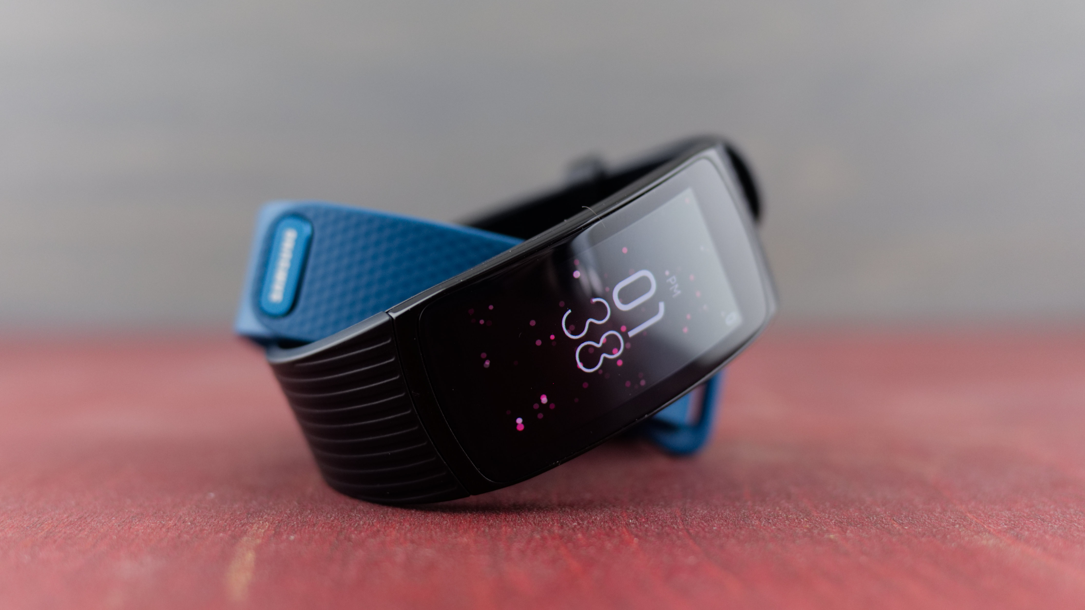
The Samsung Gear Fit 2 Pro rocks a slimmer profile than the Blaze and one-ups its with some impressive specs, like its Super AMOLED display and built-in GPS function.
You can nab each for about the same price, but the Blaze stands out in a few key ways: it's sleeker, looking much more like a proper smartwatch than a fitness tracker. Saying that, Samsung's choice is one of the best looking fitness trackers money can buy.
Lastly, the battery life of the Blaze is a step above Samsung's latest, too. You'll be able to get at least five days of use out of it before charging, about a day or two on average more than you'll squeeze from the Gear Fit 2, especially if you use its GPS function. Then again, it does have GPS built-in while the Blaze doesn't...
- Read the full Samsung Gear Fit 2 Pro review
Fitbit Surge

Before the Blaze, the Fitbit Surge was the biggest and best Fitbit you could buy. It's aimed at the serious fitness fantastic, and includes GPS tracking as well as real workout stats and a heart rate monitor.
It's bigger than other Fitbit products as it features an LCD screen, and it's also more expensive than other Fitbits – it costs even more than the Blaze at $250 (£200, AU$350).
When the Surge was released Fitbit called it its 'superwatch', distinguishing it from the Fitbit Charge and Fitbit Charge HR. The big focus is on GPS, and it's something the Blaze is sorely missing.
- Read the full Fitbit Surge review
Fitbit Charge 2

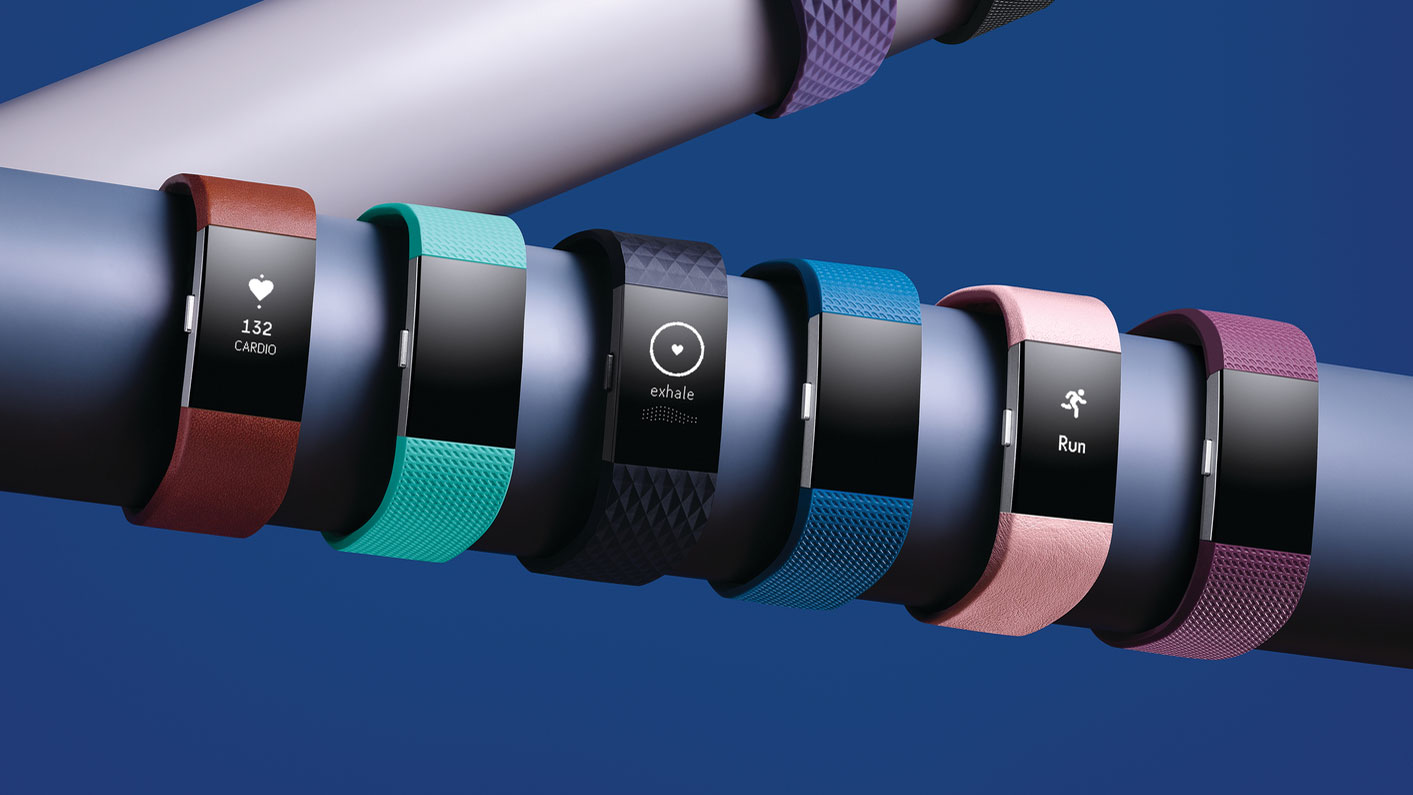
After a Fitbit product that's slightly cheaper than the Blaze? The updated Charge is a good choice for you and come with a selection of the fitness features we first saw on the Fitbit Blaze.
It will give you notifications for SMS and phone calls and has a wider screen than the Fitbit Charge HR. It's not got such a large screen as the Blaze though and you may find it more comfortable as it has a slimmer design. It's a comfortable device , so it's easy to throw it on in the morning and keep wearing it.
And if you thought the battery life of the Blaze was great, the Charge 2 is going to last you even longer – it only needs charging once a week or so. It's worth bearing in mind that if money is no object there's also the Fitbit Charge 3 too.
- Read the full Fitbit Charge 2 review
Current page: Verdict and competition
Prev Page Companion app, compatibility and battery lifeJames is the Editor-in-Chief at Android Police. Previously, he was Senior Phones Editor for TechRadar, and he has covered smartphones and the mobile space for the best part of a decade bringing you news on all the big announcements from top manufacturers making mobile phones and other portable gadgets. James is often testing out and reviewing the latest and greatest mobile phones, smartwatches, tablets, virtual reality headsets, fitness trackers and more. He once fell over.

