TechRadar Verdict
We slightly question the usefulness of this type of fitness tracker, and there are an awful lot of them coming out now. However, if you're in the market for one, this is definitely one you should consider
Pros
- +
Comfortable, discreet design
- +
Solid tracking and motivational qualities
- +
useful additional features, including phone notifications
Cons
- -
More expensive than many rivals
- -
pointless sleep tracking
- -
screen can be annoyingly unresponsive
Why you can trust TechRadar
Fitness bands are now a well established part of the tech canon, and they're aimed at a specific kind of person – does this sound like you?
You're someone who, halfway through the decade, decided to get moving. Naturally, you want to log these new bursts of momentum – else what's the point, right? – and for a small price you can now do so discreetly, at the cost of a recharge every week or so, only having your day-to-day life interrupted by a digital pat on the back for taking the stairs at work.
If you then decide to get more serious, there's the likes of the Garmin Forerunner 920XT, but this sort of band is more about baby steps to fitness. Specifically, the "doctors recommend it" 10,000 baby steps per day. However, this band does put some extra tricks up your sleeve: smartwatch-style notifications and enough water resistance for you to be able to swim in it.

Design
The Garmin Vivosmart is the successor to the Vivofit and improves on it in every way except for battery life – an OLED screen and smartphone notifications mean this needs a charge every week rather than every year.
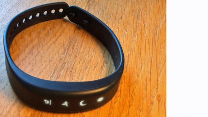
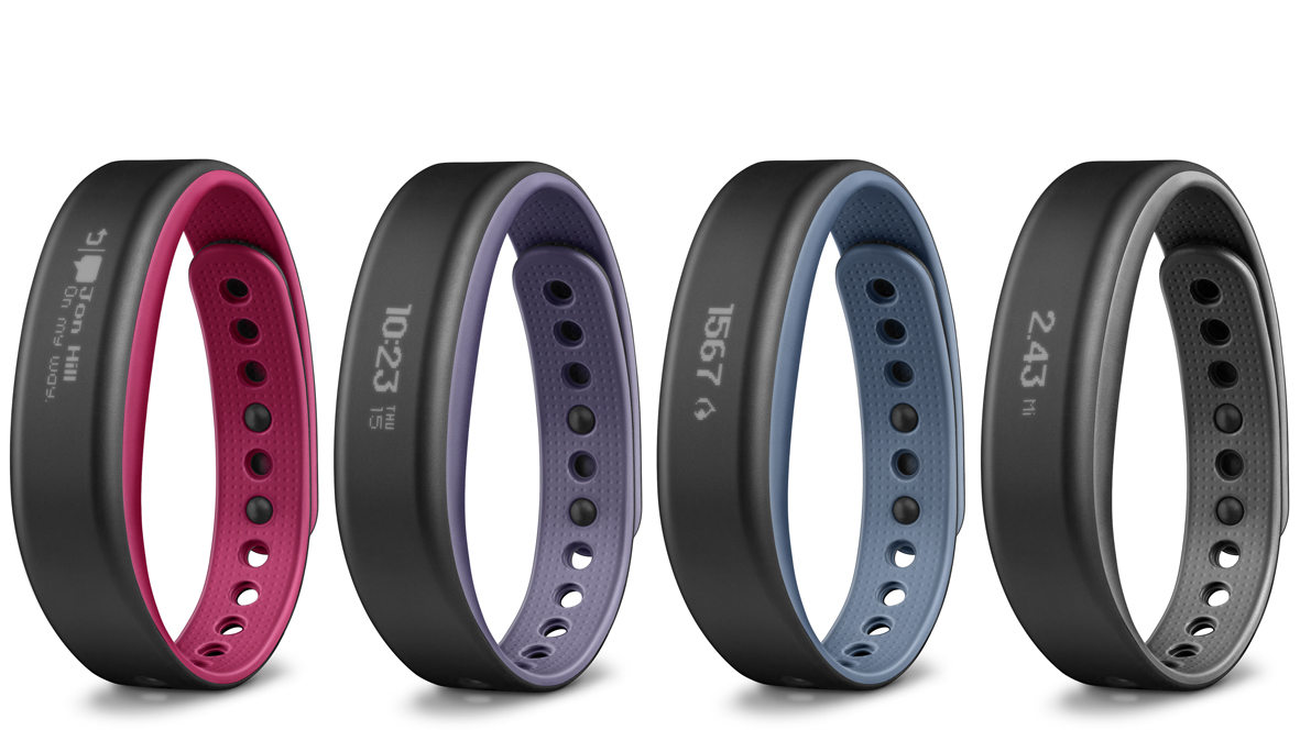
The look of it is as simple as can be: just a plain band, until you tap the screen to awake it. It's very discreet, slimline and comes in a colour palette that ranges from muted to black. It's about as comfortable as most other fitness bands, which is to say it rubs a bit, tends to leave a mark after prolonged wear, but never becomes painful as such. I like its simplicity.
The wristband clasp keeps the Vivosmart firmly in place. There's also a second mini-clasp if you like belt and braces, but I found it fine with just the basic strap arrangement.
Setup is relatively painless, though it can be fiddly on the go – for instance, you must go through five menu screens just to adjust the time, although to be fair you should only need to do this once.
It's great to be able to set which data displays you want available on the band via the app, as well as set a fixed home screen – I alternated between steps and time/date, although again, six menu screens deep for such a basic command is annoying. Syncing via Bluetooth is as easy as pulling down the screen. Again, it doesn't work first time every time, but the sad state of affairs with this kind of device is that none of them do. It's no better or worse than something like the Withings Ox or Huawei Talkband B1.
The Garmin Connect app is okay, but quite a dreary, Excel-like affair – not fun and bright like Withings' companion app, for instance – and the amount of data available through it is, by the nature of the device, quite limited. Vivosmart is compatible with Apple Health, so if you're on iOS, you could use it as one element of a more comprehensive health-tech setup, if you so wish.

Screen
The screen is very bright, viewable in all but bright sunlight – though as I was reviewing this in the British winter, there was precious little of that. The size of it allows for reasonably sized icons, and just enough text to work out what's going on when you get smartphone notifications (see below).
Screen responsiveness is not amazing – the idea is that it bursts into life with a double tap, and often it does. However at other times, this can also become a triple, quadruple, octuple tap if it's not sat quite right on your wrist, or it's feeling unco-operative. You can also set it to fire up when you lift your arm but that was even worse for me, if anything. You need to be very assertive in your arm movements, like Dr Strangelove or something, to have any chance of success.
Witness the fitness
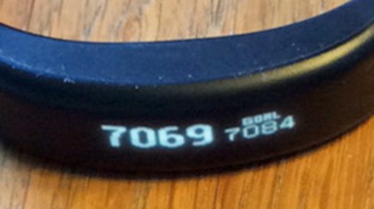
The core step-counting functionality seemed a little random. It informed me I'd taken 48 steps during sleep one night, and I wouldn't rely on the Vivosmart to give an exact prediction of steps taken, distance covered or calories burned.
That's not really the point of this kind of band, though; it's more about getting a general view of your fitness-boosting activity and looking to increase it over time, and for this purpose it's absolutely fine, being accurate enough, even if it's not 100 per cent correct.
Reach your daily step goal and you're hailed with buzzing and flashing lights. This was a little disconcerting when it happened half an hour into a car journey, but still, a nice touch.
Similarly, while being told to "Move" when the Vivosmart judges you've been sedentary for too long can be a useful motivator, it's not always practical to leap up and get active at the behest of your watch.
As well as step counting, the Vivosmart can also track more vigorous activity. Just press the desired icon to let it know you're about to run or cycle and it'll log distance and time, as well as sucking in data from compatible ANT+ heart-rate monitors and cycle speed sensors.
This is again not totally accurate, with a 10-mile run being measured as 13.3 miles. You can pair with third-party running apps like RunKeeper, although annoyingly not Endomondo, which is what I happen to use.
Make sure you check your stat-keeper of choice is supported, or resign yourself to moving to a new now and losing all your lovingly compiled data.
If you want to get social with your fitness, these third-party sites are probably the best bet, but Garmin does have its own community so you can set up step challenges and so on, with fellow Vivo and Forerunner users.
And so to sleep…
A quick word on sleep tracking, which seems to be becoming obligatory on wearables, and features on the Vivosmart. It's hard at the best of times to see what the point of monitoring the quality of your dozing is, but it's particularly sketchy here.
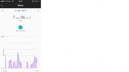
You have scroll to and press a moon icon on the band to say you're bedding down for the night, then hold the same screen in the morning when you decide to get out of bed. Well, what's the point of that? "Time I've allocated for lying down" isn't sleep analysis. It's also not much cop at making sure you're asleep during that period. On one night, a nice round 8.0 hours of sleep was registered when barely 5 was had.

On another, a coughing fit meant I had to go and sit upright in the living room for an hour. The following morning's sleep graph just recorded this as "some movement" and gave me the option to annotate the whole "sleep" with an unhappy smiley face if I wished. If you're an enthusiast of "the quantified self," well, I doubt the value of this particular quantification.
- 1
- 2
Current page: Intro, design and fitness functions
Next Page Smartwatch functions, battery and verdict