Why you can trust TechRadar
Under the hood, the Vivosmart HR+ has everything you'd expect from a high-end tracker, including a built-in heart rate monitor, GPS, accelerometer and barometric altimeter. This means it sits nicely between activity tracking devices and those designed solely with fitness in mind.
When it comes to activity tracking, your steps clock up throughout the day to work towards a goal that Garmin has set for you - although you can change it from within the app. Once you hit that goal cue little vibrations and alerts that tell you you're doing well.
Generally, Garmin's step counter seemed accurate and was within a few hundred steps of a few other devices we tested it against, like the Misfit Ray and Jawbone UP3.
A nice addition here is the move bar, which basically tells you when you need to move. It builds up over an hour or so and then you can walk it off. Other devices from Fitbit and Jawbone have a similar feature, but Garmin does it well because you can watch it slowly build up and it simply prompts you to move - rather than just annoying you.
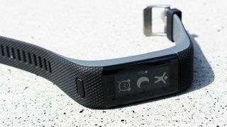
Although the HR+ can be used solely as an activity (and sleep) tracker, it really excels when it comes to fitness - especially running.
Press the home button and you'll be greeted with a bunch of options. The first one is a little stick dude. Click him and you can choose from Running, Cardio or Other.
Once within the Running option, you can specify whether you'll be indoors or outdoors - if you select outdoors, the HR+ will put the GPS to good use, as well as tracking your pace, distance, calories and time. It displays one thing at a time once you've completed your run, which you can then swipe through.
There are no dedicated modes for full GPS-tracking of other activities, which is a shame. Although, selecting Other will present you with distance, time, BPM and calories burned. The results here are decent, but nowhere near as detailed as they could be - especially if you're really into cycling and swimming.
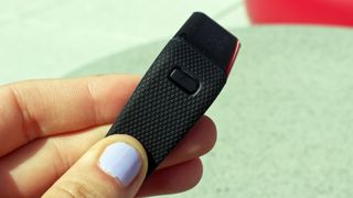
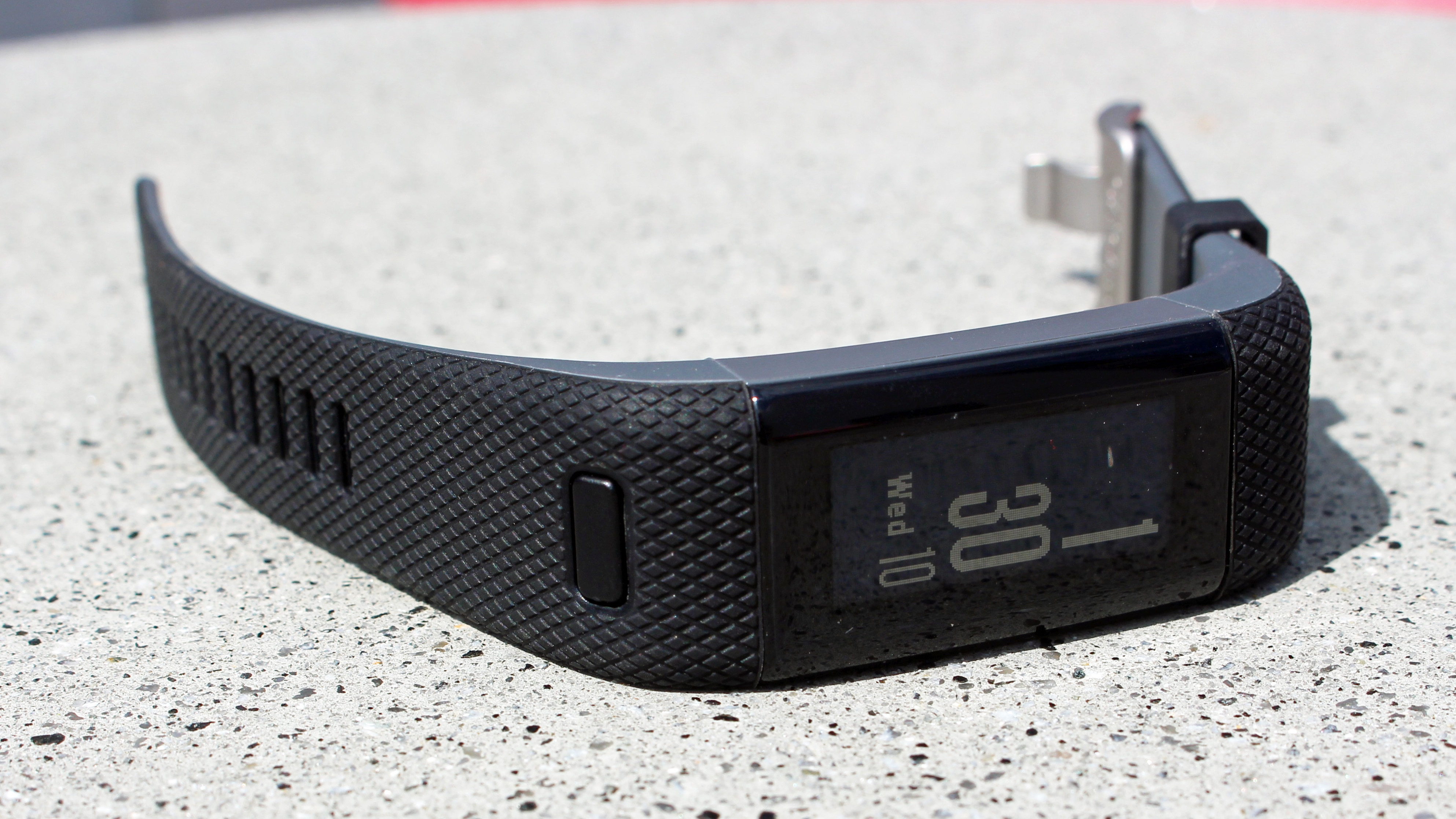
The device has one button on the front and a touchscreen. You only really have two sets of controls. You can press the button to see the main menu, or swipe up. This keeps the functionality really simple and, after just an afternoon's wear, quickly became really intuitive and easy-to-use.
We think this is vital for a wearable created to be used for running and high intensity activities - no one has the bandwidth to perform well and fiddle around with confusing menus.
Although there's nothing particularly exciting about the touchscreen it allows you to quickly swipe through all kinds of data. This includes the time, which is always displayed, your daily steps, stairs climbed, active minutes, calories burned, distance travelled, music controls, weather, your notifications and then heart rate.
Wow, that's a lot, right? And the fact that swiping through it feels simple and intuitive is a real testament to Garmin's consideration of the user journey here.
The device's 24/7 heart rate tracking performs well. It collects your resting heart rate throughout the day, which you can see within the accompanying Garmin Connect app or live on your wrist by finding the right screen as you swipe.
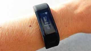
When you're working out the heart rate works fairly seamlessly, providing a slightly delayed experience when we upped the intensity of our workouts - but it caught up eventually.
The Garmin Vivosmart HR+ tracks your sleep automatically and sends the data through to the app for closer inspection. On testing it, we found it tracks sleep accurately enough, but it doesn't present data as in-depth as some other apps, like Jawbone. This is fine if you're only mildly interested in sleep tracking, but it might be worth looking at other options if it's your number one priority.
The one thing that sets the Garmin Vivosmart HR+ apart from simpler trackers, is it'll ping notifications from your phone over to your wrist. There's not much to say about this feature, other than it works instantly and everything gets sent there.
It's always reliable (if a bit relentless), sending calls, messages, Facebook messages and anything else right to your fingertips and you can tap into certain messages to read a bit more. You won't be able to read everything, but you'll get the gist.
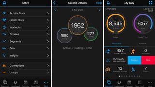
Like other Garmin devices, the Vivosmart HR+ syncs up with the Garmin Connect app. We're torn with the Garmin Connect app, because on the one hand the depth and richness of data on display is really extensive, allowing you to dig deeper into all kinds of stats.
But it's also a bit confusing and can take a while to figure out where everything lives, even after a few days of use, which feels like a letdown when the wearable itself is just so simple, but maybe that's the whole point. Your wrist is for simplicity; your app is for everything else.
The app displays snapshots of your data, like daily stats, steps and a workout leaderboard, as well as a calendar of all your past workouts, on the home page. But you can customize that and move whatever you like to the front page. So there are plenty of options to simplify and streamline your experience.
Current page: Specs, performance and fitness
Prev Page Introduction and design Next Page Compatibility, battery life and verdictBecca is a contributor to TechRadar, a freelance journalist and author. She’s been writing about consumer tech and popular science for more than ten years, covering all kinds of topics, including why robots have eyes and whether we’ll experience the overview effect one day. She’s particularly interested in VR/AR, wearables, digital health, space tech and chatting to experts and academics about the future. She’s contributed to TechRadar, T3, Wired, New Scientist, The Guardian, Inverse and many more. Her first book, Screen Time, came out in January 2021 with Bonnier Books. She loves science-fiction, brutalist architecture, and spending too much time floating through space in virtual reality.
